Illustrating Landmarks with Type
Hey there!
Let me tell you, using letters is way out of my comfort zone. The first time I attempt something with letters I discovered that there are so many rules that it blocks me a little (or more than just a little).
I struggled a lot but decided to give it a shot anyway.
I currently live in Volta Redonda (Brazil) and here we have the National Siderurgy Company (not really sure if that´s the correct translation but judging by the fact that I just discovered is A university and not AN university I should study english a bit more).
This building is called Central Office and it used to be CSN´s main office but has been left to rot for a long time now. Attempts have been made to turn this building into something useful an even A university but no agreements were made and there it stands occupying the center of the city and completely useless.
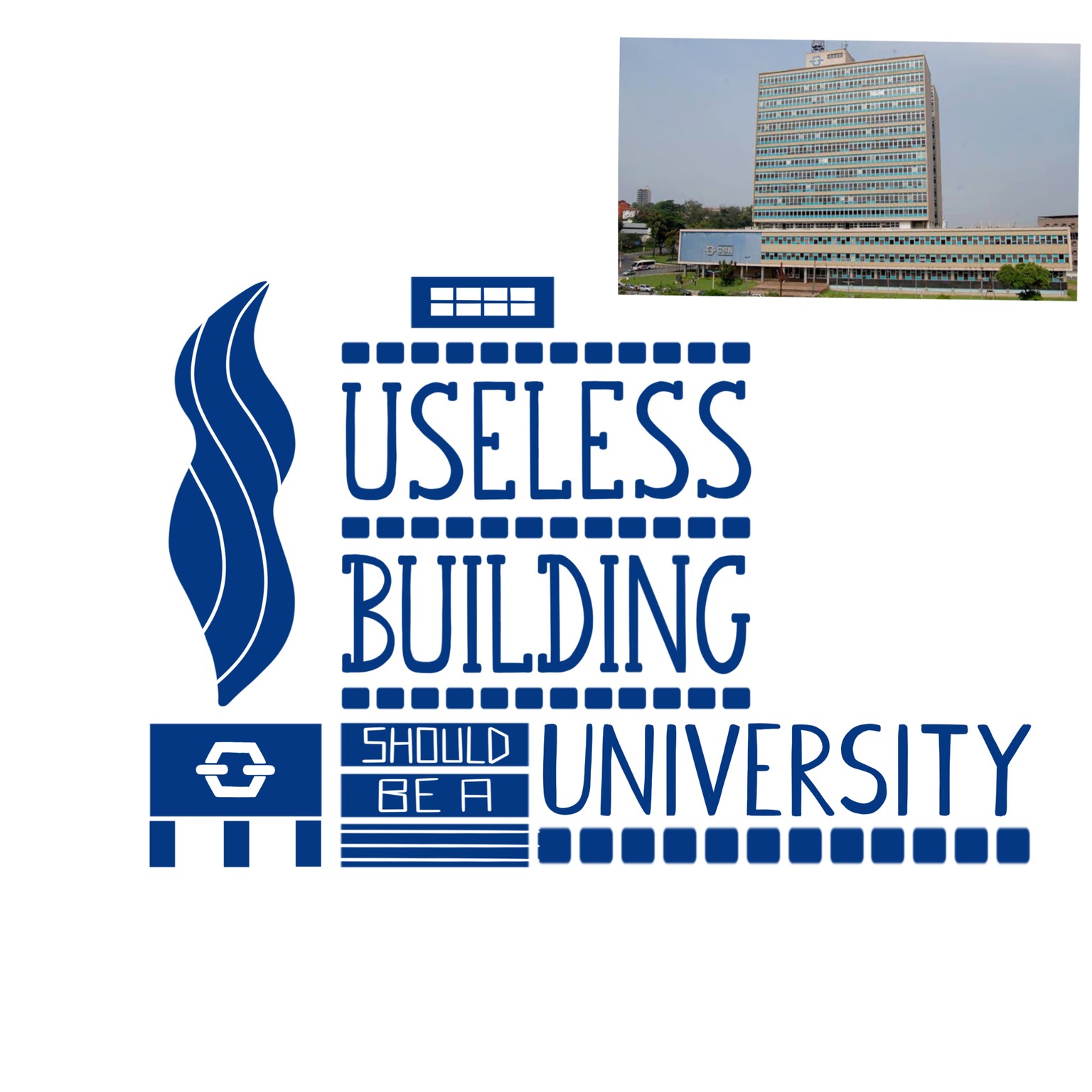
I also decided to add an element to represent smoke because the air here is pretty bad and they have the audacity to have a digital sign next to this building always letting people know how the air quality is. They own it, so no surprise it shows Good or Very good most of the times.
As you can see I have a lot of reservations about this company specially about the land they own and environmental issues so that was my motivation to go on with this project.
And here´s how it turned out.

I´m not completely happy about it but I´m happy that I didn´t give up.
All the critics are welcome.
Thank you for the class!