Heritage Pattern Inspiration
Hi, I thoroughly enjoyed this class. It was exciting to look back at heritage textiles and see these beautiful colors. Here are my examples and thoughts about the materials and process.
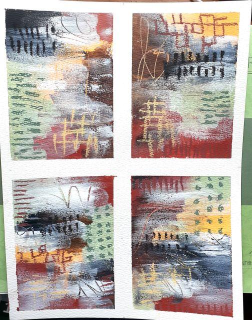
Project 1
I agree with the use of the green in this color palette. I did however use it for the dot pattern. I also mixed it with some white and a bit of grey for the box stencil but thought it was to light. I felt that there needed to be more contrast so I added some black lines and outlined some of the box stencil. These are the four I completed instead of the smaller twelve. I don't love, love them but I enjoyed painting along with you in the lesson.
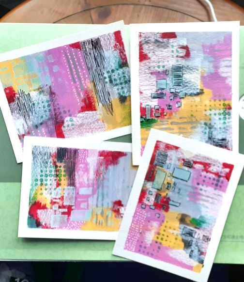
Project 2
In this project I liked the gray blue and yellow green combination. I used the Derwent tinted charcoal in Mountain Blue, the graphtint in Meadow and Dark Indigo and a diluted Port instead of the Buff Titanium. I added in a Paul Rubens Shi Yun yellow green #121. I chose not to use stencils on this one so I varied the sizes of the dots using posca pens and used graphtint pencils and a gold signa pen for the marks. I like the one on the right best.
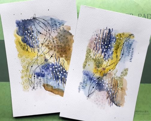
Project 3 - Love Love this one.
I love how these colors came together. I did not have sepia but I think there is enough contrast with the brown. I like this so much, I chose to keep the mark making to a minimum. I think there is a frame waiting for it.
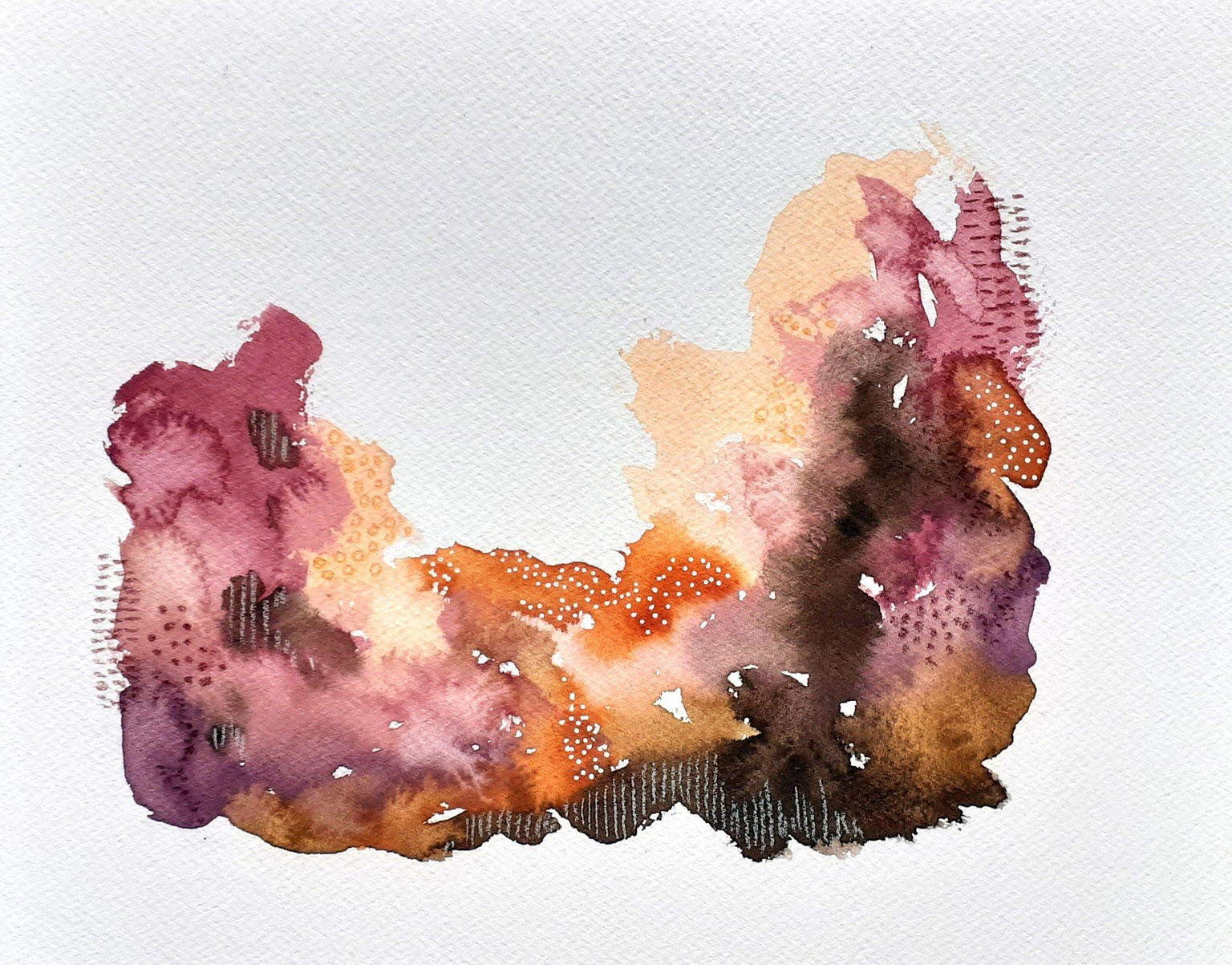
Project 4
This was not a color palette I would normally use but it was a lot of fun to create. Due to the size of my paper, I only completed four samples. I chose not to use stencils on this one as well and my goal was to make marks and add color without being precise. I like how some of the mark making from underneath shows through along with the mark making in the wet paint. This is a color palette I would definitely use again. Broadening horizons.