Heartlocked Logo Redesign
For my project I am redesigning my business logo.
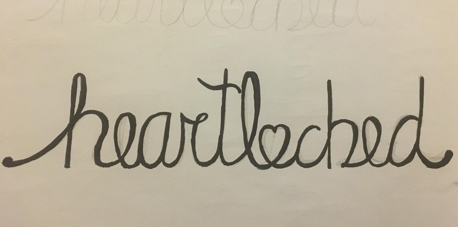
I would like a more whimsical logo in a script font that uses a heart as the "o". This is my first time trying hand-lettering and vectorizing type so this is VERY rough right now but I will keep updating it as I get better. It is going to take a lot of practice.
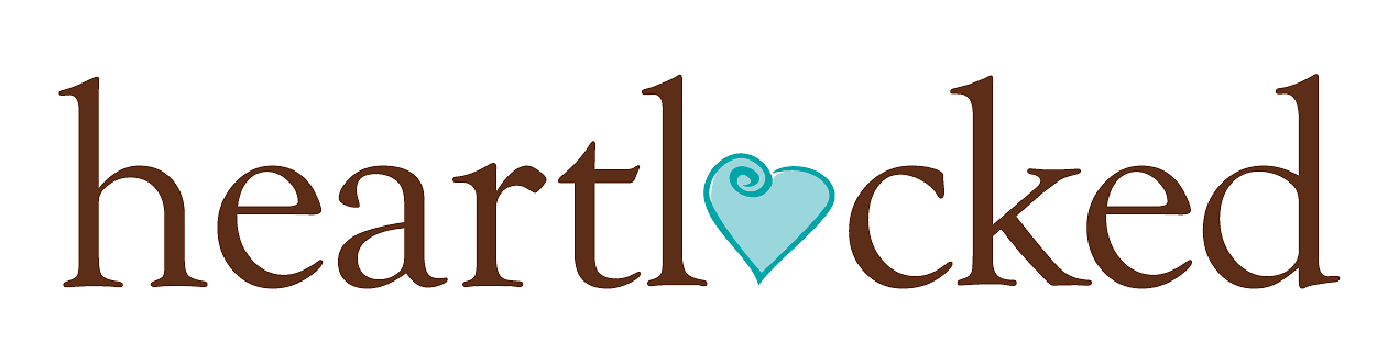
Current logo
Sketch
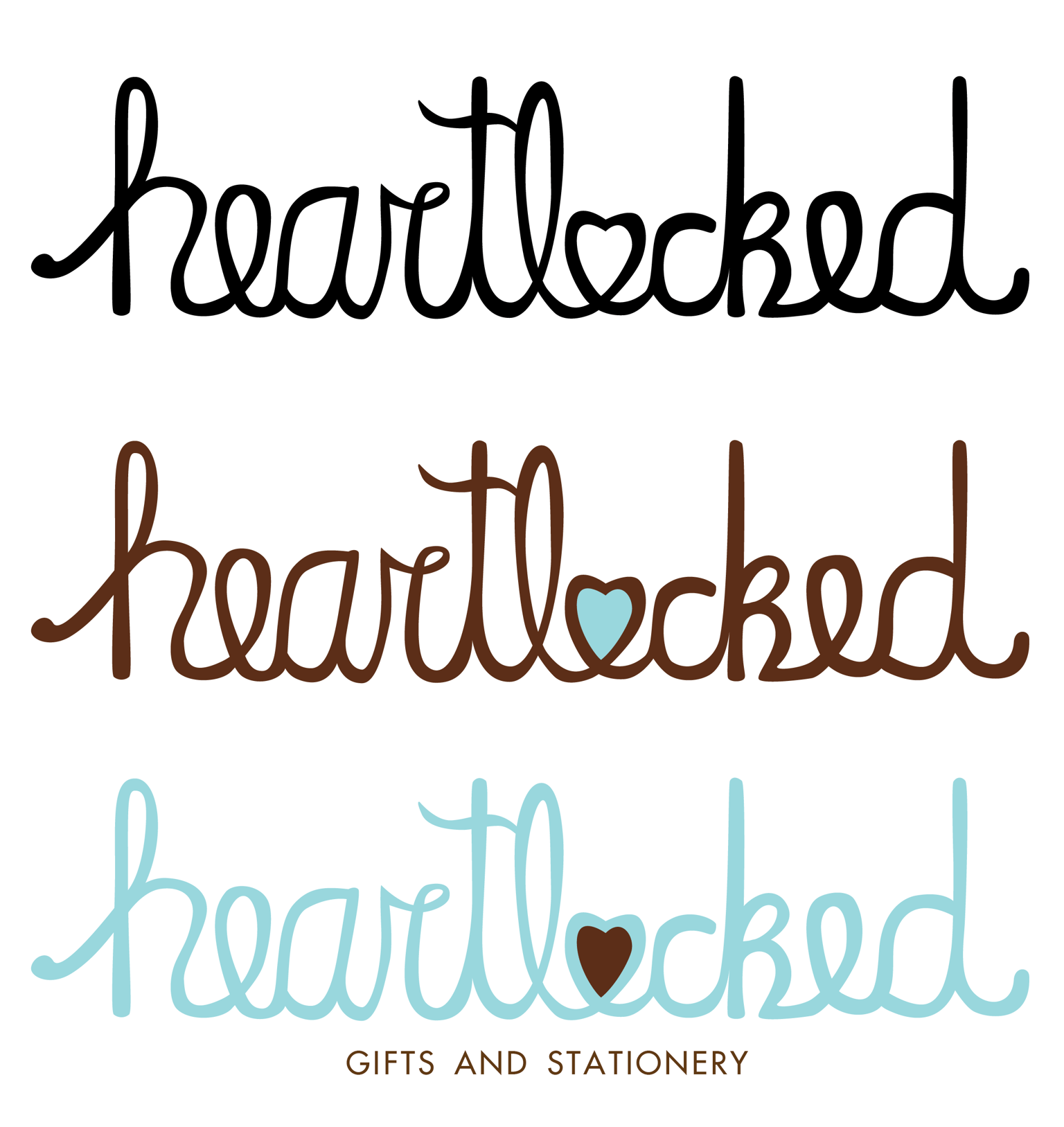
Vectorized version in black and white and signature colors
Self-critique:
It needs a lot of work. Letter shapes are definitely wonky, letter spacing and width are uneven ("heart" is tighter than "locked"). Letter height is not too terrible but the heart, the c and the k are too low. Some strokes are thicker than others. I will also keep working on the pen influence, since ultimately I would like this logo to look like something written with a sharpie, a lot like the Jeni's ice cream logo.