Frosting to my Cupcake
What a great class! Thanks, Amarilys, for some very excellent information. This is my first pass at the project. I didn't use photoshop on the first go around, instead painted the entire image on one page to get a feel for the project.
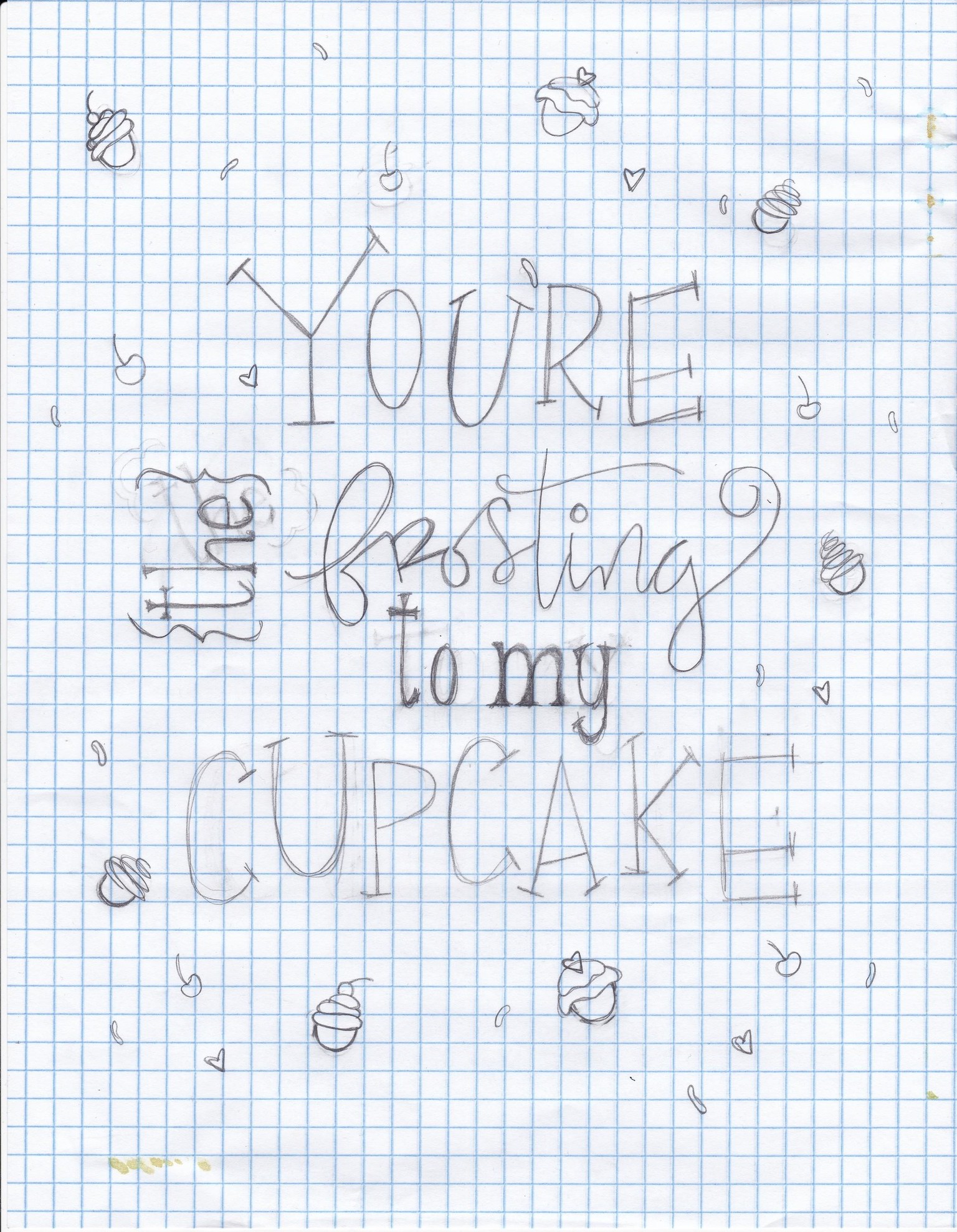
I always sketch on grid paper and paint using a light box.
And then the painted version:
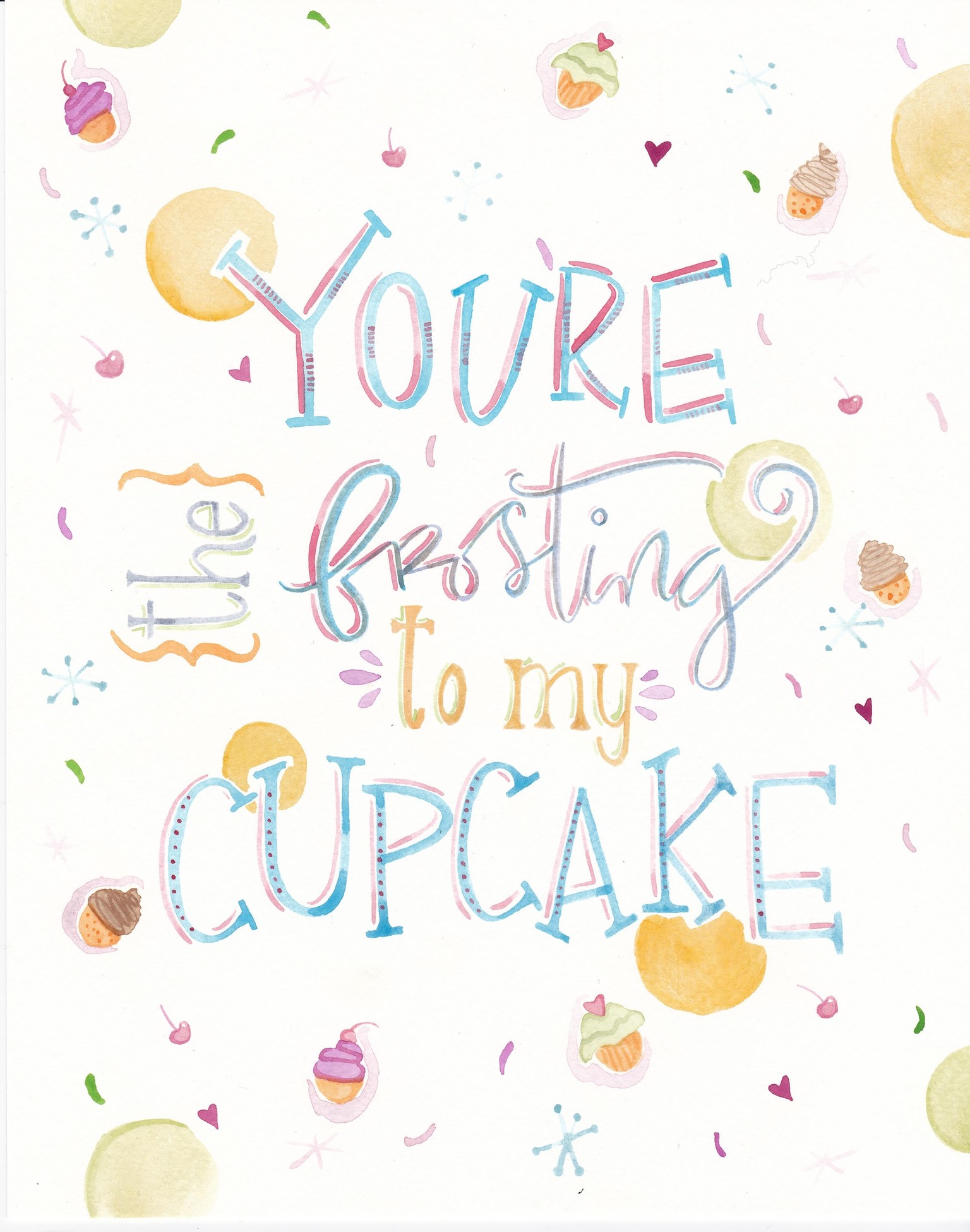
I have mixed feelings about it. I think there are aspects that I like: "you're, the, cupcake"; the dots--but there are others I knew right away were not going to work. I should have matched the word "frosting" to "the." It would have popped a little better. I also should have made the cupcakes bigger. I thought it would be fun to add other toppings, like the cherries and sprinkles, but upon reflection I would rather them not be there.
So I will be doing another version and using Photoshop as you recommended. I'll update soon.
UPDATE:
I went back and painted another set and used Photoshop to edit. I'm much happier with the result. The first one used all my own hand lettering, which after some thought I felt worked fine except for the word frosting. It needed to be thicker. So I deleted it and changed it to a digital font in the same color. I think it works well.
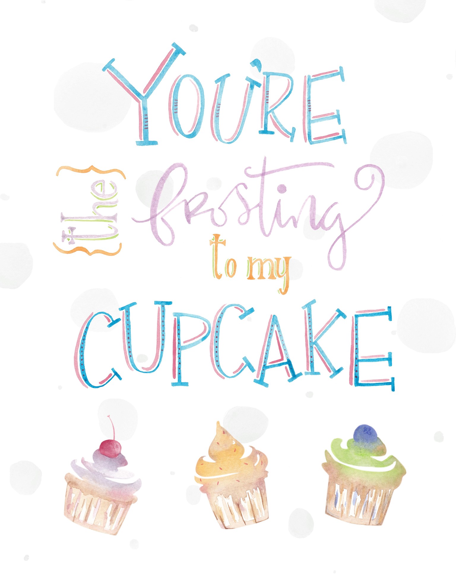
I played with different color backgrounds, but they didn't work and drowned everything else out. I used the select inverse technique to cut out the lettering, but I'm very familiar with Illustrator and the pen tool, so I used it to do the cupcakes. Overall, I'm pretty happy with the result. I'd welcome any feedback. Amarilys, what are your thoughts on combining watercolor and digital elements?
Thanks again!
Erica