Final project: Castle brochure
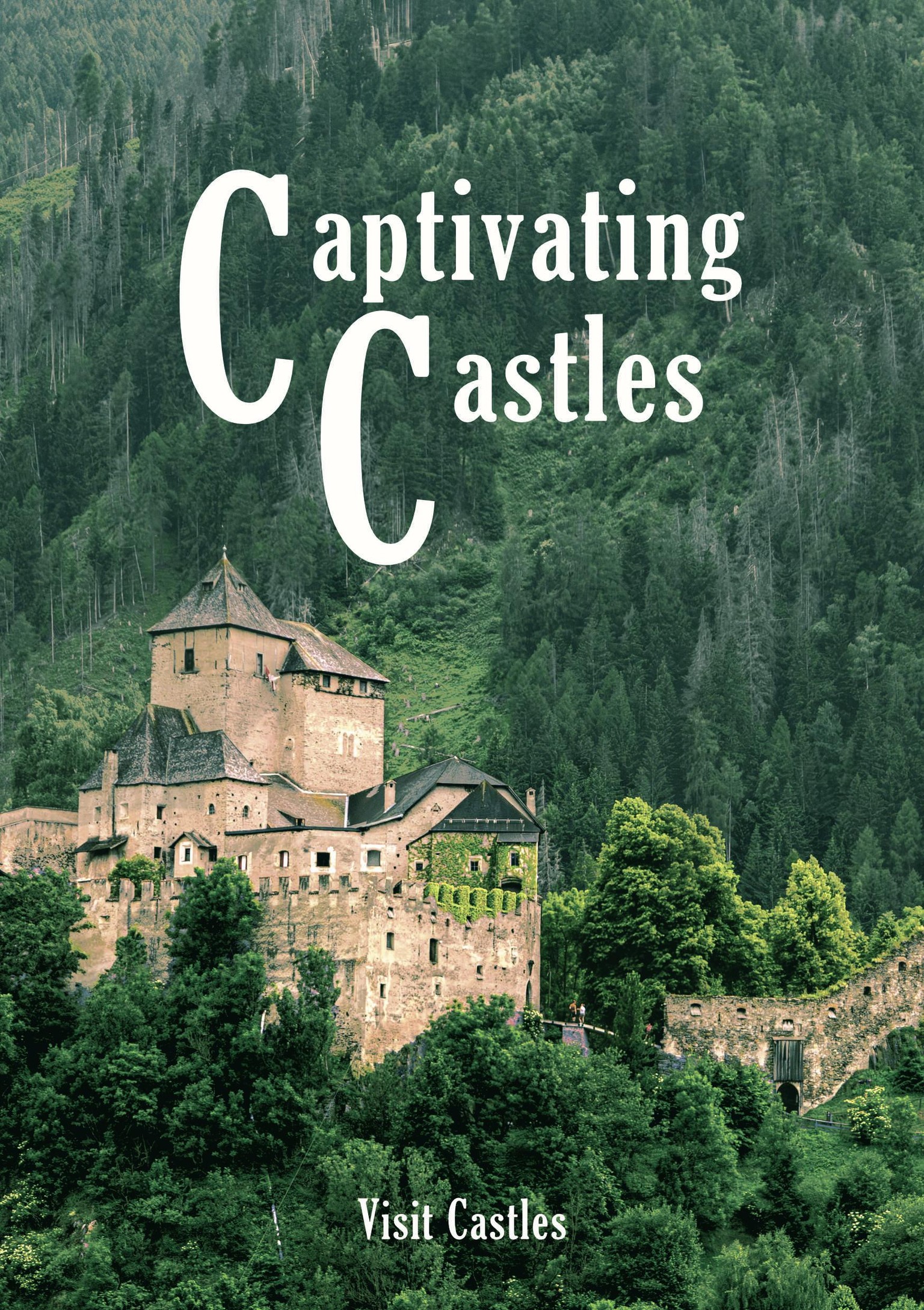
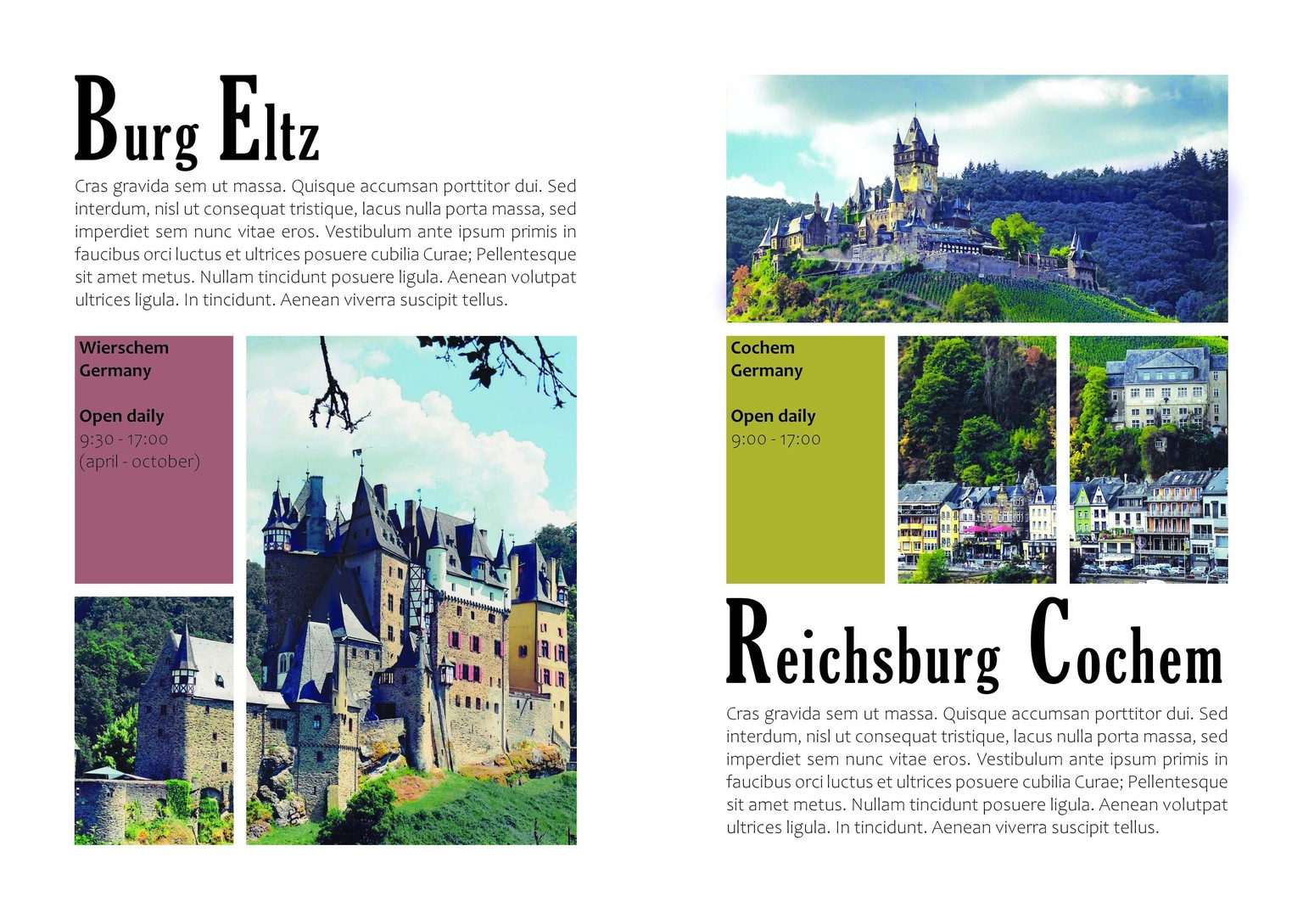
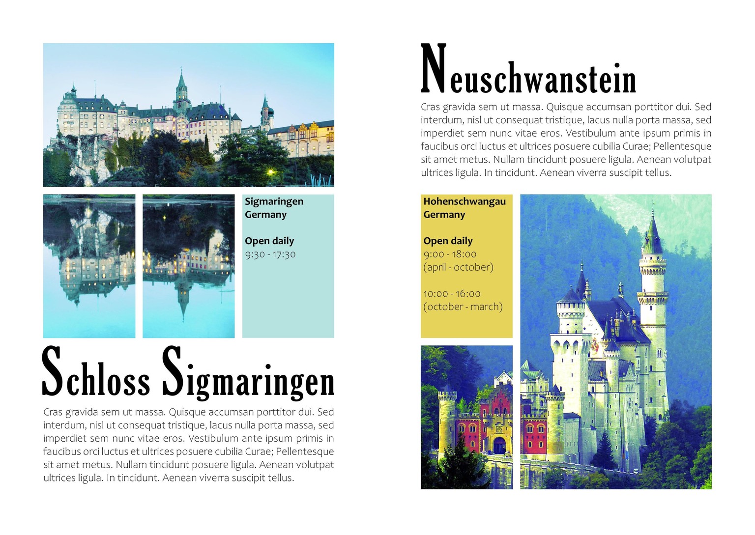
For the final catalogue project I made a brochure for a fictional Visit Castles organisation. I combined my knowledge from the Affinity Photo tutorial to edit the pictures and make them more cohesive using curves, colour balance and other adjustment layers.
For the inner pages I used column guides to create a 3x3 grid and combined picture frames for a dynamic but consistent composition. The paragraphs are just filler text, but imagine they're interesting blurbs to inform you about the castles' highlights and history.
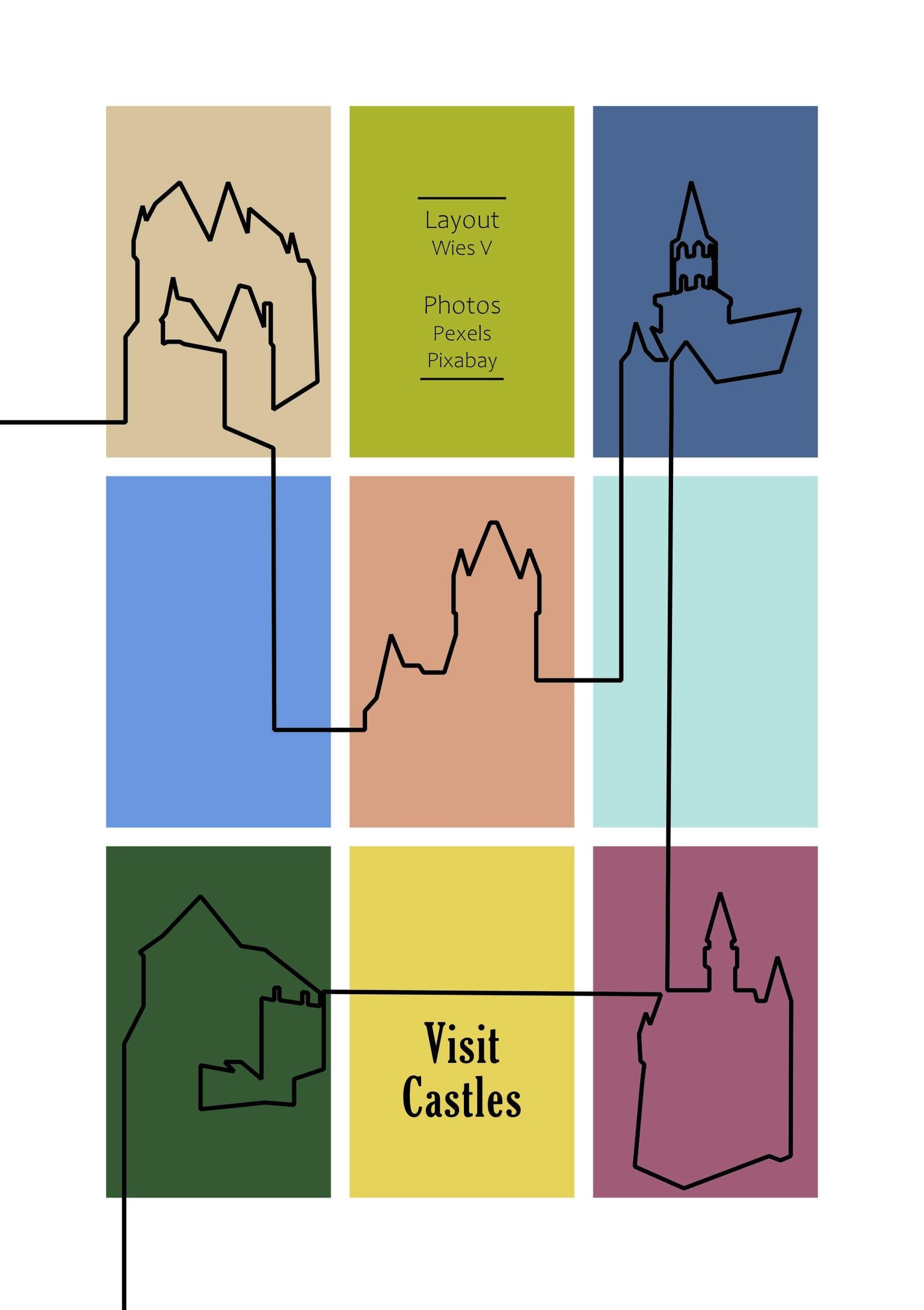
For the end page I used the pen tool tracing over the images to create a fun design incorporating all castles and some colours picked from the various photos.
Now that I upload the pictures I notice the colours look a bit more vibrant than in Publisher. Good to keep in mind which colour space I work in and how I export them, I guess!
Thanks Tim for your tutorials on the Affinity package! I won't be uploading a class project in each of them, but I did enjoy them and found them very helpful!