Final Fantasy magazine segment cover
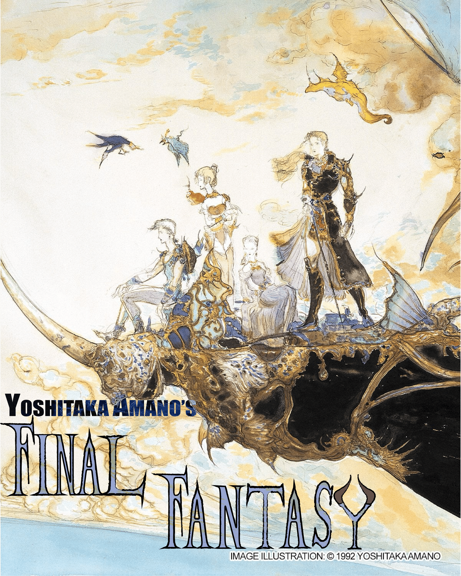
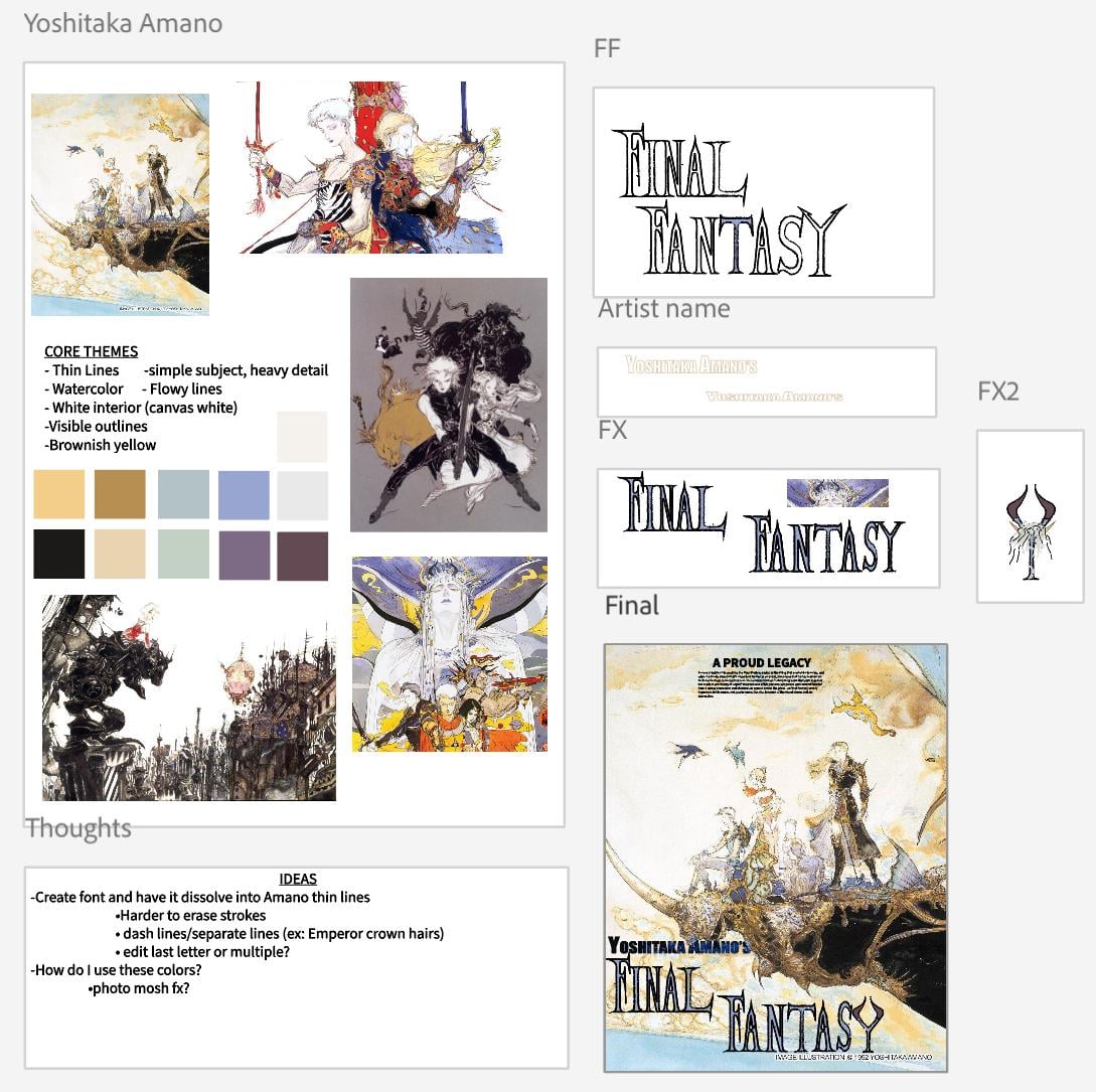 After identifying the themes, I wanted to make a text that was similar to Amano’s art. After I finished building the text, I outlined the words to make it look like pencil strokes. I used a “darken” blend so the title didn’t look out of place in front of the art. When building the “Y” I had some extravagant ideas but decided to simplify it so it wouldn’t take away from the rest of it. And lastly, I tried adding watercolor effects to the text but I didn't like the end result. Great class it really helped me map out ideas efficiently