Figma UI UX Design Essentials project
I'm following this course by Daniel Scott to get myself familiarized with Figma. I have a little bit of knowledge of prototyping on Adobe XD. Last year I started as an UX designer and recently we transitioned to Figma. This course is really helping me to understand the basics and then gradually going through to the more advanced stuff. So glad for this class here on Skillshare!
-----------------------------------------------------
Class project 01 - Create your own brief
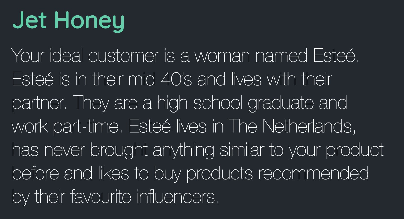
I have to admit that I did try a couple of times before I got a prompt I liked. Loved the easter eggs in the generator ;-)
--------------------------------------------------
Class project 02 - Wireframes
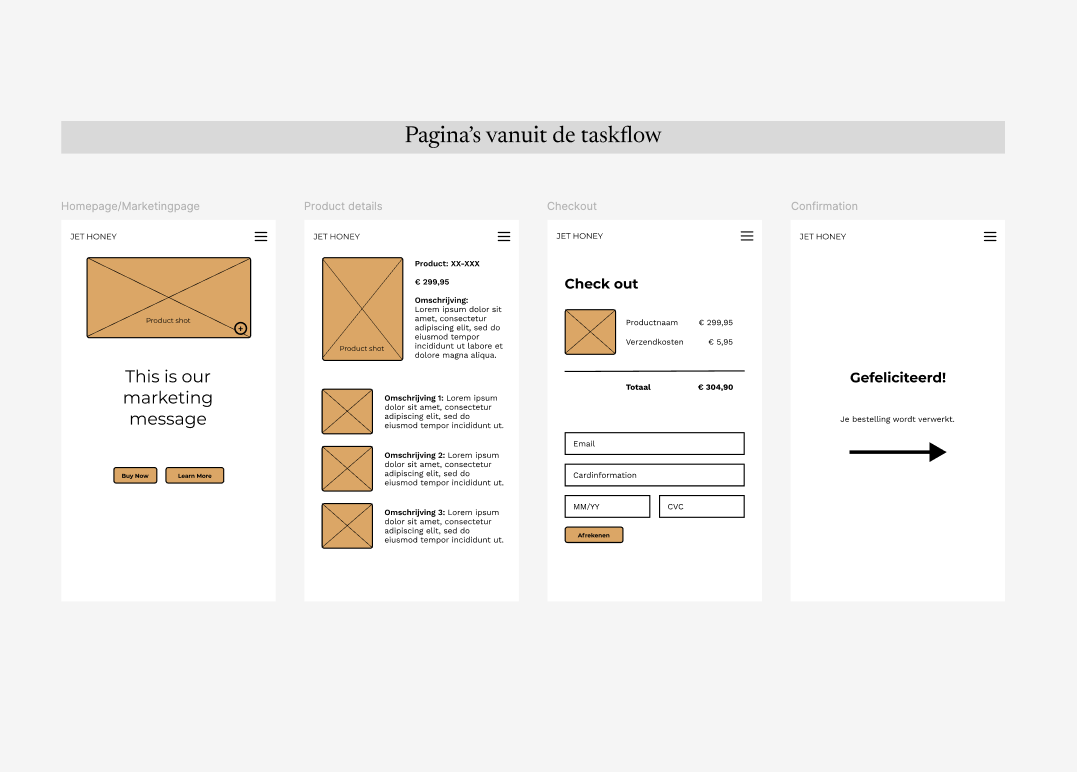
Here are my 4 pages for the mobile wireframe. I used a colorpicker on a honey image for the hightlight color. I really like how it turned out. I used 2 different fonts.
Header, Logo & Buttons: Montserrat
Bodycopy: Work Sans
The copy is a mix of English, Dutch & Lorem Ipsum
-----------------------------------------------------------------
Class project 03 - Icons
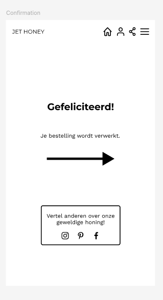
For the topnav I used the icons provided in the class resources and changed the stroke to 2. For the share/socials I used icons form the Iconify plugin. I used the lined versions in stead of the filled ones because they match the topnav icons and gives the page a clean and sophisticated look.
----------------------------------------------------------
Class 04 - Testing on your phone
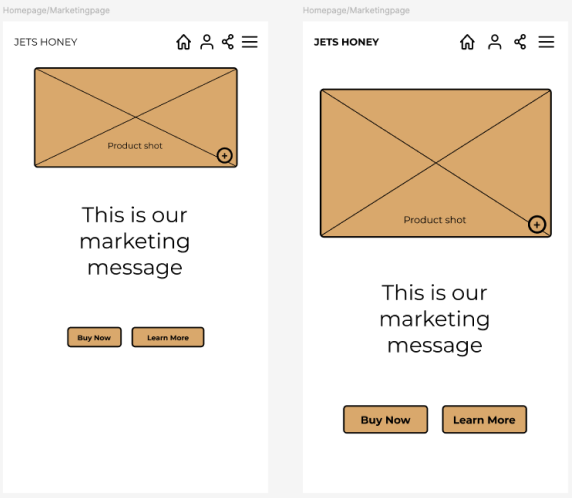
When I looked at the screen on my actual phone I noticed that it was all a bit frail/small. The changes I made:
- Logo font from Regular to Bold;
- Spacing between the topnav icons from 14px tot 20px;
- Product image bigger and a bit lower so it gives more room to the topnav;
- Buttons bigger;
- Buttonfont bigger from 10px to 15 px;
- Everything spaced out more on the height of the page to give it more balance.
----------------------------------------------------------
Class project 05 - My first animation
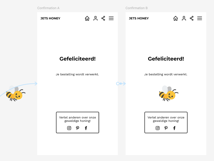
I used a cute little bee who flies in after clicking the purchase button on the checkout page. The bee icon was added through the Iconify plugin I installed earlier in the course. Used the Ease in and out back, same as Dan and set the duration to 2000ms so that the bee wouldn't fly in to fast.
----------------------------------------------------------
Class project 06 - Moodboard
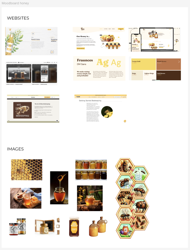
Nothing fancy, just an image dump of websites about honey that I like and images of honey packaging, bees and liquid honey.
----------------------------------------------------
Class Project 07 - Colors & Columns
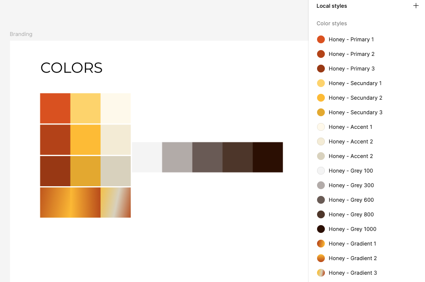
For my colors I used the colorpicker on the images on my moodboard. i knew I wanted something warm & rich. My "black" has a hint of brown to it, really liked the tips Dan gave here for picking colors and making gradients. I made 3 different gradients where the third one is a mix of the 3 colors in my palette. Probably won't use it but wanted to try it nonetheless.
------------------------------------------------------
Class project 08 - Text
Styleguide
Fonts & logo
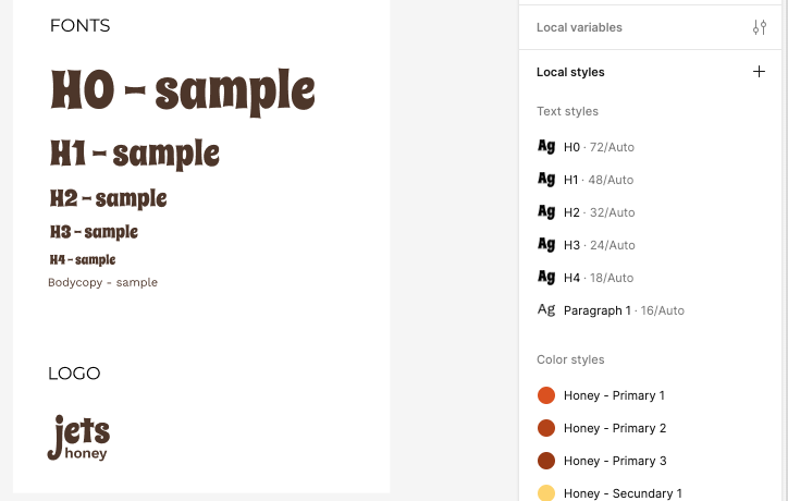 The font I used for the Headers is Spicy Rice regular which is very bold on it's own. I like the retro feel to it because my color palette is quite retro/70's in my opinion so I think it makes for a good match. My paragraph style for now is Work Sans. I'll maybe change it later. Not really sure if I'm happy with it .
Both fonts are incorporated in my logo as suggested by Dan. I played around with upper and lower case letters and a mix but ended up chosing all lower case. I think it sort of resembles the small bees that work so hard to make our honey.
Prototype
First 2 pages and productcards
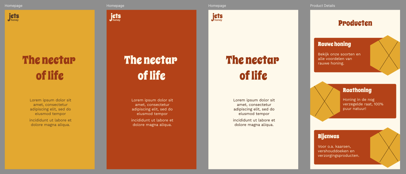
I made a couple of versions of the first page. I'm always a little indecisive when it comes to making choices on designs. I'm always worried that it isn't good or pretty enough. The first one I like the least. I think I will go with the middle one with the orange-brown background. The creme colored one is the one I started with, also like it.
For the productcards I chose a honeycomb shape for the images. Maybe not very original but I like the playfulness in combination with the retro vibe of the overall designs.
------------------------------------------------------
Class project 09 - Making Stuff
Buttons & Icons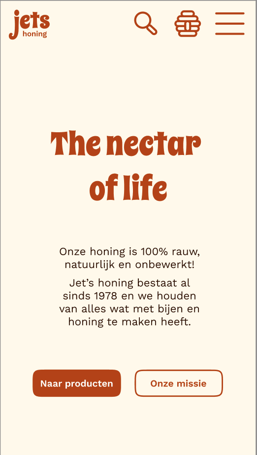
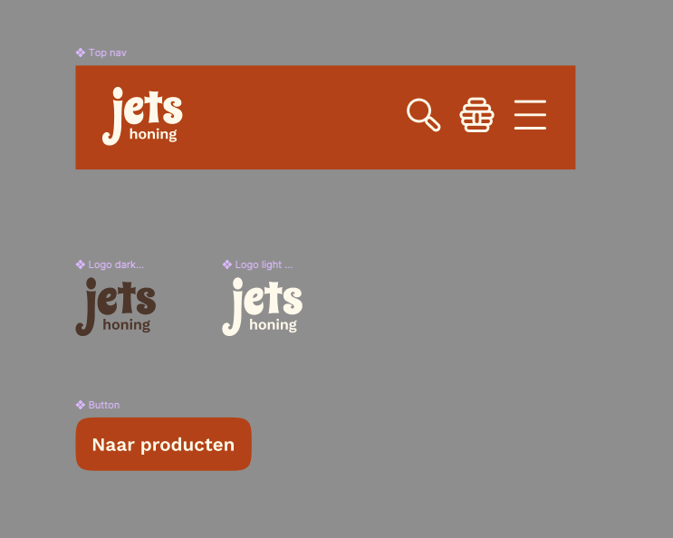
For the buttons I tried the squircle method mentioned bij Dan, I really like how it turned out. The icons I choose are the hamburger menu, a hive which will represent the place where you store your honey that you want to buy (shopping cart) and the search icon when you know what you want but don't want to browse all the sections and products.
-------------------------------------------------------------
Class project 15: Components