Designing a Geometric Ampersand
This was such a fun look at geometric letterforms, I really enjoyed following the steps, and dipped into the geometric grid-based designs class to create my grids. Here is the final result I settled on:

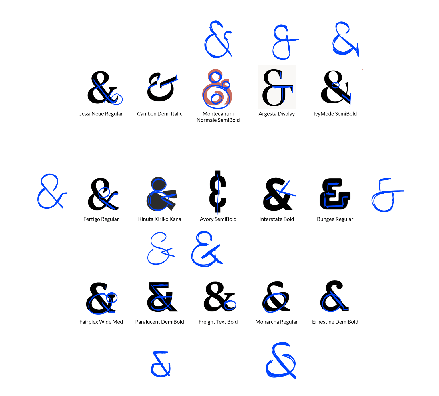
There are so many styles of ampersand, it was hard not to get carried away!
I put together some images that have caught my eye recently, without any specific direction in mind.
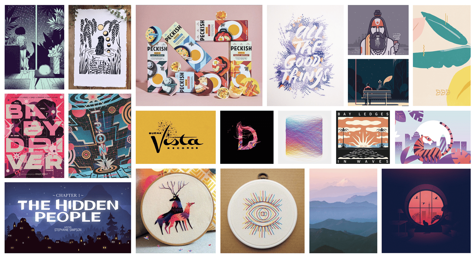
Most of my references focussed on colours palettes and lighting, so I went ahead with sketching whatever forms I'd liked from the initial research.
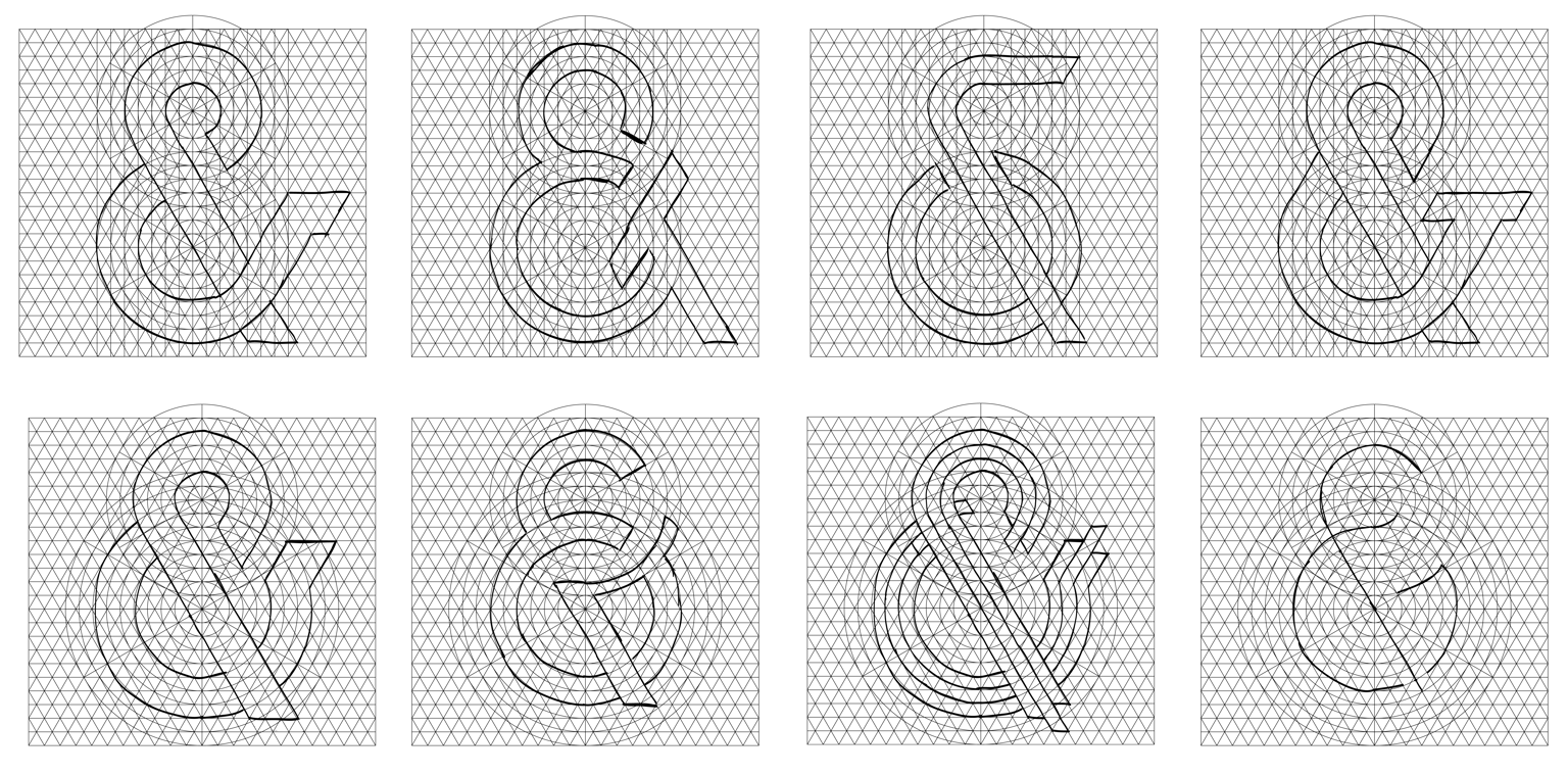
In the end, I decided to develop the form that felt the boldest and tightest. I especially liked the contrast in proportions between the top and bottom and felt like the negative space was well balanced.
I picked the first one which felt more dynamic and less crowded, and started testing out some colours inspired by the retro feel in the slightly muted brights from my style references.
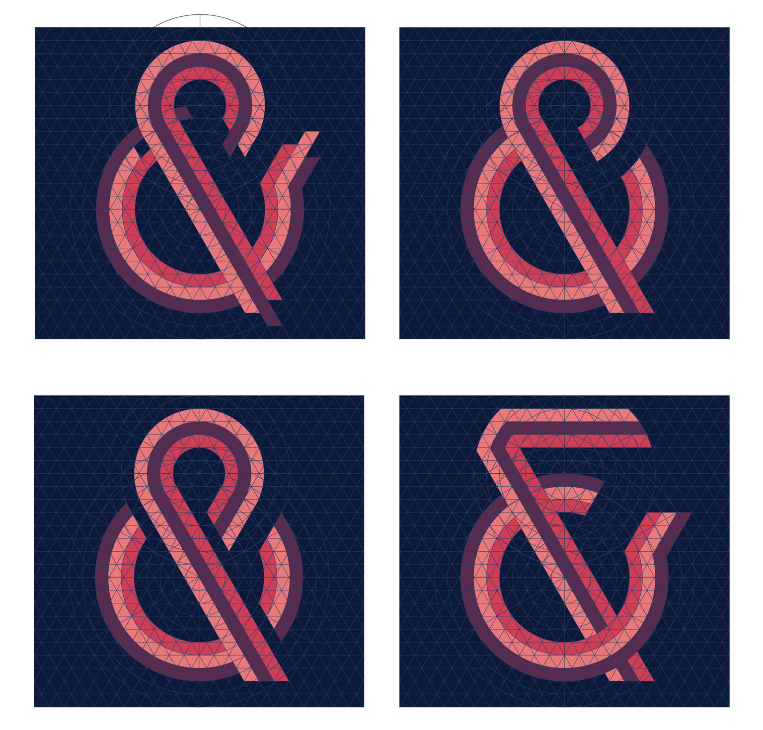
I'm hoping to make a series of these, so wanted the same palette to work in 4 variations, the experiments below show 4 different palette ideas.
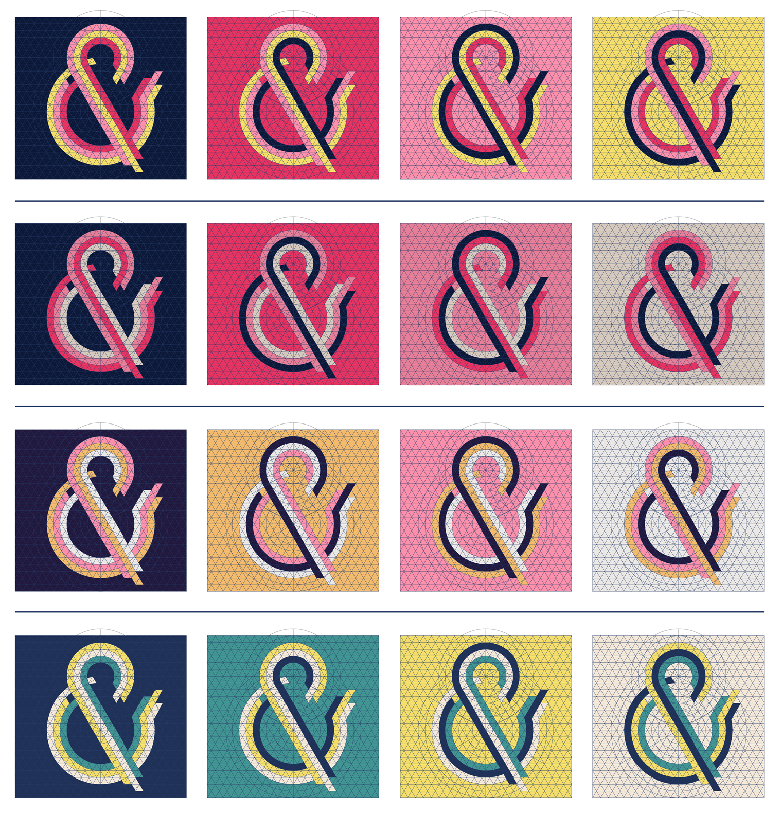
I liked the last 2 options best, and ended up going with the one that nostalgically reminded me of fruit salad sweets. I continued experimenting with outlines, fills, shadows and accents:
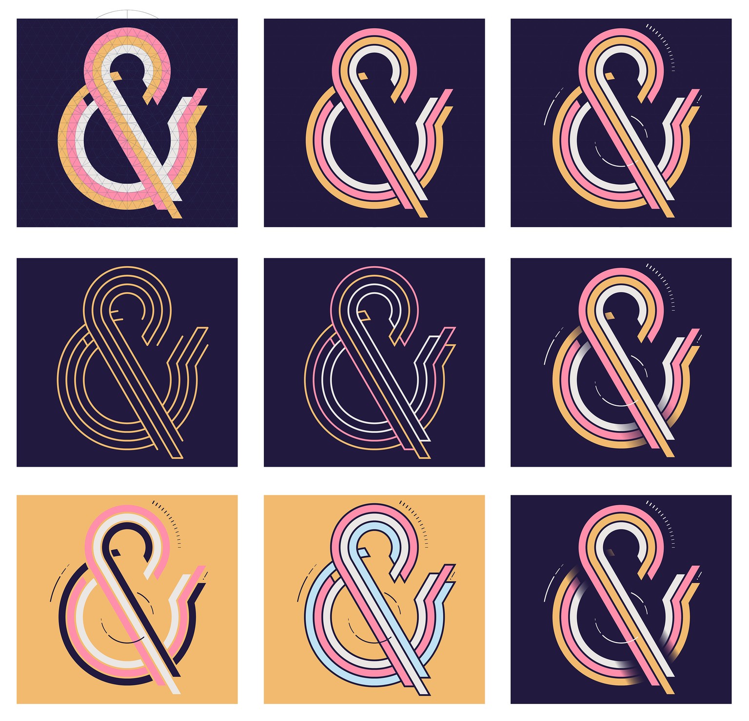
I think the final two jump out best, so will be using them as a starting point for the rest of my series (will I actually be prepared for 36 days of type for once?!)
Thanks for a great class Evgeniya!