Corporate User Account Set Up Form
Since I don't have my own site to work on at the moment, I decided to use a website that I frequent. The site is a job posting site for action sports entertainment industry, and serves both job seekers and employers offering openings. I focused on the account set up page.
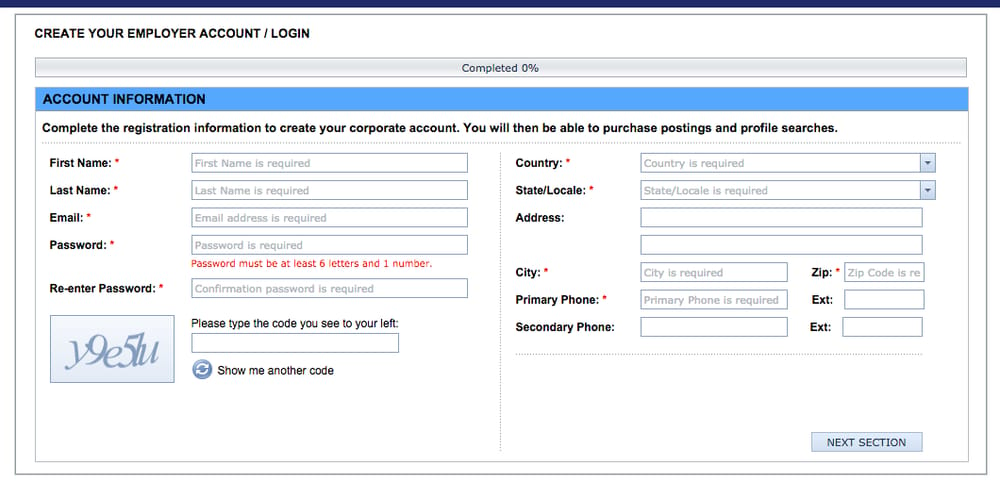
Before:
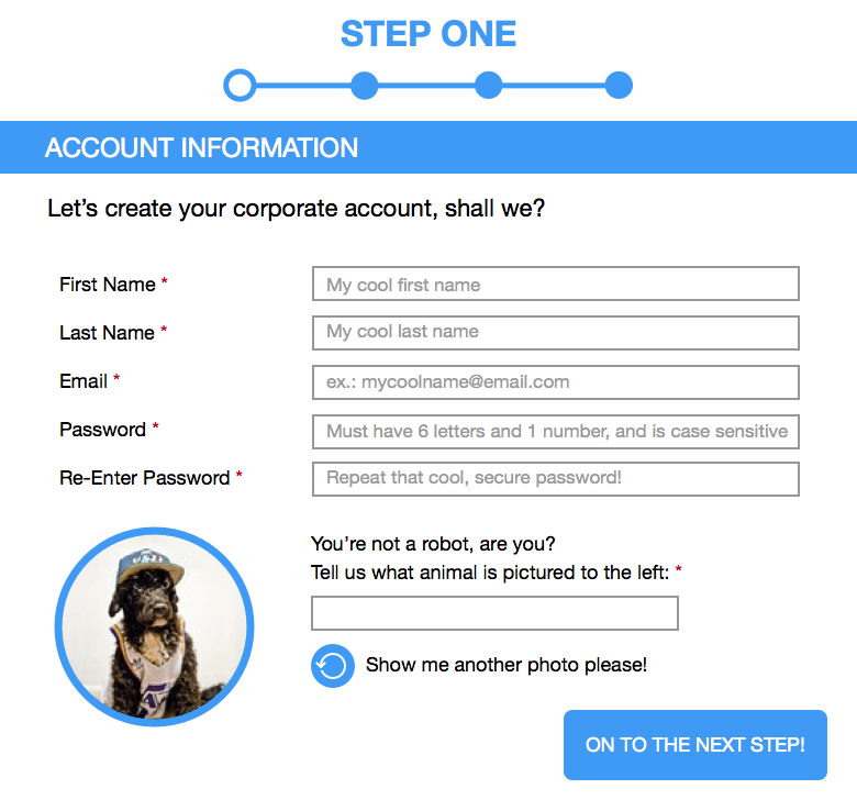
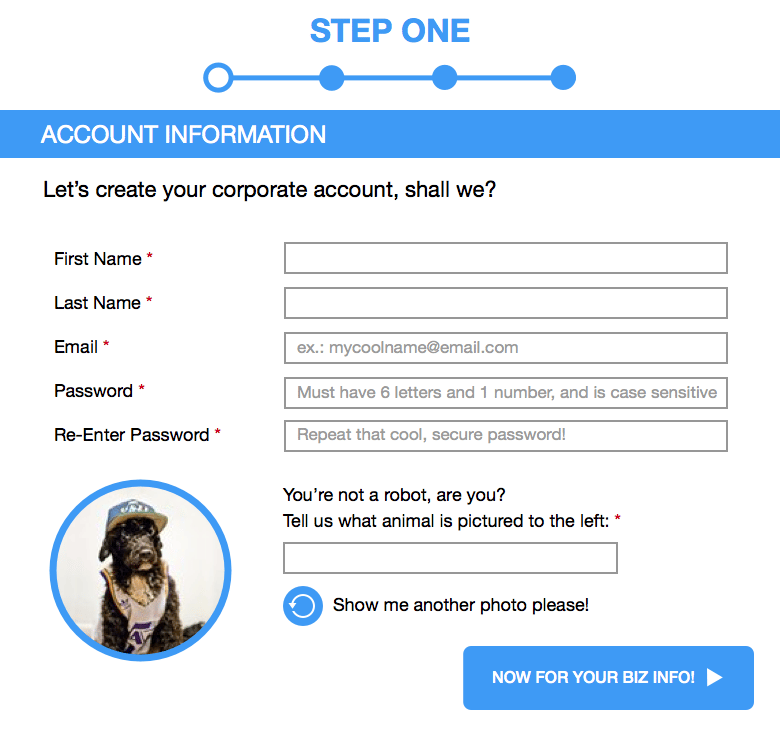
After:
Summary:
I began with a breakdown of each individual piece of content (header, field descriptions, text fields, captcha, submit button, etc.) and made decisions to improve and see how I can implement microcopy at each instance. If it didn't make sense, I wouldn't add any microcopy, and if it was too wordy/dry, I would remove or improve it. From the first screenshot, there is a lot of copy, and it is very dry while informative. So I made strides to improve the voice of the copy, and if it wasn't necessary, I would remove it. I also took into account the progress bar, and felt a percentage completion feedback would be less effective than to break down the process into individual steps. The original captcha needed an update, and I figured to make it fun while still conveying the necessity and effectiveness of a unique captcha graphic in order to further engage the user. Also, the original form has two separate forms of entry, and I feel it would be better to break them up into separate stages than all at once. I made sure the Submit Button was not dry and typical.
Hope it was an improvement!
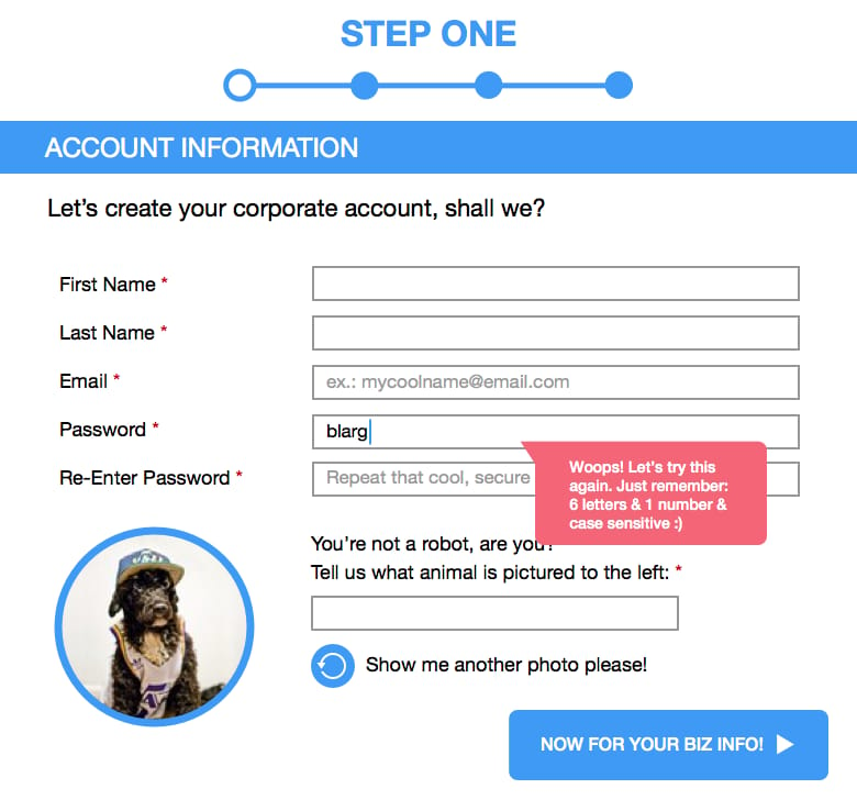
*UPDATE*
Made changes per Jack's recommendatons, plus added a Correction Prompt when a field is completed incorrectly.
__________________________________________________________
__________________________________________________________