Composition with light and dark
Well, that was a challenge and an eye opener!
I've never really given much thought to using light and dark values to make a strong composition. I'll be flipping through my art books now to see how artists use this!
These are my shapes in three values:
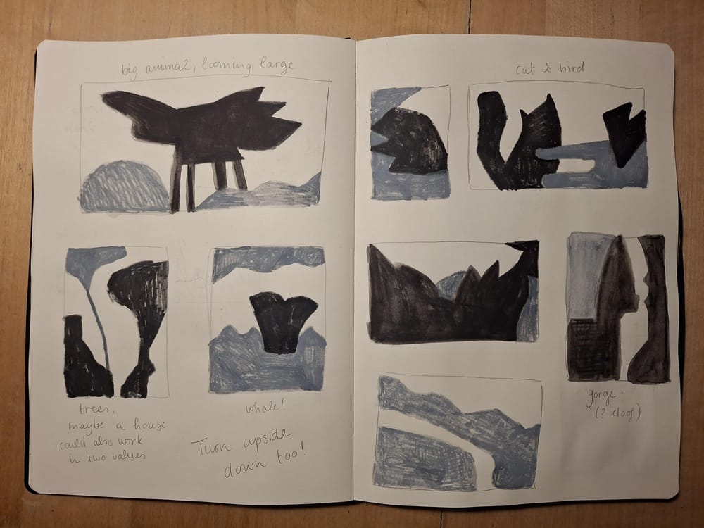
It took me a while to get into this exercise, I hadn't a clue what I was doing first ;)
I've long been wanting to do a series of paintings of/with rabbits. I think it's their plant-eating, fluffy fur and twitchy-nose vulnerability that attracts me. I did a few thumbnails, but looking back I see I didn't experiment much with this, instead I jumped into painting.
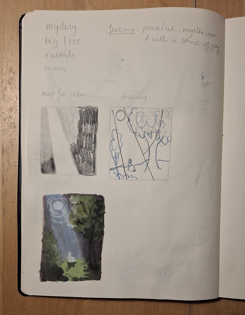
I liked the tip about values not having to overlap with objects and then I thought you could make a value map and then lay it over a drawing, so that's what I tried to do.
I did a practice painting:
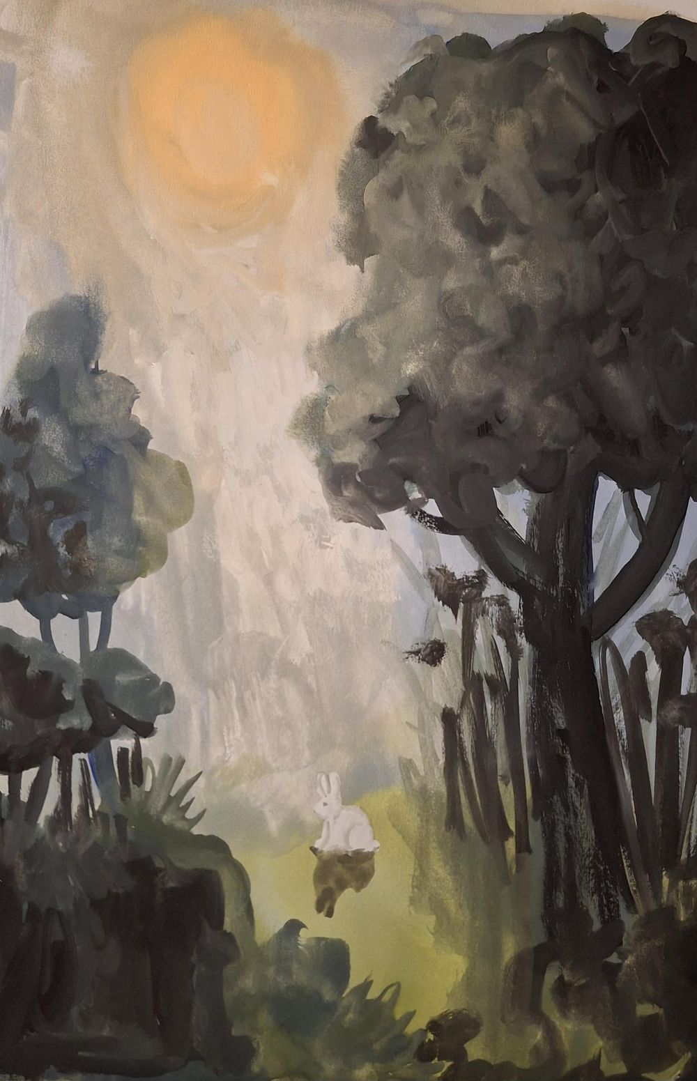
I love it for all it's bold brushstrokes.
Then I went on to work on a more finished piece.
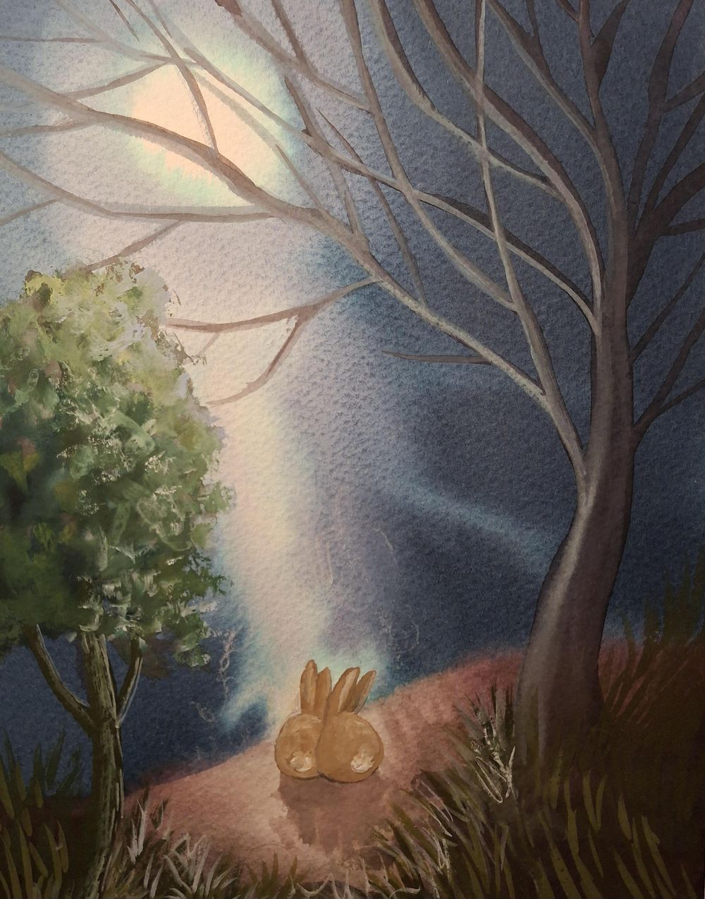
Oooh... I messed up my rabbit and then there were two, which was even better 😊