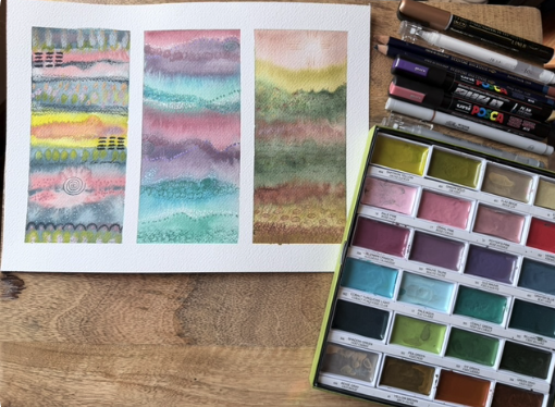
Color Play
This was an interesting project. It definitely taught me about my preferred color interactions.
For the first six paintings, I used analogous colors from Kuratake. I really like the way these turned out.
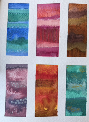
Then I did two with complementary colors, and one with split complementary. I like the first one...but am not too sure about the second. The yellow can be quite brown looking. The last one is the split complementary. I really am not a fan. On all, I used the brush at the top from Creative Mark. It is round and kind of spikey and makes thos small circles. I really like the loks it creates.
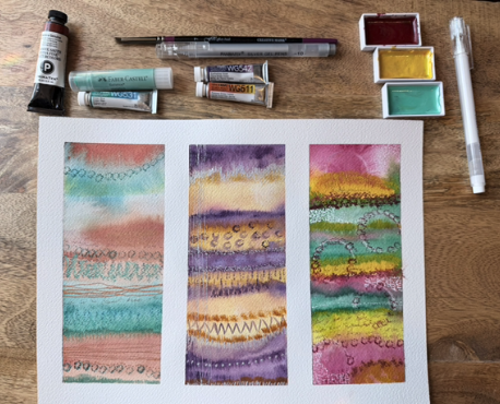
Finally, here is the triad, tetrad and artist choice. I used the Kuratake Art Deco colors and really like ther results!