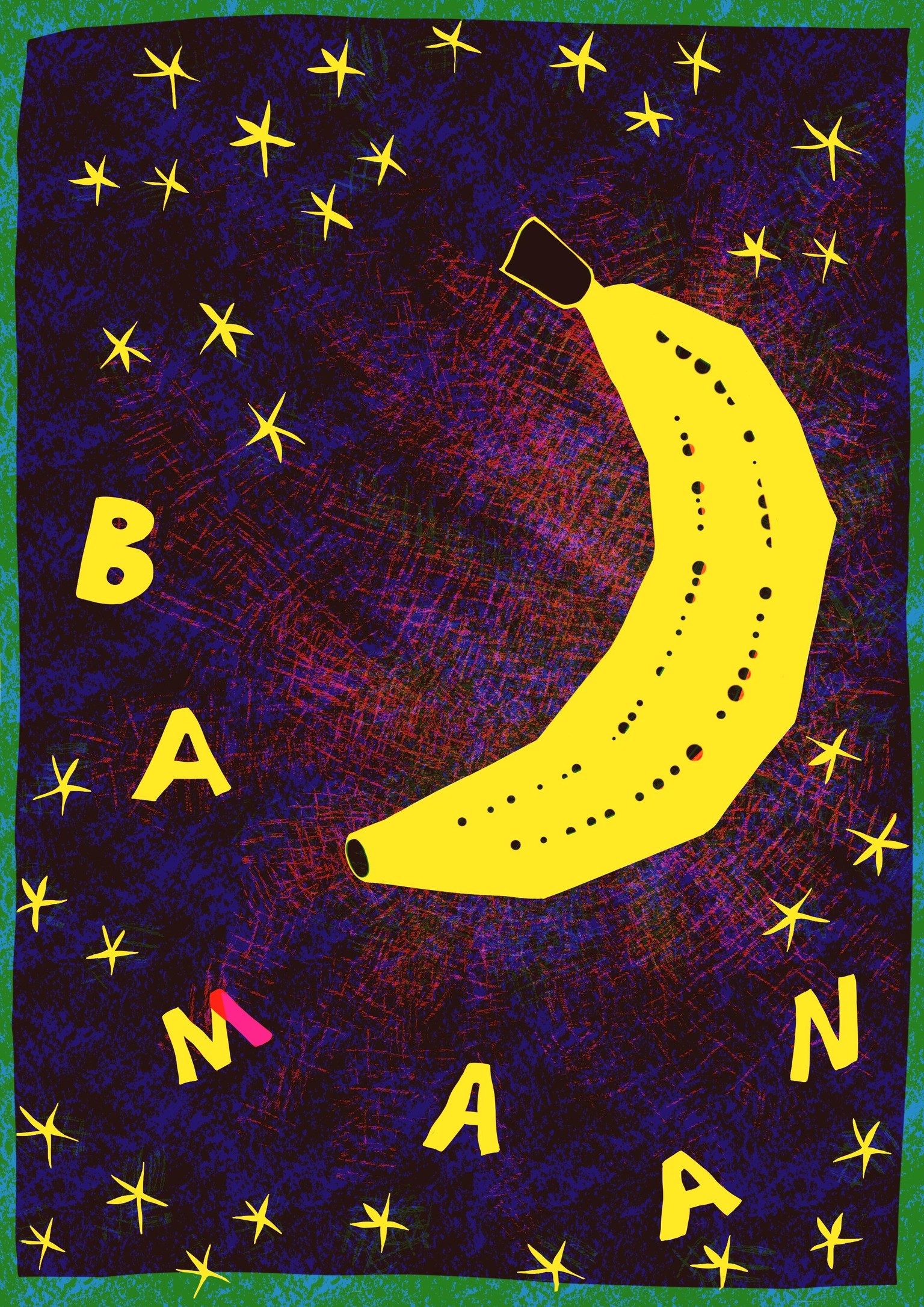
Banana Moon
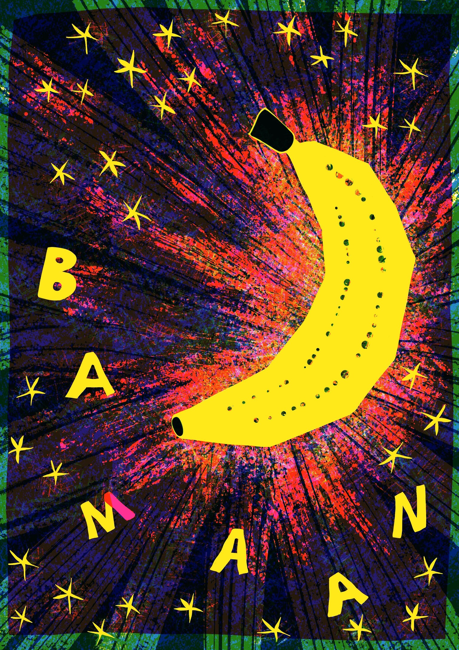
This illustration is a play on Dutch words, with BANAAN meaning banana and MAAN meaning moon. I wanted to create a dark background like the night sky, but without using black. In the process, it drove me a bit crazy (but in a good way) that every change I made in a layer, also affected the other layers, and kept on trying different textures and the way they overlap. In the end I really like the way it looks like the banana/moon is shining, but I'm also doubting if there isn't too much going on. So I ended up also making a cleaner version with less distractions.
BUT - I just watched a part of the lessons again, and I have a question now!
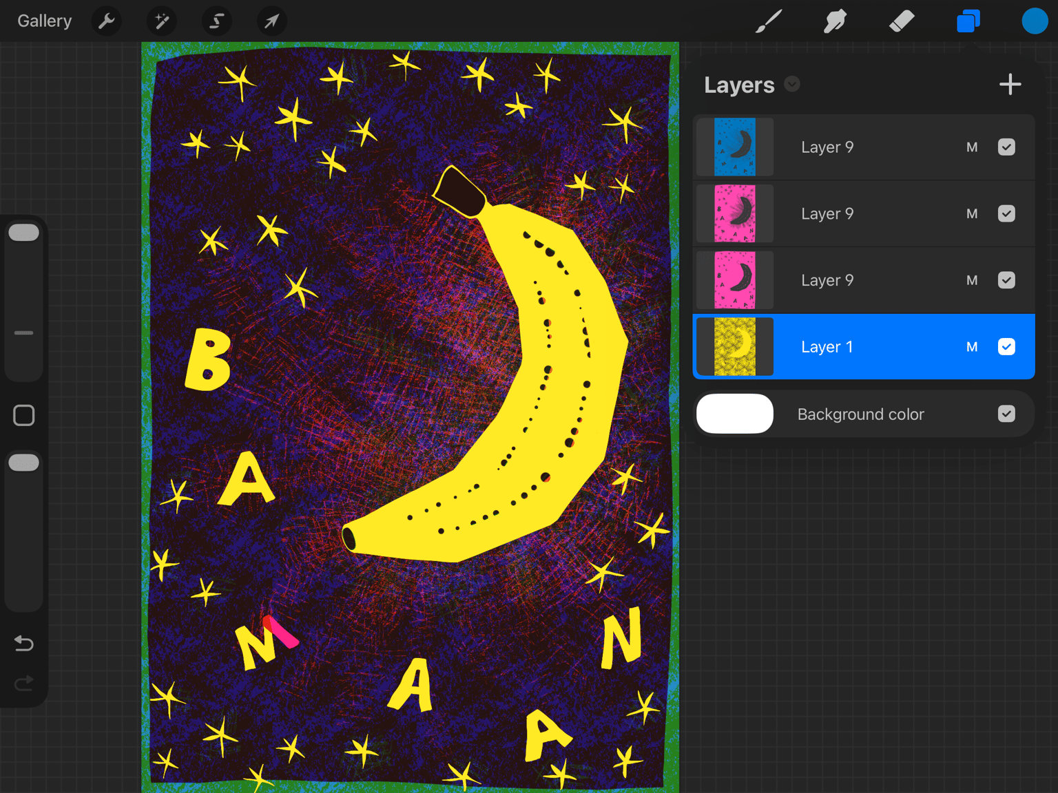
The opacity of every layer is set at 70- 80%, but I just rediscovered that every color has to be in 1 layer, so you have to merge the layers with the same color. I guess that when I merge the 3 blue layers, the print becomes to saturated? Or how does this work exactly?
The layers:
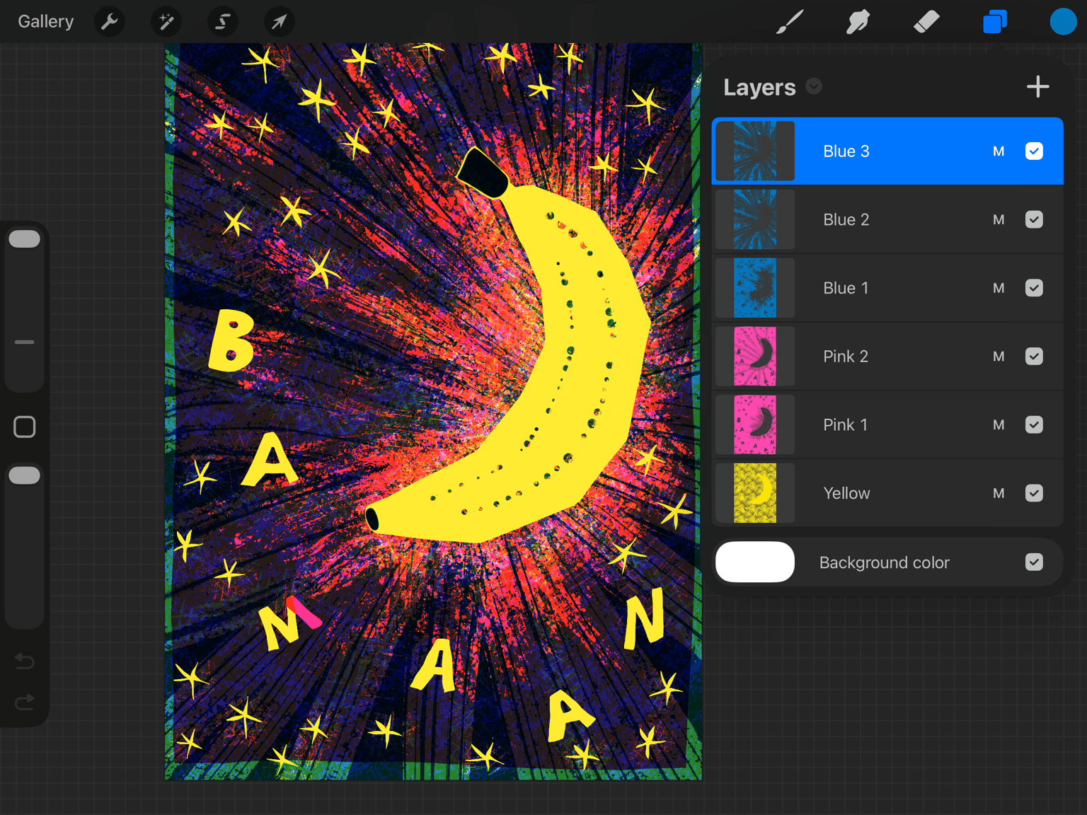
The simplified version: