Art of Typography
07/09/03
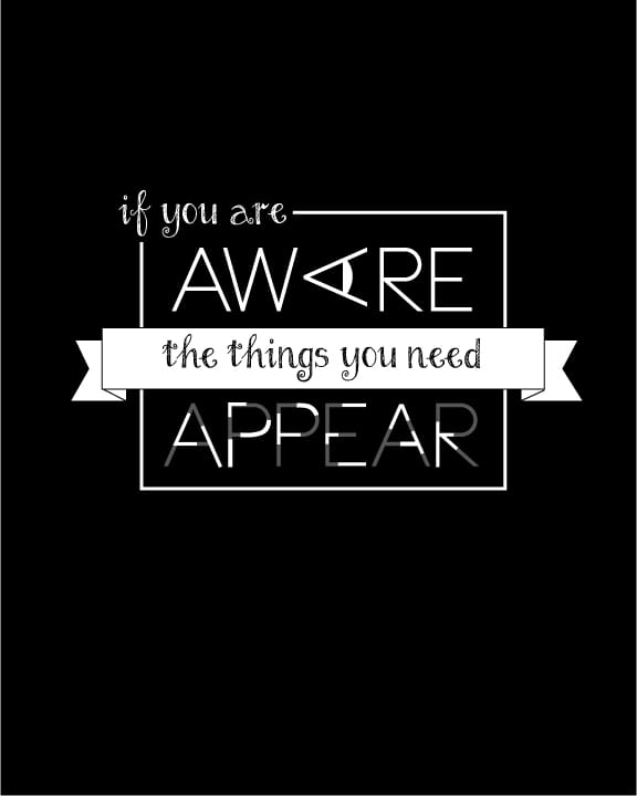
Final Piece reworked
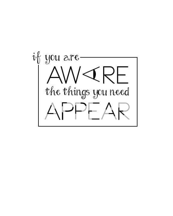
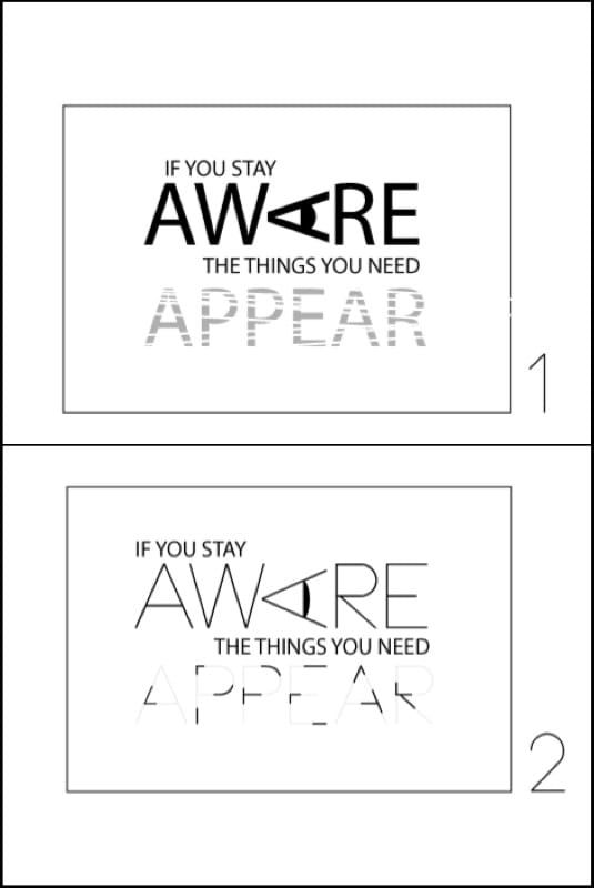
After taking into account the comments made by Faye Brown, I made a few tweaks to my final piece. I think since it has a few illustrative elements it doesn't require colour as well. Besides, I'm loving the black and white. I added the pupil element to the eye, not sure if it's subtle enough???
I've really enjoyed this process, it's been a great class.
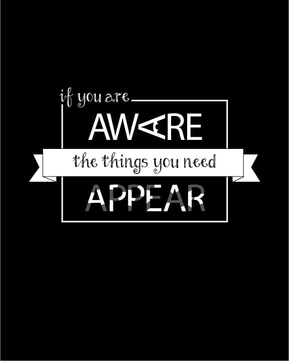
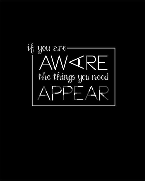
FINAL PIECE
Think I'm done here. I definitely prefer the black version, the 'appear' appears better out of darkness. Not sure if it should appear more
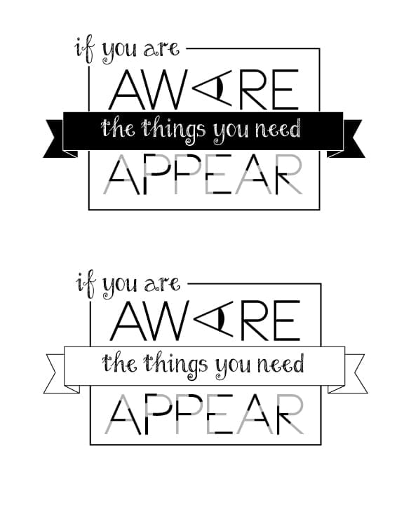
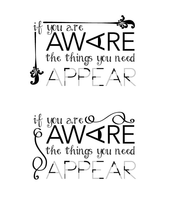
Quote 4th Draft
Quote 3rd Draft
Quote 2nd Draft
Quote 1st Draft
5. Final project - layout your quote
Okay so I went through a lot of quotes, did the Pinterest thing, then after a rather insightful unconnected conversation with my partner he himself came out with an awesome quote BUT it was quite long. Then a fellow student on this course Stephanie Sims suggested I use something I had said in passing on the first week of the course. Having looked at it I could immediately see how it would be a good one to work with:
'If you are aware, the things you need appear'
It's nice and simple and has two great words to play with typographically - AWARE AND APPEAR
Thanks Stephanie :-)
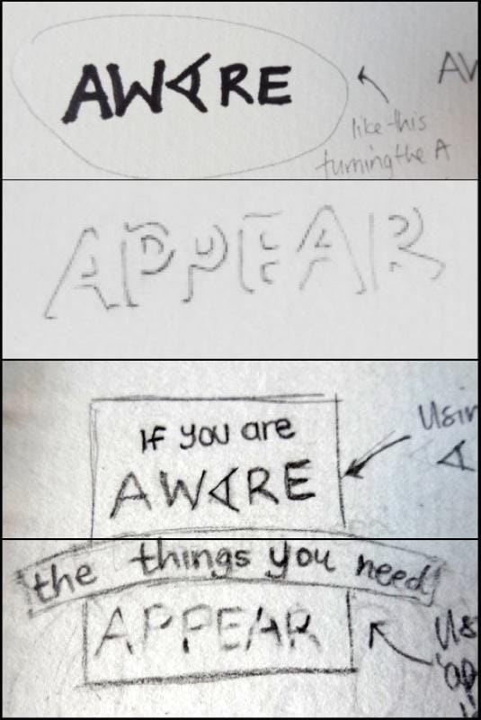
Here are my initial sketches:
Getting a feel for the actual words...
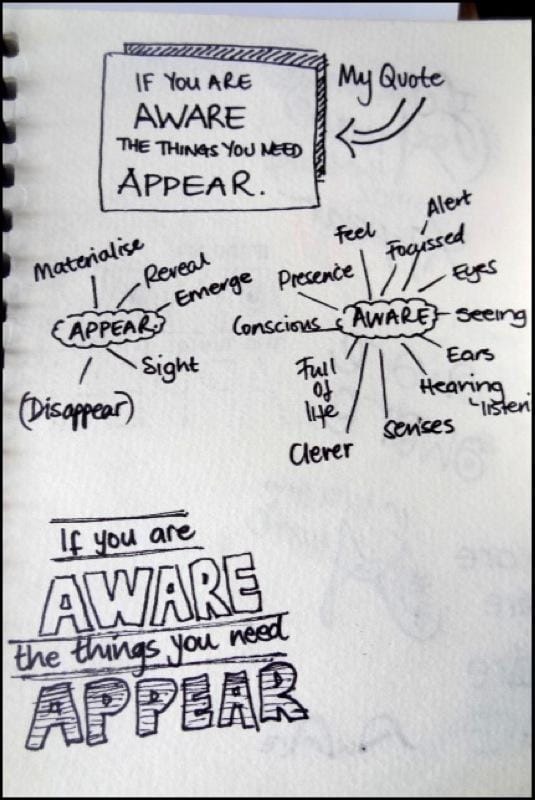
Getting it all out of my system.....
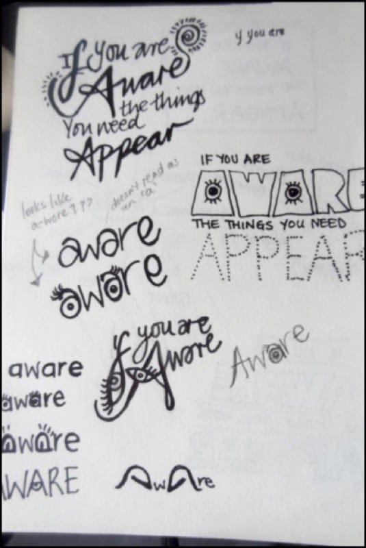
Getting somewhere.
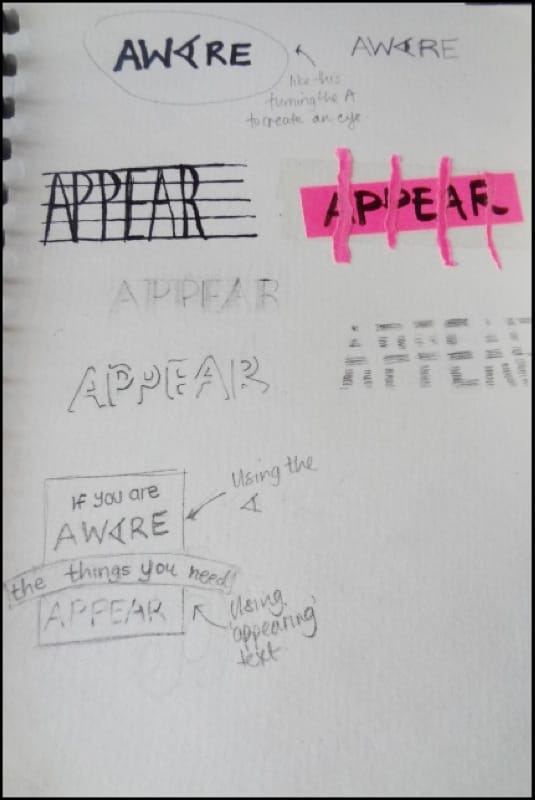
Ready to take it to the Mac. The turning of the A to create an eye is definitely working and I like the appear 'appearing' so I'm gonna get onto the Mac
MacTime.
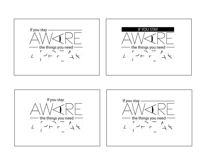
I'm going to develop no. 2. Play with the layout, type faces etc
MacTime. I'm going to develop no. 2. Play with the layout, type faces etc
_______________________________________________________________________________
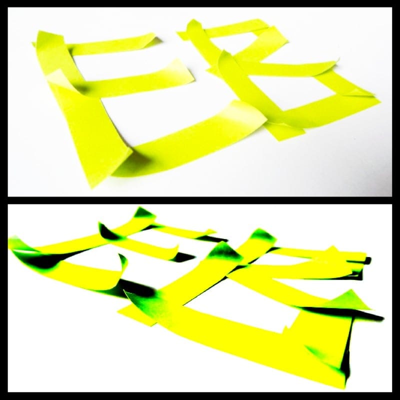
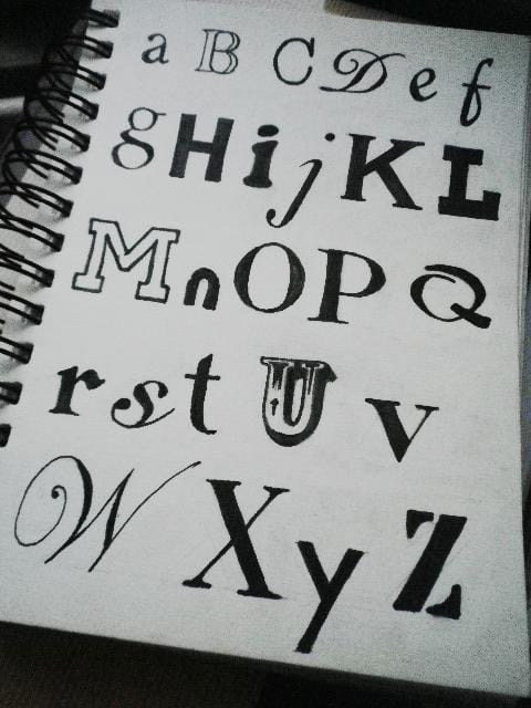
4. Creating your own typefaces
Create your own!
Created using mini post-it's. Was cool to play with the shadow whilst taking photos and then bumping it up in PhotoShop :-)
Sketching and inking
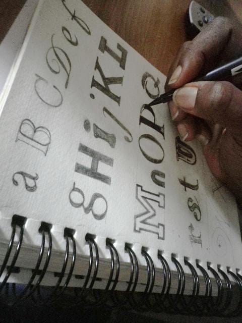
All done. Was a very therapeutic process :-)
____________________________________________________________________________________________
3. Brands and Logotypes
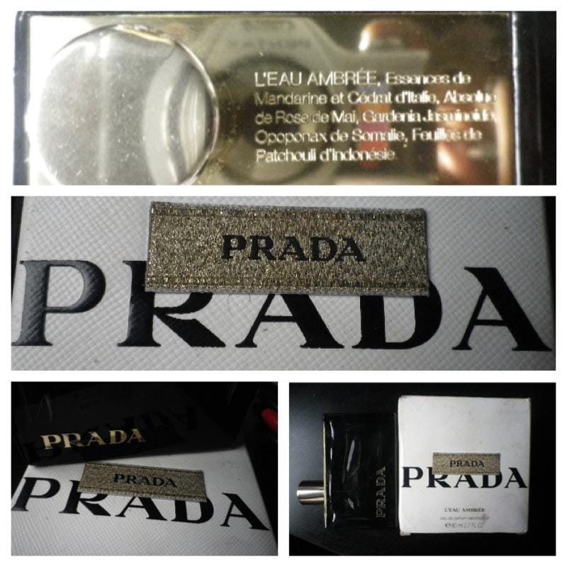
I decided to photograph my Prada perfume. I love the typeface because even though it seems classic that slight twist on the R gives it a touch of innovation plus it's screams luxury and class. I also love the use of a sumptious gold label more in line with clothing/handbags against the cardboard of the box.
The following write up is from famouslogos.net which is a great site to check out if your interested in logo's:
"DESIGN ELEMENTS, HISTORY AND EVOLUTION OF PRADA LOGO
Shape of the Prada Logo
The Prada logo is undoubtedly one of the most prominent and memorable logos in the fashion industry. It can be called a “hybrid”. The iconic logotype comprises of very unique and persistent lettershapes which almost work like an echo to the brand identity of Prada.
Each character has a dynamic quality, as it is profoundly related to all the other characters. This helps achieve a functionalist purpose and makes Prada one of the most easily recognizable fashion brands in the world.
The Prada logo is a badge of authenticity and quality which plays an instrumental role in both the brand and product recognition.
Colors of the Prada Logo
The use of black color in the Prada logo symbolizes integrity, purity, nature, elegance and strength.
Font of the Prada Logo
The Prada logo incorporates a hand-drawn typeface."
_______________________________________________________________________________
2. The Fundamentals - History and Anatomy
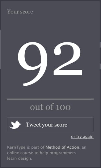
Playing the Kerning Game
Okay so here's my top score so far ...92 yay!! It's very addictive!!
________________________________________________________________________
This is just a quickie using all the stuff I learnt today, including the typography history stuff which was interesting :-).
I struggled kerning the script type as once you start reducing the gaps the join lines overlap and it looks messy. I played with the clipping exercise for the TYPO part which was fun. I had to do each letter individually - when I tried to do all four letters together I lost the whole lot and ended up with the outline of the type with no colour. If anyone knows a way round this in illustrator please do let me know.
I enjoyed this so much I actually signed up for the Skillshare Learn the Ins and Outs of Illustrator course with Brad Woodford WHICH IS CURRENTLY 25% OFF WHEN YOU USE 'DESIGN' CODE (Thought I'd shout that one!!!)
Update 21/06/13
Let me get the word right!! Attention, attention, attention!!
__________________________________________________________________
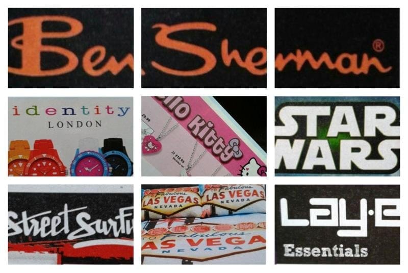
Examples of type in the Argos Catalogue!
__________________________________________________________________
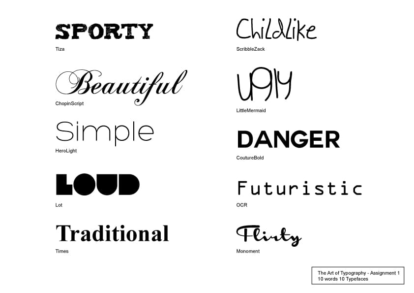
Assignment 1. 10 words 10 typefaces/ Type examples
Being glad I entered this class at the beginning I'm determined to keep up with the tasks... no matter what!!
Despite a busy weekend, I managed to take some pictures of type this weekend (which I'll post eventually) but I had to complete this assisgnment. My plan was to go on the suggested websites and look for fonts etc but it's amazing how if you're aware the things you need will appear. I received an email today from an amazing creative resource/learning website called TastyTuts. On it was a link to a YouTube video on a Font book the guy who runs the website had put together. In the YT description was a download file with the font book and 140 free fonts YAY... definitely made life easier! Here's the link:
http://www.youtube.com/watch?v=k4uV6Ab0KME
So here's my ten word/typefaces