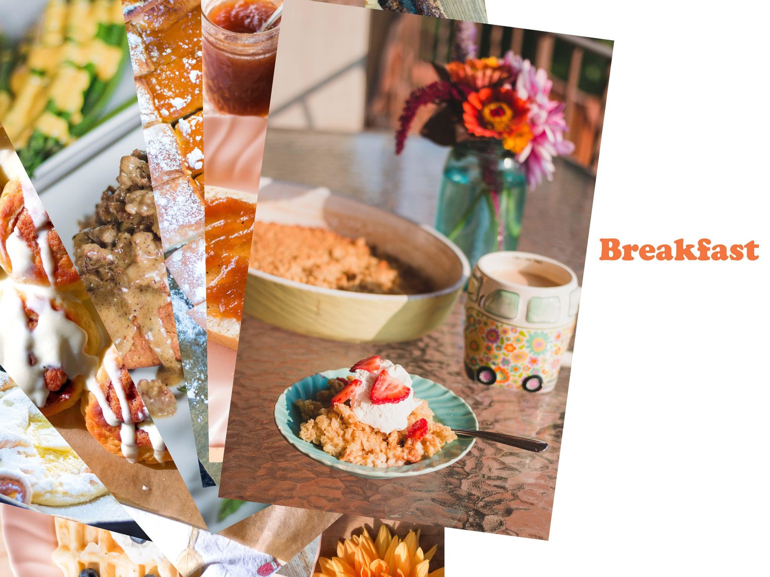
Adventures with Alice
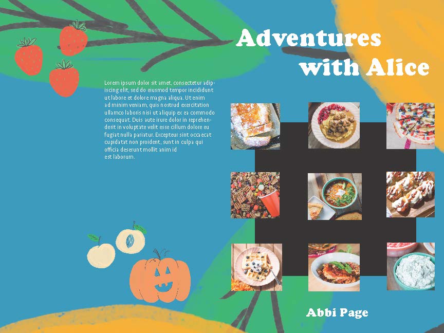
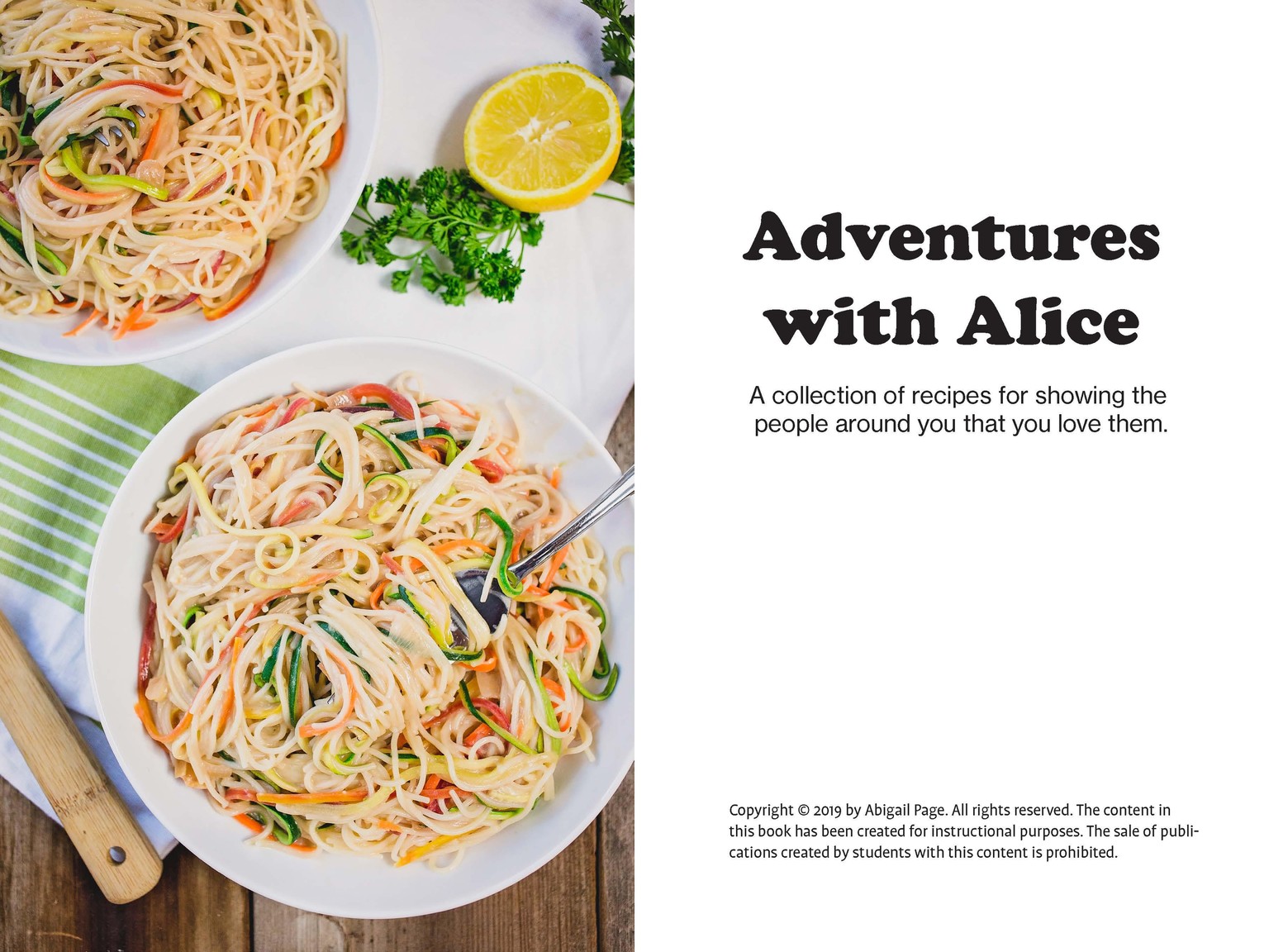
For this project, I tried many different layouts. I used Cooper Black to represent the old timeyness of Alice's recipes. I followed the design trend of putting photos of the recipes on the cover, but I added a square in the background. I followed the design trend of using a full-page photo to represent the recipes. I used my eye and the tone I was trying to create to pick colors. Could I get feedback on my project?