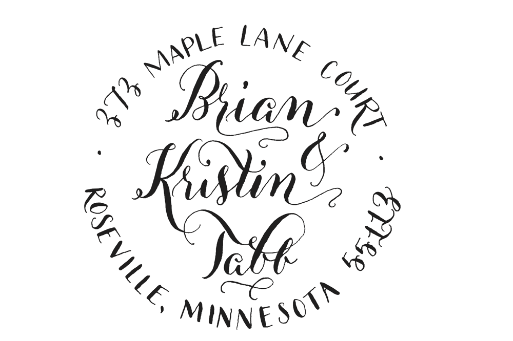
Address Stamp
I'd love any feedback on design as well as on editing it on photoshop/illustrator! Thanks :)
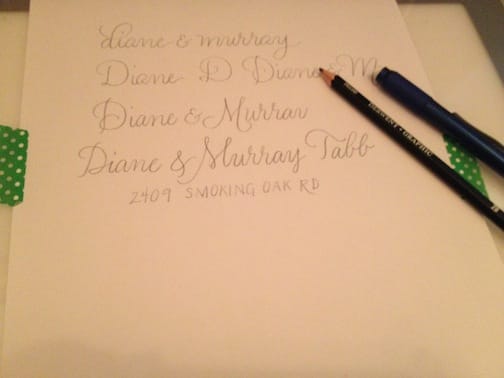
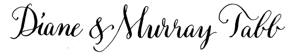
Okay, I decided to do another address stamp as well... here's the process.
(pencil)
(ink)
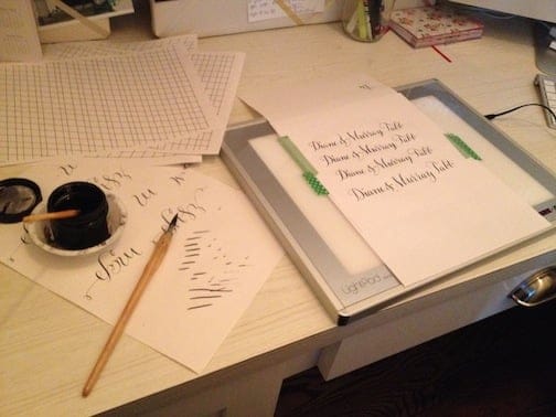
(scan)
I'm not crazy about it... I think it's difficult for me to do calligraphy over the pencil because the spacing between the letters can be too narrow (diane is too narrow). practice makes perfect I suppose.
(photoshop)

(illustrator)
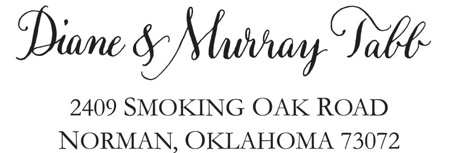
On this, the typed portion looks HUGE, but on a small stamp I think it will be the right size... I hope! It's 11pt.
I love feedback! Thanks!