Abstract Composition Assignments
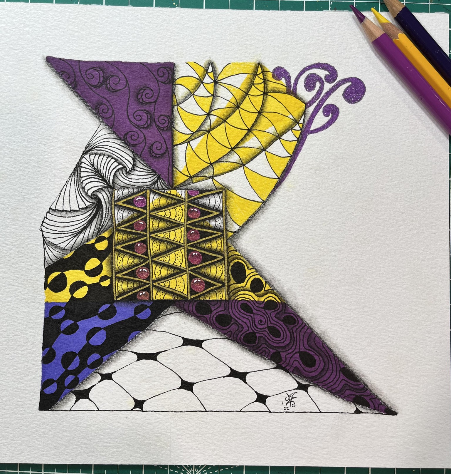
Assignment 4: The Window Composition
This was a very quick attempt. I think I might move on to another abstract class to do in tandem with this one. This class inspires me to want to move away from structured doodles but I'm afraid I don't know where to begin...
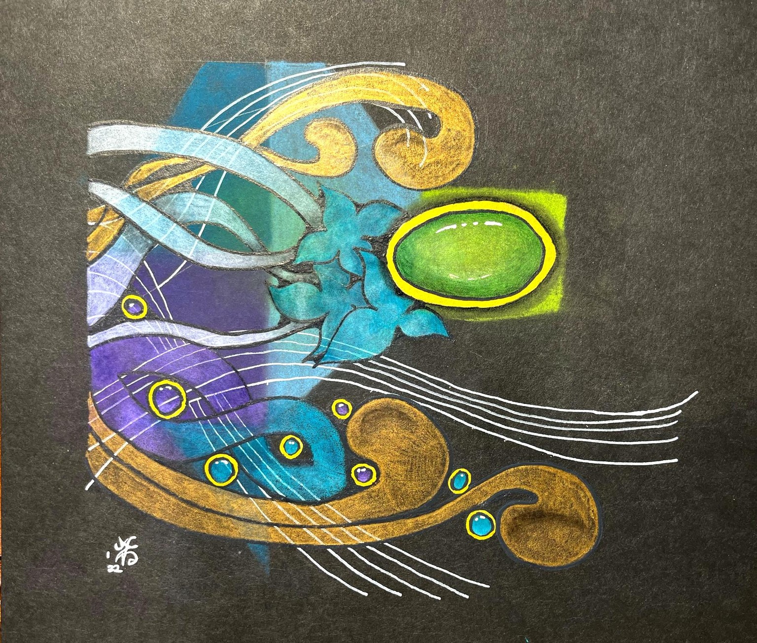
Assignment 3: Movement
This one was much easier. I love how this class is helping me place shapes.
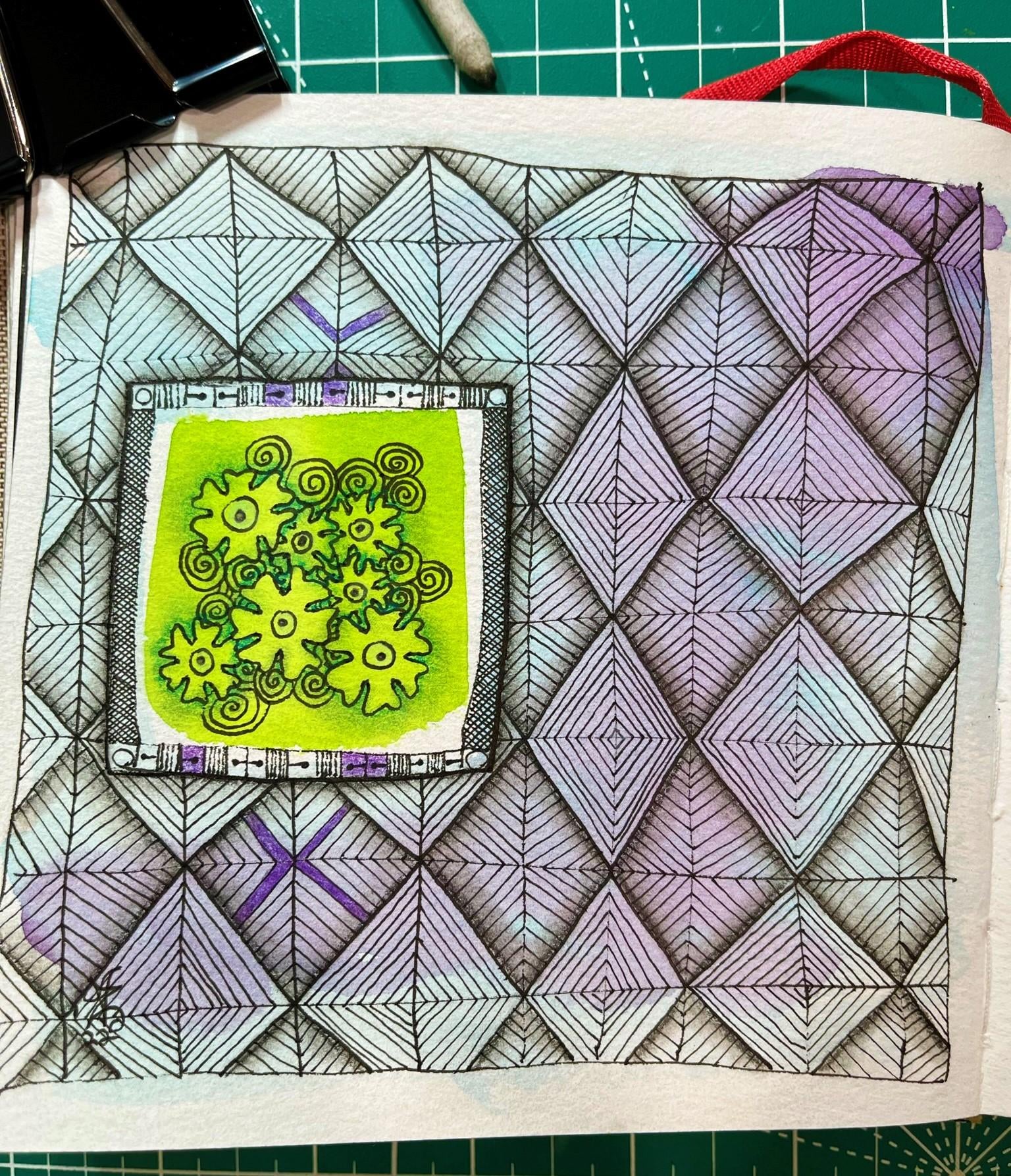
Assignment 2: Arrangement of Shapes
Using example 2? I loved the waterfall idea and liked this result much better than assignment #1.
Lessons learnt:
Coldpress watercolor paper works better than Bristol for my technique.
The triangular shapes leading from the focal point work well.
Liked these colors!
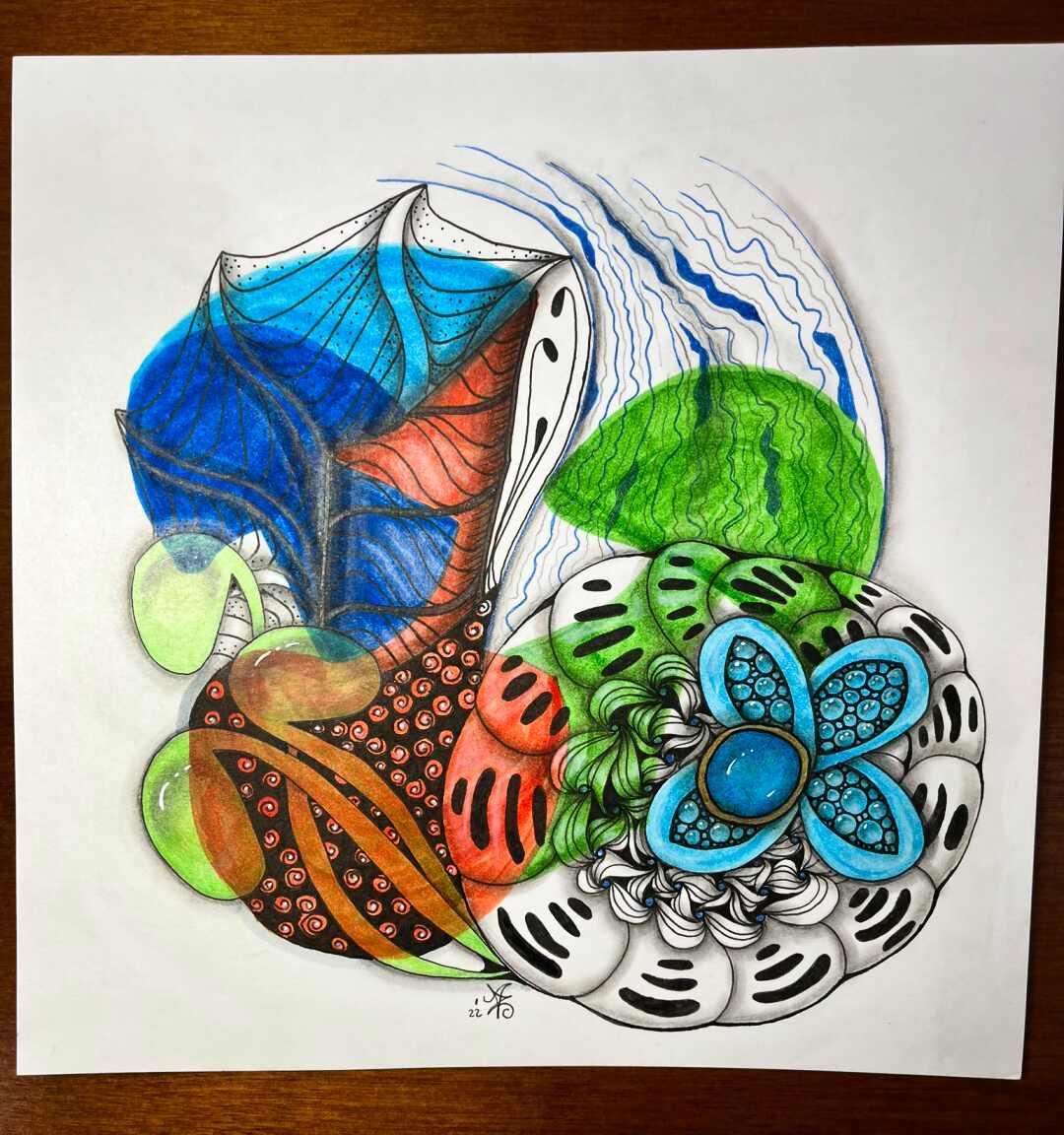
Assignment 1: Placement of Shapes
I used brushmarker to place colorful shapes (mushrooms) on the paper per composition example #1 before adding deconstructed geometry.
Lessons learnt:
Mushroom shapes aren't a good background for this type of work. I think the background shapes should be more irregular so as to not distract the eye. I understand now why a swatch mark, a rectangle or a circular shape works well for this purpose.
Using the "2 on the left, 1 on the right" composition (modified) for the additional line work partially worked. The green mushroom overwhelmingly distracts rather than adds to the focal point.
Brushmarker on Bristol leaves streaks. Consider this when deciding on media for this purpose as it adds texture that might not be needed/wanted.
The big blue shape in the upper left of the artwork pulls the eye from the focal point. Balancing color like this wasn't really needed. The focal point color could've stood alone. It would've been better to use smaller amounts of it elsewhere in the piece and keep the right-side colors in the orange or green color family.
Creating "flow" using this technique is harder than it looks. Although I tried to add movement with the blue wavy lines and leaf shapes, I think they send the eye off the page to the left instead of pulling the eye to the focal point. I will need to do some planning in advance to avoid this.
I don't like how this turned out but I do feel like I learned quite a bit from it. When I finish the class, I may try this one again to see if I can improve it.