2001: A Space Odyssey
I've spent quite a bit of time choosing a film, and in the end decided to go for one of my favourites and, being a huge sci-fi & space fan, stick to the theme & style which comes naturally to me.
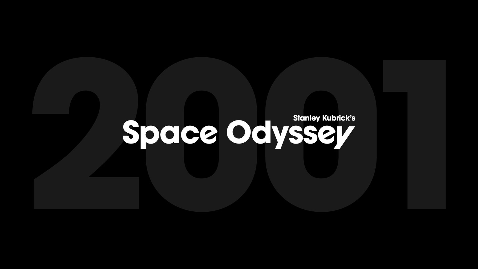
I started by typesetting the title in Illustrator, and then copied the elements across to Photoshop.
I went for extruding only the part of the title to somewhat allude to monolith from the film, and dropped the "A" from the title for the sake of creating a neater design.
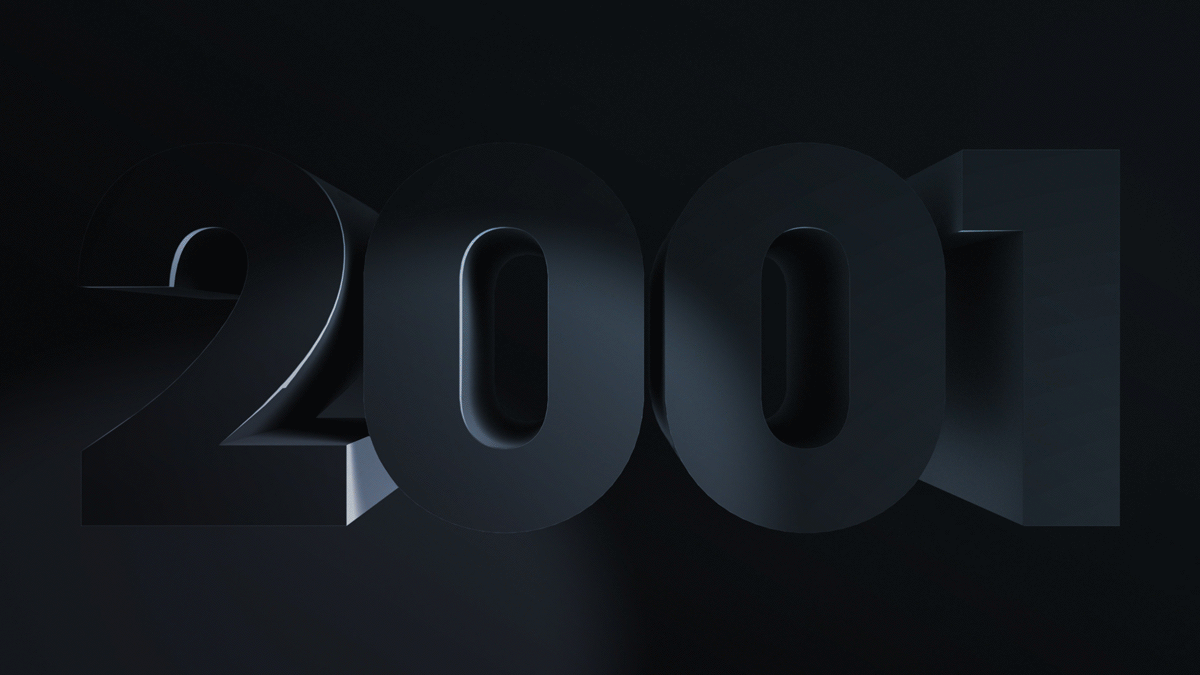
After extruding the type, and setting up the lights, I added a lens flare, a little bit of grain and toned the whole image very lightly with a gradient — stages shown in the GIF above.
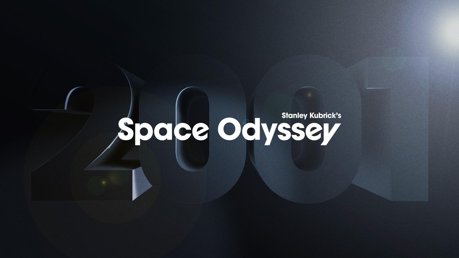
I was originally aiming for a shiny monolith look, but at the end realised that I might be asking too much of the Photoshop 3D capabilities:) And I had to experiment with the render settings a bit, though I kept on getting some render artefacts, and since I didn't want to wait for a render for a few hours, I resorted to cloning some bits out.
Thank you, Jamie, for this fun class!
—Evgeniya