1920's Exploration and Sample
HISTORY
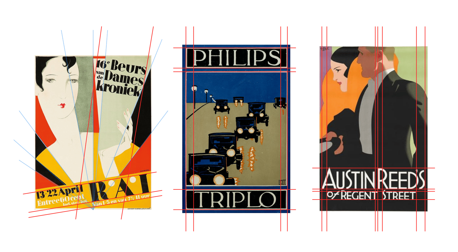
For the initial research, I went to Pinterest with a general intention to find art deco inspired posters. Content of the 1920's era I found to be very modern, think Frank Loyde right type of simplicity in the execution of letterforms. Strong uses serif fonts and very consistent use of silhouettes of the subjects for posters. Geometrics are also in strong use during this period.
Grids for this period were very simplistic allowing for the art to shine through as the subject.
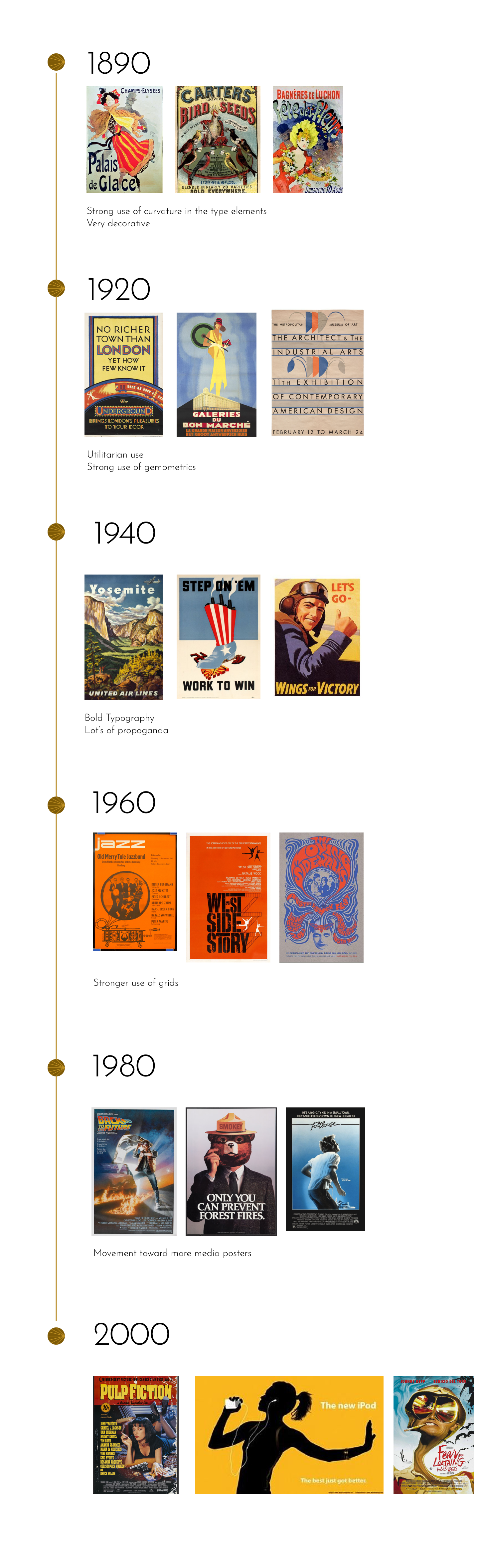
For the timeline, I highlighted some general observations. Generally speaking, I saw over time a movement toward more consistent grid patterns and the utilization of strong hierarchy to show more information.
COMPOSITION
My goal for this project leaned more toward the application of the theme and hierarchy rather than hand-lettering.
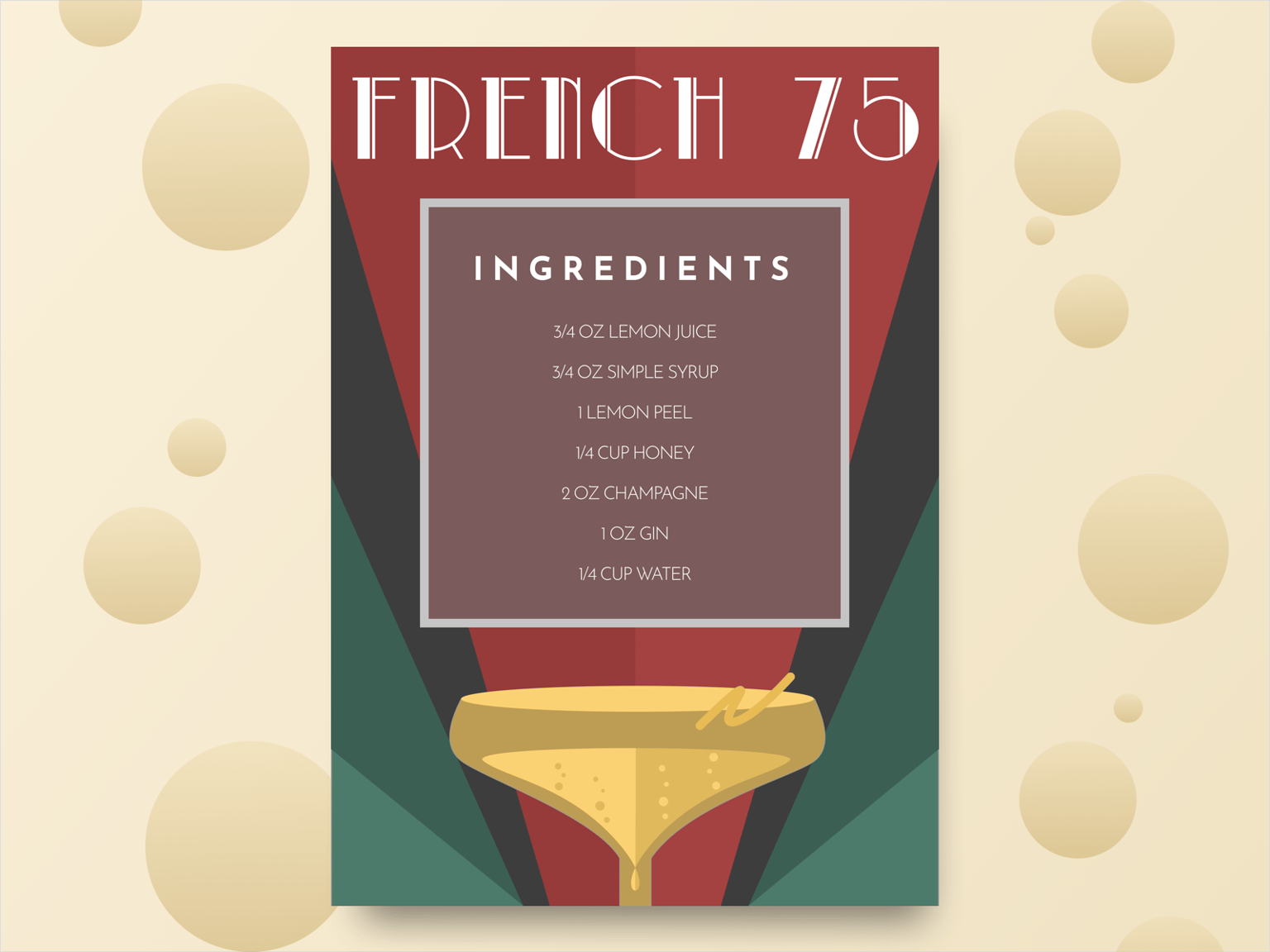
The 1920s and more specifically the late 1920s are known for the art deco movement. For this project, I wanted to apply this theme to something relevant to that era. I chose to do a French 75 ingredients poster. I especially wanted to include the geometric aspects seen in many posters of the era.
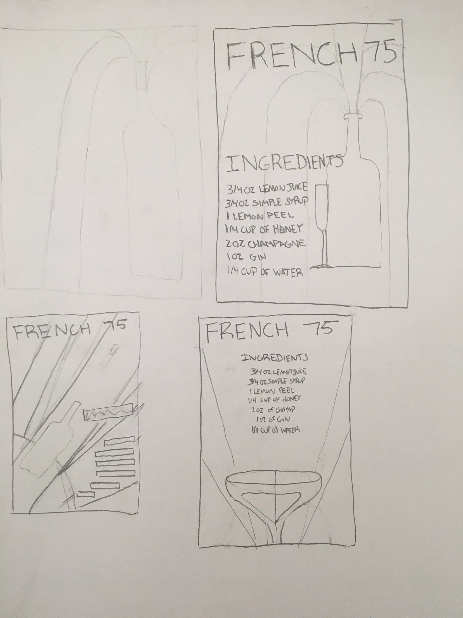
I chose to continue using the 3rd options shown above.
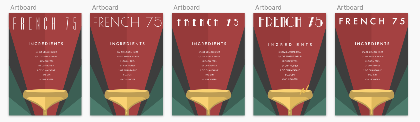
In terms of font choice, I wanted something reminiscent of the era but keep readability. I chose to use two fonts, Park Lane NF and Josefin Sans.
FINAL PRODUCT