Visual Foundations - Athena redesign
Firstly, thank you Julia for creating this course. I am interested in transitioning into UX design and found this course interesting as an intro to UI design foundations.
For the project, I decided to take an article about a subject I know and redesign it into a more visually appealing article. I was going to use the Wikipedia entry for Athena but it was just too much text so I chose a simpler article and redesigned the first few sections.
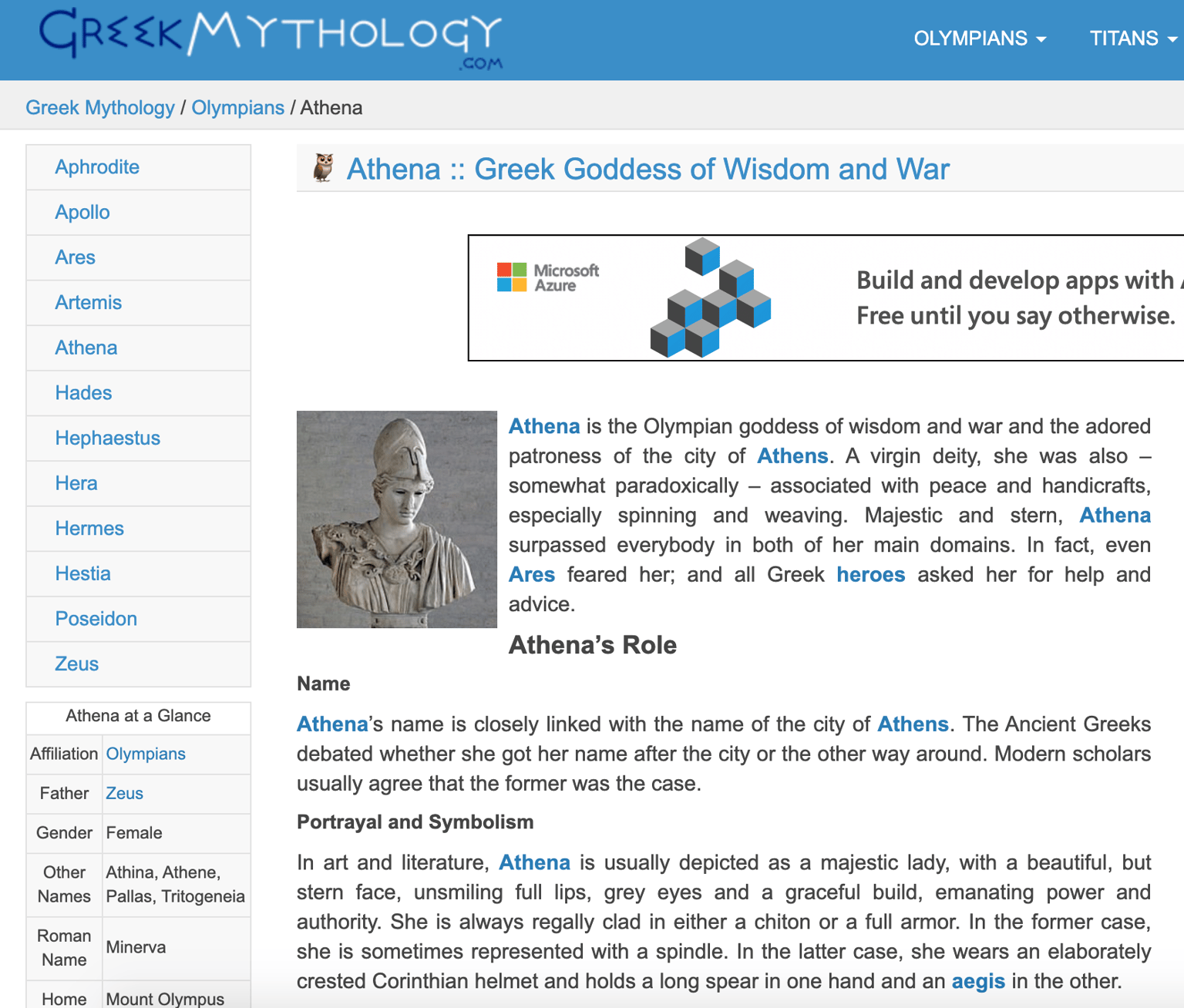
This was the article. I ignored the navigation and just focused on the text in the article itself and a few of the extra bits of info from the 'Athena at a Glance' sidebar.
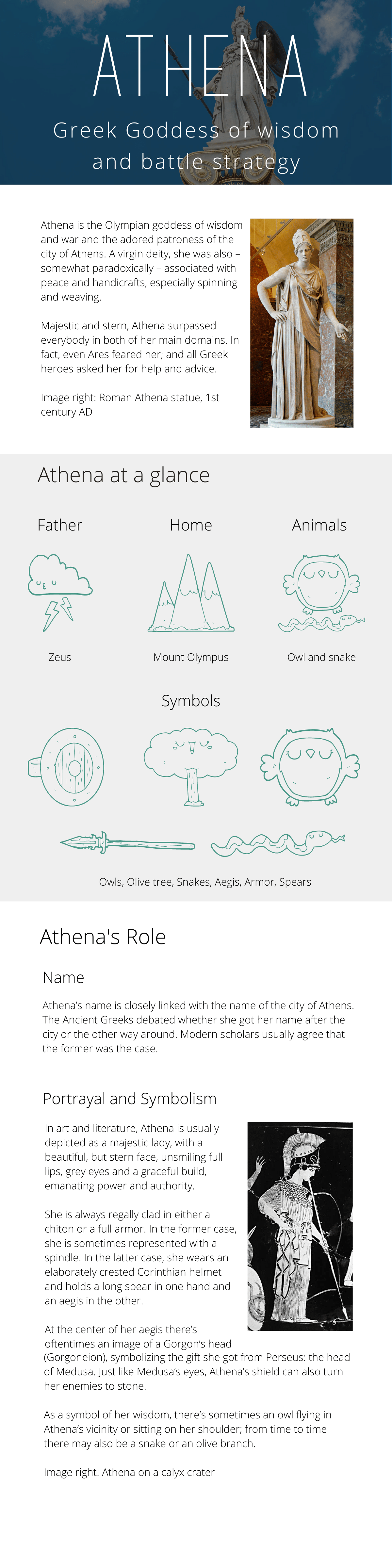
This is my redesign:
As I don't currently have Sketch, this was designed in Canva. This presents a few issues as it is not as easy to use gridlines and you don't have as much control over individual elements so the alignment and sizing aren't perfect.
I really like this header/display font but struggled to find a body font that I was happy with. The main principles I tried to adhere to were:
- rule of 8 (text size, image height)
- warm colours for background, colours chosen through complementary palette on Adobe Color
- Hierarchy text sizes, san serif fonts
- Negative space
- Text alignment and line width
I think this still looks very basic and it could look more professional, I would love any feedback you could offer on how if I have correctly applied the principles from your course and how I could improve this article design.
Thank you!
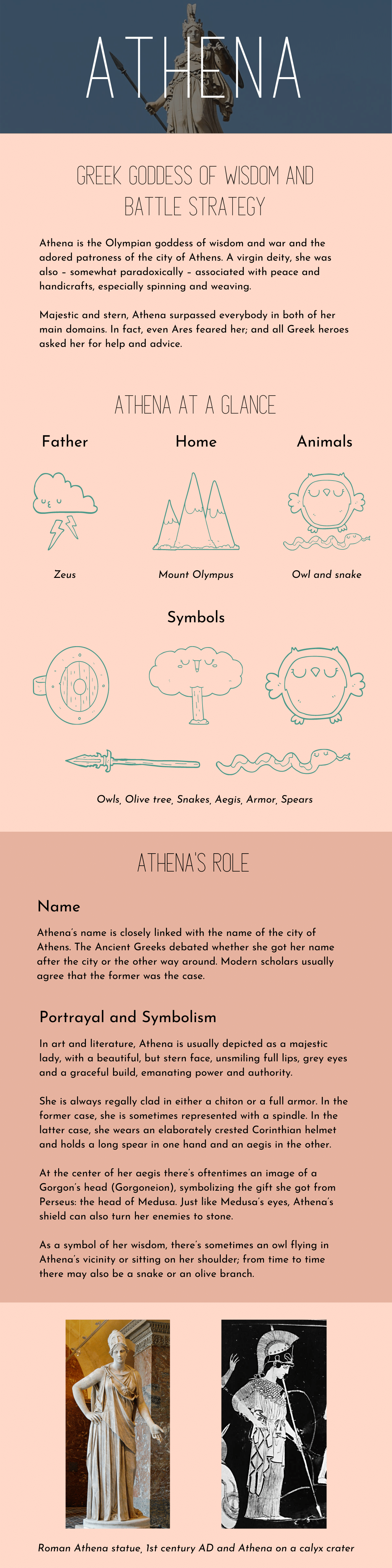
Version 2 after feedback: