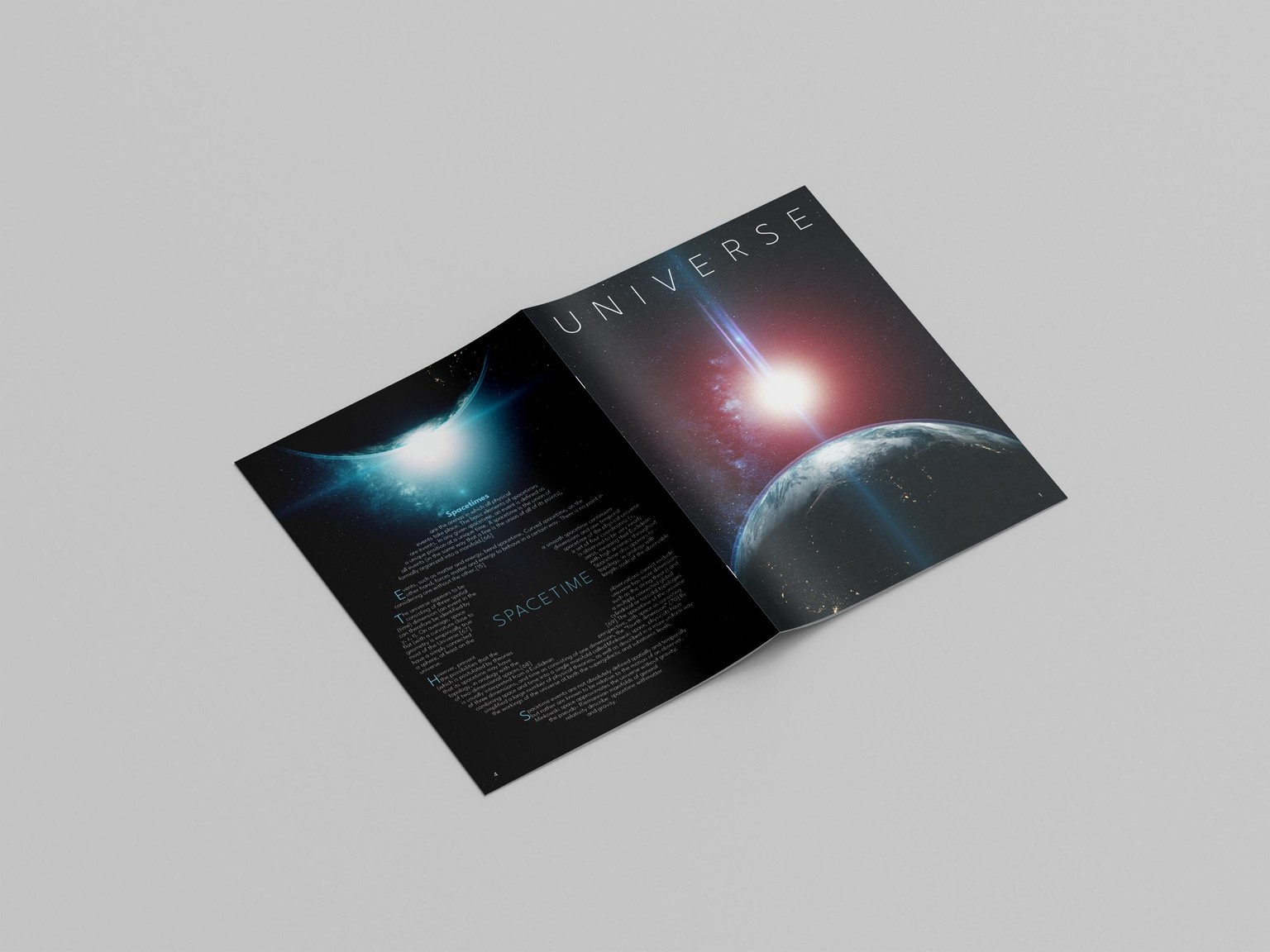
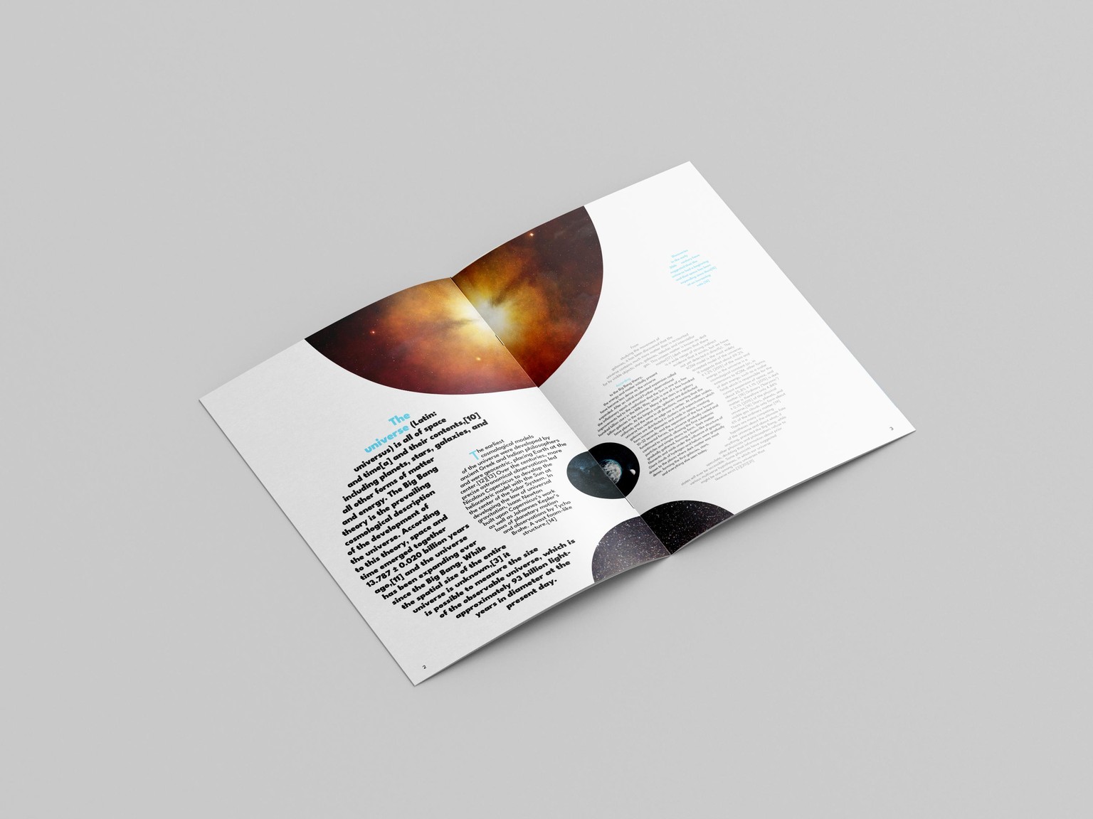
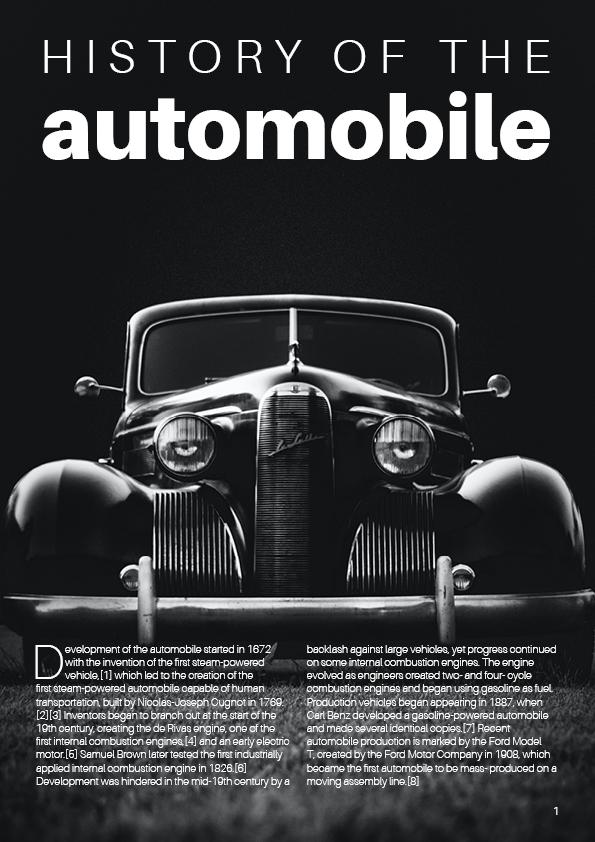
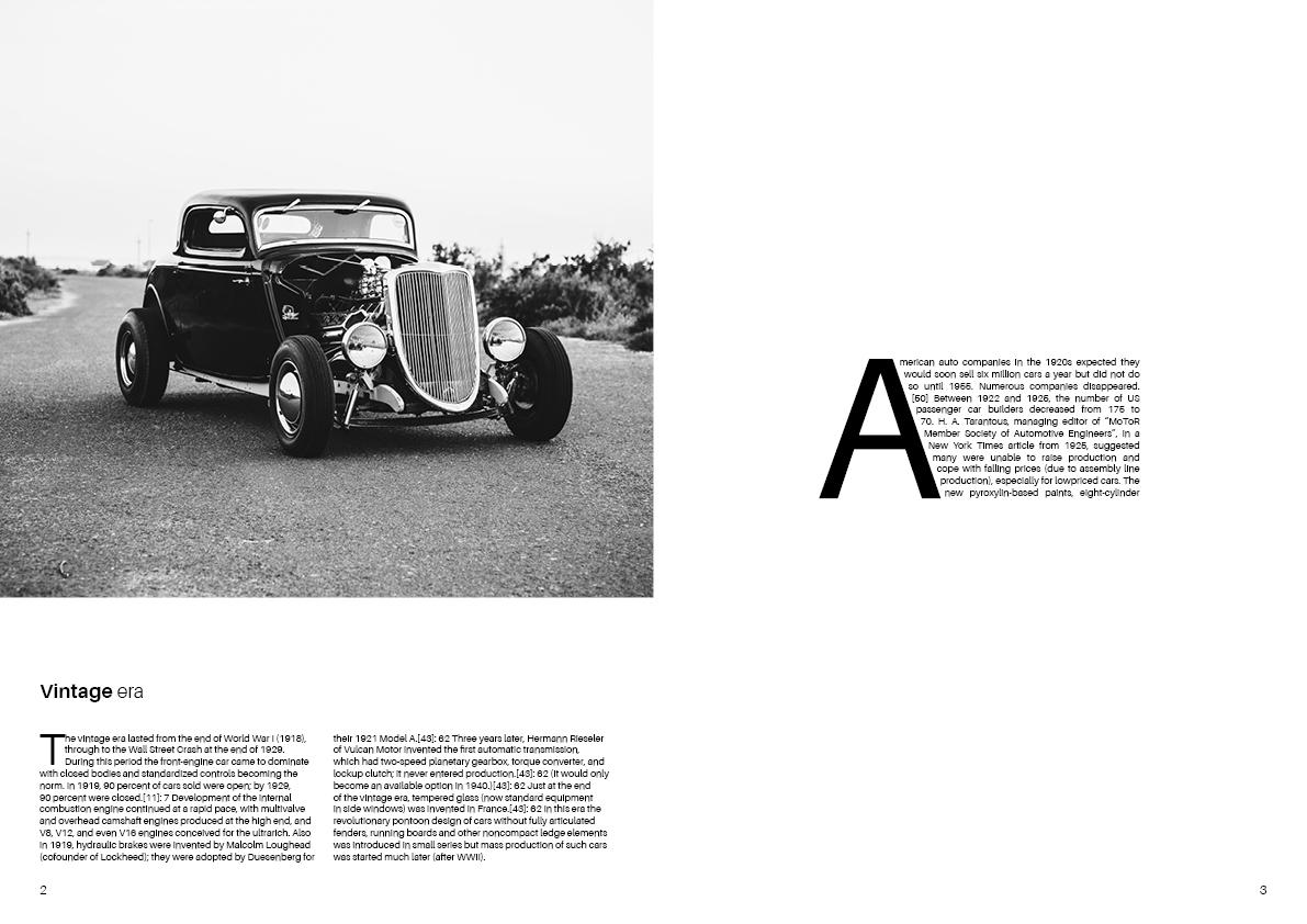
Universe, History of automobile, symmetrical and asymmetrical balance
 Applied principles taught from both classes.
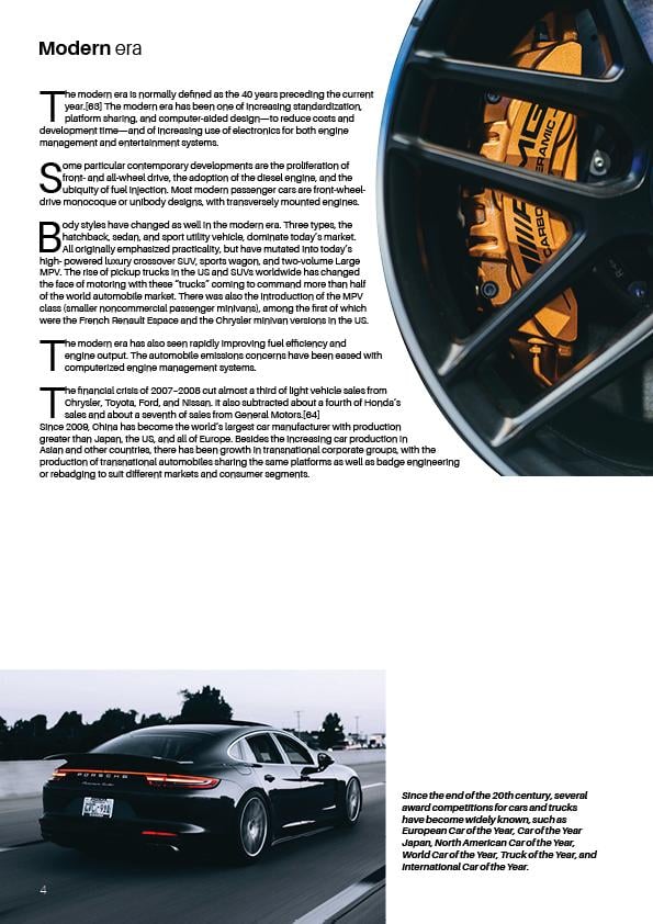
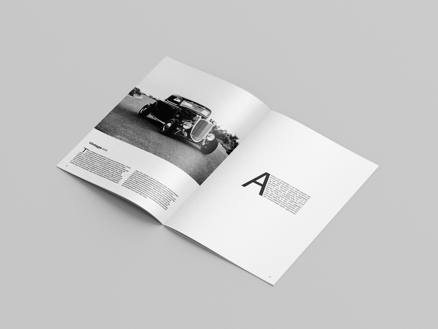
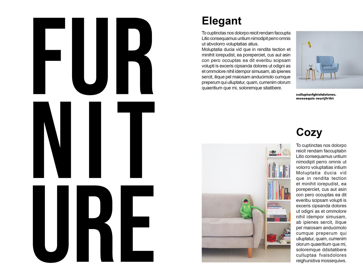
Used in both projects high contrasting images as focal points to draw attention of a reader, except on page 3 in car project where i used Big drop cap as focal point on page with a large white space.
Applied hierarchy in headlines subheads and body copy in terms of size and contrast.
Repetition can be seen in Typefaces/Fonts i have used as element, shapes and colors.
Mostly worked with symmetrical balance and a little with asymmetrical in car project which can be seen in composition of pages.
Any suggestions for improvement are welcome.