Typography Exploration
Hi Hayden! Thank you so much for this class, it is super helpful as I was just trying out Adobe Illustrator CC. It was free & so it's my first class on skillshare that I tried!
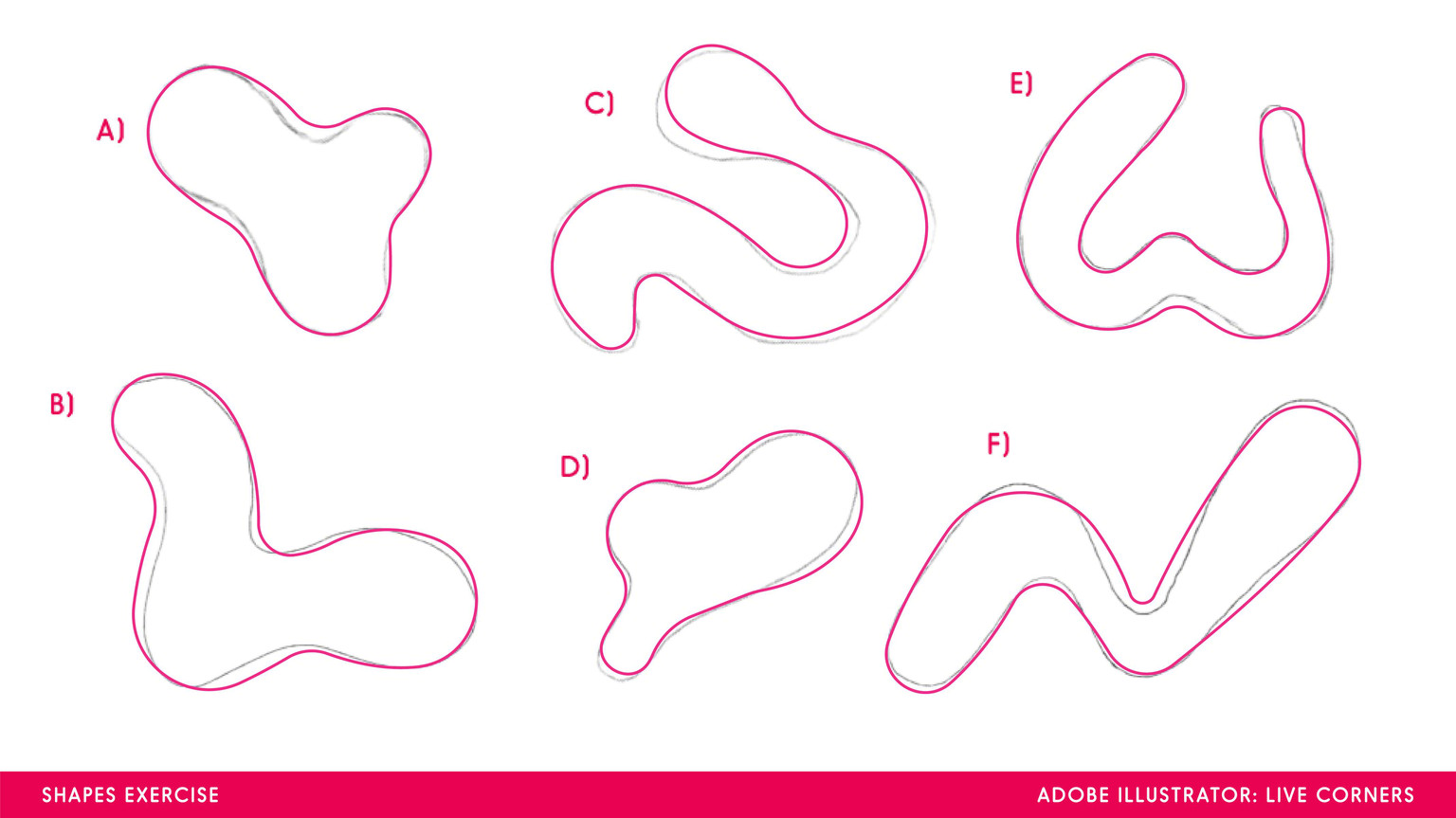
Part 1 : Tracing Exercise
It was challenging where to put the anchor points, sometimes the live corners didn't show up due to inaccurate placement. I guess it is supposed to be a little far from the round corners we want it to be / a little pointy for it to show. But it's a good exercise before we hands on the real project. Lots of them are misplaced lol.
Part 2 : Illustration
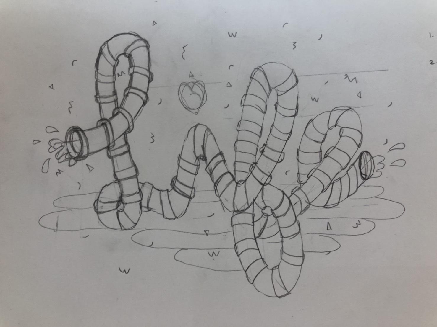
So this is a typography I was trying to illustrate, a water boom slides shaping "life" alphabets.
I decided to skip the water background as it looks too crowded + take down the water splashes on the other side & just keep one.


So these are the results, with and without outline. I tried the wiggly textures on the confetti & water, and a lot of it on the slide's pipes. I know it's not perfect & still had rough edges, but it totally worth the practice. Thank you so much Hayden!