The Potting Shed Project
-> 08/21/2020
In a couple of days, I have selected 3 color palettes, a few fonts, and logo designs. I will upload some more progress within the next week.
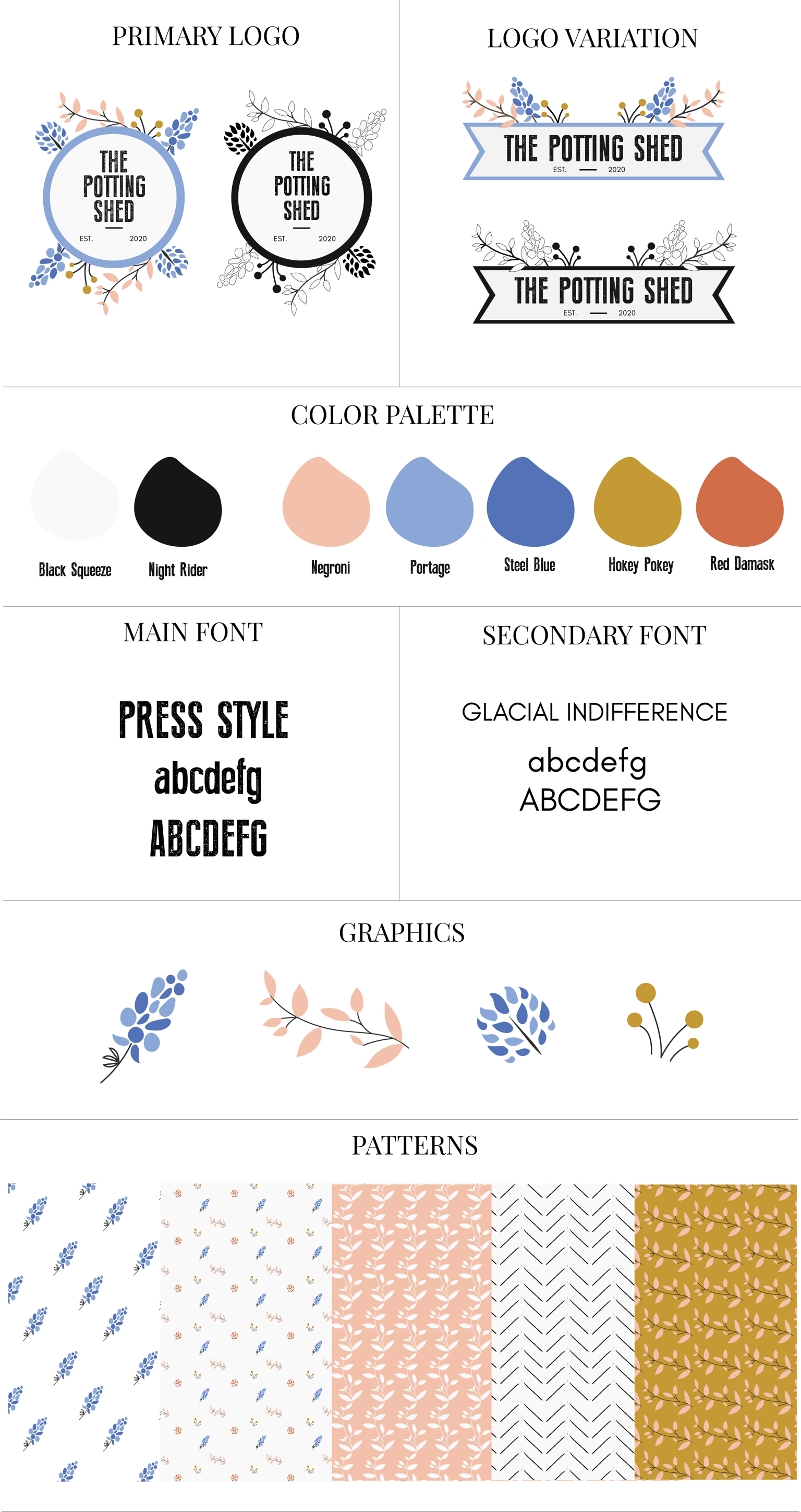
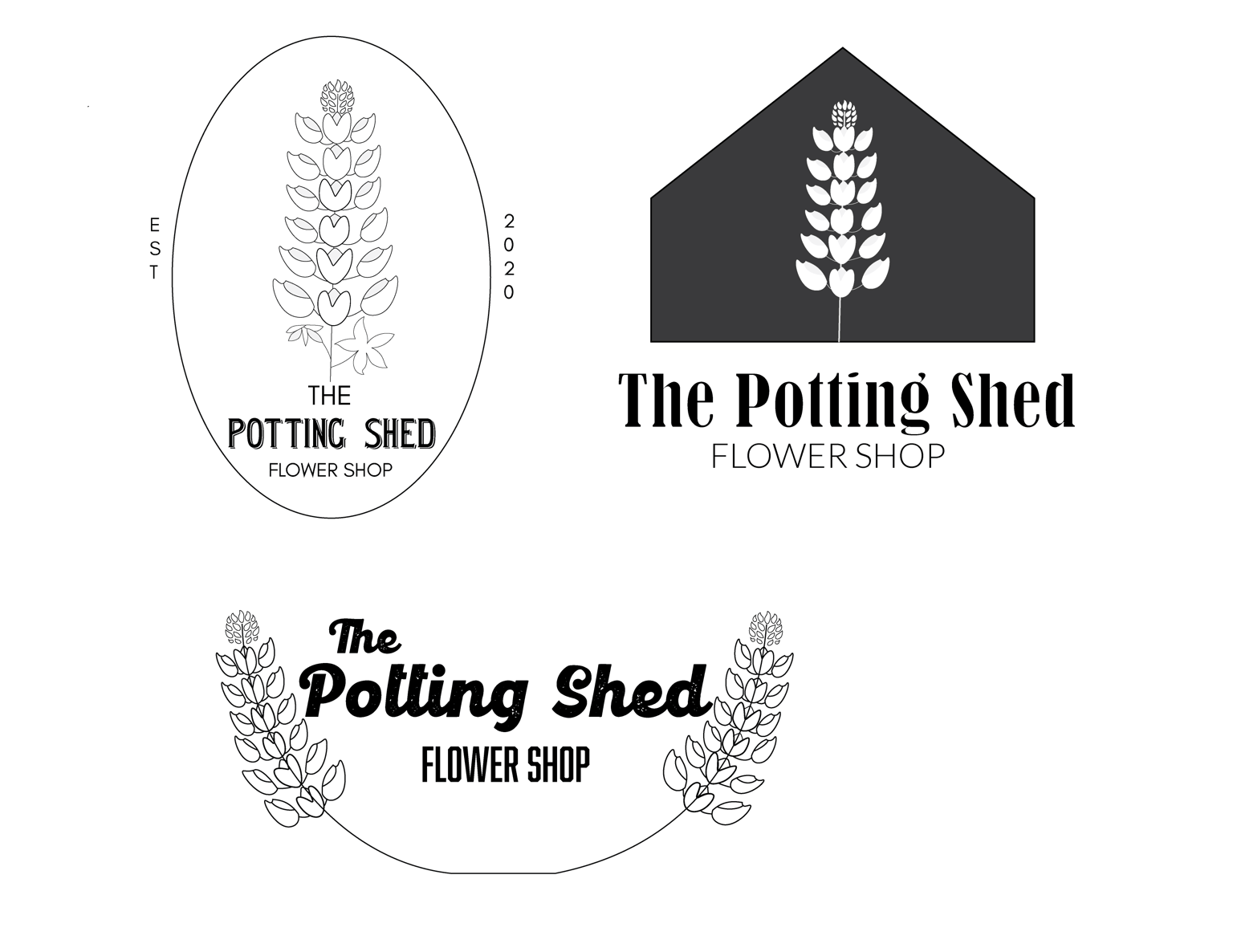
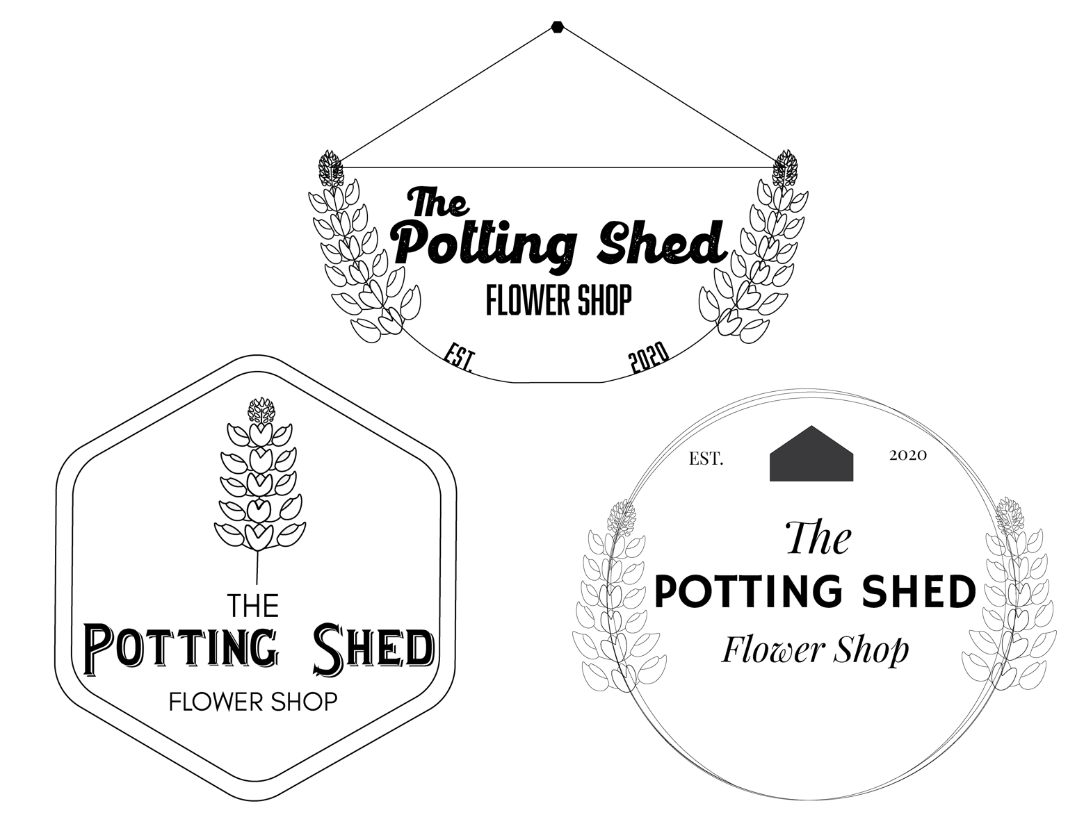
When I read the questionnaire, it said they were a small town flower shop from Dallas, TX so my inspiration for The Potting Shed was to use Texa's most popular flower, the Texas bluebonnet. This flower is blue so I think I will be choosing a palette that includes this color which was also mentioned in the questionnaire. *Disclaimer: I'm not an illustrator and I'm brushing up my illustrator skills*
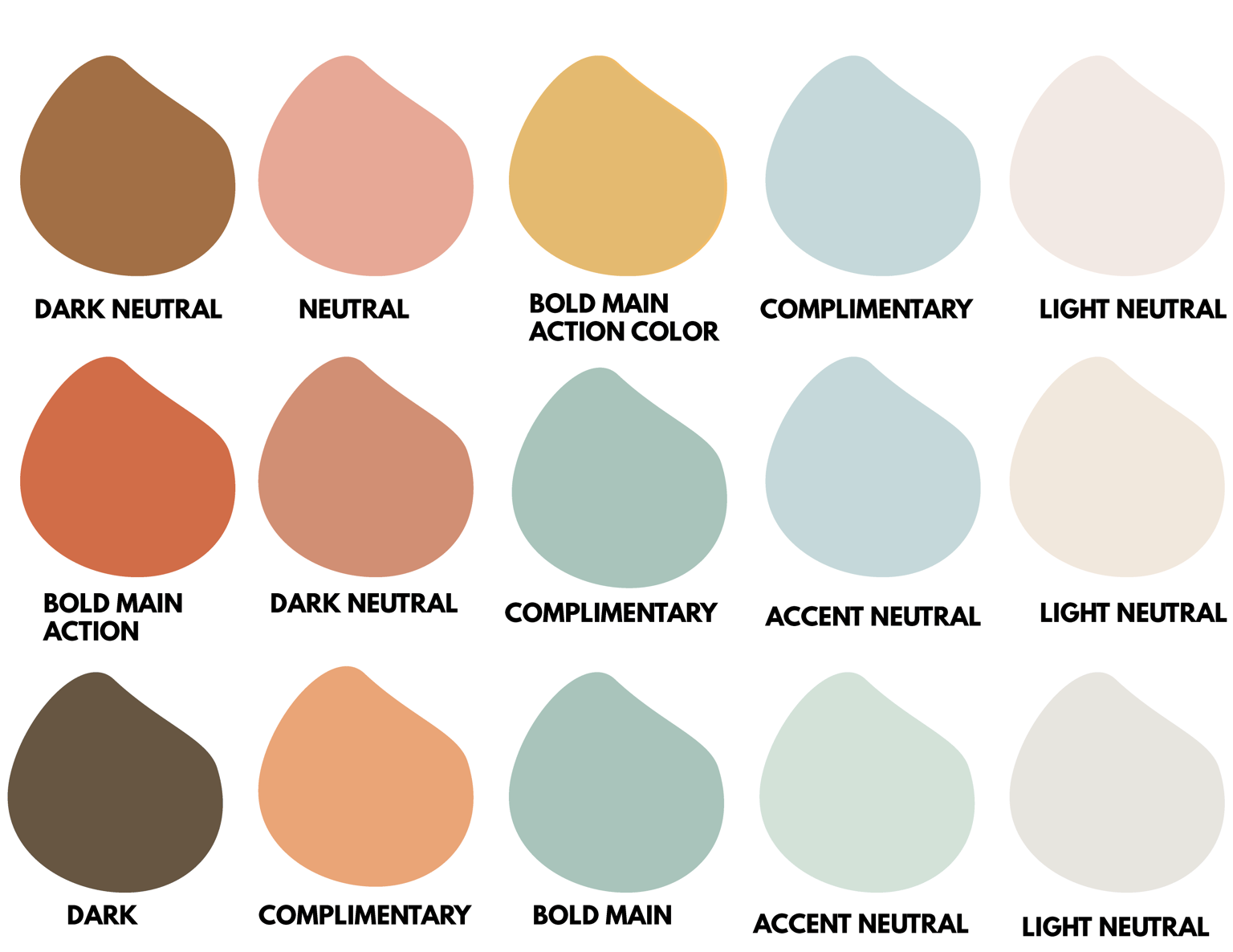
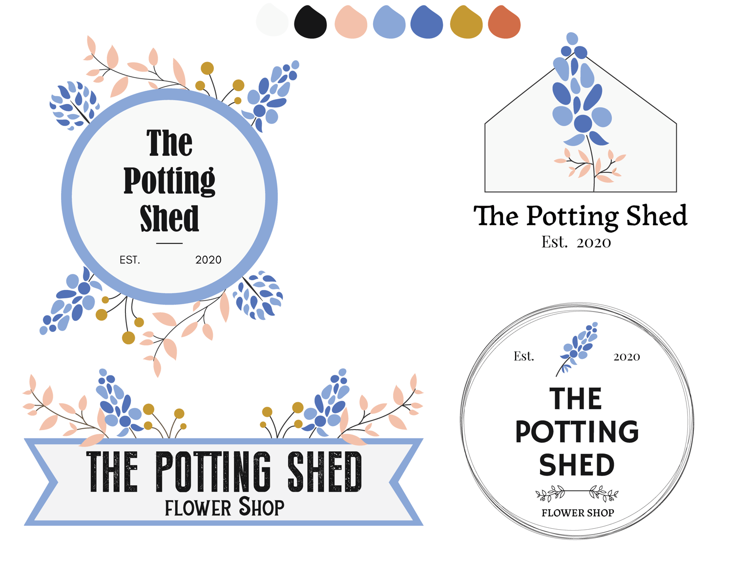
Color Palletes row #1, #2, #3. The style concept I perceived from the questionnaire was vintage, earthy, womanly, warm, and clean.
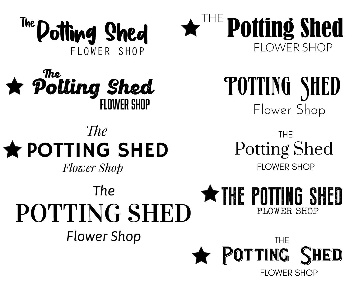
I put stars next to my favorite fonts for this project. It's really hard to pair fonts btw.
I'm a libra.... I consider too many options :S
I totally accept constructive feedback, ya'll! Thank you.
-> 08/29/2020 UPDATE:
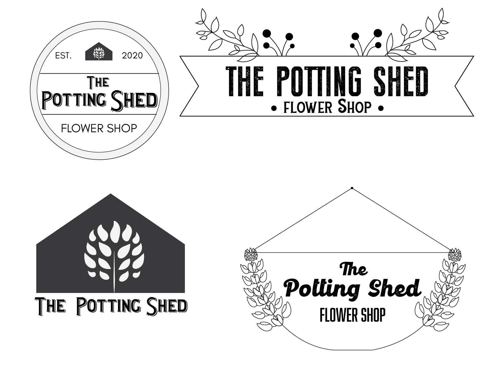
These are the logos and color palette options I went for at the end. I will be uploading patterns this week.
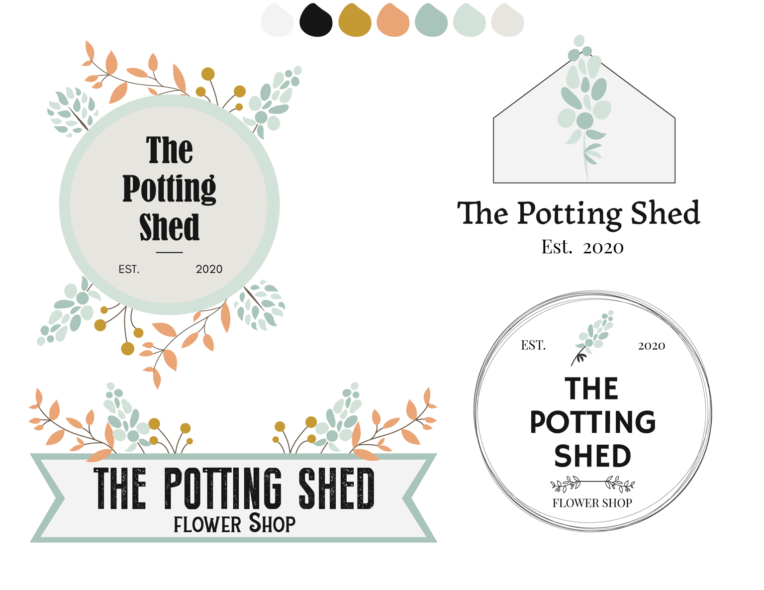
Texas Bluebonnet color palette below
-> FINAL BRANDING BOARD 9/14/2020