The Parsley Project
A huge class project, took me half a day but learned so much!
I chose to illustrate parsley, mainly because I wanted to draw it to learn the difference between parsley, celery and coriander. It do these studies sometime, because I have a pathological need to know things :)
Start with a confession:
1. I'm a raster girl and Illustrator is alien to me
2. I don't like the end result
Which brings me to my plea for help and an honest critique so I can improve my next drawings.
The shape is pretty good and I wanted a realistic illustration as much as possible. But the shading...terrible! I am not as good with values as I thought, I really need to practice that (I'm going for a 7 day b/w practice only!).
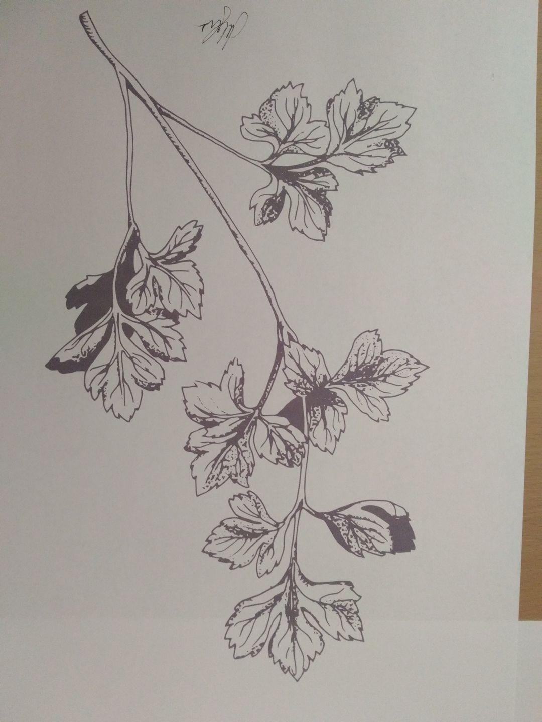
Bref, here's my journey from first sketch to shaded tracing. Where did it go wrong on the way? Should I have used a different type of hatching instead of dots?
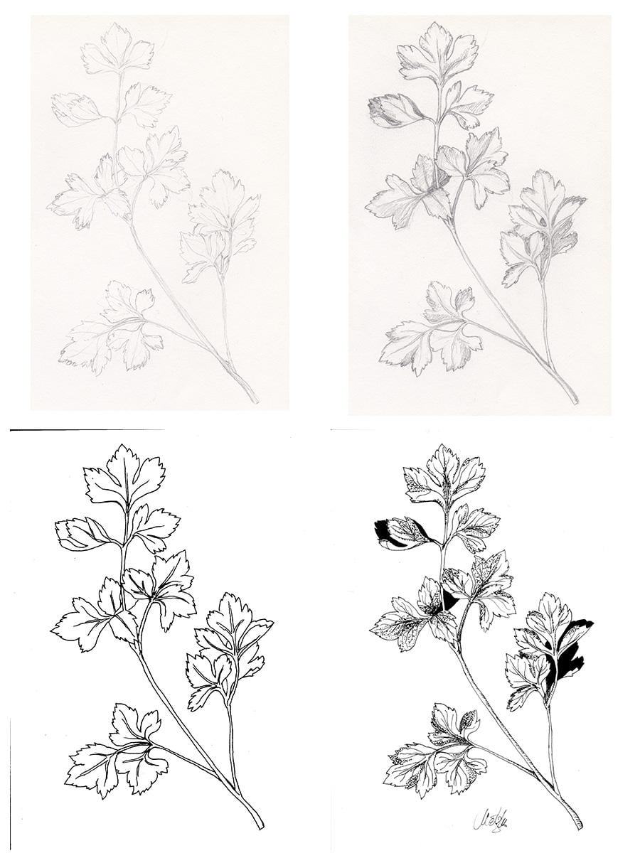
I printed my parsley but low ink in my printer so it's not really pretty.
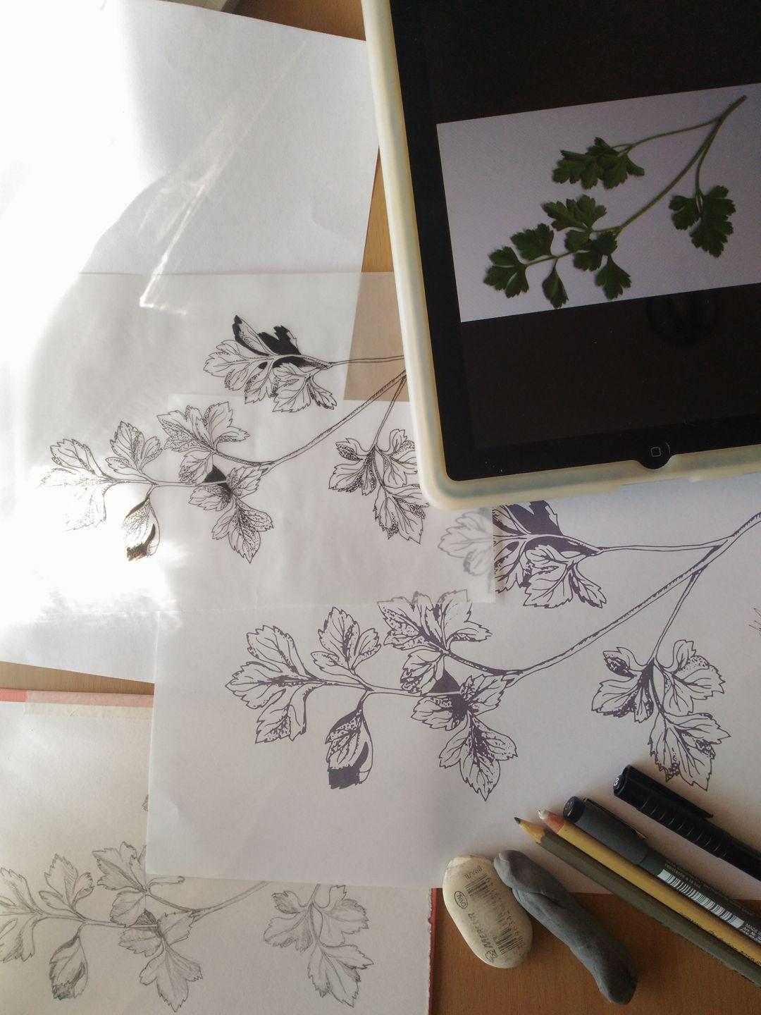
Here's my workspace with the reference image, sketches and final printed art too
I'm really looking forward to your feedback and critique, Barbel, be merciless :) Thank you!