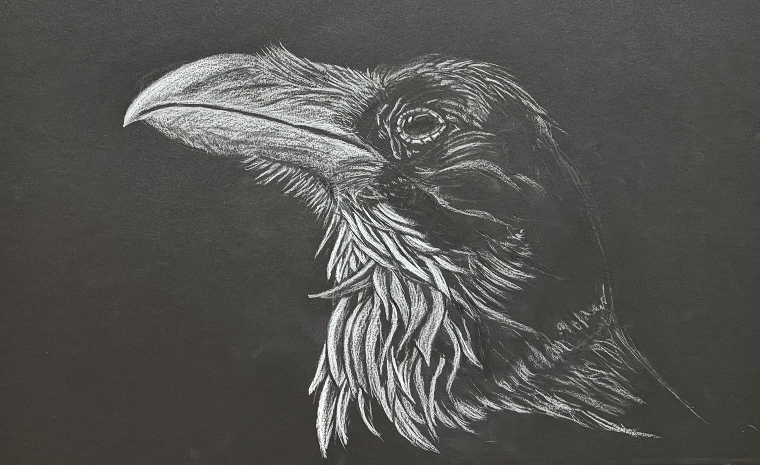
Stark Crow on Black Paper
I really enjoy drawing on toned paper - black paper was one of the first materials that I bought (by accident), but it turned out to be a great thing. I’m not that interested in doing coloured drawings, but doing bi or tri coloured drawings I very interesting to me.
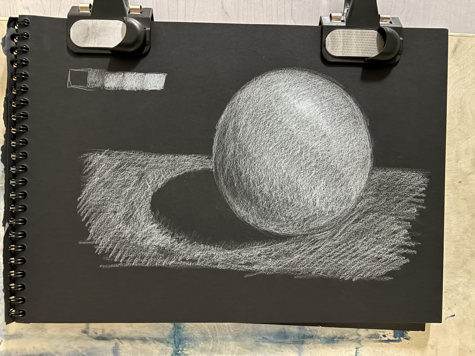
This class was helpful in showing how to tighten up details with different types of pencils and cover up my sketch lines (I always freehand sketch) that I’ll keep using. In this drawing, I was most interested in the cross contours of the feathers and the texture of the beak, but I struggled with the fine line work around the eyes. No layer of fixative on this drawing, but I see the value of it, as the two kinds of pencil don’t always combine well. My interest isn’t so much on the realistic details, which I why I chose to leave the back of the neck relatively dark and focus on the bold shapes of the feathers - I did use the shading techniques suggested to make them pop. Overall, the picture is quite dark, and I wasn’t happy with some of the mid-tones that I put in - in the end I removed them and embraced the stark contrast - maybe not to everyone’s taste, but it’s a choice, and I felt it made the best use of the medium.
I’ll take more of these classes to keep levelling up my black paper drawing. Thank you for posting this content; it's a niche, but it’s really good to have some input, and there aren’t many other classes on it. I am always grateful for feedback on my work.
Materials: Canson XL Black Paper, F&C Black and White Pencil, Derwent Black and White Pencil, Kneeded Eraser, Zero Point Eraser