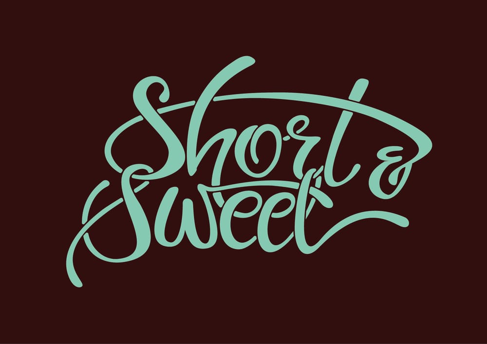
Short & Sweet
Upon a longer deliberation I decided to settle for something short and sweet. Therefore, quite literally "Short & Sweet" is the phrase I will be lettering. I would like to focus on quality over quantity and make sure that this piece actually works well and I don't get overwhelmed. The original quote I wanted to go with ended up being way too long for this project, so it will have to wait for a later time.
I will try to come up with a few different lettering styles and see which one works the best.
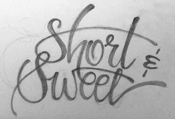
Draft 1
First sketch of my phrase. I'm quite happy with it, but realise that some tweaking will have to be done in Illustrator to balance out some of the letters better.
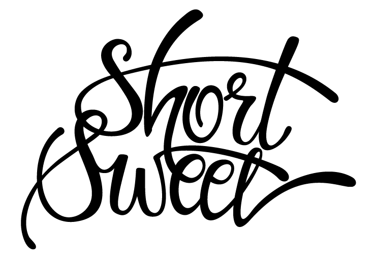
Draft 2
I took the sketch into Illustrator and traced it. I realised I will have to try a few more versions of the ampersand and then later import it into the piece. I am also thinking of adding a bit of weight to the letters to make them more 'bubbly'.
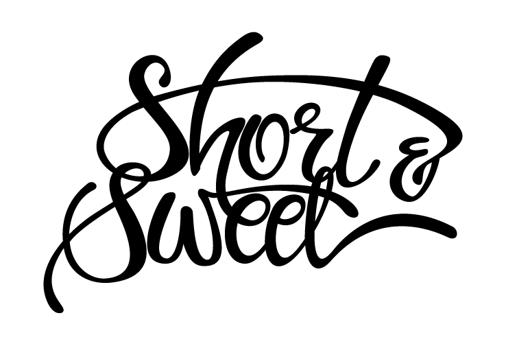
Draft 3
Finally decided on the style of the ampersand. Tweaked the balance of the letters a bit, changed the kerning between 'S' and 'W', as per some people's suggestions.
I think I am reaching the point, where I have overdone it. The more I'm working on it, the less I like it. I can't help feeling that something is off about this. Any suggestions would be very welcome indeed.
Note to self: go for balanced lettering next time instead of freehand madness, because that requires actual skill and experience to pull off.
Draft 4
I decided to stop the madness of trying to redraw the composition and actually push it forward. The multiple overlaps of the letters were asking for a clear distinction of the letter shapes. A couple hours later, this is what I reached. Now to do some actual shading.