Sample Project
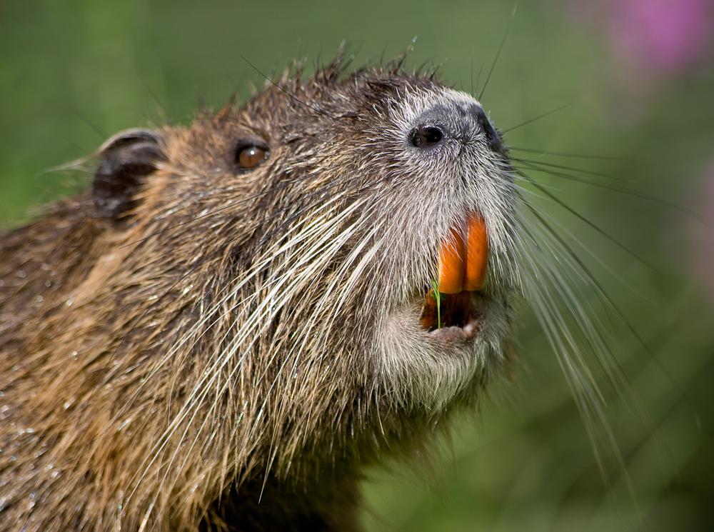
I started off the project by deciding on a native swamp creature to Louisiana. Their teeth were a big indicator to the colors and style this illustration would take.
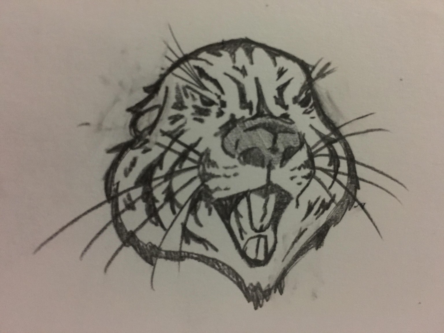
As you can see from the videos, I had a ton of sketches before I settled on this one.
I played around with colors, building the layers in as many different parts as possible till I finished the logo.
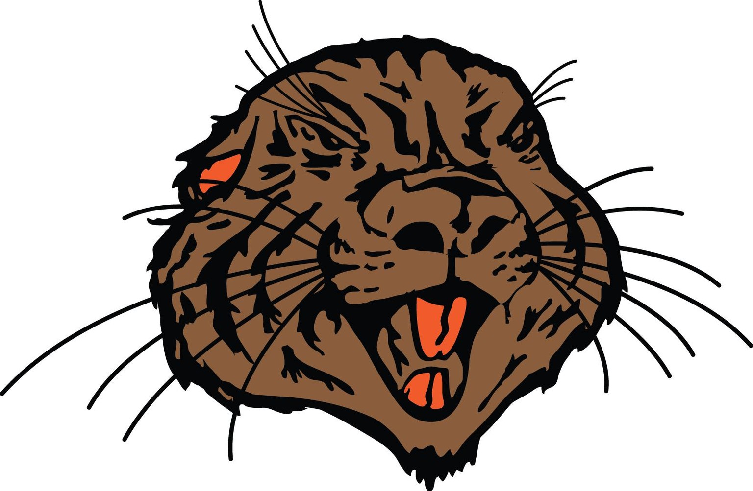
The logo stayed pretty close to my original sketch. The main changes were stretching/squashing the wonkyness of my original drawing. The teeth being that bright orange had the visual impact I was going for.
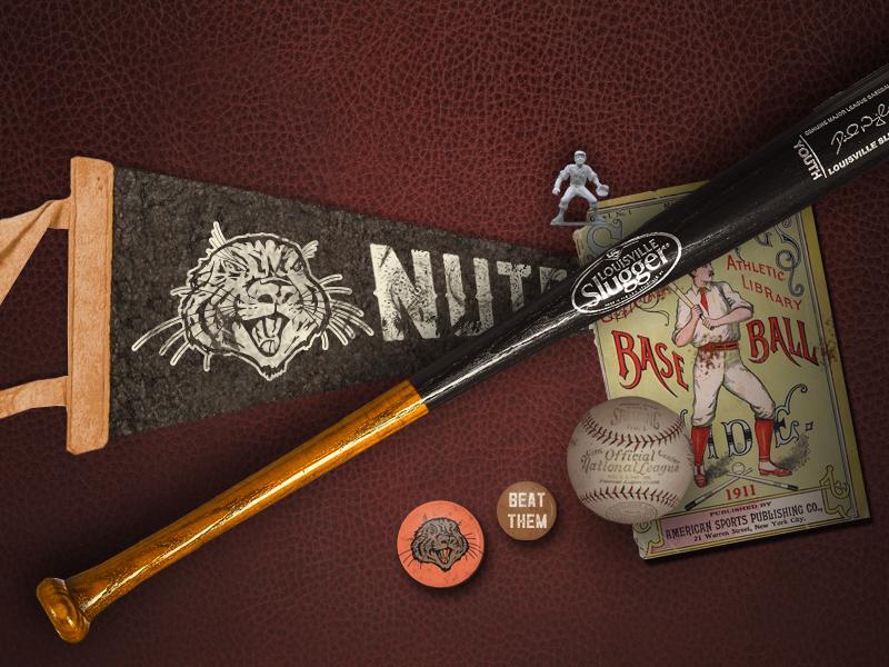
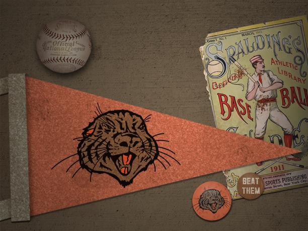
I dropped my logo into the mock-up and I was good to go. I made two different mockups to show the versatility of my logo