Salt Label
July 18, 2013:
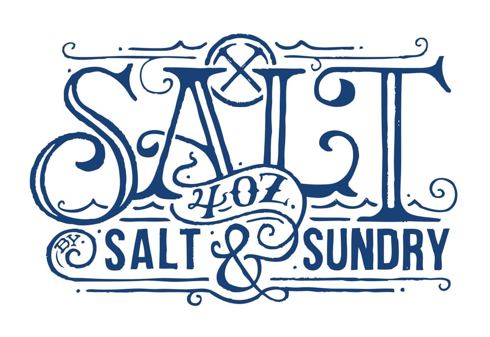
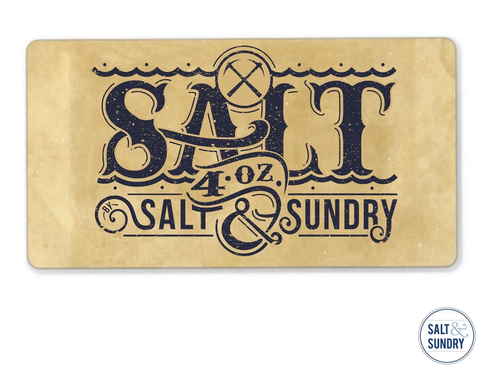
I thought I'd post the latest version of the label and the new design for the top label since its changed a bit since working on it in the class. Thanks for all your comments and keep up the good work - John
June 18, 2013:
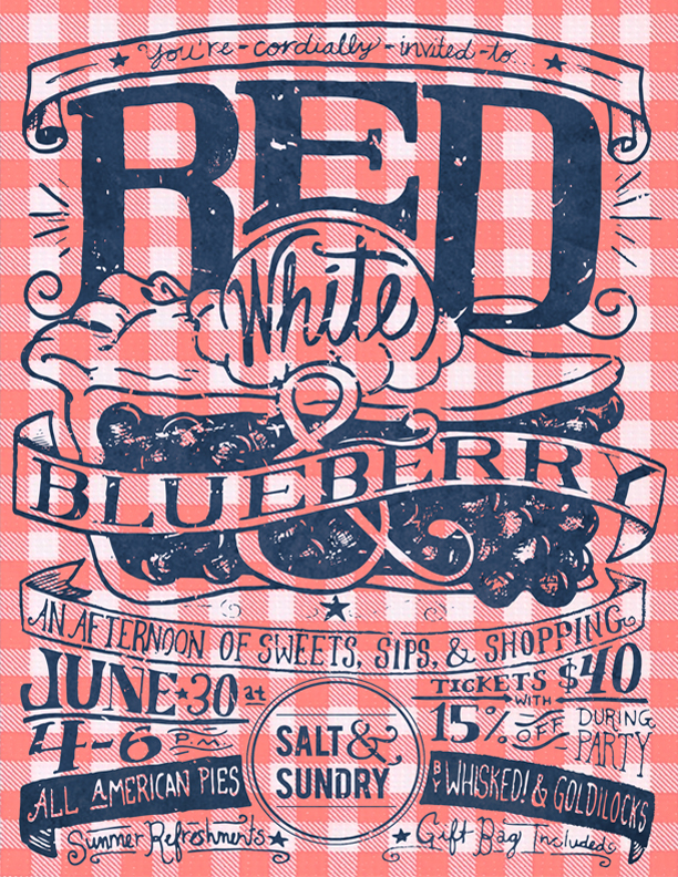
Thanks to the success of the Salt label, Salt & Sundry reccently asked me to also design an event poster in a similar style as the label for an upcoming instore Fourth of July party. I was happy to do it and to again use all the techniques I learned in this class. It was a great opportunity to try a variety of hand drawn fonts in different arrangements and sizes and I'm pretty happy with the result.
June 2, 2013:
I thinned down and simplified the letters and for a finishing effect I gave the label a hand drawn feel. Let me know what you guys think and thanks for all the feedback, it was all really helpful.
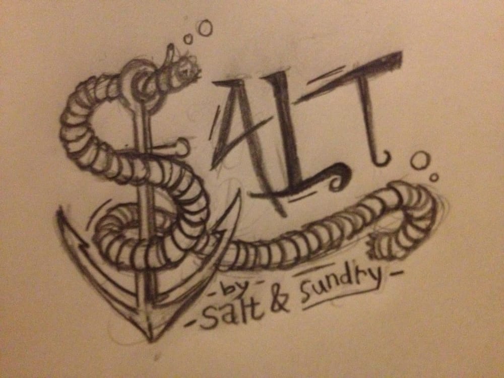
May 30, 2013:
Below is the first version of the label all vectorized in the computer. There's a few areas I still want to continue resolving, like making the ampersand look more like the one in the store's logo in the bottom right and making some adjustments to the curls on the lettering. I think I'm also going to try to thin out the main 'SALT' letters more...
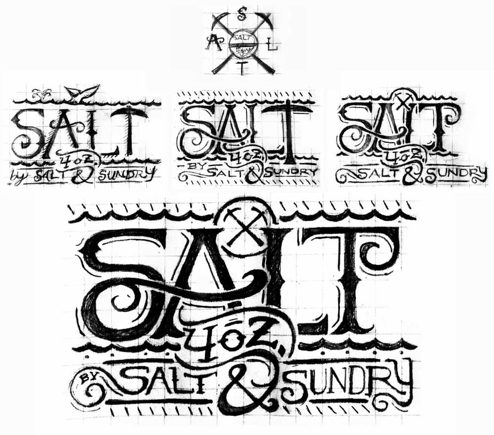
May 21, 2013:
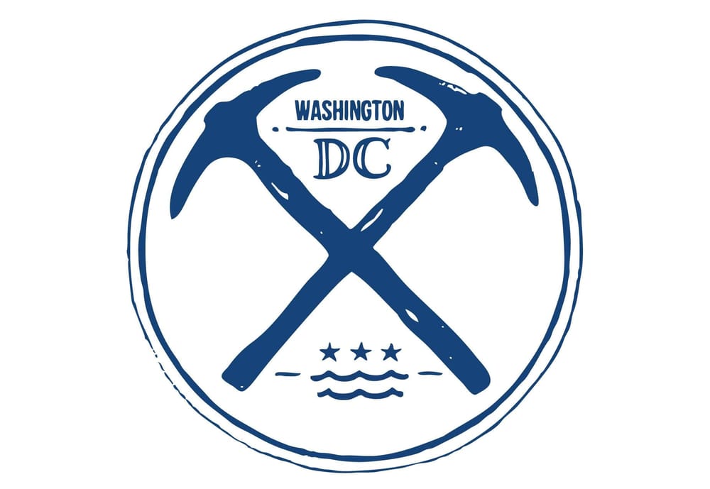
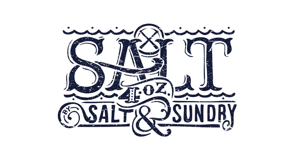
After a discussion with the client about the sketches, the ideas were consolidated into one design borrowing a variety of elements from the different sketches. The top of the salt jar’s lid will have the crossed picks design, to work with the circular shape. The label on the face of the jar will be a longer rectangular design with a 1 to 2 ratio and is laid out in the sketches below.
Let me know what you guys think and thank you all for your feedback, it’s been so helpful in narrowing down the ideas and shaping the final design.
May 19, 2013:
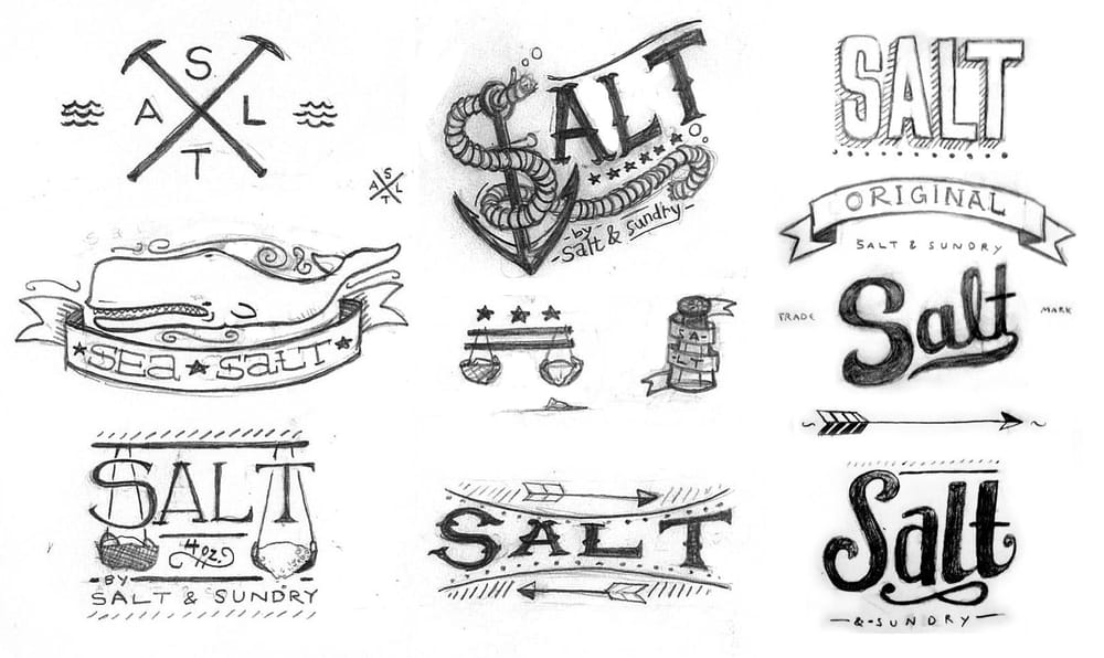
I added some new script type options to the first set of sketches to create some more variations.
May 17, 2013:
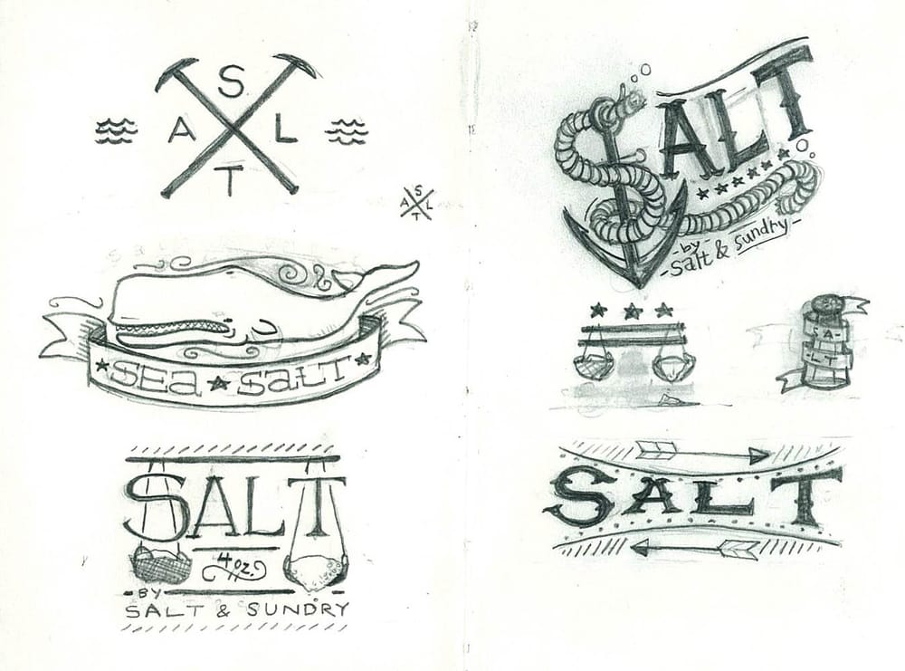
I gathered my thoughts and was able to sketch out a bunch of different ideas for the salt label. The sketches are in the early phases and though I do think the final design should have a hand drawn quality to it the layout and line work will certainly become more polished. In the designs I included different Americana and nautical imagery that comes to mind when thinking about salt (whales, anchors, picks and waves) as well as different design techniques (like banners, stars, swirls and underlines) and am planning on combining some parts of each into one cohesive final design.
Let me know what you think.
-John
May 13, 2013:
I have been asked to design a label for Salt & Sundry's new salt jars for sale in their shop in DC's Union Market. Salt lends itself to some good nautical imagery and I'm looking forward to developing this idea with the help of everyone in the class. More to come soon!
-John