Raymond
Update: 07/29/15
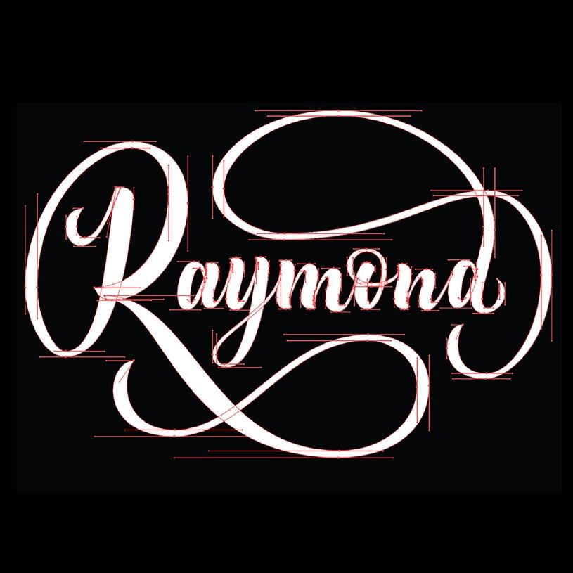
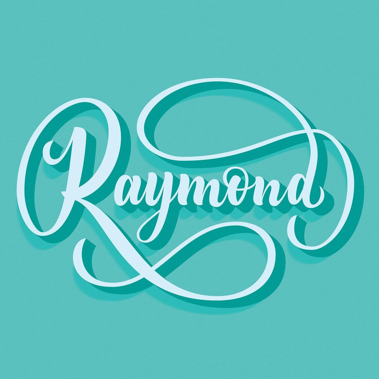
Hey there! Tonight I looked at vectoring my lettering piece and in the process combined the bottom flourish and the leg of the R to be one stroke. I was a bit eager to assign some color to the letters, so after I was pretty comfortable with my point placement I decided to add some styling :)
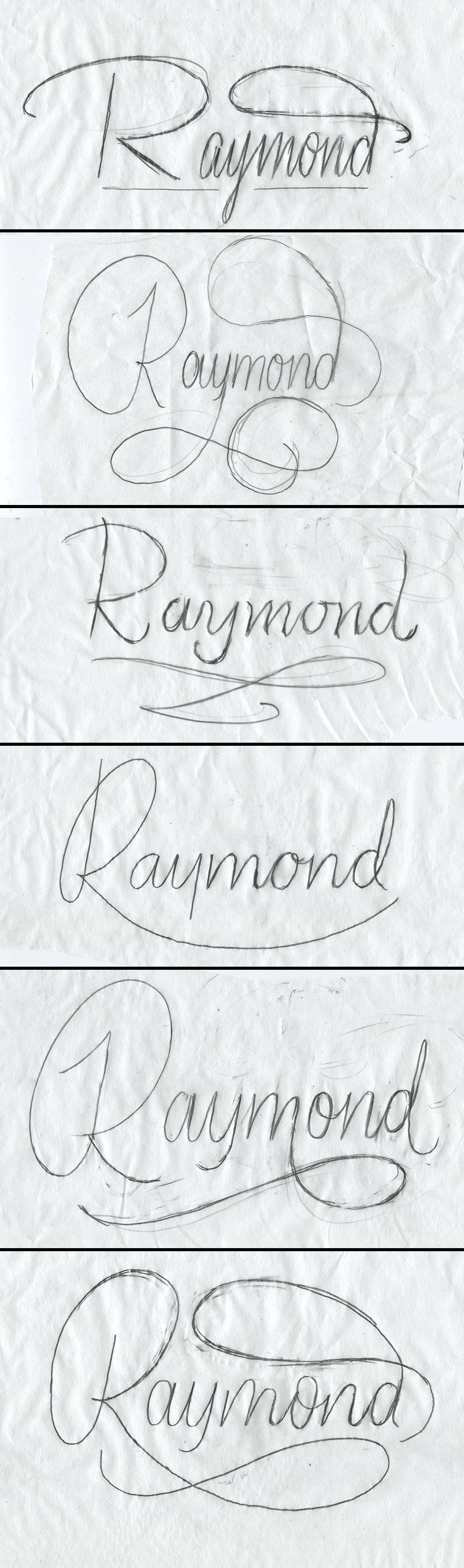
Hello there! I am going to participate in the two week course starting July 31st, but I wanted to get a little head start and practice a bit before then. So I decided to letter my name as practice. I have havent been very successful with flourishes in the past, but I liked how Martina explained how they can be done, making sure they take on the same oval as apparent in the other letters. I did a few stylistic sketches and then decided to just focus on one, and began refining from there. Below are my initial sketches.
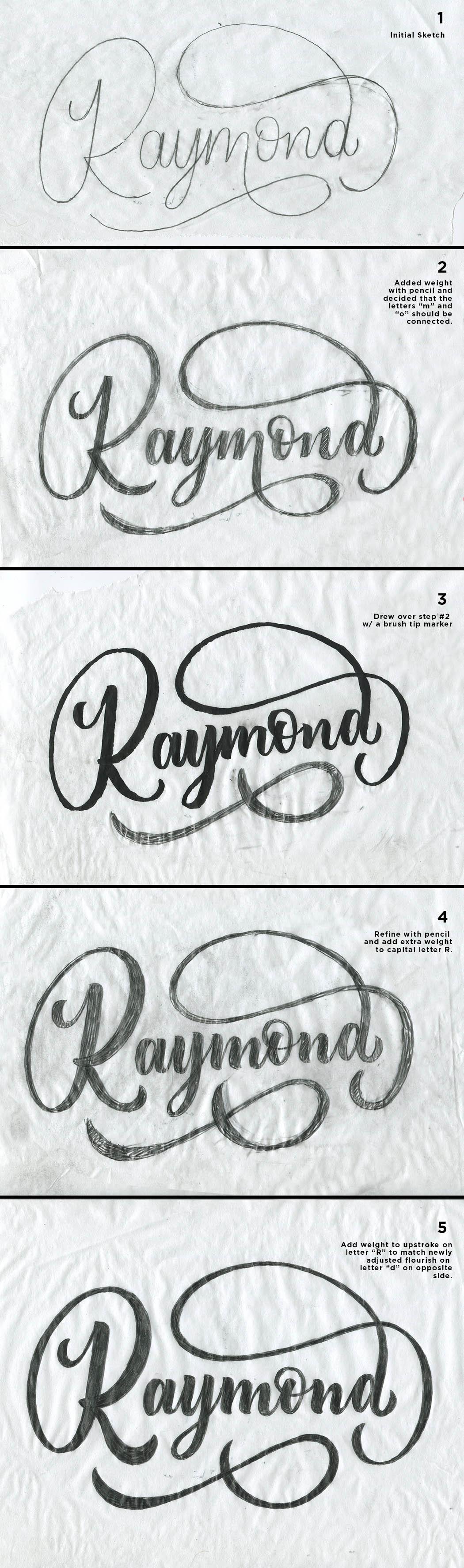
Below is the process that leads you from my initial sketch through the steps towards a more refined sketch.
Thanks for checking out my project so far, I look forward to participating in the two week course starting soon. I hope to learn a lot!
-Ray