Punky and Geometric
This course was way out of my comfort zone as a designer, so I had to do it. However it was such an exciting project I got totally carried away. Any feedback really appreciated.
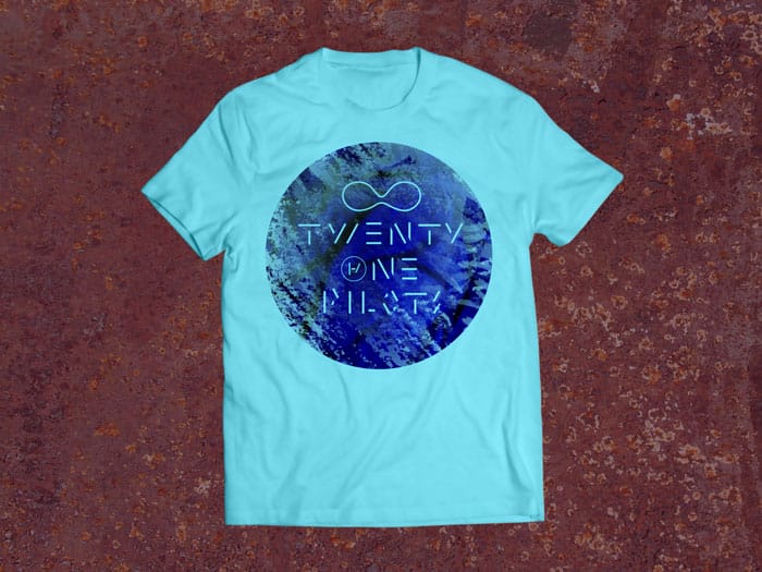
This is probably my favourite one which happened by accident when I was switching layers in photoshop.
_________________________________
INITIAL IDEAS / SKETCHES
I started with a couple of ideas - very quick and rough, exploring using the logo idea and mask as a basis as well as the idea of pilots/propellers/planes and matches which I felt reflected the incendiary quality of the music.
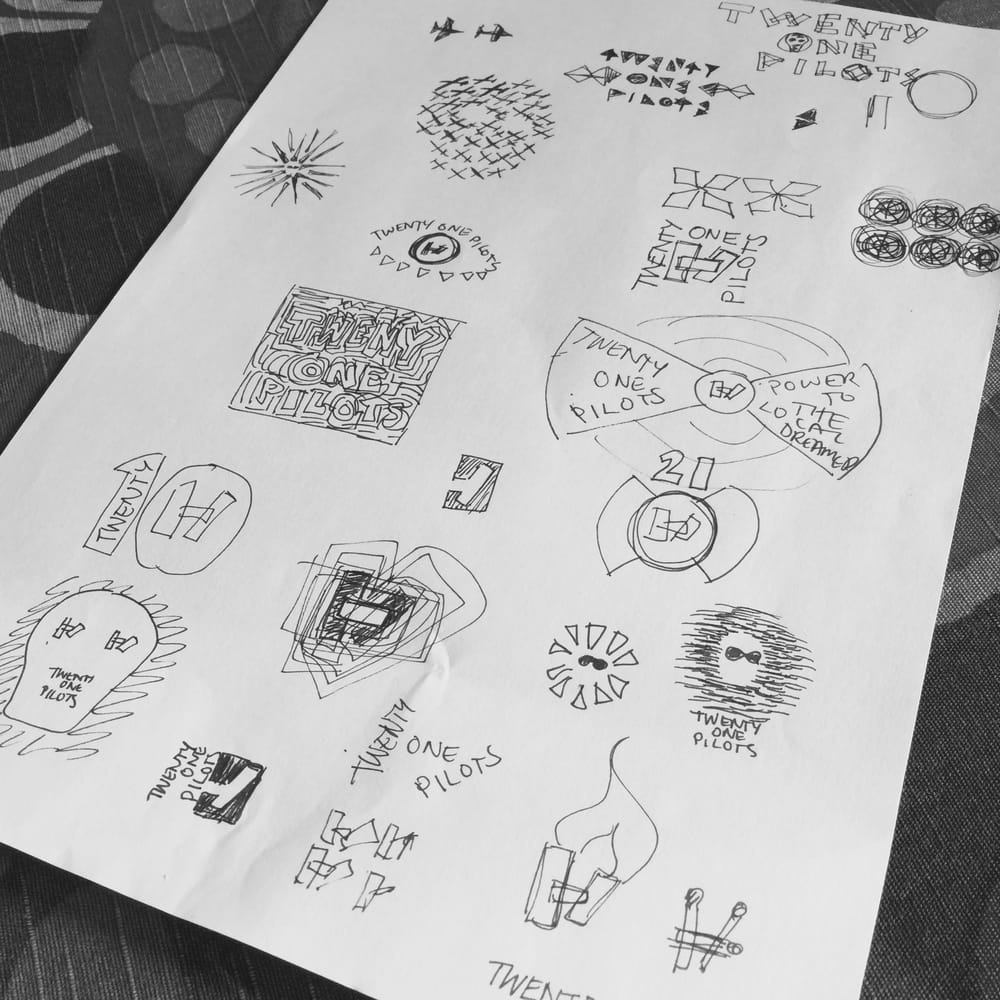
I worked through four main ideas, blocks lettering, geometric type, matches and planes in illustrator then tried out different colour ways and made sometimes quite extensive refinements in photoshop.
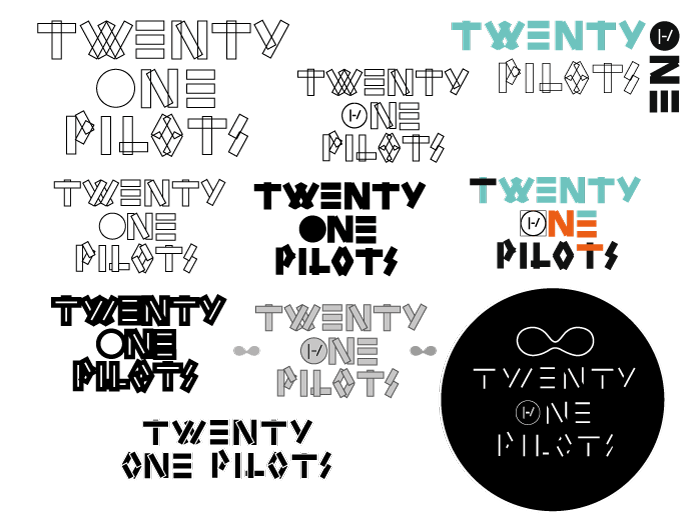
1. BLOCKS TYPE IDEA
This is taking the idea of the logo and overlapping blocks to make some bespoke lettering for the name and incorporating the symbol quite subtly in the one round element (the 'O'). The round shape refers to the propeller idea (not obvious I know!) Differing line thicknesses and fills give it a completely different look:
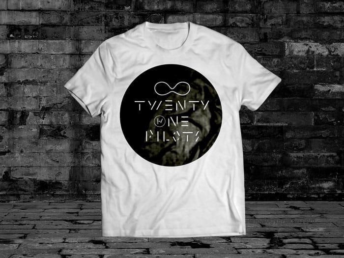
Here's the mockups in two colour ways:
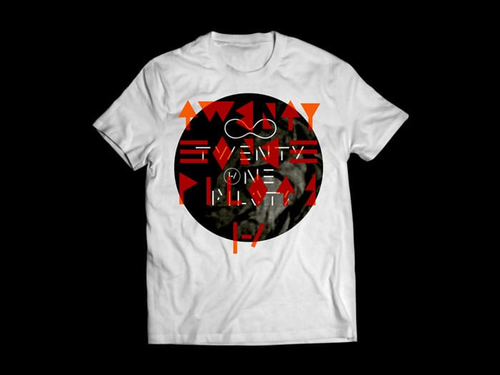
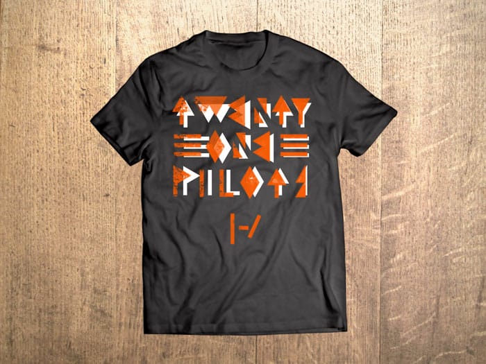
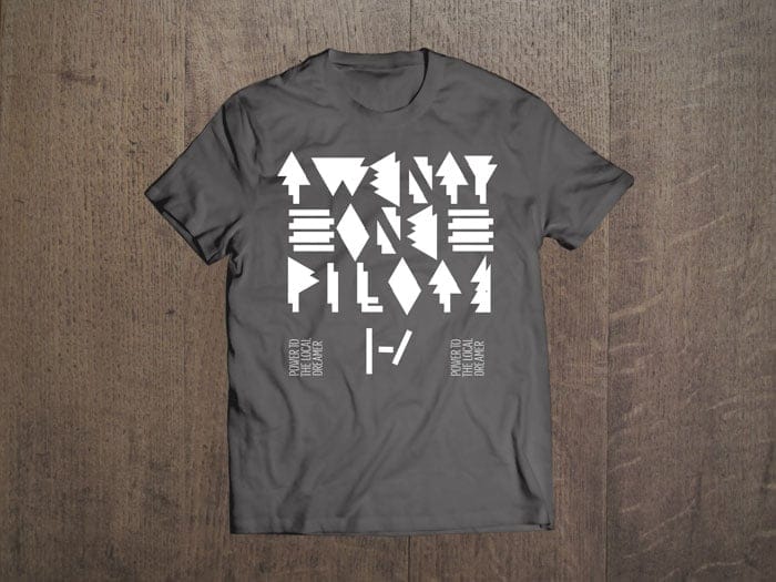
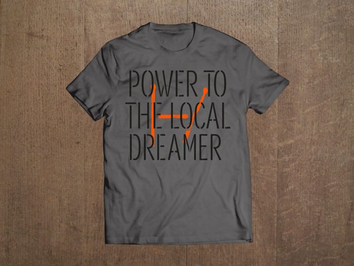
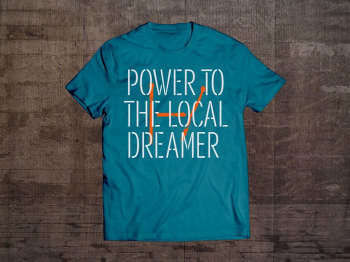
2. GEOMETRIC TYPE IDEA
This idea was to use geometic shapes to construct the lettering. I expanded that to incorporate the logo and the slogan. It's a bit minimalist but has a aztec vibe so I quite like it.
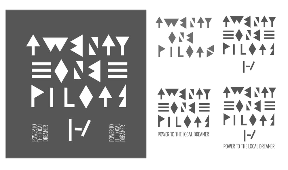
I changed this quite a lot in photoshop - it's maybe a little abstract but I think it would fulfil the brief of being intriguing and like a 'code' that those in the know might get the idea.
3. MATCHES IDEA
Listening to the music made me think of incediary ideas and energy - so I used matches to make the logo and used a font which I modified to make it look like a grafiti stencil. It was a challenge to get the legibility right - and the feel of the type to match the feel of the burnt matches.
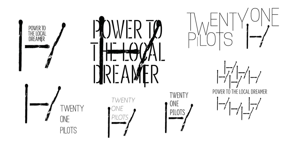
Two colourways make it more legible in the mockups:
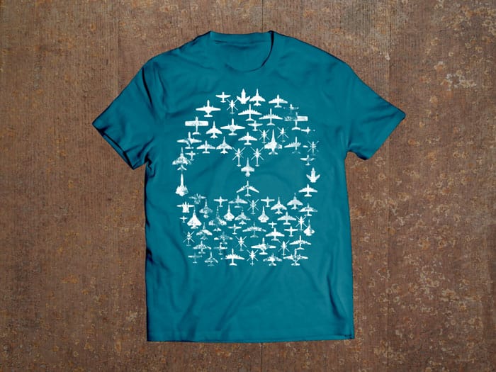
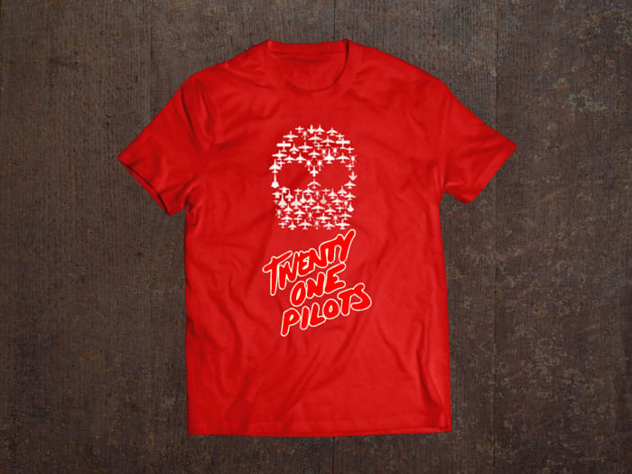
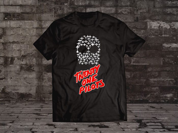
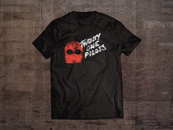
4. PLANES IDEA
The final idea was quite different as I wanted to see if I could incorporate planes in the design to make the shape of the ski mask (I used USA military planes in silhouette). Ask it was quite agressive I decided to humanise it by using hand written lettering which ended up looking quite 1970s DIY punk.
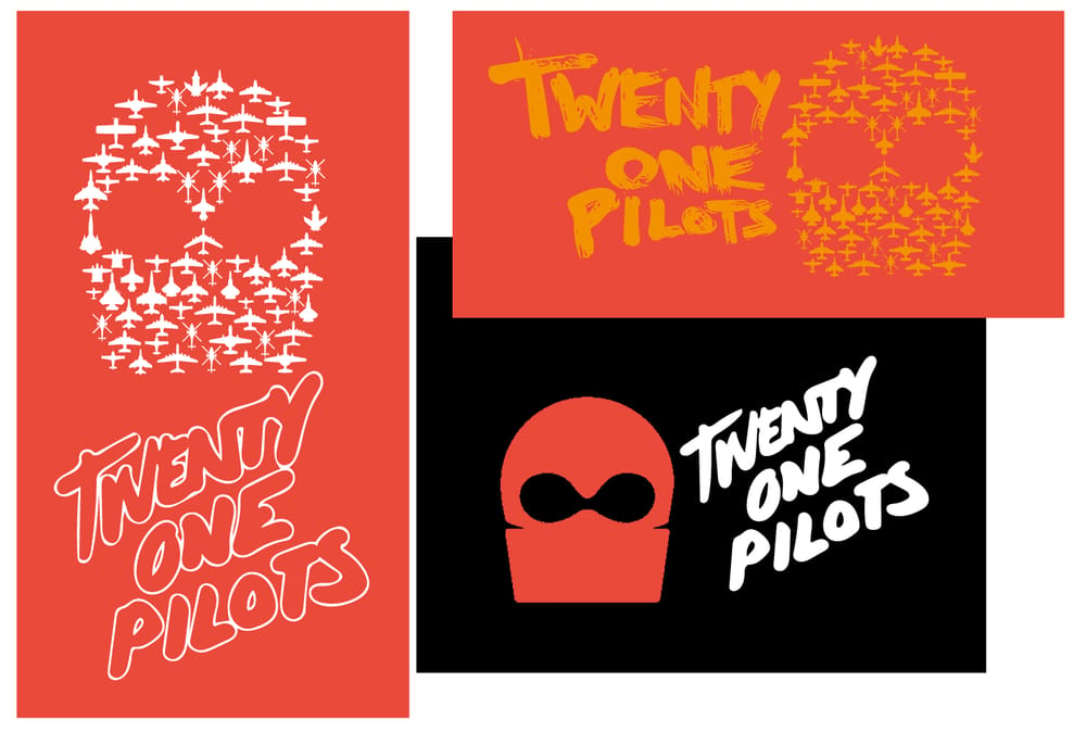
The mockups for the idea of the single planes mask:
I added in the typography to make it more legible but don't like these quite as much:
I also did a really simple version without the planes and bit of distressing (my least favourite as looks quite heavy metal which doesn't quite fit the band:
Thanks if you got to the end - I loved this project and learnt so much. Thank you Brandon for the inspiration!