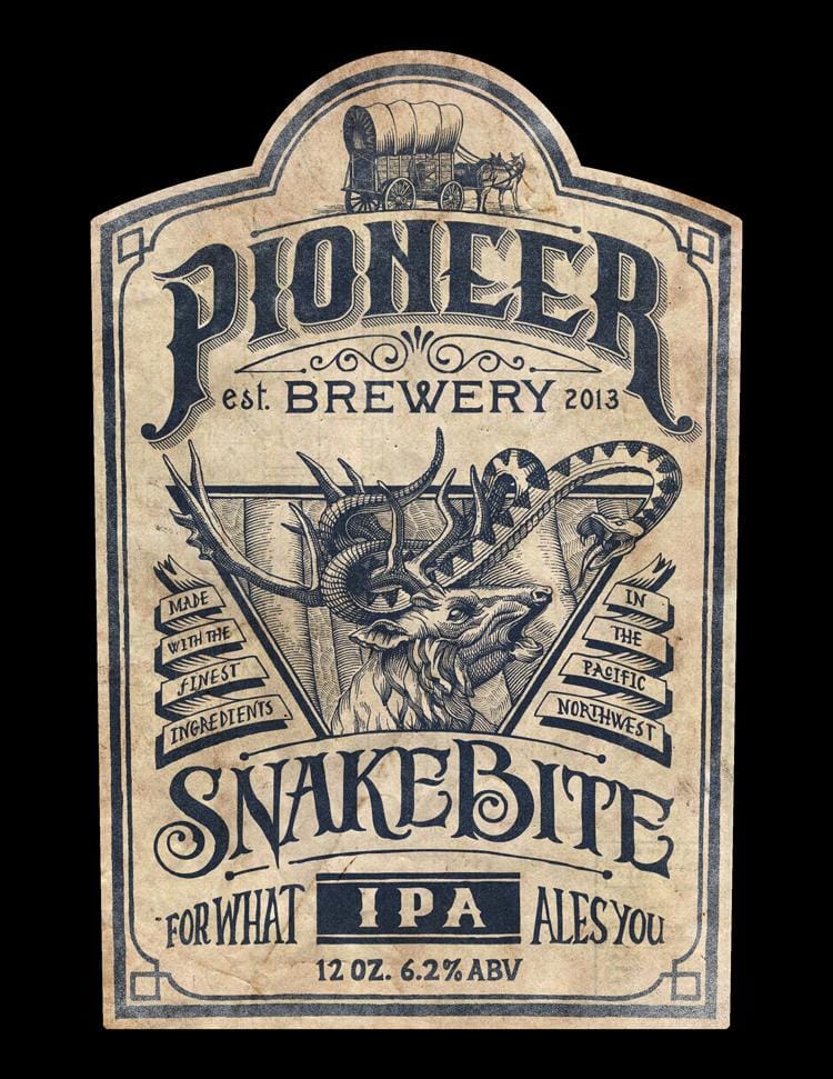
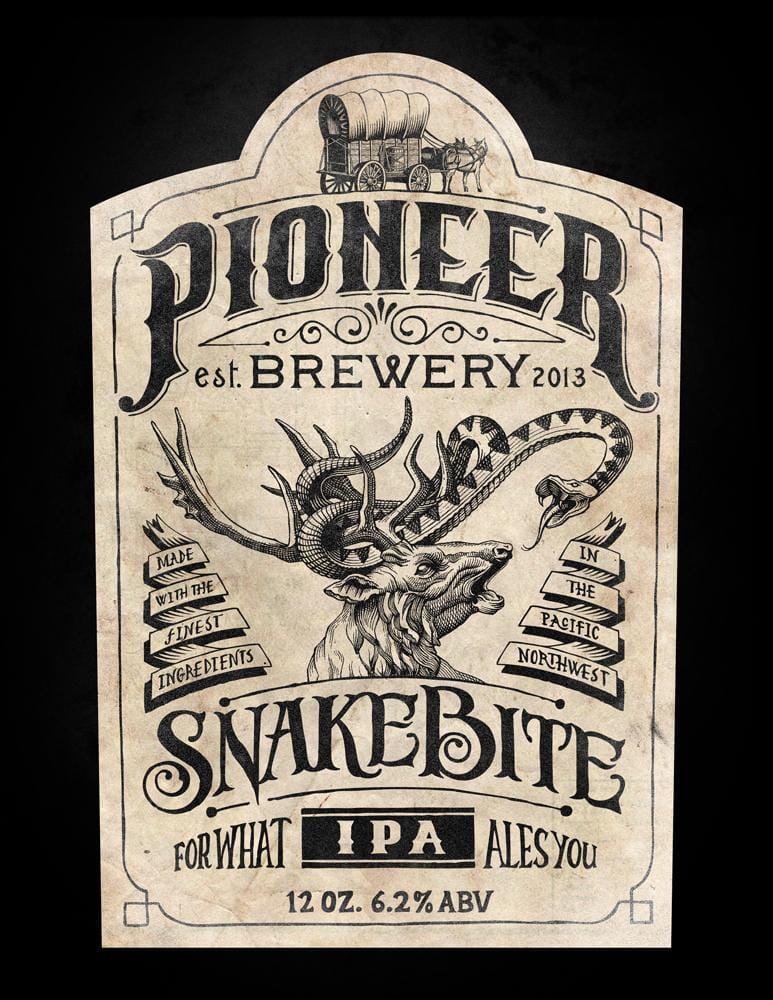
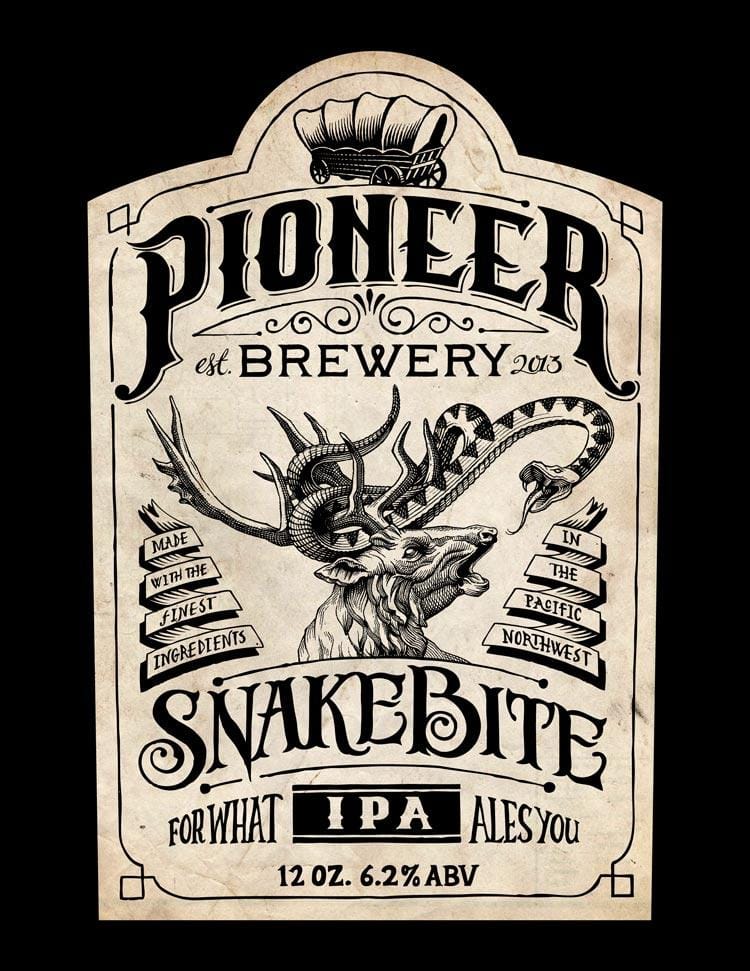
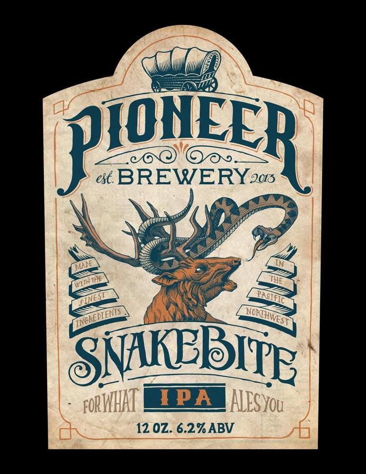
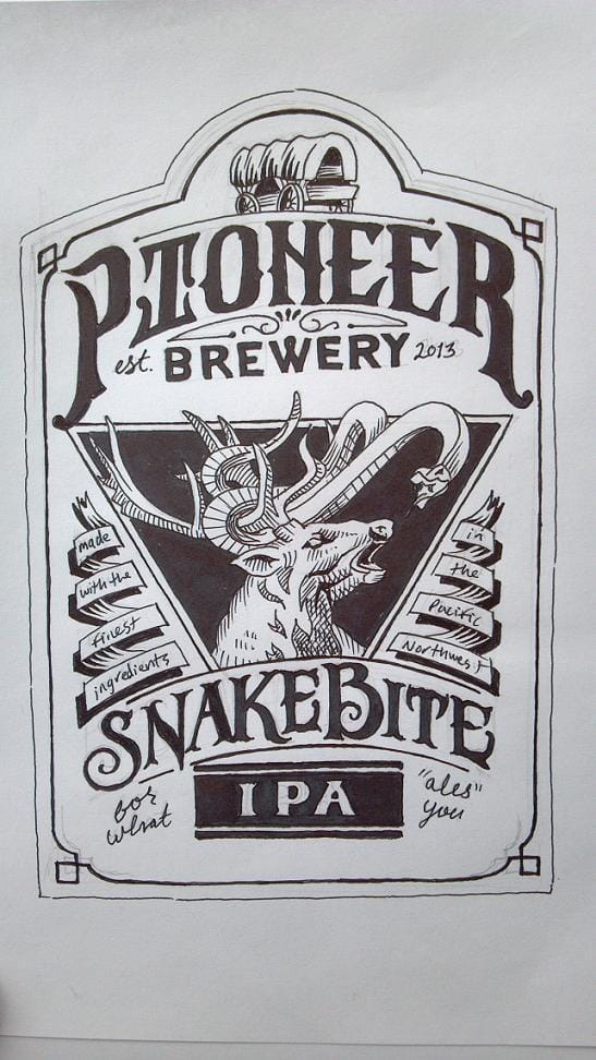
Pioneer Brewery: Snakebite IPA
6/19 Update (not really an update)
Sorry for highjacking the recently updated page, but as this class comes to an end I just wanted to say thanks to everyone that has taken the time to view/appreciate/critique/consider my project. To see this kind of overwhelming support has been very encouraging. And a huge thank you to Mr. Contino for giving us all access to his insight for twenty bucks. Unbelievable...
6/9 Update
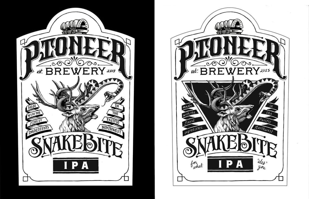
I received a ton of helpful criticism during peer review, so I've updated my project based on some of the suggestions from Jon and other students.
1. Doubled up the outline and gave the strokes some width variation.
2. Brought back the triangle at the suggestion of Brianna, and put the deer and snake in an environment. Hopefully the tree background serves to fill in some of the awkward negative space around the antlers and acts as a background texture, rather than a distraction. J.J. Mentioned the illustration was a little right-leaning, so I figured the geometry of the triangle could help balance it back out.
3. Doubled up the outline on the triangle with varying stroke widths to match it to the over all outline.
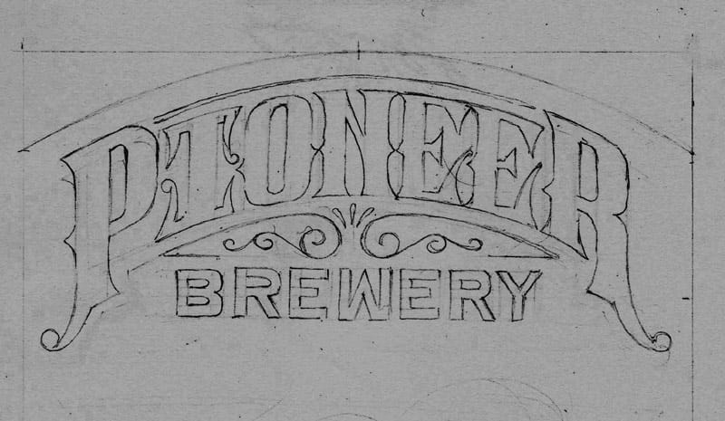
4. Centered the "tear-drop flower" below PIONEER.
5. Gave the wagon and mules/horses a little bit of ground to stand on.
6. Jon mentioned the type and illustration were too separate due to the type being flat and solid, so I added an old-school hatched drop shadow to PIONEER. I think the hatching helps connect the type to the illustration and helps to give the logo a little more importance in the hierarchy.
7. I liked the idea Keith mentioned in the comments about a weathered navy on a sand colored background, so I settled on this navy for color. I like the monotone look, but all black felt a little boring.
5/27 Update
One more update before peer review. Today I got around to drawing the wagon and the type for "est. 2013." I decided to stick with black and white for the fianl design (for now) and maybe experiment with color later on. I added some texture over everything to give the design a weathered look.
Here's the wagon. I attempted to draw several versions of this thing with no luck, but I'm pretty satisfied with this one:
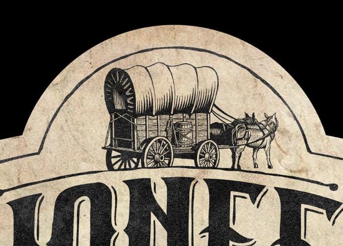
I think it ties the logo in with the illustration of the deer. Here's the full version with texture:
5/26 Update
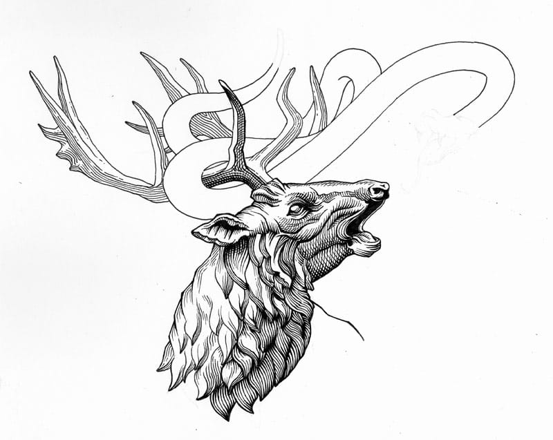
A couple of people asked in the comments below if I would talk about the process of inking the deer in a little more detail:
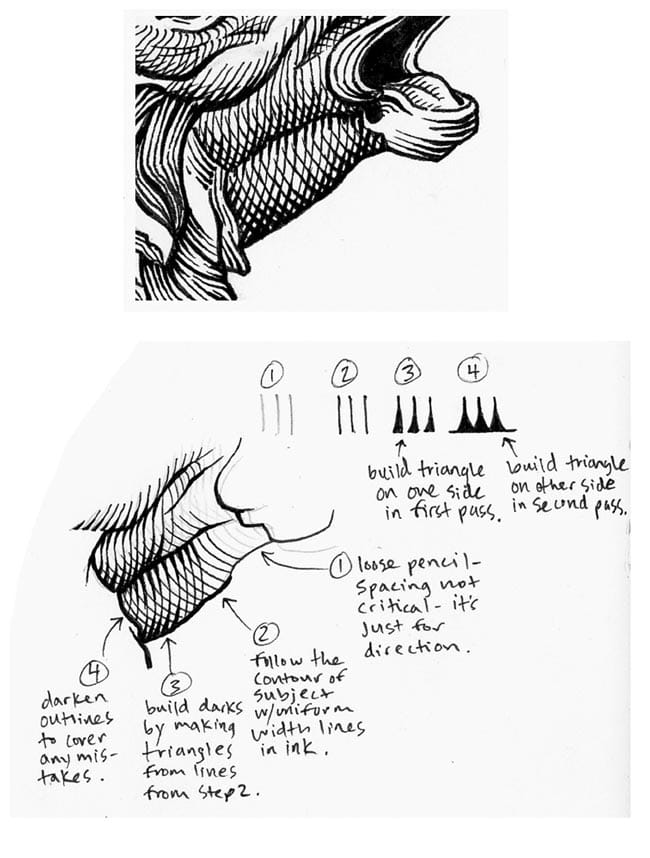
The nice thing about building weight on both side of the line is that if I get a couple lines too close or too far apart in step 2, I can build more weight on whichever side I need to make them look more uniform.
I am by no means an expert at this technique, so I have plenty of reference material handy for when I am inking. I'll usually just google "hatching" or "etching" and look for an image that has a similar form or light source.
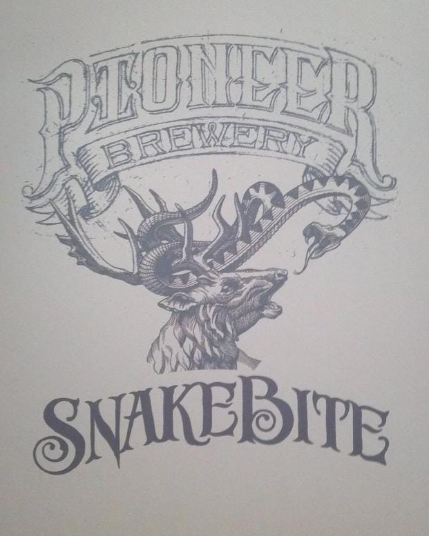
I re-drew the word Pioneer to make the "I" more legible. Actually, I only had to draw IONEE. I finally got around to drawing out IPA, FOR WHAT ALES YOU, 12 OZ. 6.2% ABV, and est. 2013. I'm pretty happy with everything so far, except for "est. 2013" and the wagon. So tomorrow I will draw those things again.
I kind of like the all black version on the textured, worn background. I was trying to come up with at least one color option for now, but it needs work:
I decided to lose the triangle to let the illustration breathe a little bit, too.
5/23 Update
Here's a scan of the inked version of the latest composition:
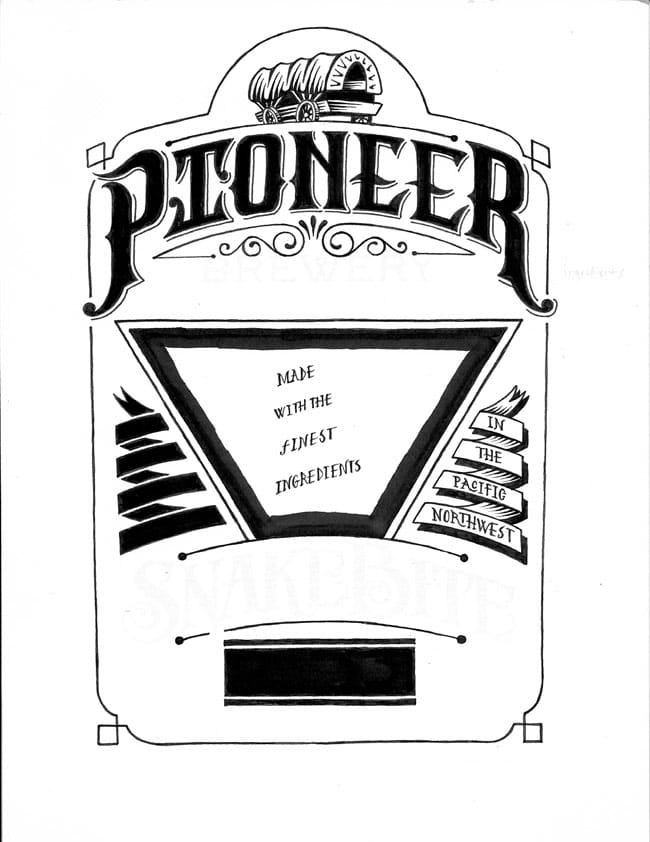
And here's where I am now, after assembling other elements in Photoshop (the wagon is just a placeholder for now):
Disclaimer: The letters "IPA" arent hand drawn yet, and the banner type on the right image, as well as the "est. 2013" are brushed on in Photoshop.
I'm not really sure about the triangle. I might try and make it smaller so that the illustration breaks out a little better. I really like how the banners on the right look, with the type reversed out, but that might be an issue with printing, given how small the type is.
I hope to have the wagon drawn over the weekend, in time for peer review.
Question: Does this latest revision still read as "PTONEER"? I think I've stared too long at this and can't really tell.
5/21 Update
Updating from work with MS paint and cell phone photos :P
I was reworking the type for "Pioneer Brewery" and found that a banner with some scrolls would fit nicely. After I drew it, I realized I didn't want every word on the label to follow the same curve. Here is the image anyway, since it is the only one I have while at work with the type for "Snakebite":
I also had a little time to start fleshing out the details of the full composition, and start deciding where I wanted to place my lights and darks. I'm thinking this will be one or two colors on a light background:
Since I am drawing each element of the design individually, it will be easy to compose them individually in Photoshop, and address spacing issues between them. Is this cheating? I don't know, but it's easier.
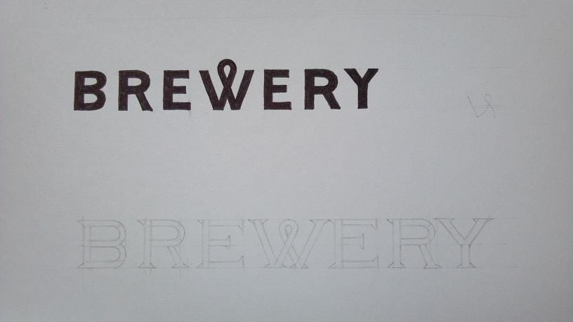
Here's a closeup of the two versions of type I'm deciding on for "Brewery":
5/18 Update
I spent some time drawing out the type for "Pioneer Brewery" to see how it would fit into my layout, and to make sure the right amount of importance would be given to this piece of information:
Once I felt comfortable that I would have enough room for the illustration and supporting information, I started to experiment with the deer and the snake. I went through a few different versions of the initial sketch, trying to get the composition to flow properly.
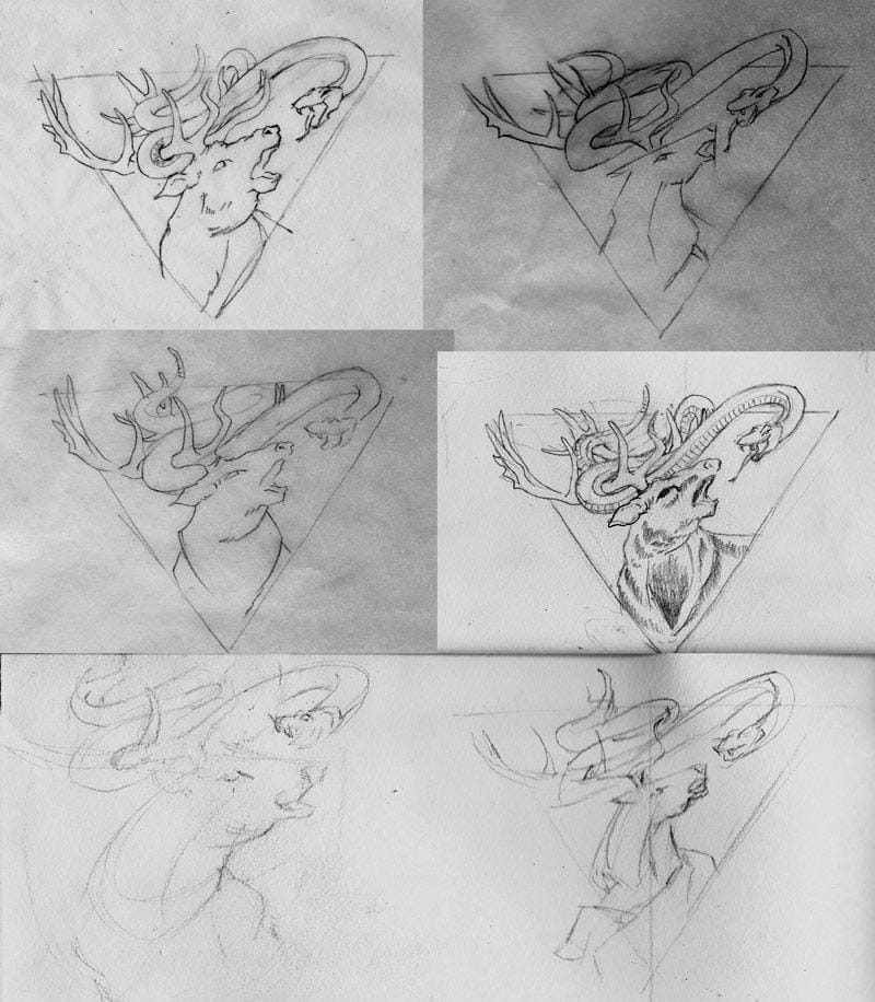
I finally settled on a combination of the deer from the bottom left, and the horns/snake from the middle right. I cut and pasted it in Photoshop to give myself a tracing template, this way I can stay as true to the original feeling of the sketch(es):
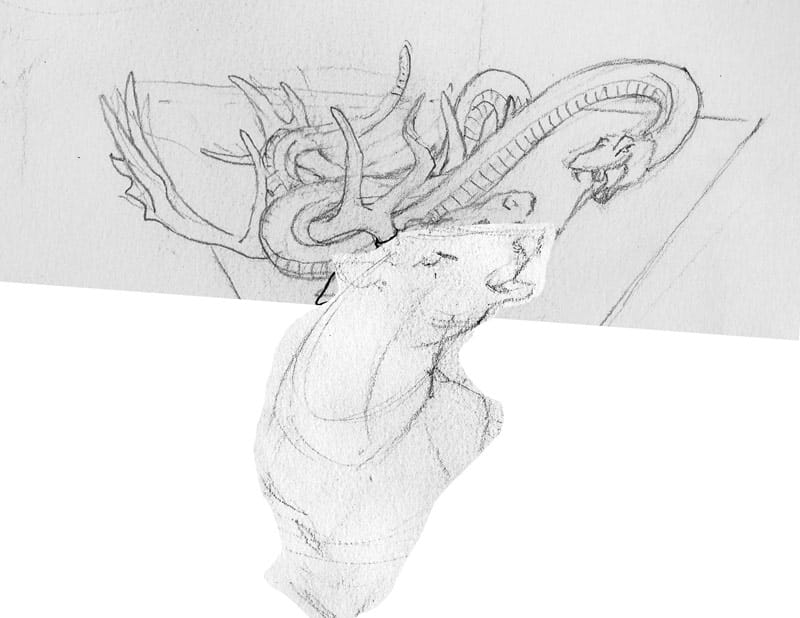
From here I nailed down the details of the sketch with pencil, and started inking. Here's the progress I've made today:
Here's where I started this class, but further updates will be made from the top down:
I live on a road called Pioneer, in what used to be a booming mill town near Seattle, until it was burned to the ground in the late 1800s. There is a ton of history here, so I decided to pay homage to my tiny town with a hand crafted label for my next batch of hand crafted beer!
Backstory
I began with researching American pioneers, and discovered that one huge problem they faced was that of snake bites. They had many interesting cures, including grinding the horns of a Red Deer Stag into a powder, mixing it with water, and applying the paste to the wound. But the one that seemed the most popular was to get the victim obnoxiously drunk.
Concept
My plan for the label is to make it look like an old bottle of elixir, featuring an illustration of a Rattlesnake fighting a Red Deer stag. The illustration will be a fun way to represent a problem and a solution, while carrying on the theme of 1800s pioneering in America.
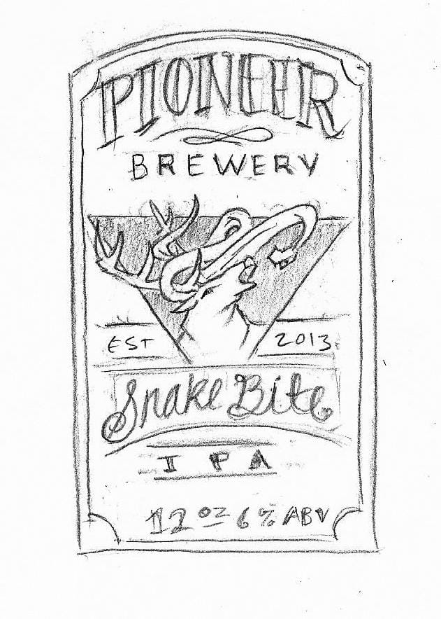
Here's a quick sketch of the layout: