Niswa Re-brading
Logo
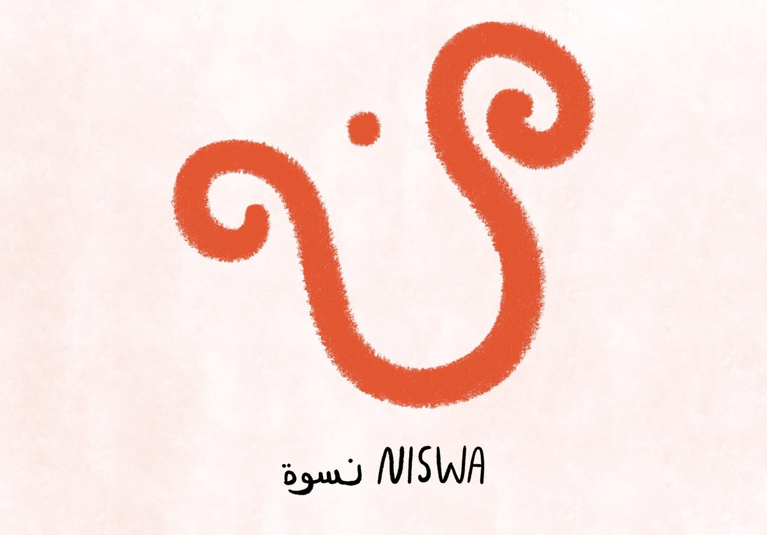
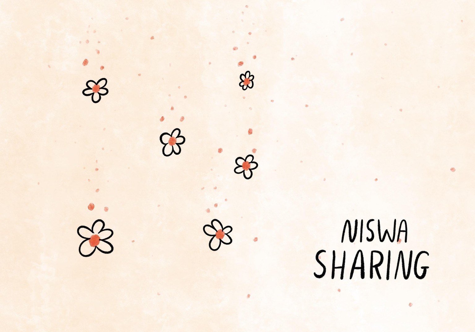
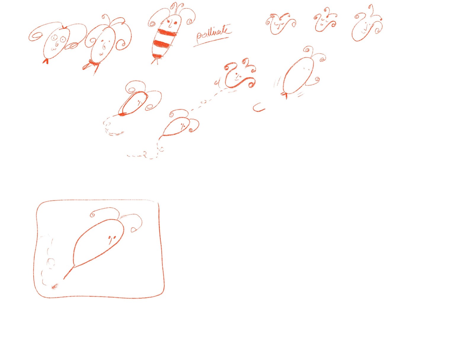
Niswa strives to empower women by raising awareness on women’s health and its environmental impact. It aims to create a community where women are connected to the environment and are in charge of their bodies, fertility, beauty, and health. For the style, I choose the contrasting lines and the fluffy brush to give the sensation of something very silky, simple brushes and contrasting shapes, and colors, using lines and textures. Typeface: handwritten, simple, Arabic and English incorporation, my own hand lettering. The logo content: logo gives the fluffy sensation, cozy, gentle, wholesome, embracing. The bee, Women Uterus, and The Arabic letter “Noon”.
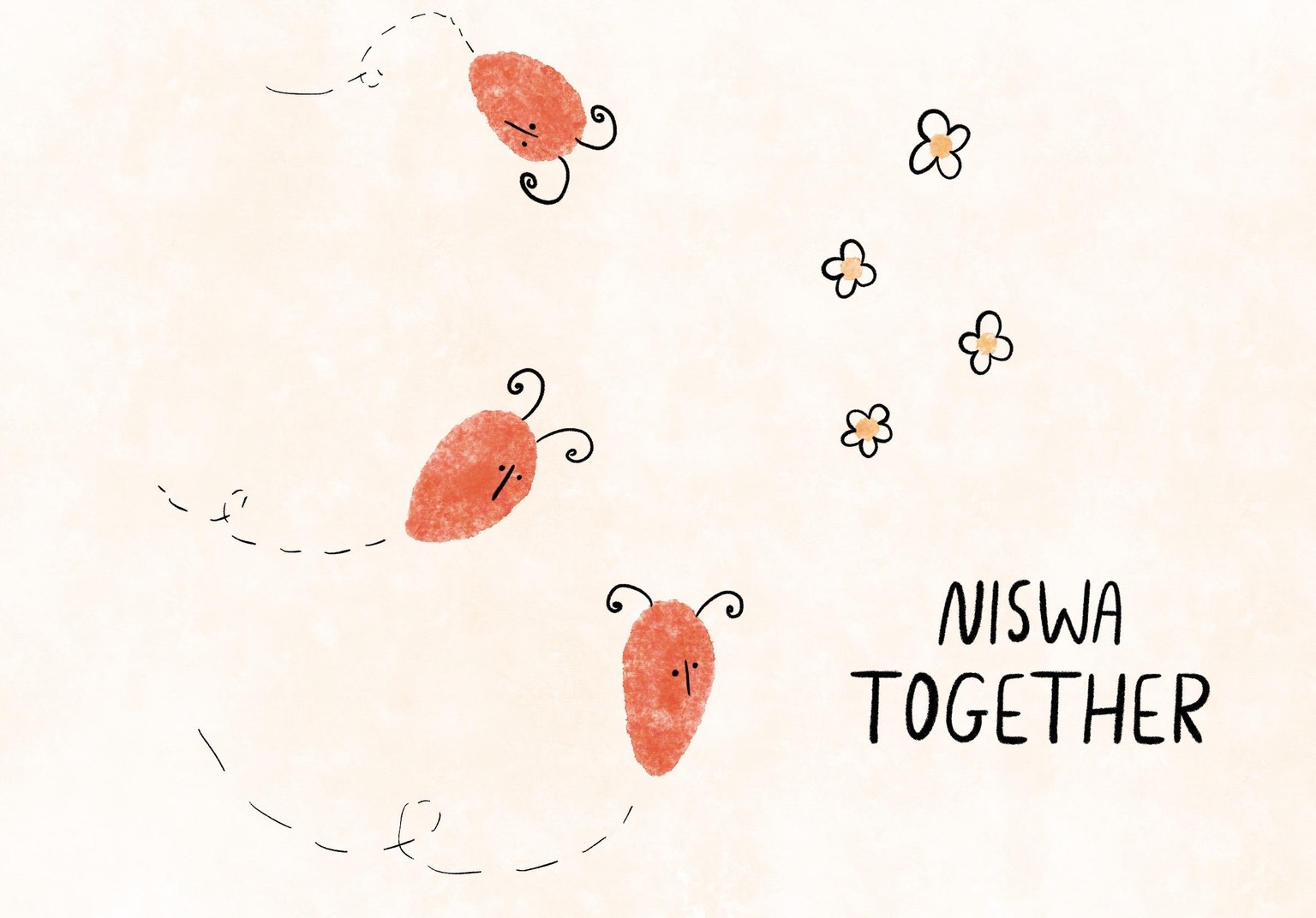
Branding was focused on the story telling, where I create a series of pictures, that tells an unforgettable, and unexpected, relevant story telling for the I divided the story into three pillars:
1. Augmented reality
2. Collaborating together
3. Sharing the knowledge.
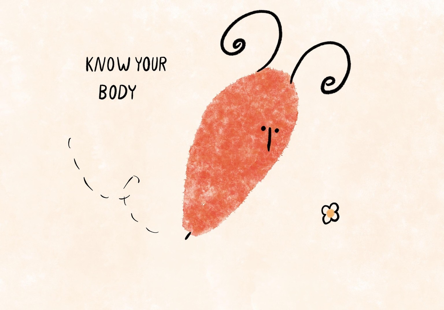
The story telling of the brand identity: 1. Augmented reality using The Tagline “Know your body” Where Niswa is the bee and it’s pollinate the flowers,
the story and the logo study:
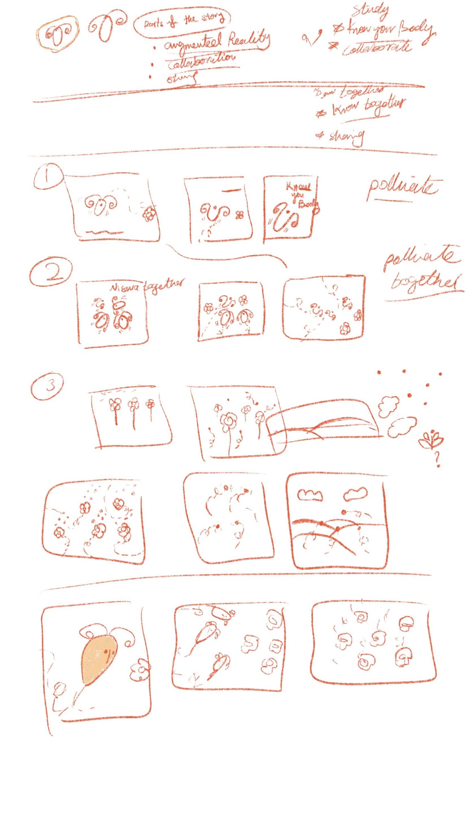
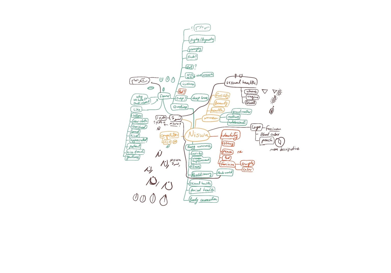
The mind mapping: