NYT "At Home" Analysis
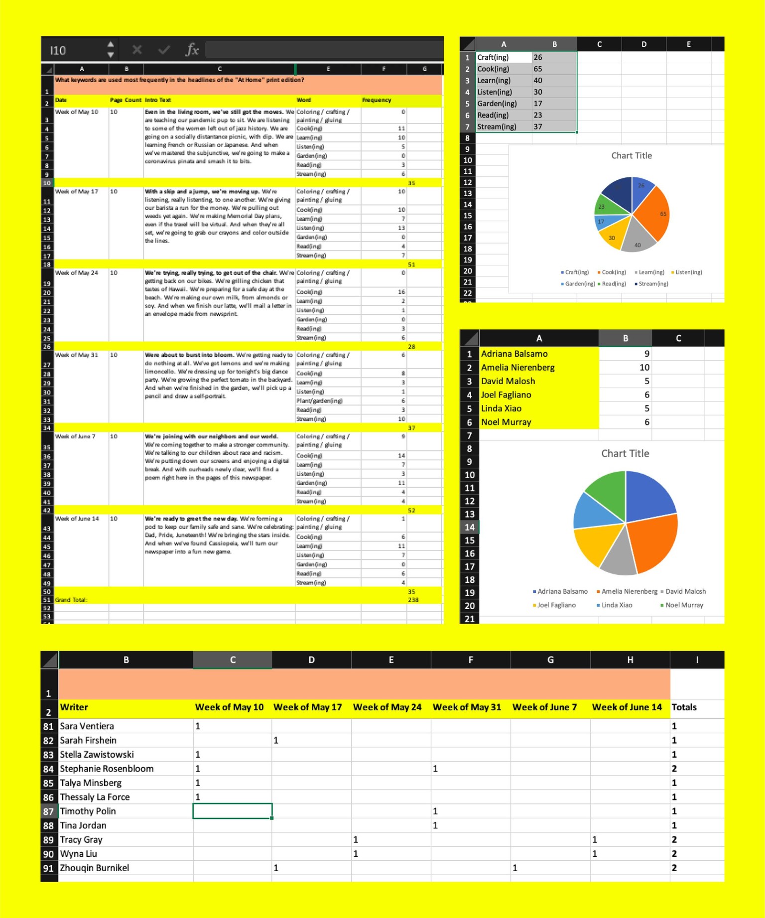
Info: I decided to deconstruct a series of 6 issues of the recently added "At Home" section from the Sunday NYT. I measured a few word and writer / contributor frequencies across the 6 issues I chose (5/10, 5/17, 5/24, 5/31, 6/7, 6/14).
The Experiment: Each print edition of “At Home” includes articles on cooking, parenting, exercising, relationships, arts, crafts, outdoor activities and shows to stream. A litany of things to do, make, watch and listen to while stuck at home. I chose a list of words at random to conduct this data visualization experiment. I also decided to catalog the color palettes of each week’s cover art, and then tracked the writers and contributors to track frequencies.
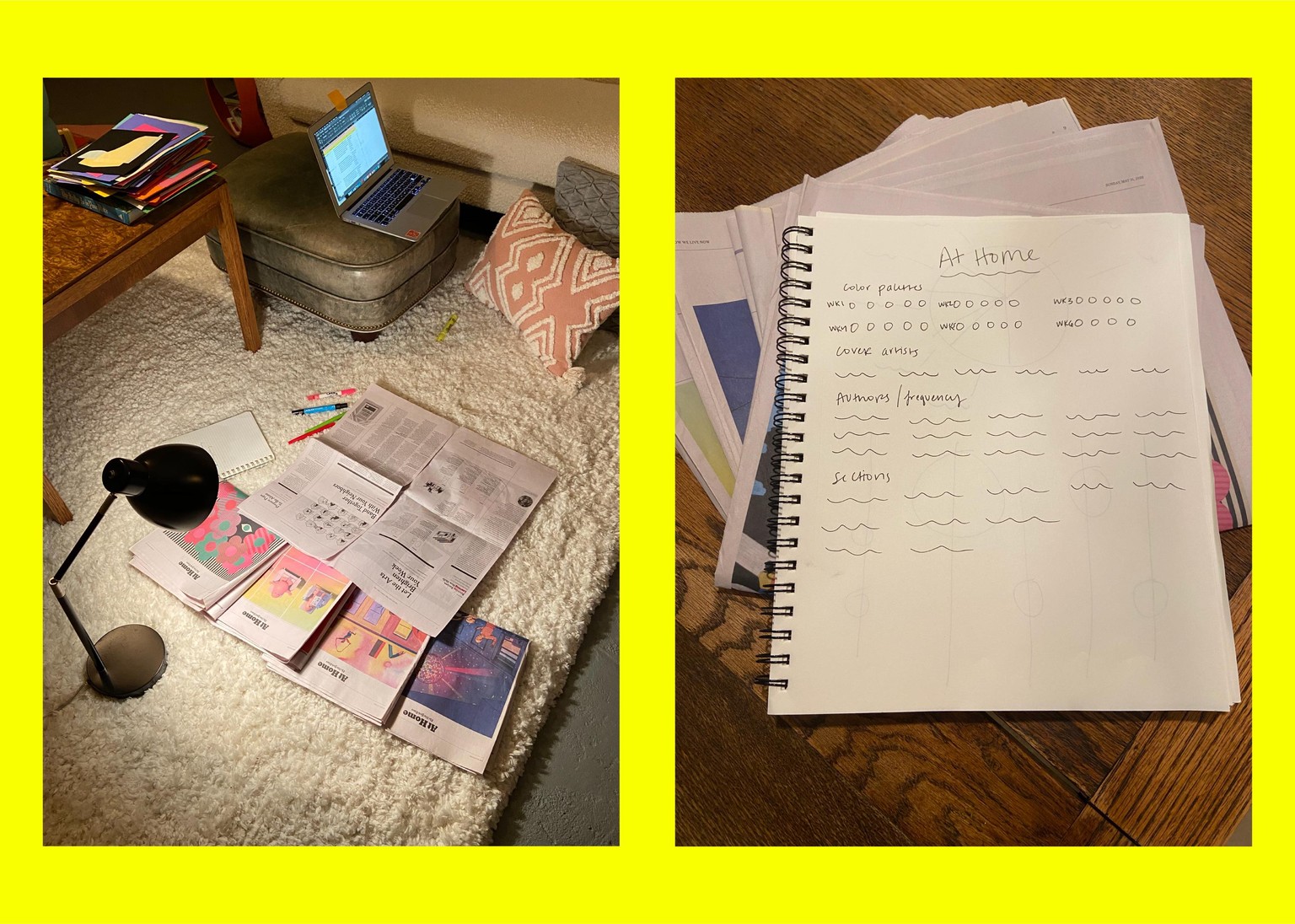
Here is where I landed for now!

Process: I synthesized all of my data and created test graphs in Excel. I then recreated the graphs in Illustrator. For the final poster, I built everything in InDesign. Here is a look at my spreadsheet and a few of the sketches.
I really enjoyed this course and learned a lot along the way. Thanks, Nicholas!