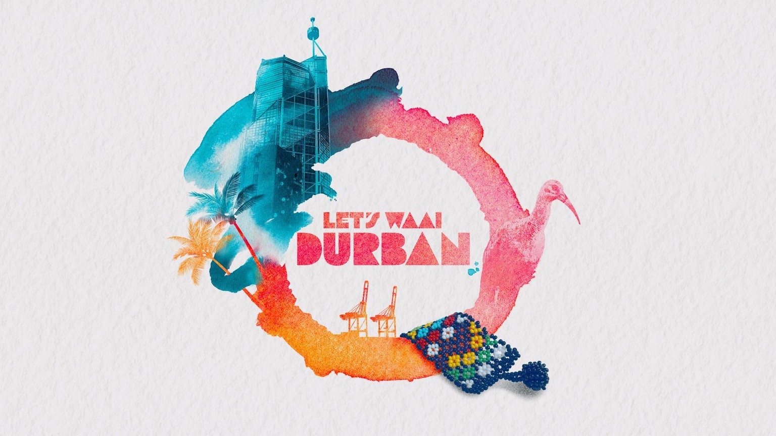
My City Postcard (Durban)
Whoah.
So, create a postcard to represent my city, that will also stand as the demo for the class. Well, the process was super fun, and made my city feel like home again!
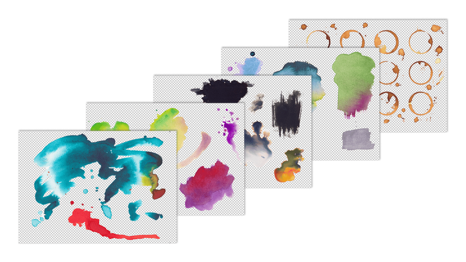
First, I created a whole bunch of textures, to give myself plenty of options once I reached the Composition phase. Knowing I'd be releasing these as downloads for the class certainly played a part in the variety of mediums and shapes.
I actually used these two to create my postcard.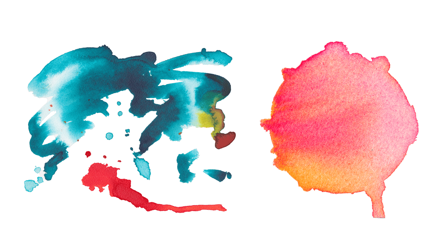
They're both Acrylic Inks, which I thought had the best vibrancy to represent my coastal city. I thought they had a natural contrast which cued the sub-tropical humidity as well as the cool ocean.
With the textures done, it was time to grab some Photos and Vectors to bring the concept to life, so along with a friend, I headed into the city.
I'd set myself a goal of finding imagery within five categories:
Architecture (landmark)
Animals (endemic)
Botanicals (endemic)
Industry (what my city is known for)
Trinkets (unique and interesting)
I was really happy to get the shots I needed, and process them according the to the class techniques. The choice of imagery is well-explained in the class!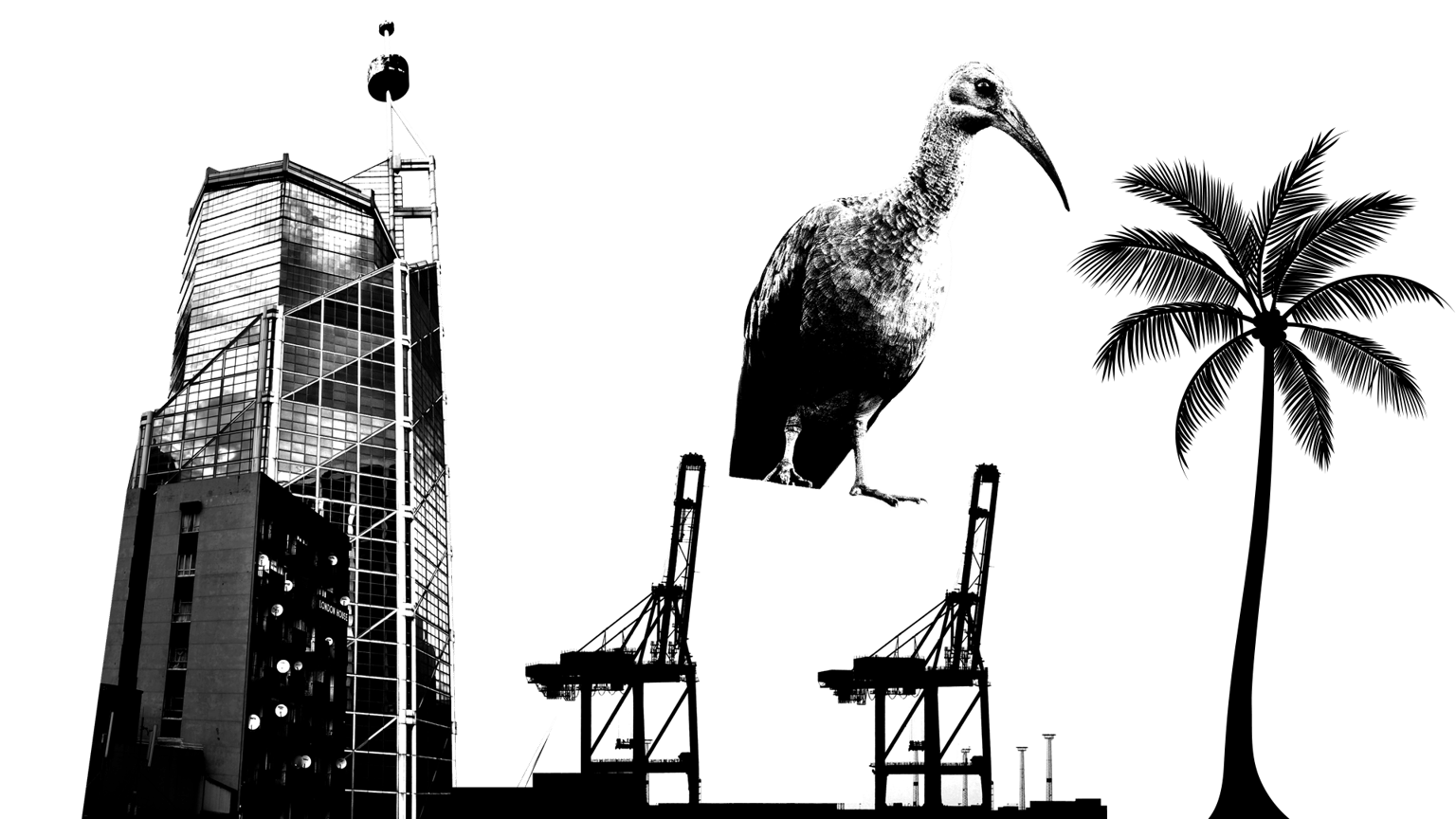
With all the assets collected, it was time to sketch some ideas for the composition.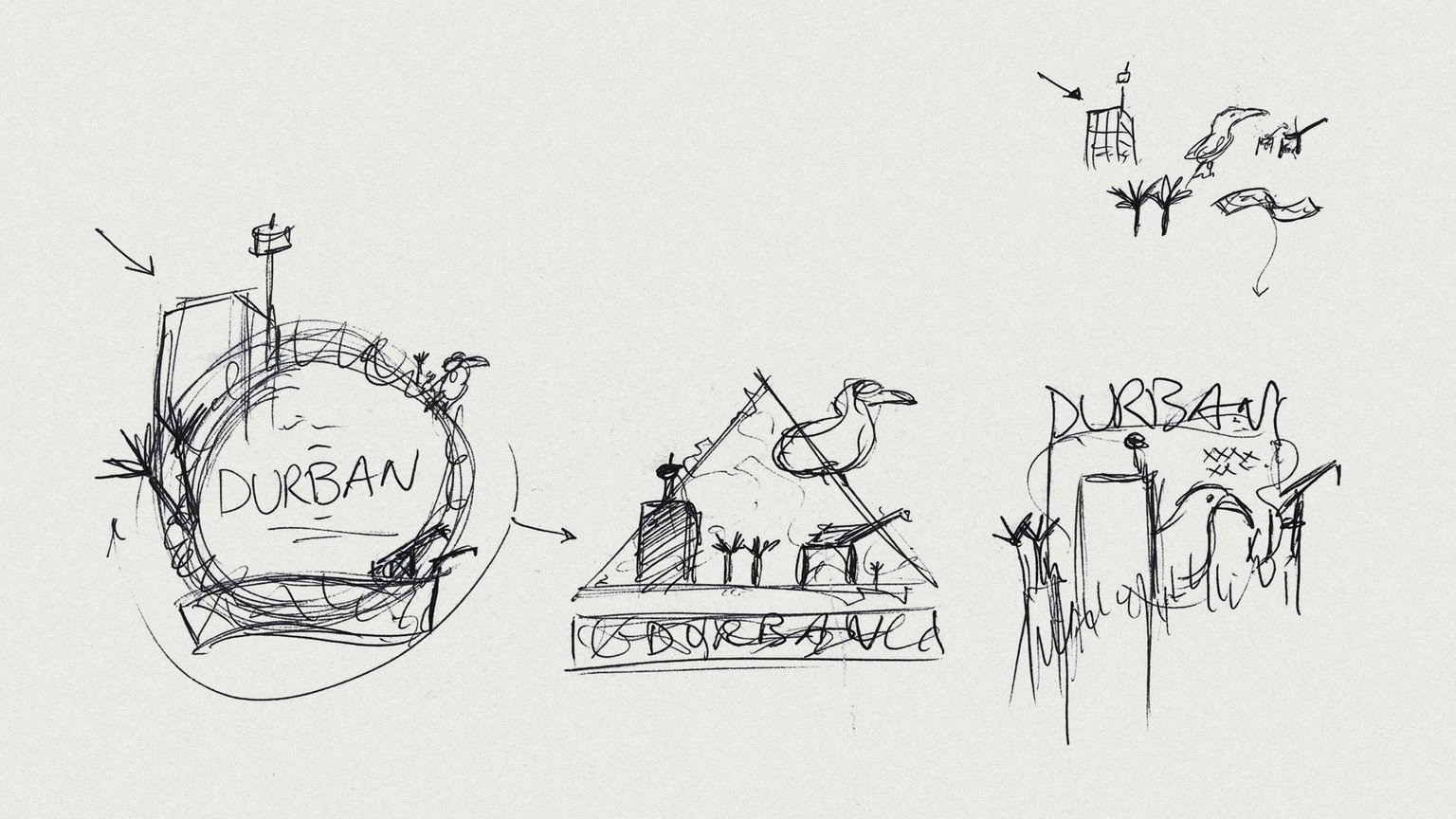
The Final Postcard
The postcard design ended up pretty close to what I sketched above, with just a few alterations that better suited the textures used, and the overall balance of the illustration.
I was really happy with it, and the initial prints looked good enough to use in the class intro!