Logo Design/Animation
Introductions – Who I am
Hi all,
My name is Brandon Mata and I currently attend DAAP (the school of Design, Architecture, Art, & Planning) at the University of Cincinnati. It is here that I pursue my passion for motion design, and design in general.
As an aspiring motion designer I itch to explain my current bumper but limiting time and resources to do so, will stick to the branding aspect of my design. (you can view my logo bumper animation at my website: www.bmatadesigns.com/Logo-Bumper or alternatively like/follow on my vimeo account at Logo Bumper
I thought it'd be nice to share with other aspiring/learning students or otherwise, my process of self-branding & logo exploration.
I strongly feel as though the process to creating any design can be as beautiful and engaging as the end design. That said, it can also be frustrating and challenging, but as the saying goes, nothing in life that is worth doing is easy.
Step 1 – Establishing boundaries for your brand
There is nothing more frustrating as well as liberating as having no limits to what you can put down on a canvas. Sometimes living in a tight box will open your imagination to what exists outside of it.
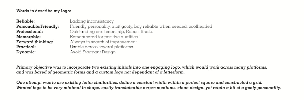
That said I like to have some constraint in any project to better guide my thinking. So I first started with a word associations exercise to establish how I wished to be percieved, as well as how I viewed my own ethics/truths:
(click for bigger imager)
Step 2 – Establish a visual anchorpoint: Moodboard.
It is important to note that establishing a visual language can go a long way, and can save you alot of time and frustration if you take the time to pull inspiration. If you are not familiar with a moodboard, id recomment looking at some on pinterest, as these are better examples than on google.
Unfortunately I did not have the foresight to do this at the begining of the process, which led to alot of wasted time scratching my head for a starting point.
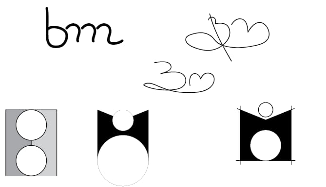
Step 3 – Ideate/Sketch/digitize.
I began sketching with my primary objectives/word associations in mind. This eventually led me to this piece which I really enjoyed,
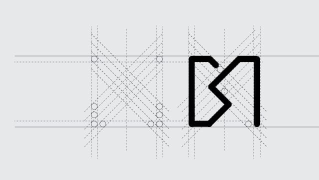
and began exploring digitally:
(click for bigger imager)
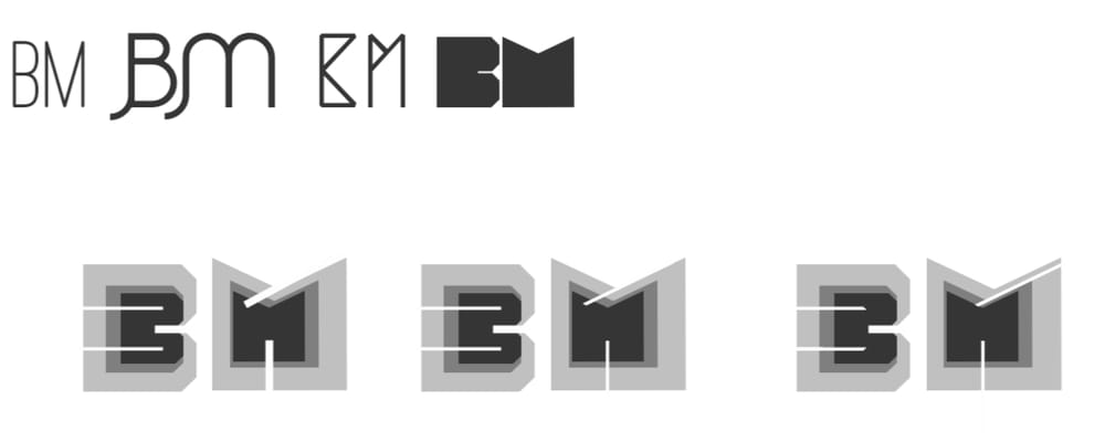
It is important to note that at this point I had fallen in love with the grid I was working with but soon realized that (as mentioned in this lessons video) sometimes you need to kill off the ideas you love most. I had hit a rock and wasn't feeling moved so I moved to the next step...
(also it was getting alot of 'MTV' vibes from collegues which I wasn't aiming for)
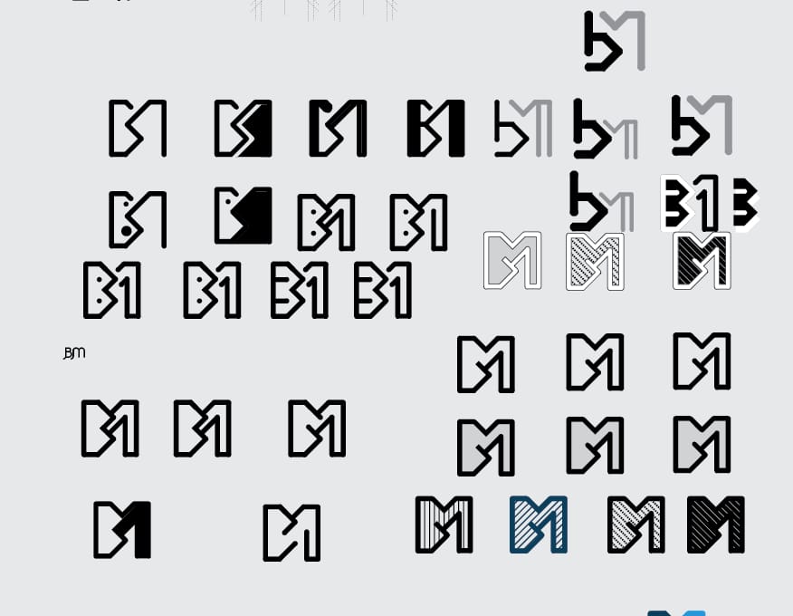
Step 4 – Explore, Explore, Explore
When you don't know what else to do? Do more. So I ideated more and more, each concept different then the rest (or sometimes slightly different). This gives a better breadth of possibilities rather then pidgeon holeing your concepts right off the bat.
I designed loosely and not particularly precise, so as to get as many designs in as short of a time period as possible. (I left some many out for their particularly embarassing 'looseness')
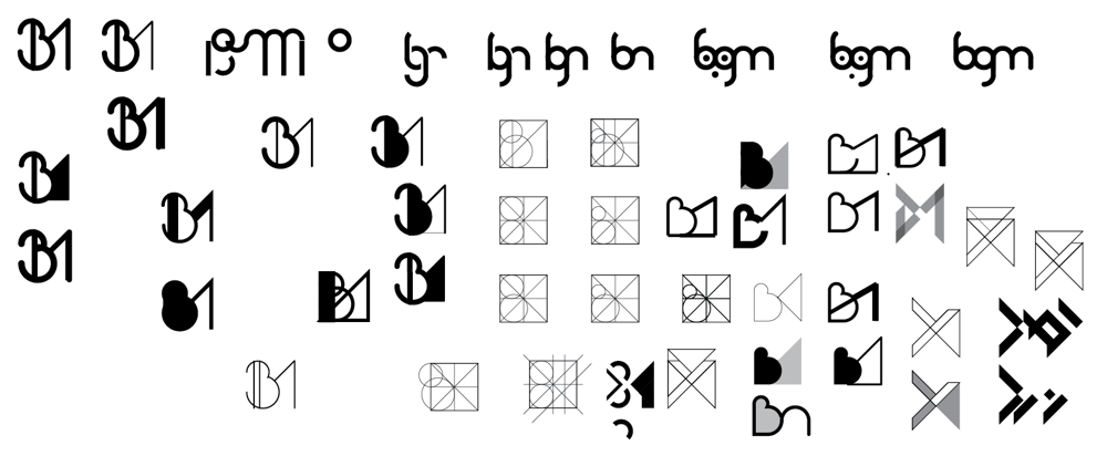
(click for bigger imager)
If you notice, you can even spot the beginings of the logo in the top right, and how they formed through ideas gleamed in the top left.
Once I had a few solid peices I moved on to the next step.
Step 5: Define & Refine
At this point I chose the logos which I felt were moving towards my goals and set up a board:
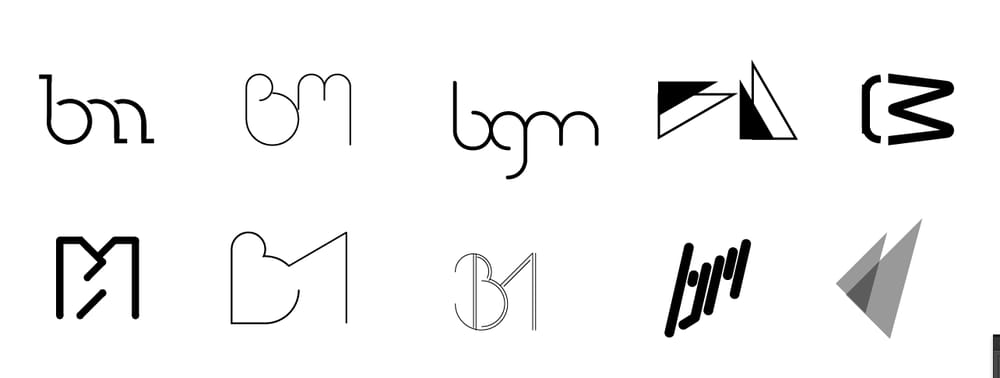
I then revisited my brand word associations to check which ones I felt were on a good track. I also refered to collegues on which were working best and asked why (sometimes a fresh eye advises best).
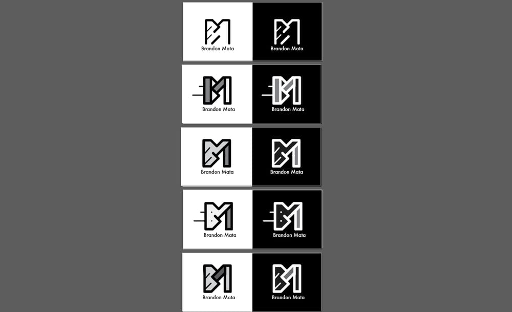
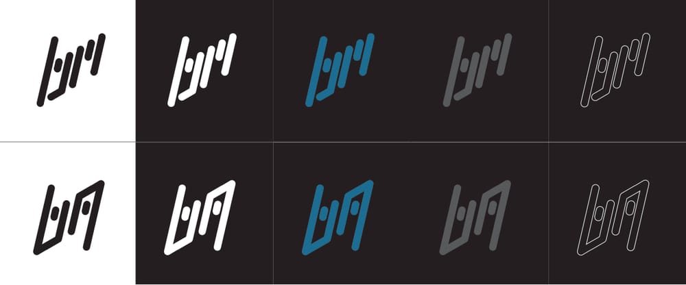
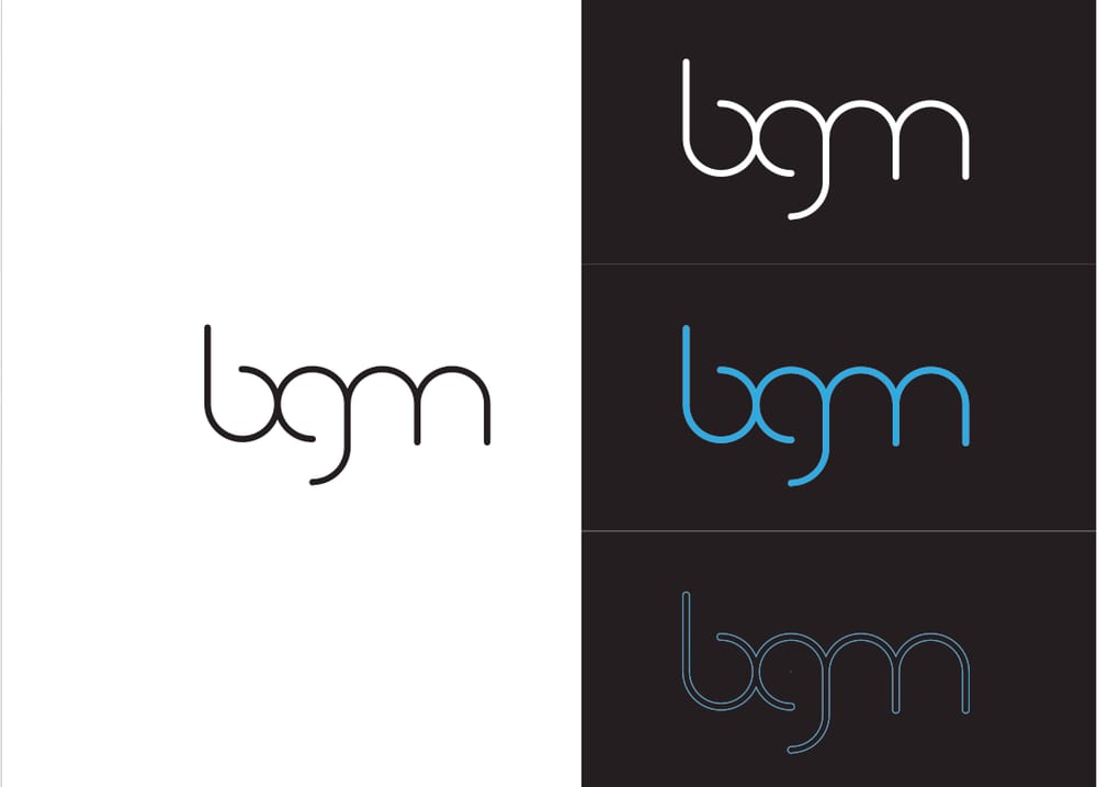
Step 6 – Color Handling & Final tweeks
Blue is my favorite color and personal associations carried by blue often fit my character: relaxed, cool-tempered, fluid. I also still enjoyed some aspects of these final designs and wanted to compare them in all aspects as well as potential varients that would improve the style of the design.
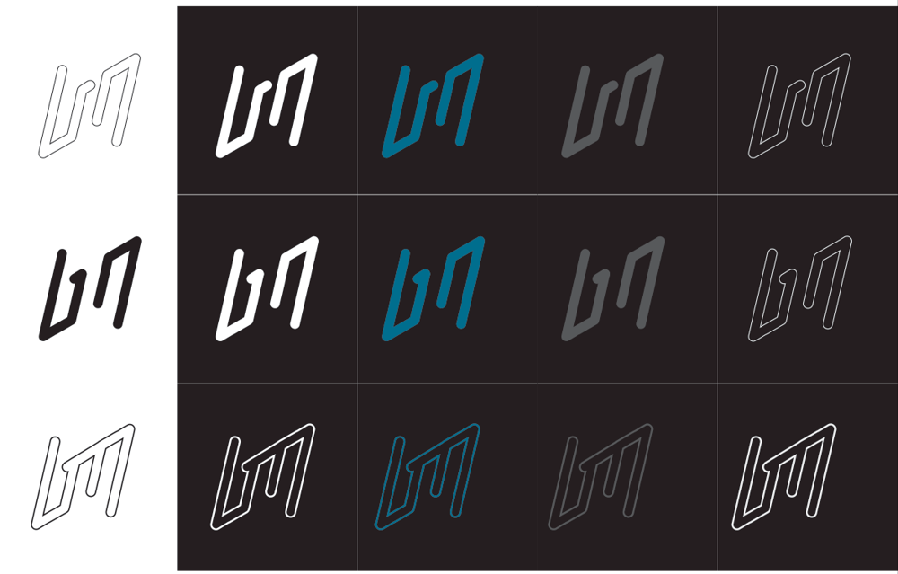
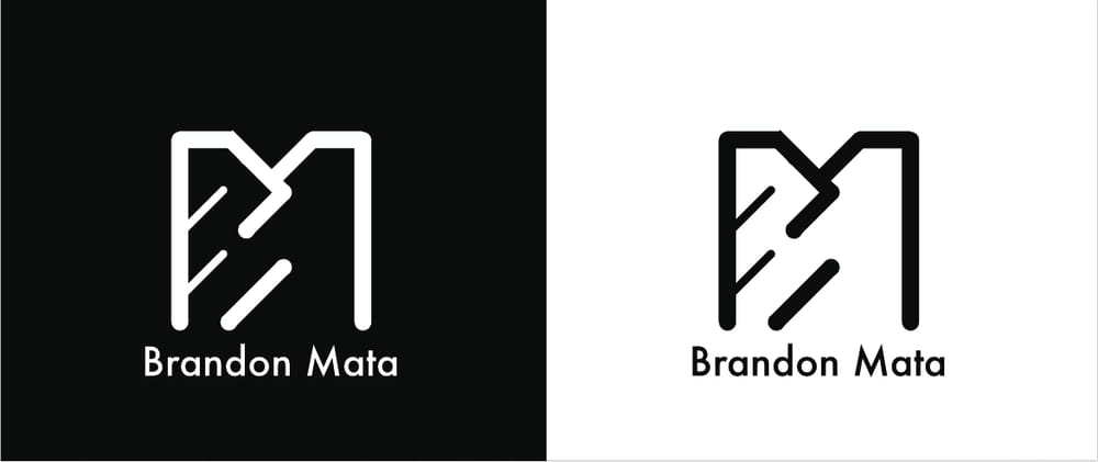
Step 7 – Finalize design!
At this point I narrowed it down to the following design, with a potential alternate. I felt as though prior blues were not making the cut through the black and I enjoyed the neon digital aspect to the design.
Final Notes
So this write up was a little longer than I had anticipated but it is my hope that maybe someone might gleam some inspiration in their own work, workflow, or even what to avoid! Design is never final and I can't gaurantee that I won't rework my logo, but such is the plight of the designer :)
Last learning from this project, always remember that if your in a fix and don't know what to do step back and rethink your strategy: "Work smarter not harder"
Thanks again for viewing, reading or watching!
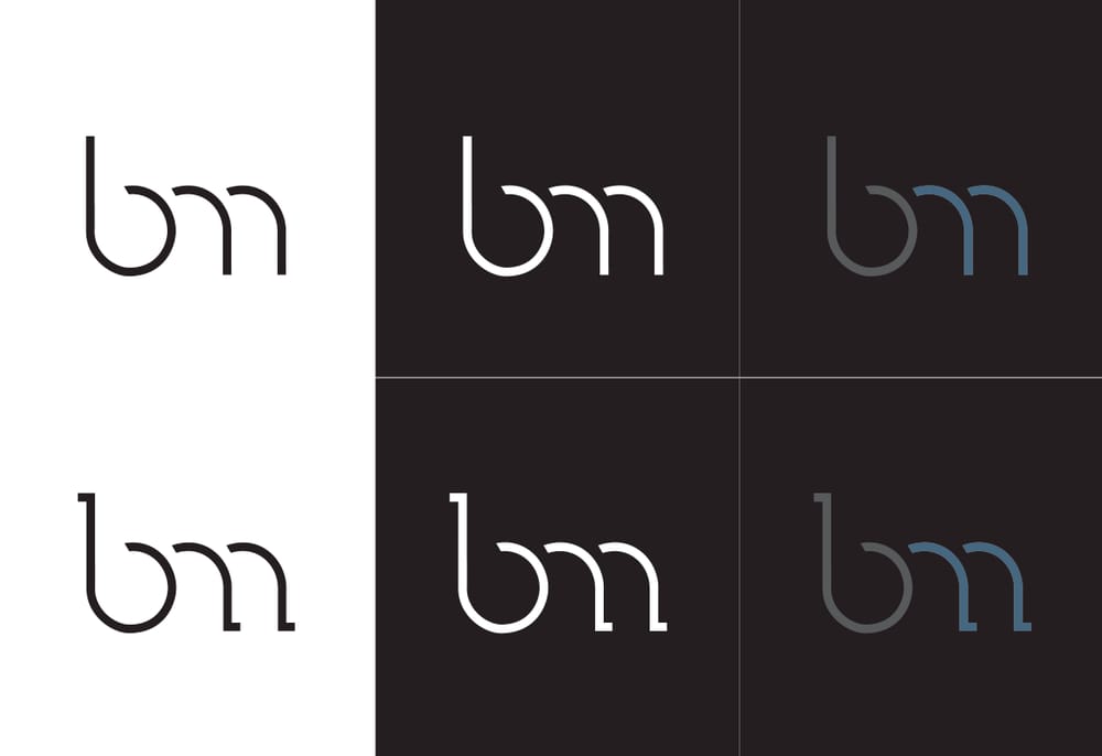
– BGM
(www.bmatadesigns.com)