Let's find a place to get lost (Part II: Color and Texture)
UPD: I want to thank Mary Kate for the great challenge. I really enjoyed it!
____________________________________________________________
Hi guys!
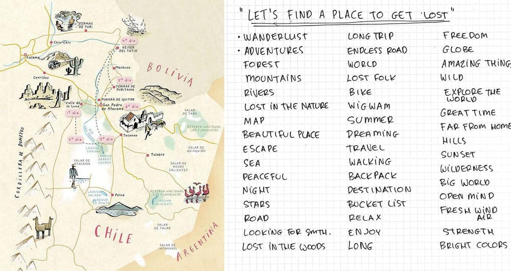
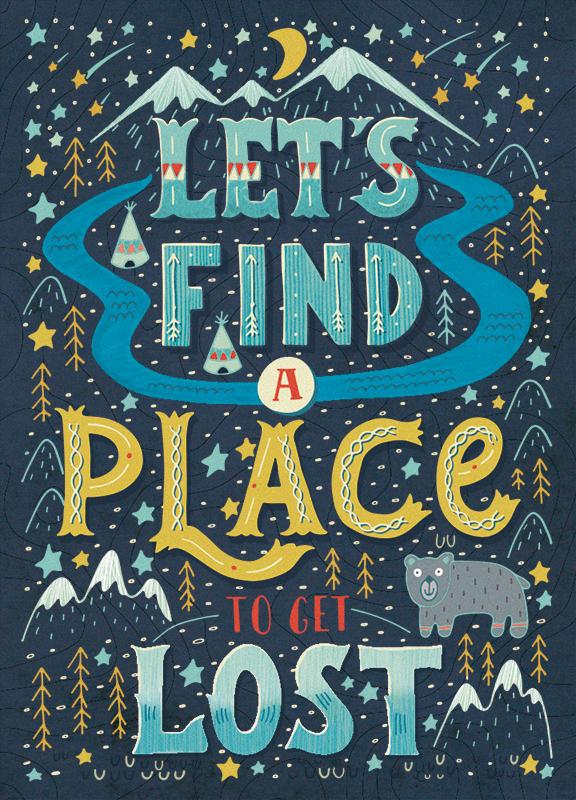
Here is my first project step. I love traveling. I like to discover new places in the world and sometimes to get lost somewhere. This why my phrase is: “Let’s find a place to get lost”.
July 14, 2015
Inspirations:
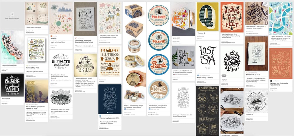
Here is my moodboard on Pinterest:
Some initial warm ups:
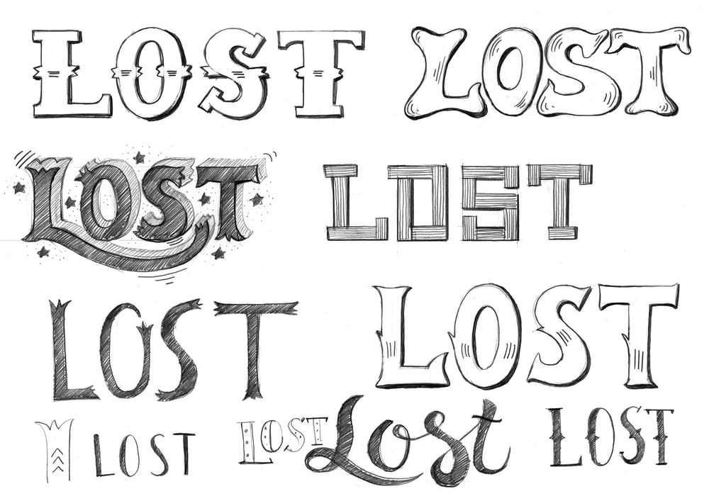
Thumbnails are very sketchy: :)
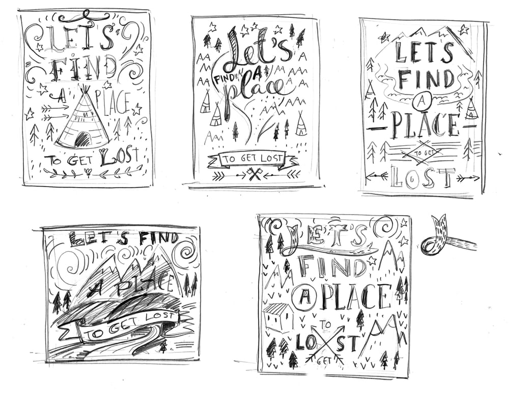
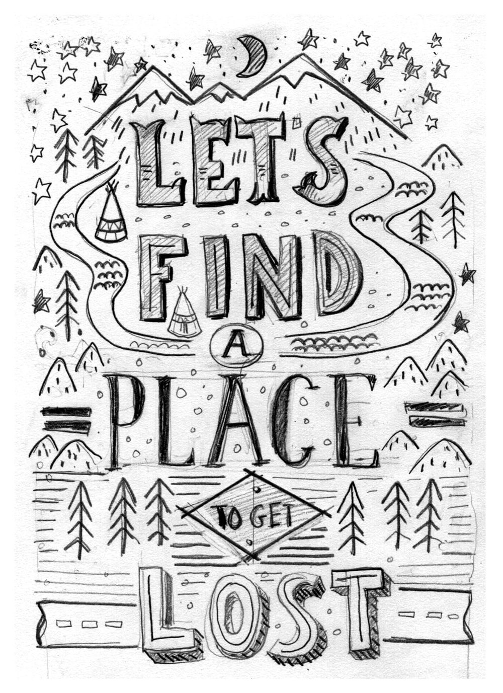
The first very rough sketch:
UPDATE: 17 july 2015
These days I had some more time to think about my drawing and I redrew it completly. May be it is too much, but I like it this way.:) I think the style of the letters is now much more suitable with the whole picture, the most important words are quite equal and another elements are situtated on the right place. All those things make the picture more logical and cohesive.
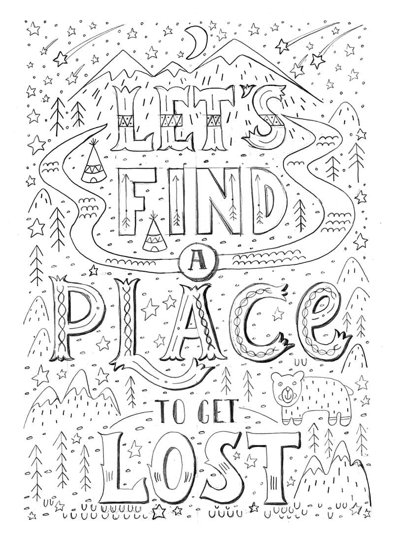
Starting to ink..
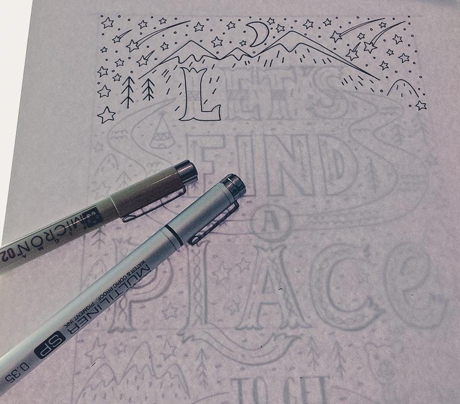
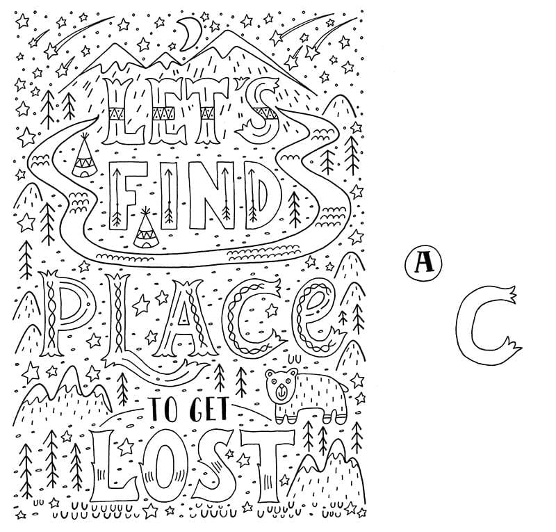
Here is the inked image. May be I'll add some kind of shadow to the word "lost" as on the final sketch, but first I have to think about the coloring of this word.
UPDATE: 25 july 2015
Thanks everyone for the wonderful feedback!
Now let add some colors to the image!
The coloring was the hardest part of the project. I didn't realize how many colors I had to use. So it was quite difficult to combine the colors with each other and at the same time I had to make the words as much as readable. I think it turned out pretty well:)
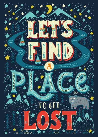
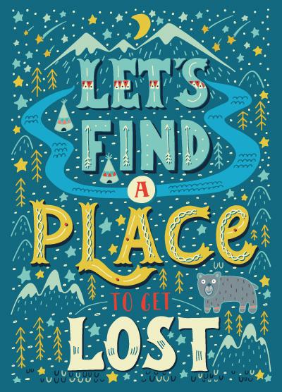
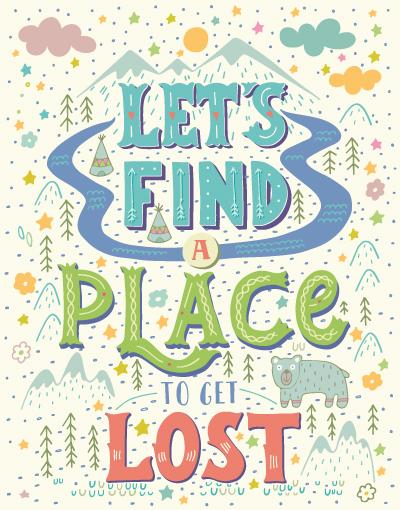
I couln't choose the best version. So I let you see the three versions I like the most (may be the second one I prefer a little bit more). What do you think? I'd appreciate all your comments about the coloring.
UPDATE: 31 july 2015
The last step of the project is texturing. I've made a couple of textures by my self but some of them didn't look very well, so I had to cheat a little bit with two textures (on the right side) from this wonderful site: http://blog.spoongraphics.co.uk
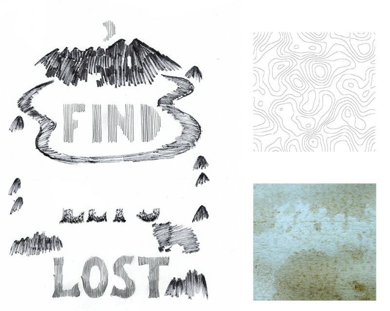
As a finishing touch I added some highlights to the letters and a little bit noise to the whole illustration.
And this is the result:
Everyone who supported me during this challenge, thank you very much!