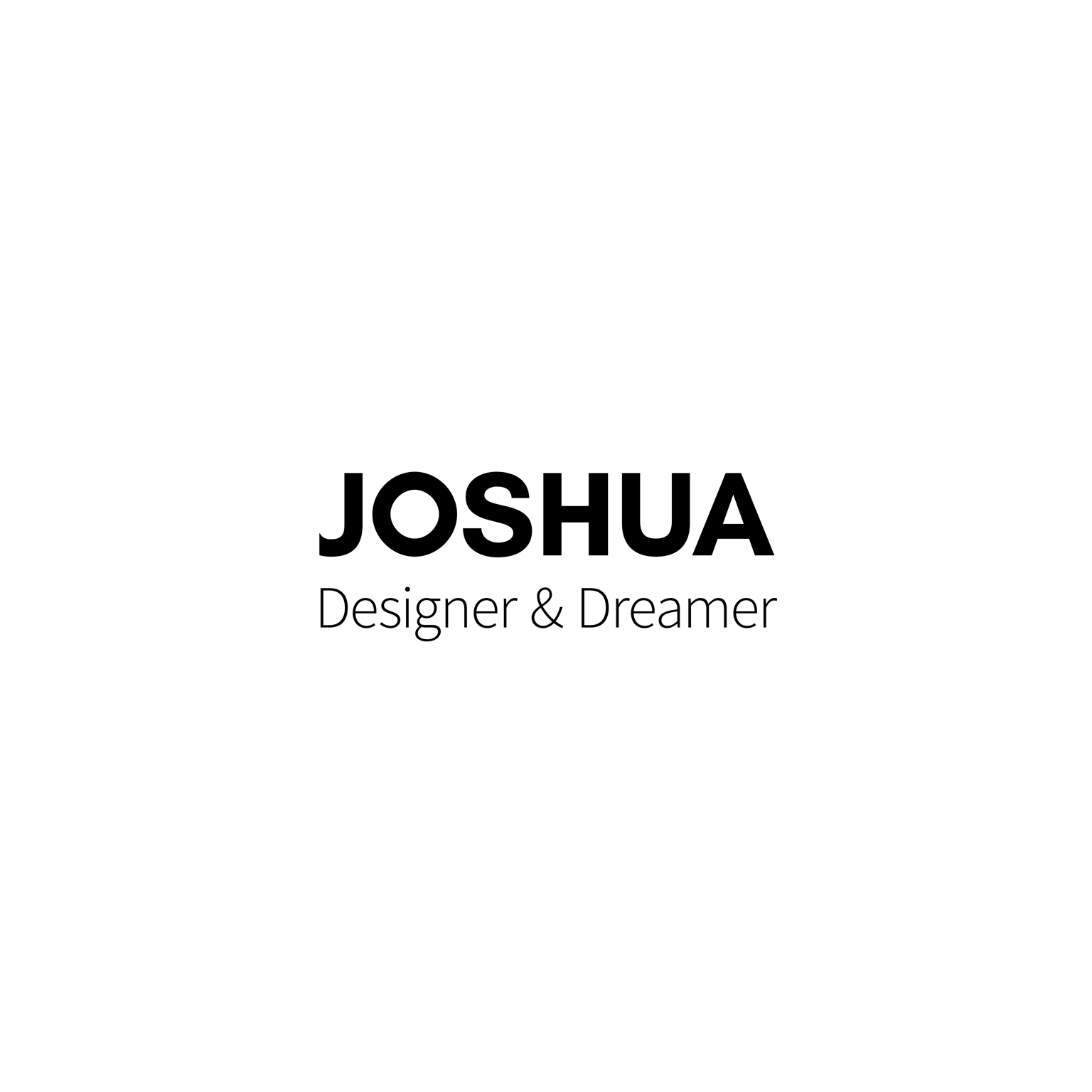
Joshua: Designer & Dreamer
Thank you for a lovely class and a wonderful opportunity to practice pairing typography.
Composition 1 (Dreamlike)
I really enjoy fonts that have high contrast in the strokes, and one of my favorites is Commercial Type's Dala Moa. I've set it in Medium, All Caps here with Lato Thin.

Composition 2 (Vivid)
Of the free typefaces I've picked up outside of Google Fonts & other curated libraries, Glacial Indifference stands as one of my favorites. It's set here in Bold with Source Sans Pro, Light.
Composition 3 (Flowing)
These are two fonts I have loved using separately in projects. I really like the look they have together - Work Sans, Regular reminds me of a stone in a flowing river of Playfair Display, Bold Italic.
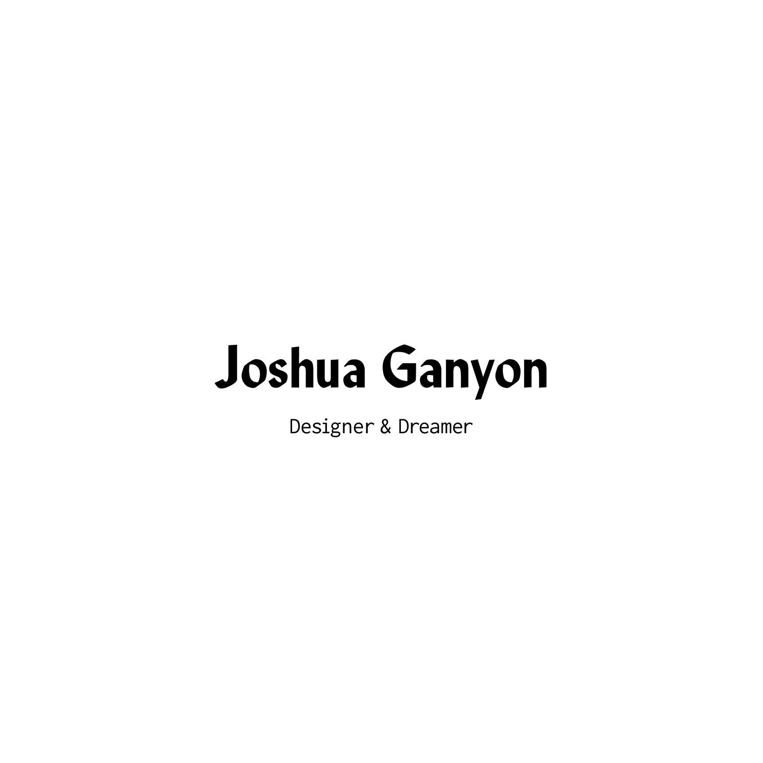
Composition 4 (Visionary)
I settled on this final version after creating four others. I began by using the typeface Lust, but decided it was too round and voluptuous to pair with the remaining Inconsolata, Bold. I then tried Romana but there were still too many curves. I then remembered that MPI Sardis, which is in the same vein in my mind as Romana, has blnt corners and a lovely calligraphic style.