Impressionist Drawing Vol. 1
My course drawings.
First apples exercise. Ooooh colour :-)
This was 'light green' paper apparently.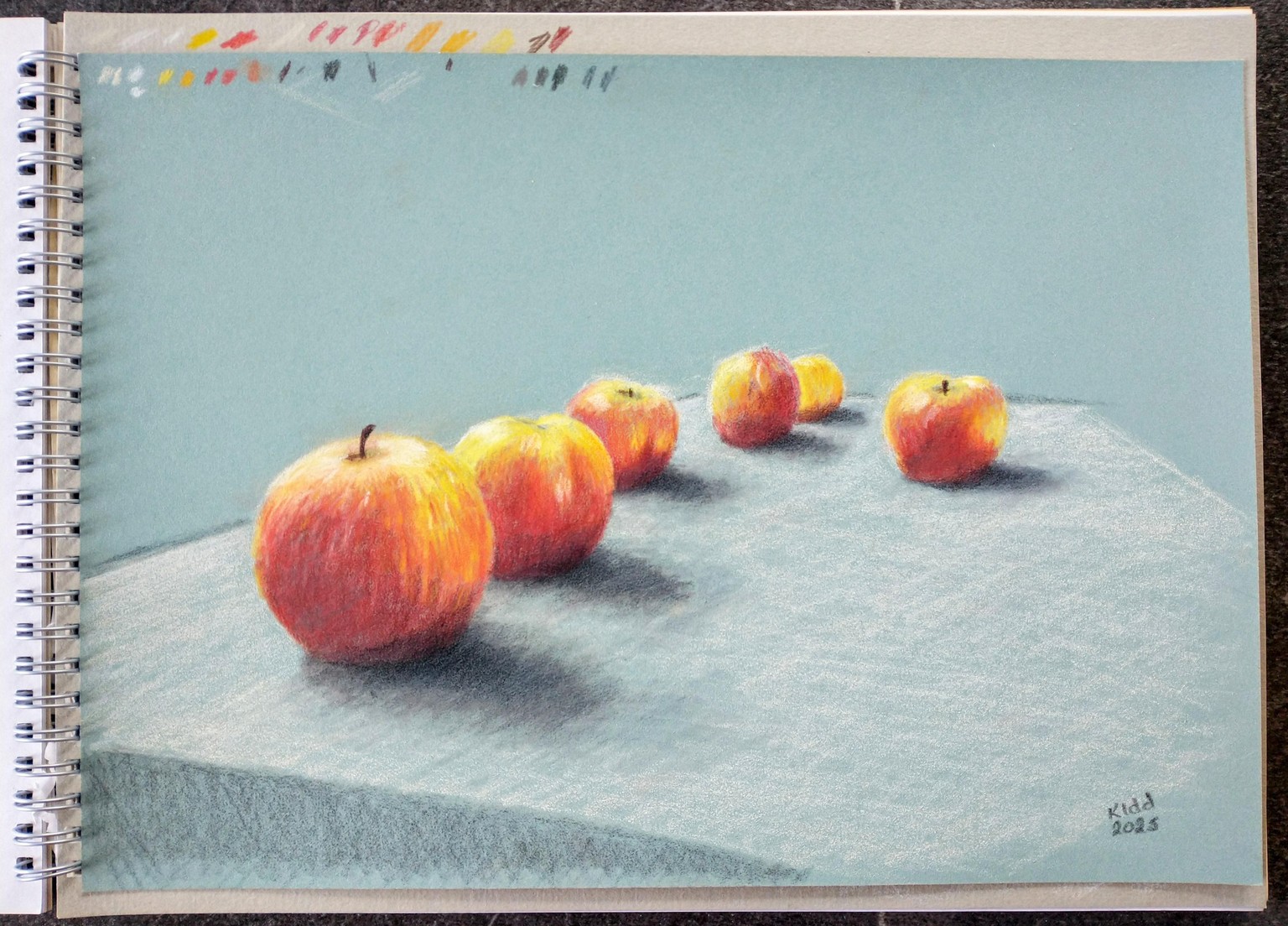
Second Exercise: Apples on table sketch.
I used a different white paper this time. Not as good at holding the pigment.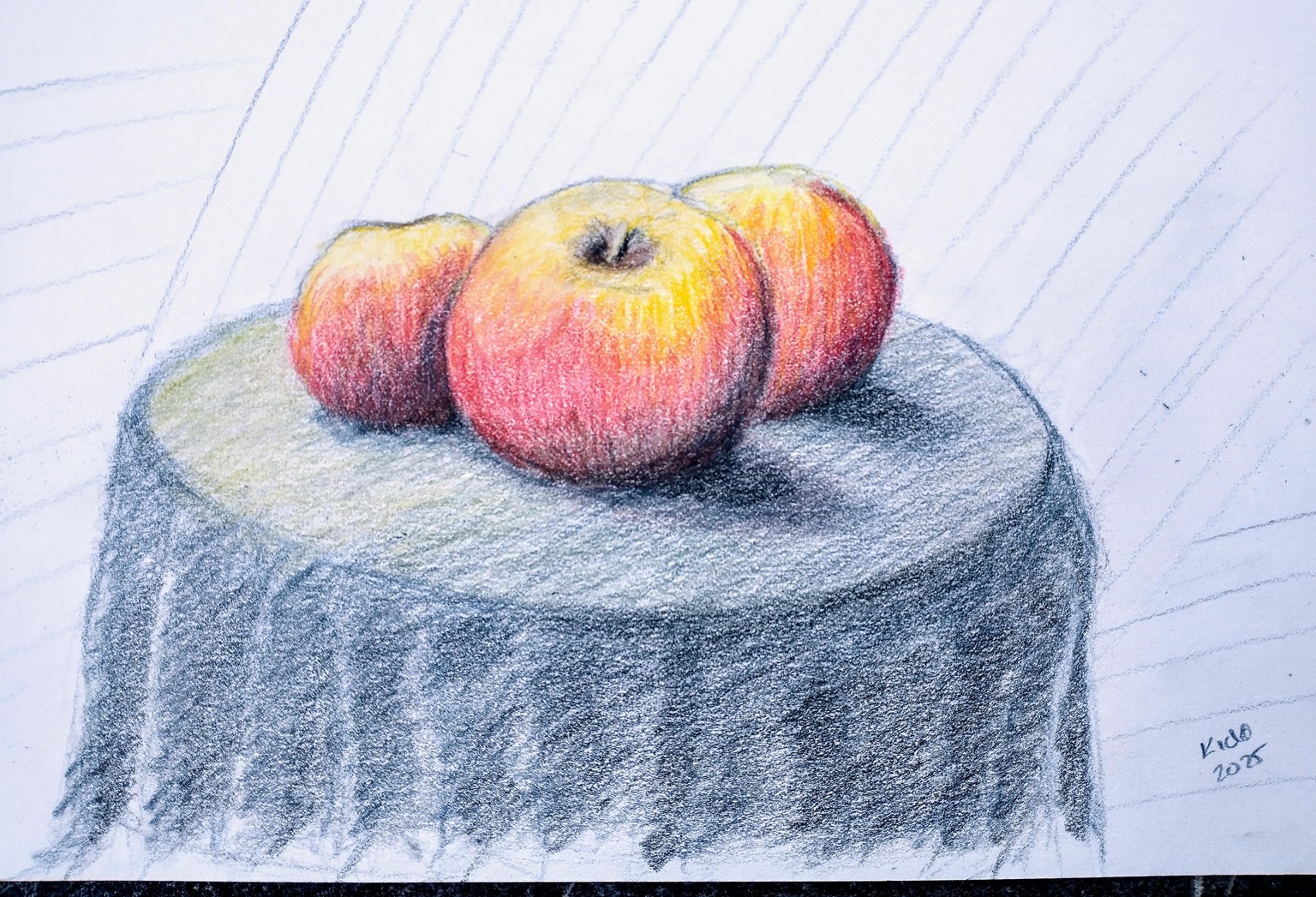
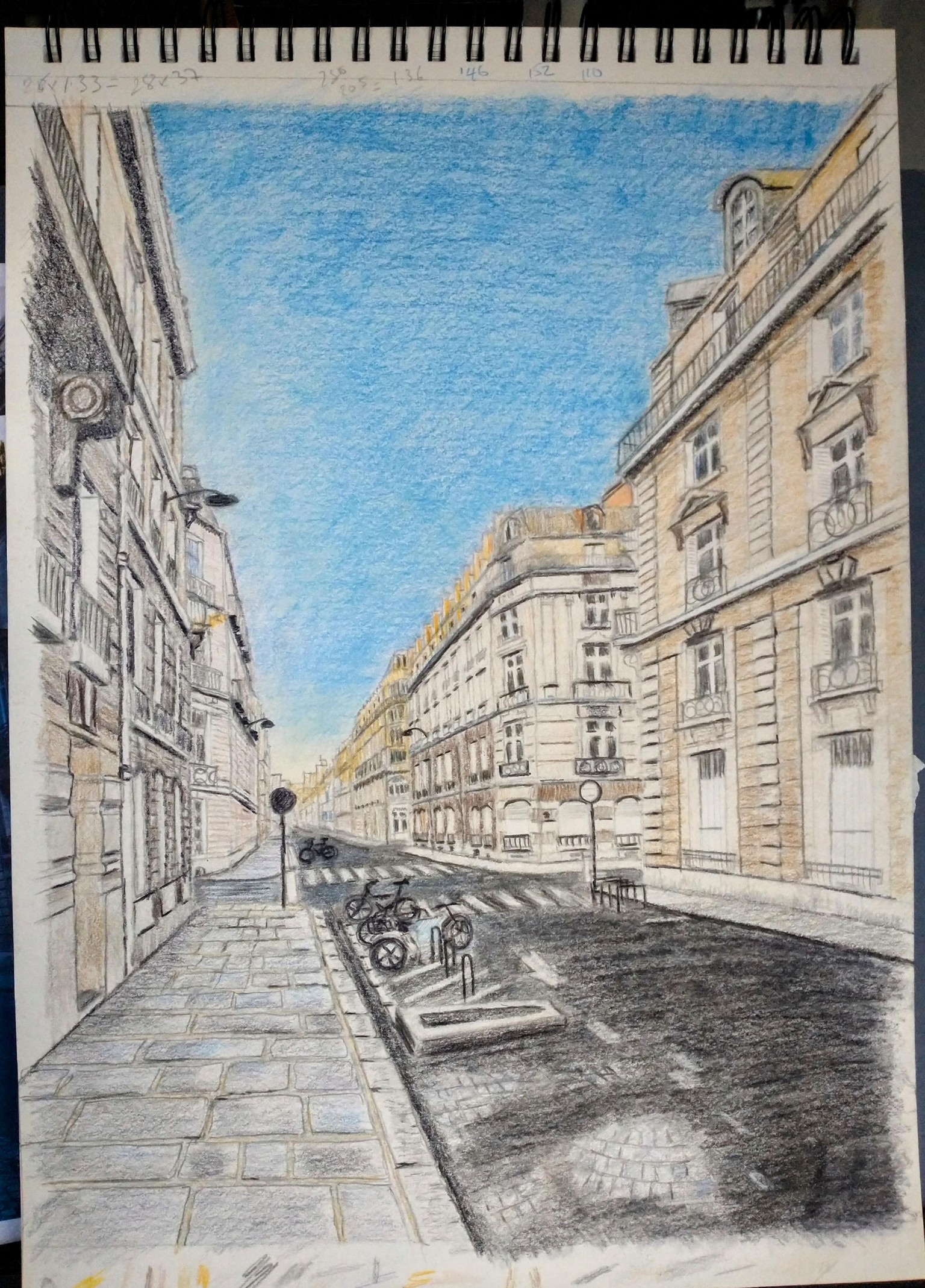
Parisian Street:
Goodness - there is a lot of work in this. The picture had me working to try and keep track of which line/window and balcony I was working on at a time.
I used graphite and colored pencils on mixed media paper (A3) for this as I wanted to test mineral spirit to blend the sky and the road. I think that 'sort-of' worked - more practice needed I guess. The down-side was that the paper was a cream color and as a consequence I needed to color the buildings after and my white pencil didn't show. This would have been a good picture to do on colored paper. I wish I had looked at session 15 and 16 before I started it to see what the colored paper version looked like before starting it. I might come back to it.
I am reasonably happy with my drawing - most of the windows seem to be in approximately the right place, although the perspective/size of the bicycles and the street cobbles under the asphalt maybe don't quite look right?
PS - this must have been very early in the morning for the empty street and the low sun angle.
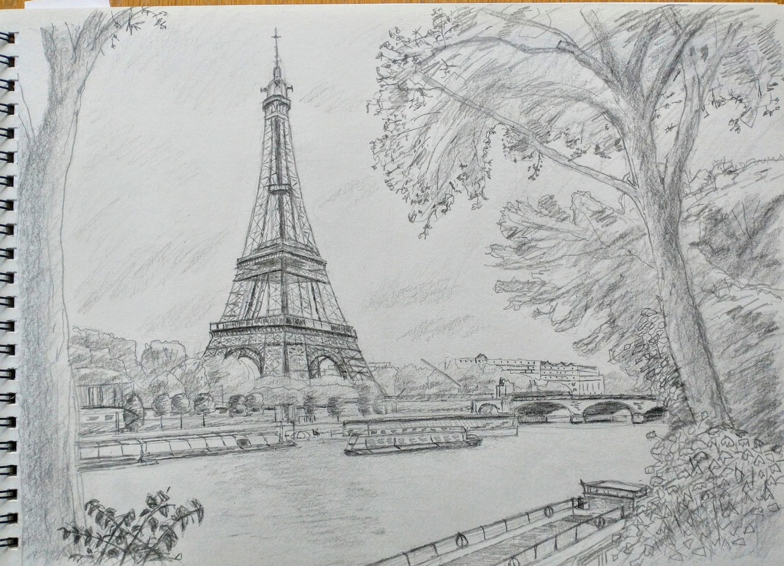
Eiffel Tower scene:
I have a question: there is a lot of content in the pictures of the Eiffel Tower and Titanic. Is it worth considering a larger surface than A3 such as 35x50cm or even A2?
Another question: the demonstration is using white paper? I was wondering about using the light blue or light grey pastelmat to take advantage of its tones for the sky and river - any thoughts on that please?
Thanks
Eiffel Tower - practice sketch - sess. 17-20
I thought I would do a practice sketch in my sketch book and grapite (A3) of the Eiffel tower before doing a colour drawing - just to get some practice really. I altered some of the leaves and trees as a personal touch from the reference image.
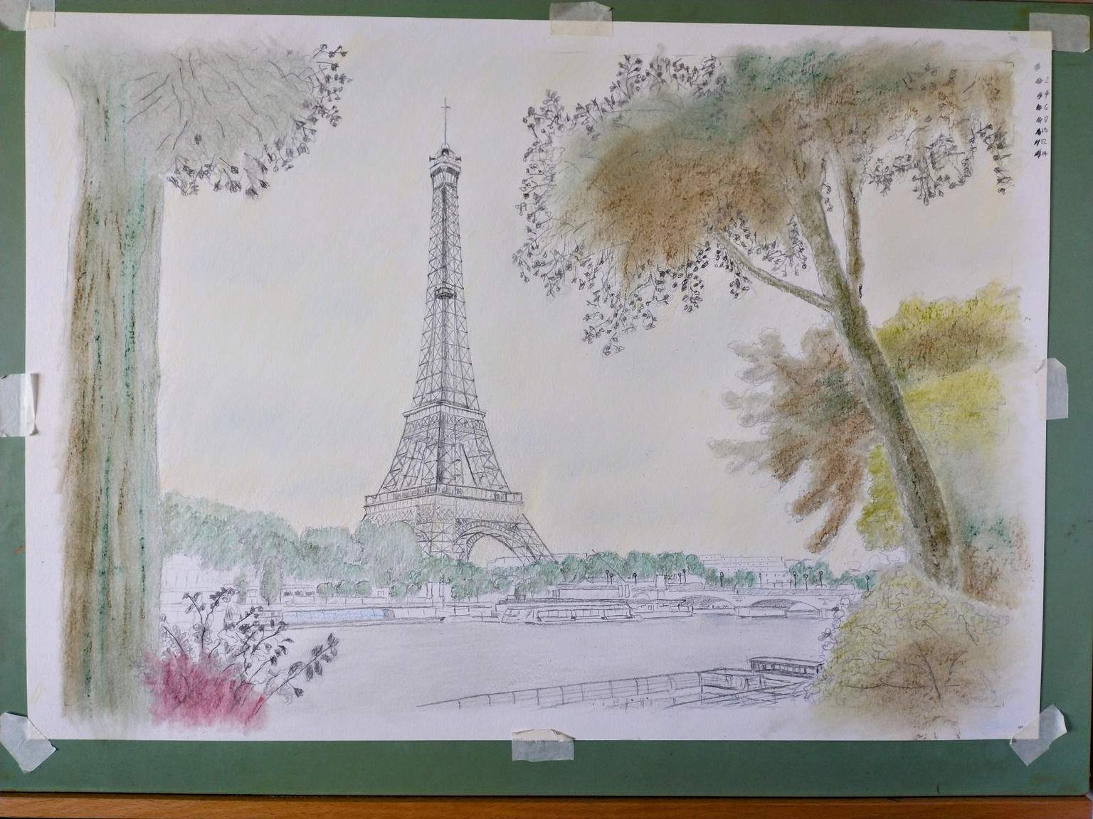
after a bit of a gap - Im doing the colour version of this picture and I decided to experiment a bit.
Im using a large A2 sheet of Winson and Newton heavyweight drawing paper to test out. This will be the largest drawing I have ever attempted.
The idea was to use the pastels (Bruynzeel and Rembrandt) to create the under-painting and then continue with coloured pencils. I tested out compatibility on a separate sheet and the pencils seem to layer quite nicely with the pencils. Im using the pastels to get coverage in the larger areas.
This is where I have got to after the 'blend everything' in Session 21 about 4 minutes in. Theres a lot going on in sessions 21 and 22 !
I think this is one of those points where one thinks 'what did I just do?' and carry on trusting the process :-).
I also tinted the sky with a wash of light yellow pastel when I started so that the gaps inthe clouds would have a yellow tinge (very light Naples Yellow - no 19) and a slight ochre tinge near the horizon (Yellow Ochre 27). I like the Bruynzeel pastels, they blend very nicely and seem to create an almost watercolour effect (I must remember that). I thinks the clouds need a bit more heavyness work - but there are plenty of layers still to go.... :-)
I'm starting to think how I can apply this to my own pictures now. We visited Salisbury a few weeks ago and took some nice photos of Salisbury water meadows and the Cathedral (yes that one! ). I might post that here later on when I get around to it...
Work in progress. Somewhere near the end of Sess.23.
I think I might have missed out a few steps. Also, now I have seen the photo I think the tree on the left needs to be darker in value somehow. (seems to be quite a useful exerise to take a picture and look at that). I made a disater of the tree top right to start with. Fortunatley the paper didnt fall apart with the amount of erasing and has comeout quite reasonable I think. 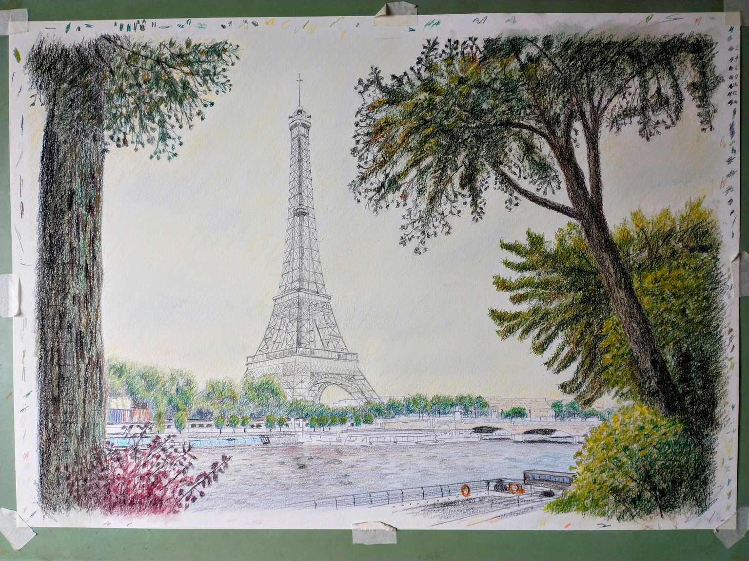
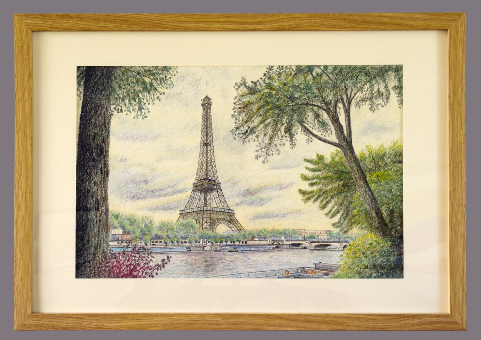
Eiffel Tower - final version:
My paper is just about burnished in several places now, with the number of layers, and so I thought I should stop.
Im not quite sure what happened with the sky. I started off with something else in mind and this just sort of happened. The experience did make we look out of the window at some of the clouds drifting by to consider what I was actually seeing - interesting.
Anyway, I quite liked the way it looked - in spite of it turning out a bit different to the example.
The A2 size was the largest drawing I have tried so there was much to learn here along with everything else. After much smudging, I used a piece of wood as a rest. This was the first picture I had to stand up and move around to complete it - I couldn't stay seated in the chair for this size.
I had some problems getting the left side tree dark enough - blending dark indigo and walnut brown seemed to work in the end. I remembered the tree example from one of the drawing and sketches course examples and used the little U shapes for some bark texture.
Im looking forward to using some of the lessoned learned on my own pictures.
I put in a very inexpensive frame ( 70x 50 cm) to see how that worked out.
We've been away on holidays to Scotland so there was lots of lovely scenery and castels to practice sketching whilst away - and try to remember and consolidate the course material.
A sketch of Caerlaverock Castle, Scotland. It has an irregular triangular shape.
Lots of little things I could work on with it - but Id better get back to the course material :-).
(pencils on cartridge paper )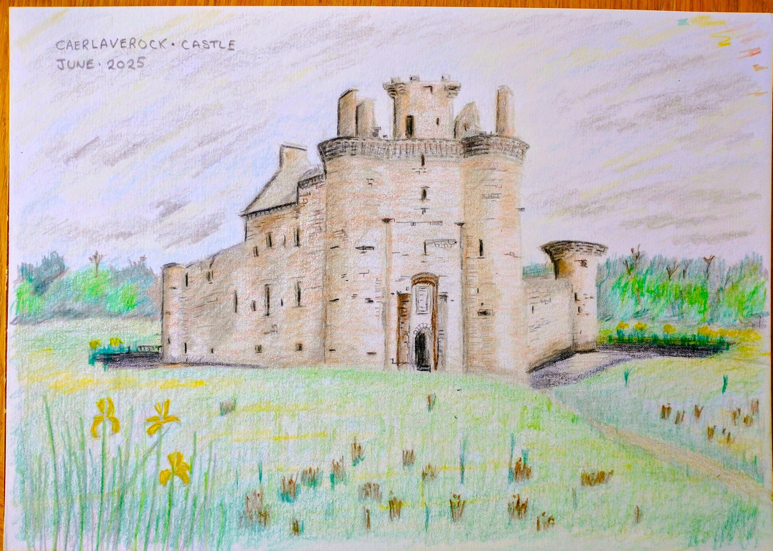
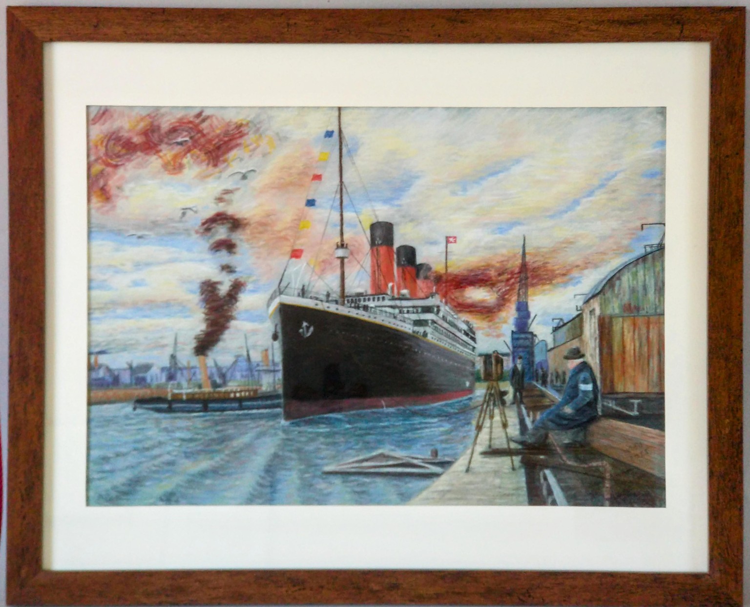
onwards to the Titanic next ....
This was only intended to be an exploratory sketch - and I was having fun so just kept going :-).
I thought I might might add a personal touch to the narrative by imagining the the front character as a photographer capturing the moment and adding some flags.
Graphite and Bruynzeel Design pastel pecils on A3 mixed media sketchbook
I will do this again on the luxury green paper .....
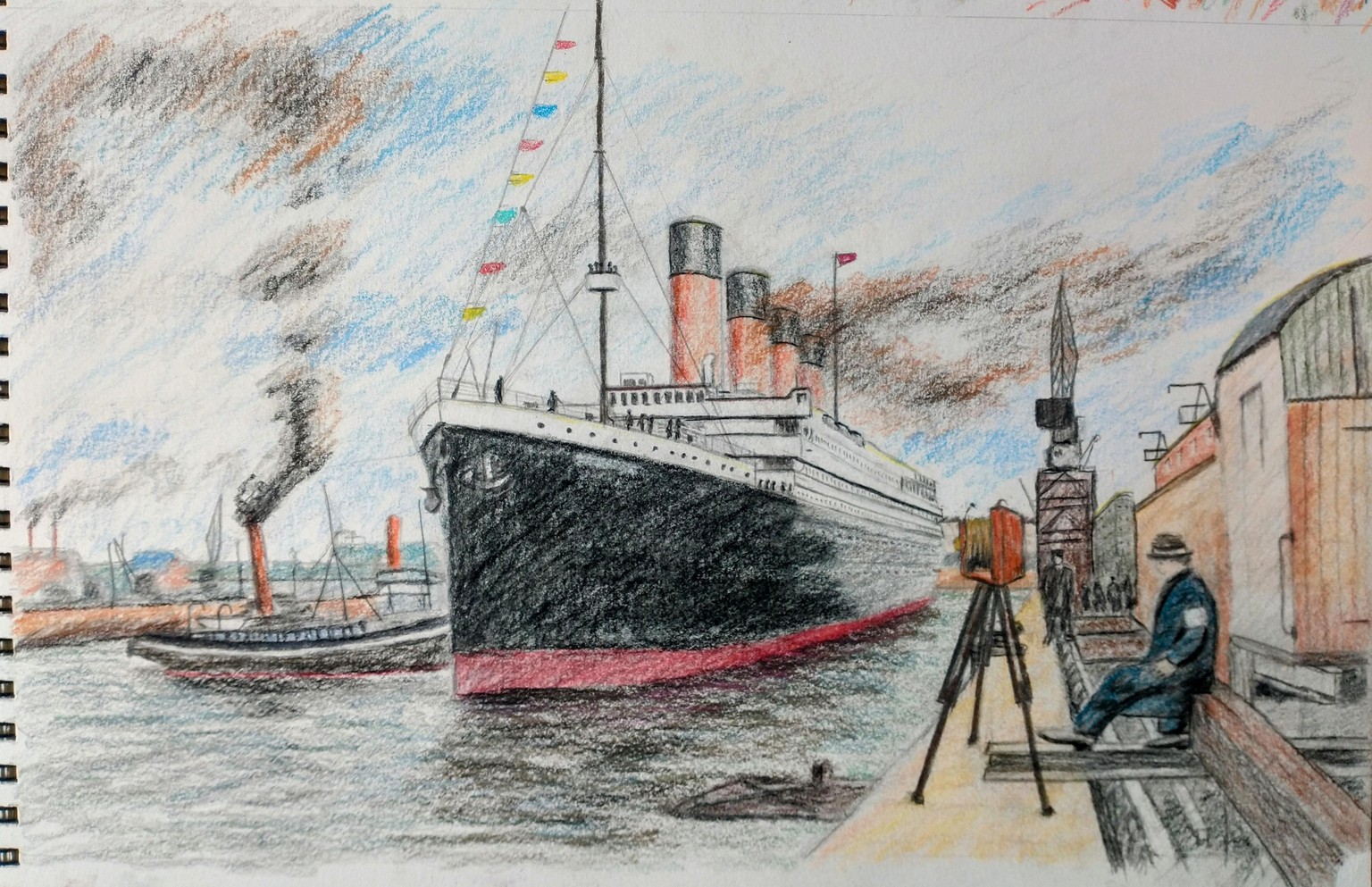
... to be continued ....... on the green paper. Im interested to see how working dark to light works out for this.
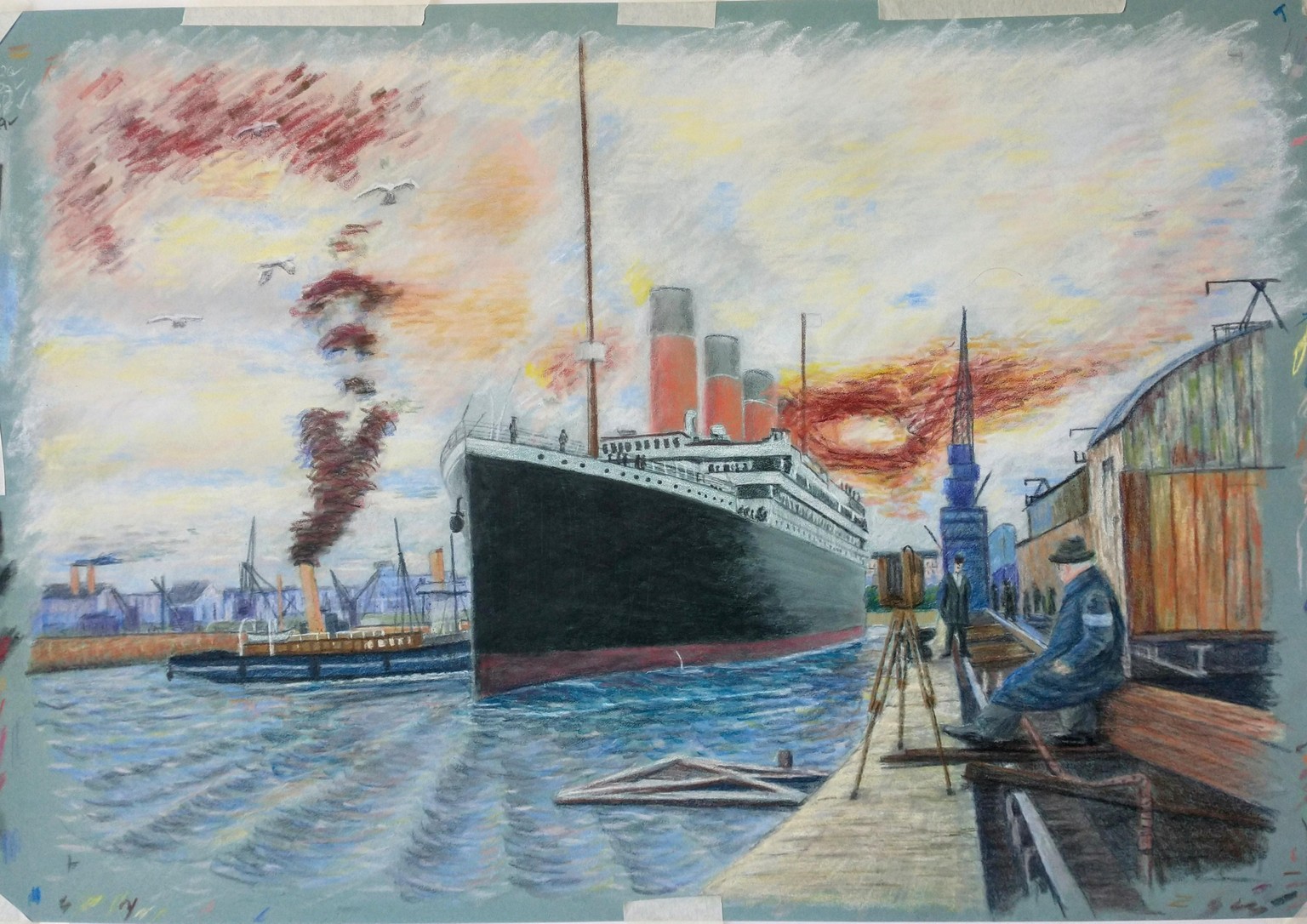
Titanic again!
Somewhere near the start of Sess. 32, just about to start some water.
This is on the same green paper that I used at the start of the course (light green Pastelmat) with coloured pencils (Polychromos), using Bruynzeel design pastel pencils and Rembrandt soft pastels to block in the details.
I have had an issue with the initial starting drawing (using white) as I managed to obliterate some of it when filling in the sky also with white, however this was recovered by re-touching the remaining outlines with grey.
The camera (for the imaginary photographer - giving a reason to have the character in the picture) has gone back in. I added some birds - ha ha - I live about an hour from Southampton = there are birds. :-)
I quite liked the Monet reference in the narrative and so I used a blue and purple colouring for the distant features. I'm also experimenting with the broken colour, so apart from the initial 'blocking-in' I'm trying to use that for the surroundings. I am not sure if that will work for the ship and I don't want to ruin it at this stage, so I might leave it in its current style to provide a bit of a contrast I suppose.
I gave the 'photographer' a dark blue coat. I think the reference image has dark brown. However, I wanted him to have some contrast with the mainly brown background - hence blue. I think it works quite well.
I curved the quay side a bit so. This was more by accident than design, but I think it makes the quay side a bit less strong in the picture. The reference straight lines look very strong.
I seem to be covered in either white pastel from the sky or black pastel from the ship - ha ha .
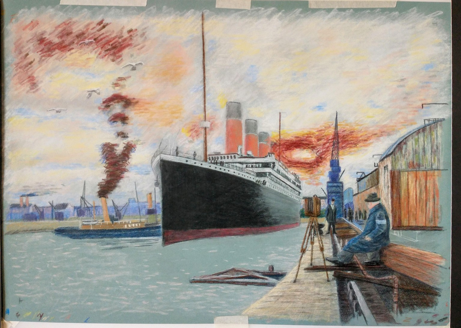
wow - 7 more sessions to go on this. It's going to take a while :-), but I am enjoying it and doing a bit most days.
...at the end of sess. 35:
Water and more details to L and R docks.
Trying to be careful not to smudge everything now :-)
mmm - i seem to be having some issues streaming sess.37 at the moment after about 2 mins. The others seem fine and I am sure I previewed this one earlier... Hopefully just a glitch and all will be well tomorrow.
Finally,
This was a marathon :-).
I dont think the paper or myself will take any more.
Pastels and pecils on green pastelmat ( 35x50 cm -half a sheet).
Im quite pleased with it. Learned a lot. A few personal touches. Tried a few things out. Missed a few steps. Some mistakes along the way.
I think its time to move onto the next course now.
Thanks.