I think I just flunked kindergarten art
Thought I’d pick a seriously obnoxious pink and a bright teal (at bottom of sheet). Purchase of my acrylic paints, used primarily for gelli-prints, is based on lowest price. The pad I used is like a big desk calendar turned upside-down. Compromising, but I mixed and mixed and even tried using the black but wasn’t please. So,I got mostly blues and pinks even though I tried to do a mix that would show which colors I was using. Almost all my colors turned out streaky even though I gave them a good stir on the paper before swatching it. I expected a pinch of black would turn that pink into a faded rosy shade, but not even that. I expected to see nice pastels using white.
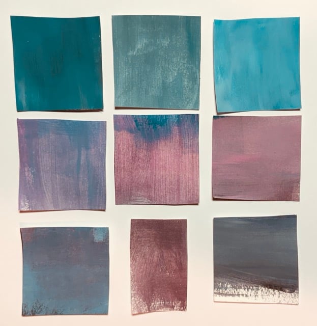
I wish these hadn’t been so streaky to work with or painted on non-optimal paper. Top row, I see a fairly solid deep teal (black added) a toned down green that I like followed by the teal lightened with white. Middle row: I’d call the first color a muddy blue-pink mix trying to be purple, then a pink toned down to a soft rose (versus original neon pink), and last a pink toned down by gray that could be ok. Bottom row: Here’s a mash-up of blue and pink near some gray, but I like that reddish color in the middle, and last, black I tried to lighten with blue and white. The colors in the middle of each row are colors I’d use, so no loss. A couple of losers in the group but a good exercise and very fine class.
First time I ever did anything like this with acrylics which aren’t my best medium.BTW, I can do lovely color-mixing in watercolor, and even buy “the good stuff” about which people are sure to disagree. LOL!!
PS I really didn’t use pink paper for the big sheet. Poor lighting in that spot.