Honey Bee
My animal of choice is an insect: the honey bee!
Inspiration / Reference Material
I was inspired to choose the honey bee because of a wonderful non-profit organization called HoneyLove. I'd like for the work I make in this class to underline and raise awareness for the importance of honey bees in our world, so I'm leaning towards making a poster or postcard for National Honey Bee Day (August 15th 2015).
I also created a Pinterest board including images found on Pinterest as well as Google and Dribble. I am most drawn to the botanical-style illustrations, and the very detailed fine linework illustrations.
Brainstorm Images
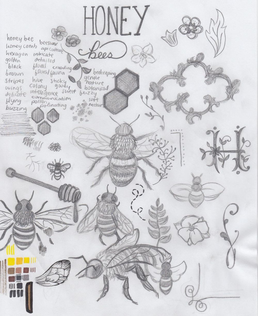
A list of related words, a sample of colours to use including experiments with metalic markers, and some practice of drawing bees, decorative elements and flowers through reference of books I own + Pinterest & Dribble searches. The decorative floral H, some of the flowers, and some of the filigree elements are direct copies referenced from a book I own called Handmaide Soirees - they are not my original ideas.
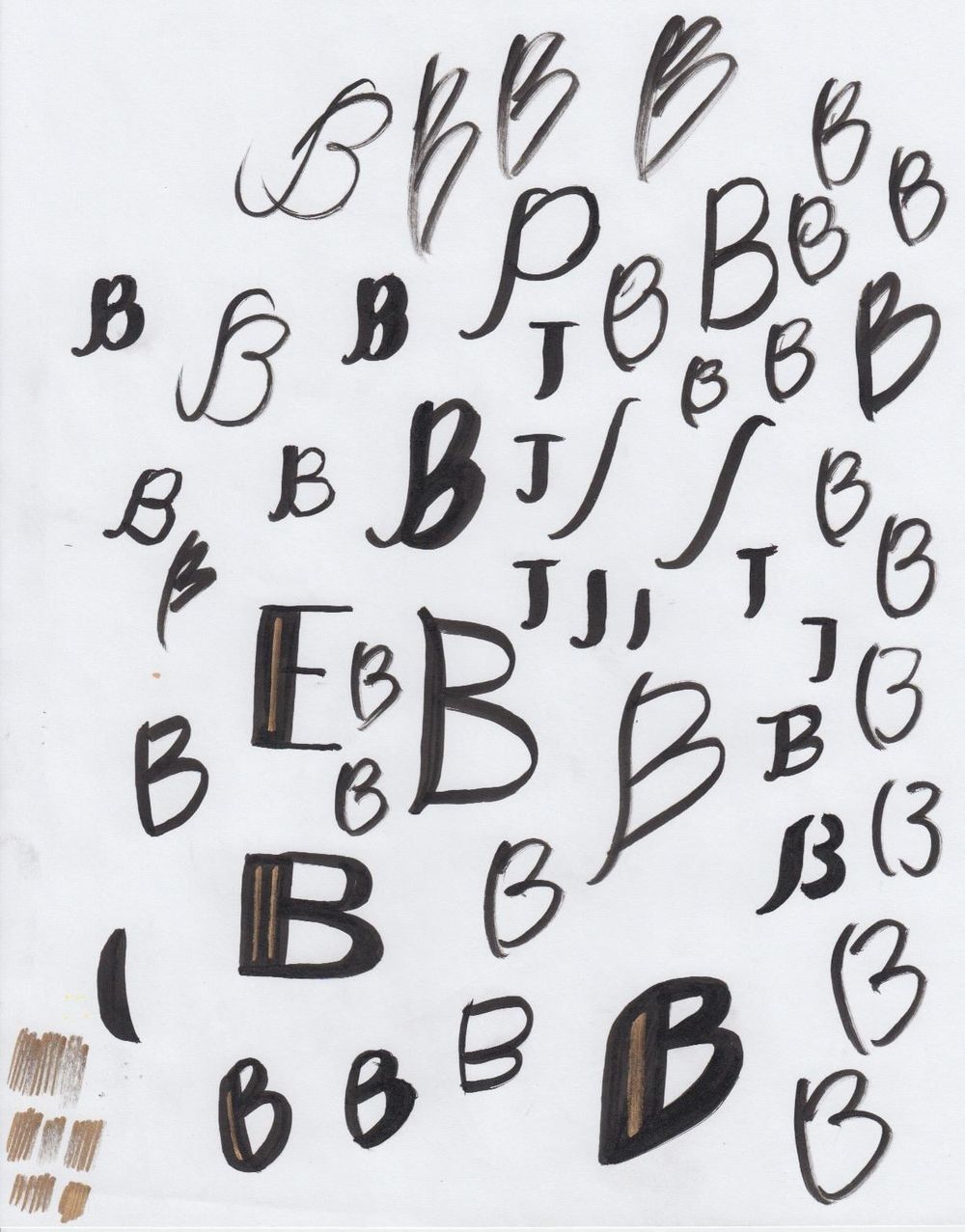
Playing around with a Micron Brush pen. It's difficult to get the hang of drawing smoothly with a brush pen, but it's fun! I was testing out a metalic gold Sharpie here as an inline for black letterforms.
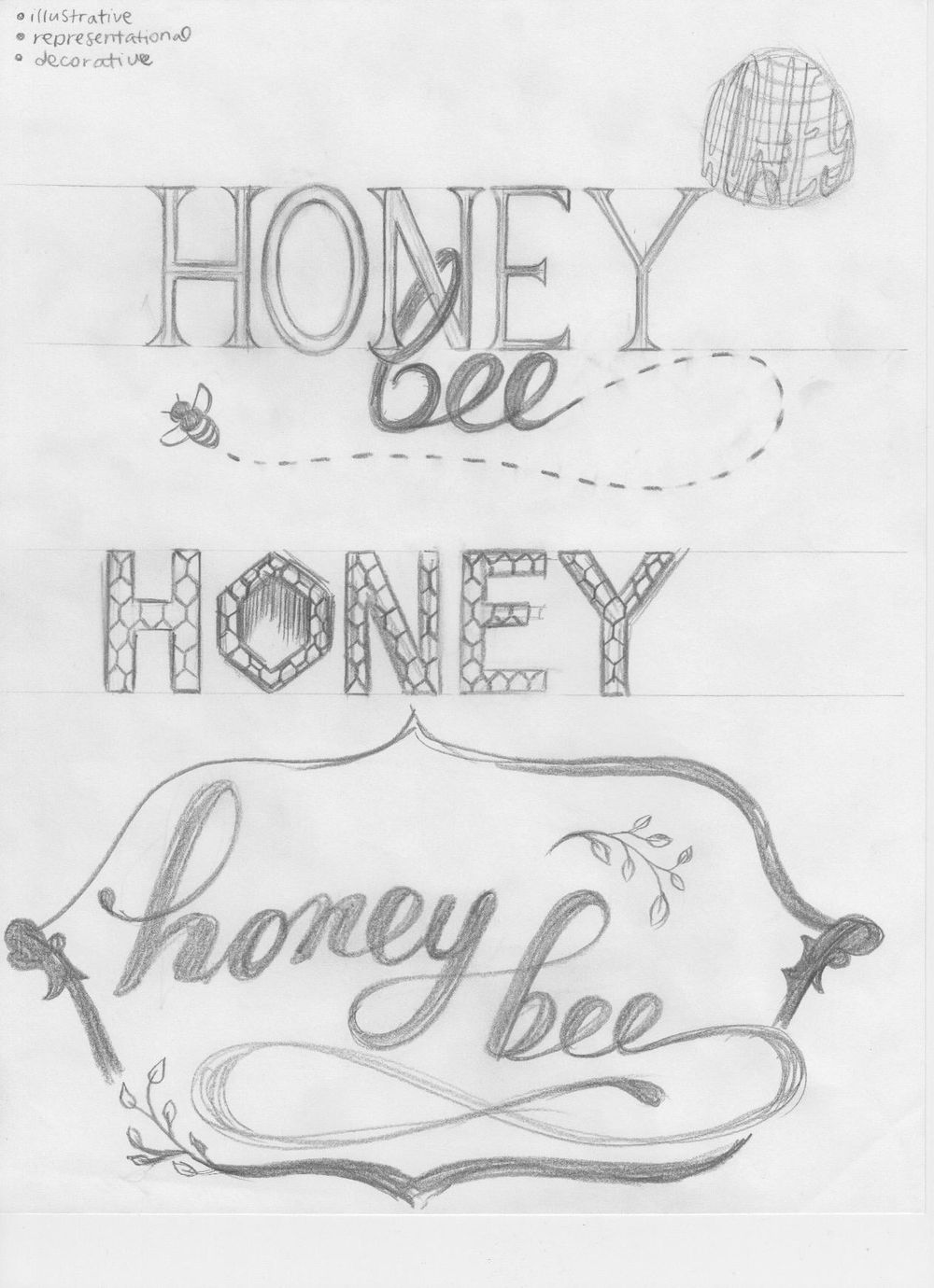
Trying out three different styles: illustrative, representational, and decorative. Though I used "honey bee" and "honey" here, the word(s) I actually letter for my final piece will most likely be different. I have to figure out what to letter that might encourage appreciation of / further research into honey bees and their significance. I'm not leaning towards the popular "save the bees" either. I would like to mix it up a bit.
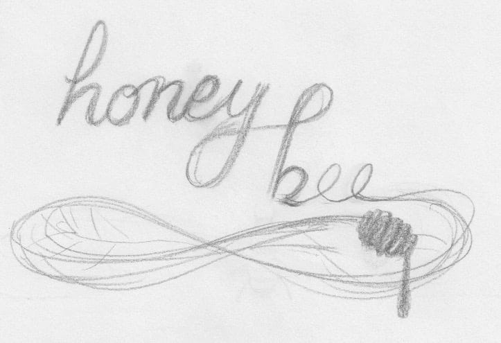
I really like the delicate, veiny elements of a honey bee's wings. I incorporated a very rough sketch of that detail here, using the decorative extension of the 'e' to look like wings.
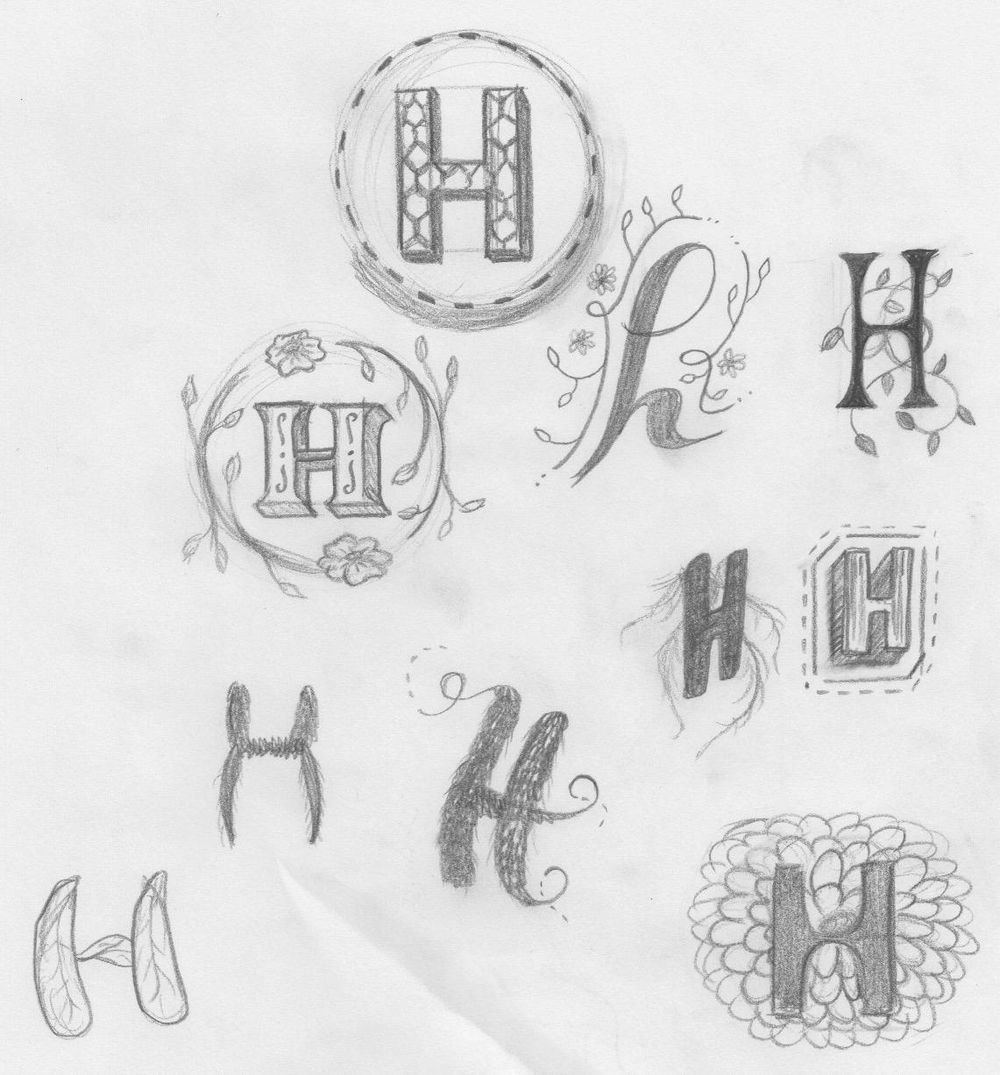
I tried the dropcap concept just to simplify things. It was nice to practice incorporating characteristics of a honey bee into just one letter. My favourite one is the bold serif H with the drop shadow that is framed by branches / flowers.
Thumbnail Concepts
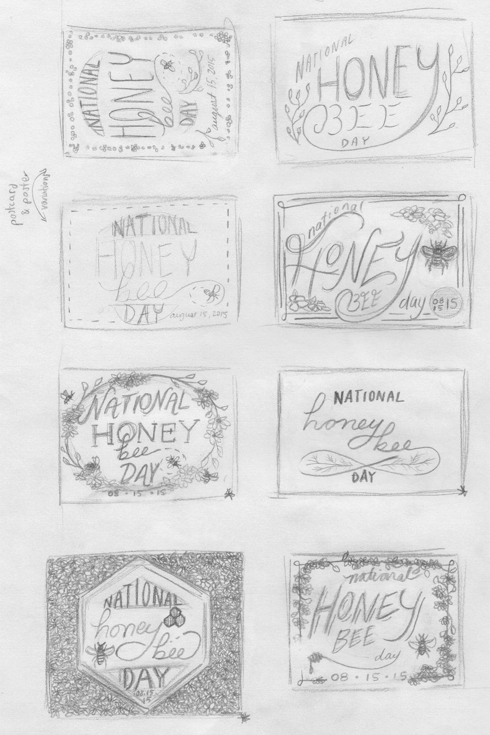
Brainstorming concepts for a National Honey Bee Day 2015 poster + postcard pair.
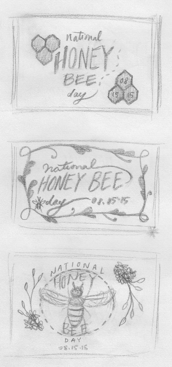
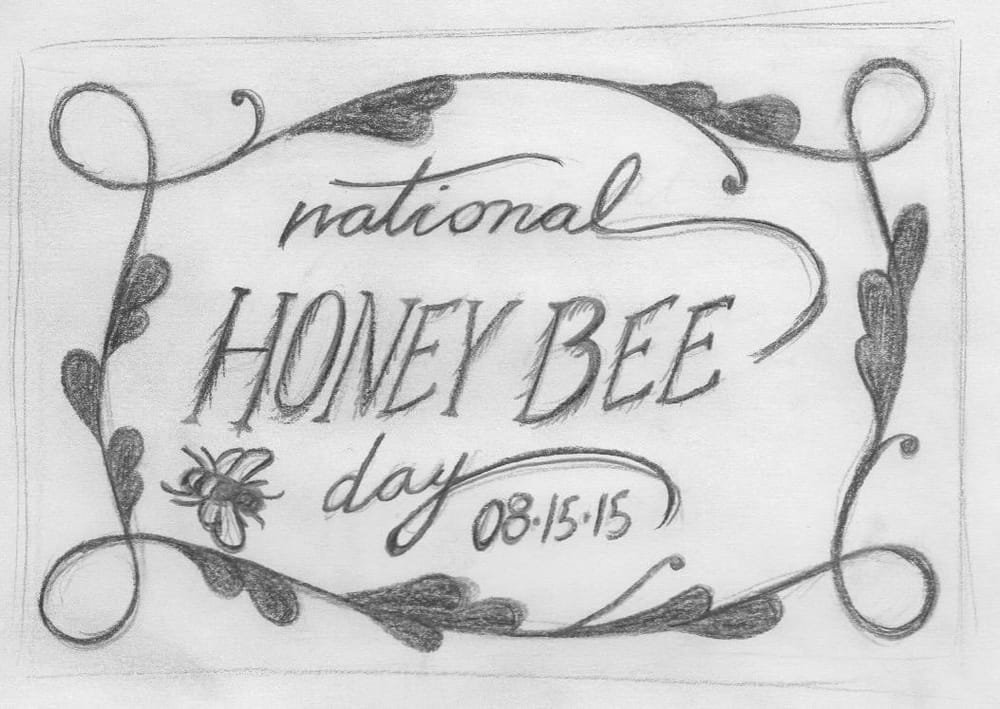
Revised Sketches
I spent the most time on this sketch out of the four revised sketches I made. They all have major room for improvement - I just wanted to explore my favourite concepts in a bit more detail before chosing one and refining it further.
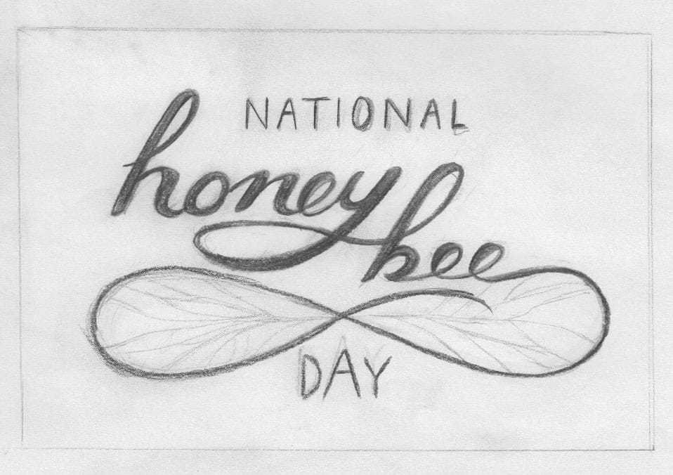
I really like the minimalistic nature of this one. I see myself printing a postcard for National Honey Bee Day in black and white on a yellow or gold coloured paper. That, or printed in black and white on a cream coloured paper with some gold detail in the lettering. I missed drawing in the date on this one.
A small attempt at representational lettering using the hairy quality of a honey bee's legs for the words "Honey Bee" in the centre. I didn't refine this sketch or the one after it as much as the first two.
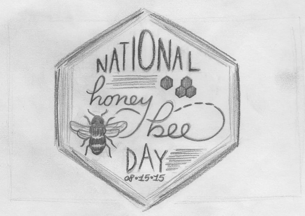
In my concept thumbnails, I drew this as a rectangular composition with flowers filling in the white space outside of the hexagon. I'm toying with the idea of this being a die-cut post card.
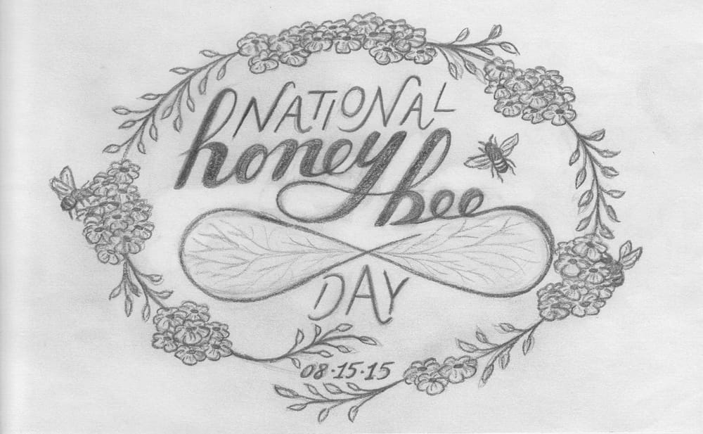
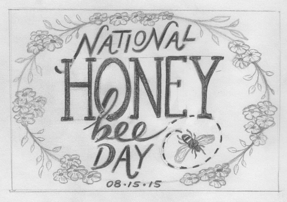
This refined sketch combines two of my favourite concepts from the explorations above.
Before inking, I sketched this concept out again using my LightPad to straighten out the script and to centre and balance the wings inside the floral frame.
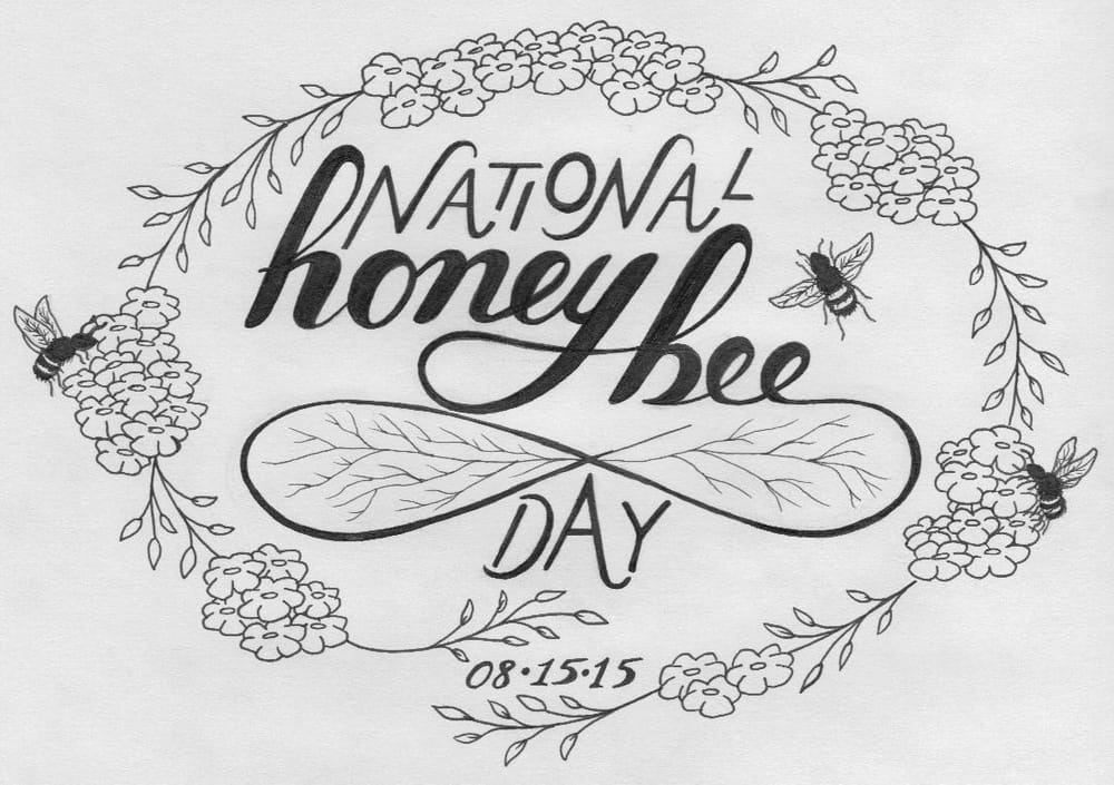
I added some detail to the flowers and branches, as well as carefully went over each letter to smooth out some of the edges. I think my script lettering is a bit clumsy in places, but it's an improvement from when I first started lettering. Practice, practice, practice.
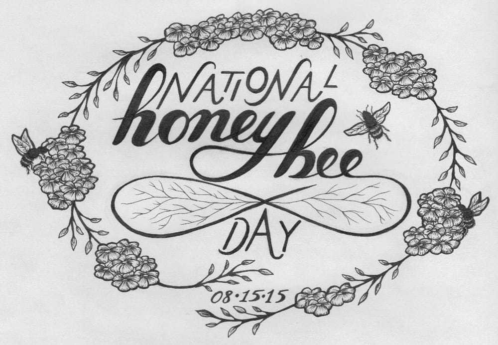
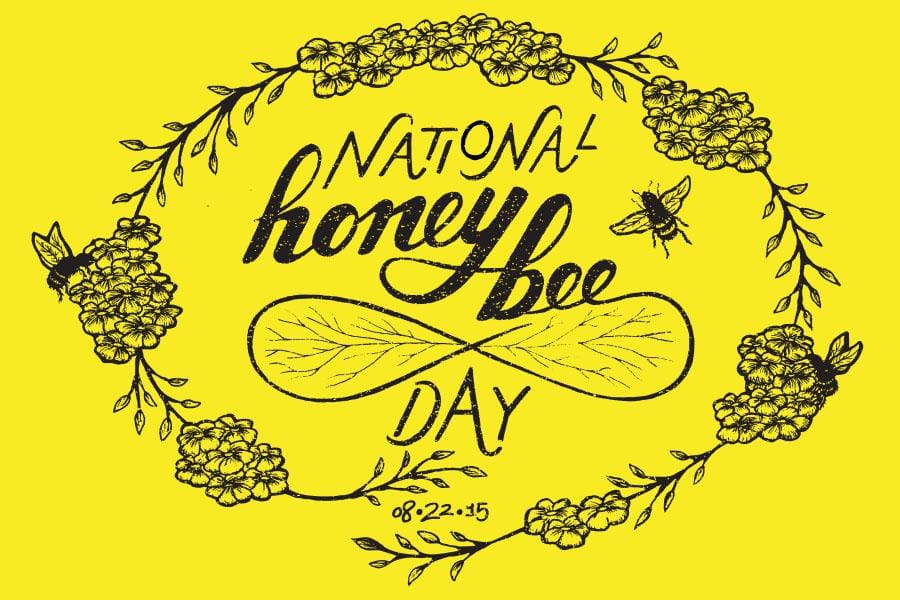
This is the final inked + vectorized illustration. I made some slight adjustments, but left some 'flaws' intact. I also layered on a subtle grunge texture by Sean McCabe.
I also did a test print on yellow paper. The only things that are still bothering me are the date, the tension between the bottom of the 'y' in 'honey' and the left wing, and the lack of consistency between the 'e' characters. Things to work on - noted. If you notice any more areas of opportunity that stand out as more than illustrative character, please let me know!
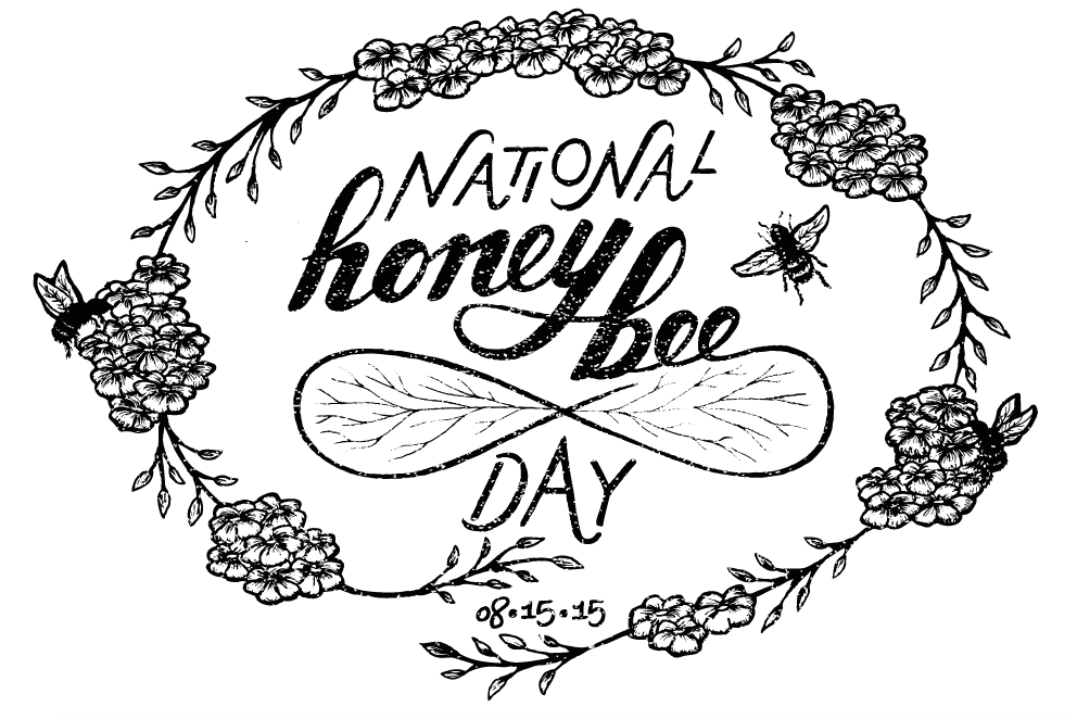
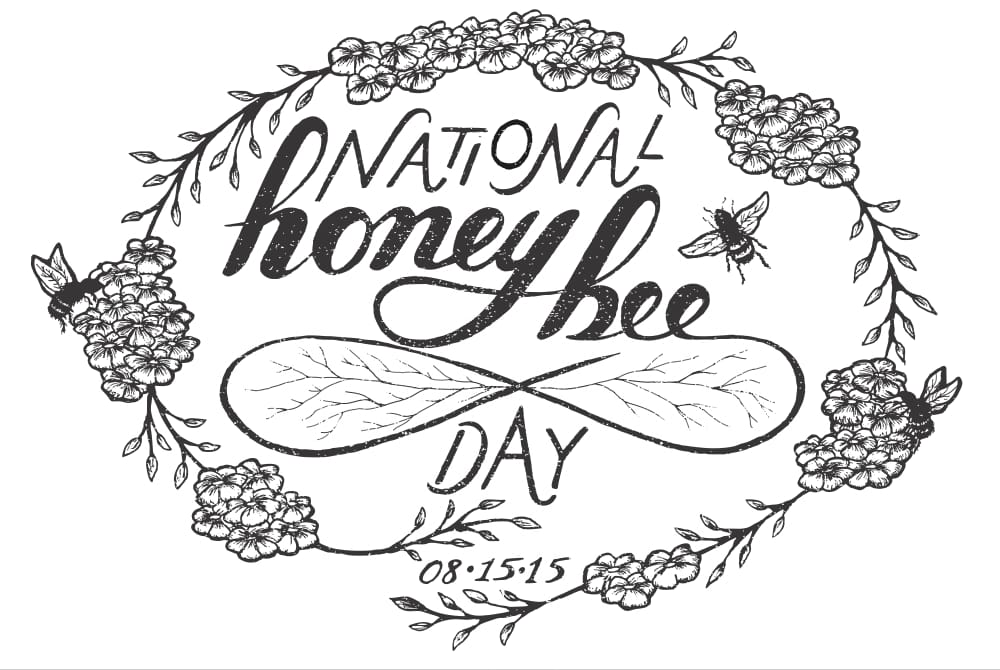
Taking into account all of the amazing feedback I've received, I revised the "honey bee" lettering by fixing the tight space between the 'y' and the wing, as well as closing the bowl on the 'b'. I also re-drew the date, which had previously bothered me.
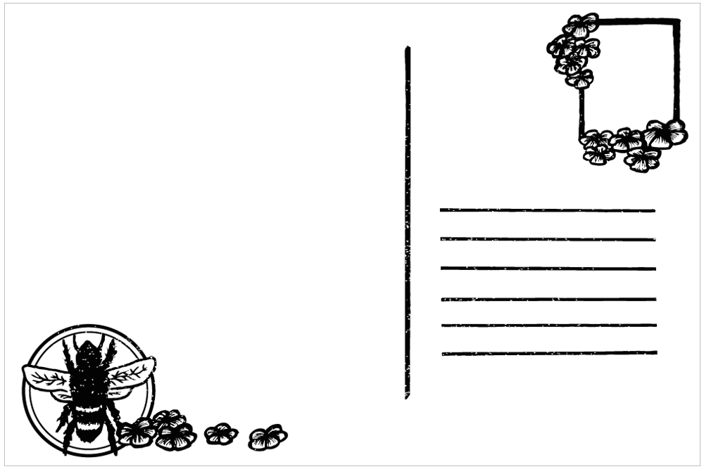
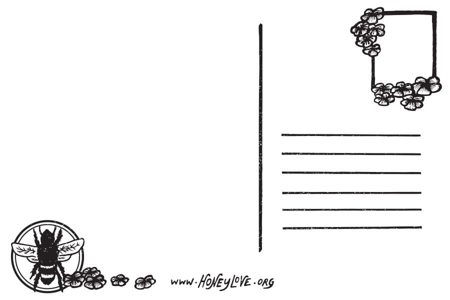
This is the back side of the postcard design. I originally thought I'd design a postcard-size mailout with information on honey bees already on the back. However, I thought it would be nice to give the user the freedom to write whatever they'd like.
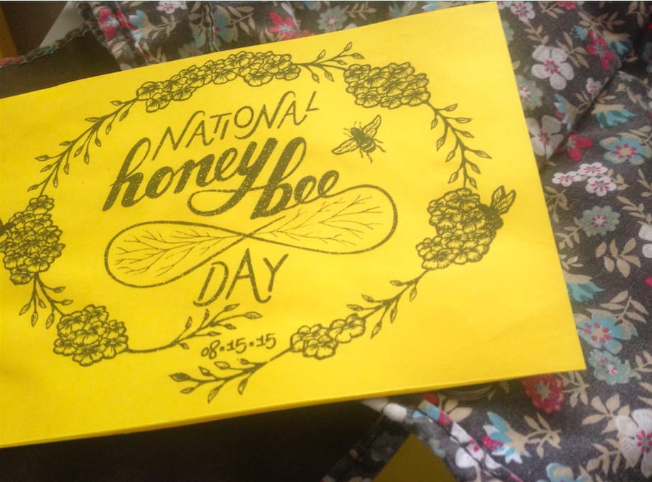
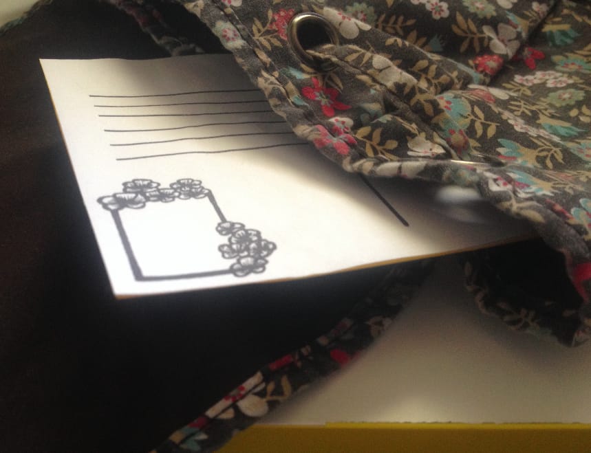
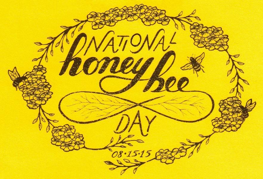
I printed out the final composition on yellow paper (front) and white paper (back) to make a postcard mock-up. It's displayed in these two photos like it's being placed into a floral backpack.
*** UPDATE ***
The date for National Honey Bee Day 2015 is now 08-22-15. I have updated my design to reflect this, as well as added the website for HoneyLove, having sent it off to them for use! The final images are below.
:) Feedback is welcome and appreciated.