Heuristic Evaluation of Redbus Website
Redbus Website: Context and Evaluation Purpose
Redbus is a leading online travel platform that enables users to seamlessly book hotel rooms, bus, train, and ferry tickets across various destinations in Asia. With features such as route search, seat selection, operator filters, and secure digital payments, Redbus aims to deliver a convenient and user-friendly booking experience. This project presents a heuristic evaluation of the Redbus website, conducted using Jakob Nielsen’s Usability Heuristics for User Interface Design, to identify key strengths and usability challenges within the platform.
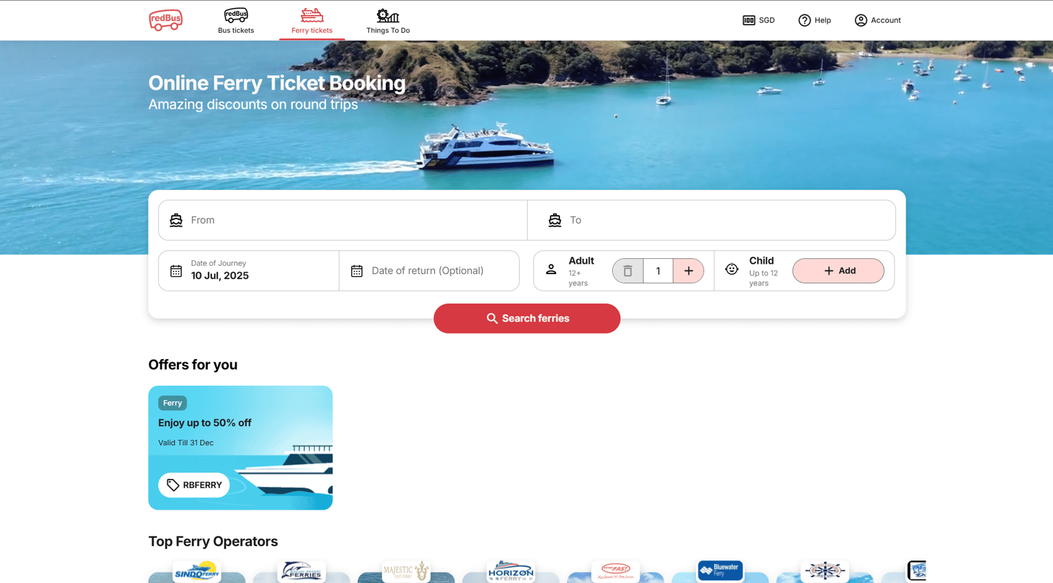
1. Visibility of System Status: As observed in the above image, Redbus effectively uses color cues and visual indicators to show the user's current location within the website. In the top navigation bar, the red-colored icon, bolded label ("Ferry tickets"), and the red underline indicate that the user is on the Ferry Tickets page. This gives users immediate feedback about where they are, which enhances orientation and reduces confusion.
2. Match Between the System and the Real World: In the same image, the top-right corner displays "SGD" (Singapore Dollar) alongside a downward arrow, which intuitively suggests a dropdown menu for currency selection. The use of “SGD”, a widely recognized currency code, aligns with real-world terminology used in e-commerce and travel platforms. This makes it easy for users to understand that this section is related to currency settings, without needing any explanation.
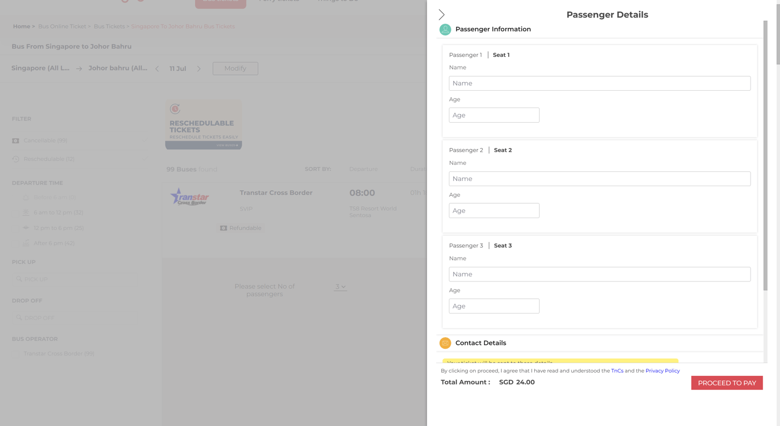
3. User Control and Freedom: In the above image in the Passenger Details overlay, users are provided with a back navigation arrow, which is in the top-left corner, that allows them to easily return to the previous screen without needing to go back step by step or start over. This gives users a quick way to exit the booking flow if they change their mind or realize they need to modify something, supporting the idea of an "emergency exit" from an ongoing process.
4. Consistency and Standards: Clicking the Redbus logo in the top-left corner consistently takes the user back to the homepage, a well-established web standard. This behavior matches what users have come to expect across most websites and applications, thereby reducing cognitive effort. Users don’t have to stop and think. It becomes an intuitive action because of its consistency with platform conventions.
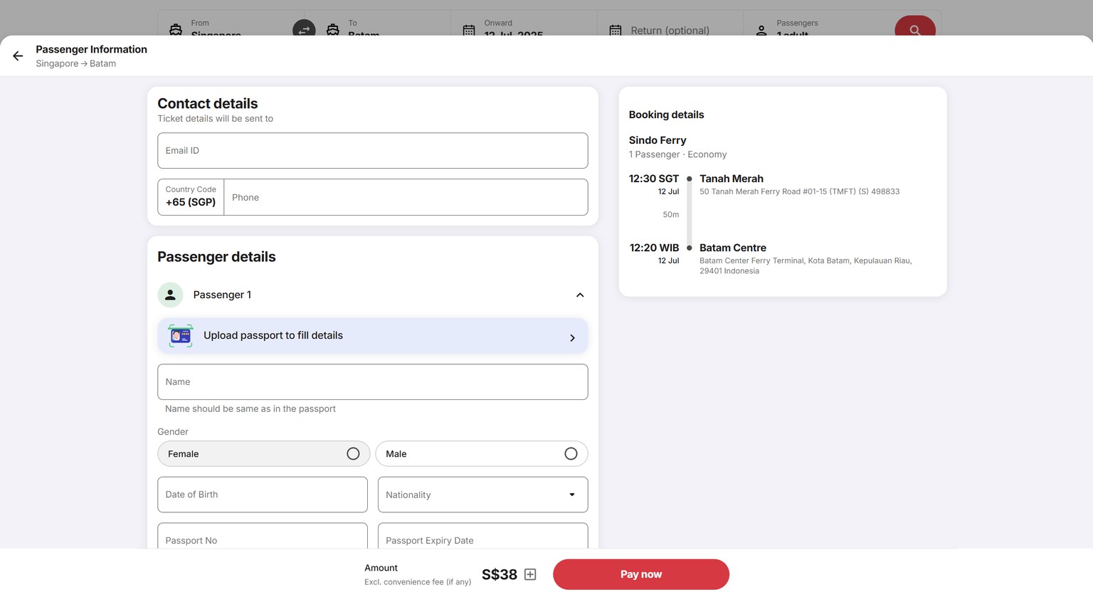
5. Error Prevention: The system includes an “Upload passport to fill details” feature, which helps reduce manual data entry errors, particularly for sensitive fields like name, passport number, and nationality. By allowing users to auto-fill critical information from their documents, the interface prevents typos, formatting mistakes, and mismatches, which could otherwise lead to boarding issues or identity verification errors.
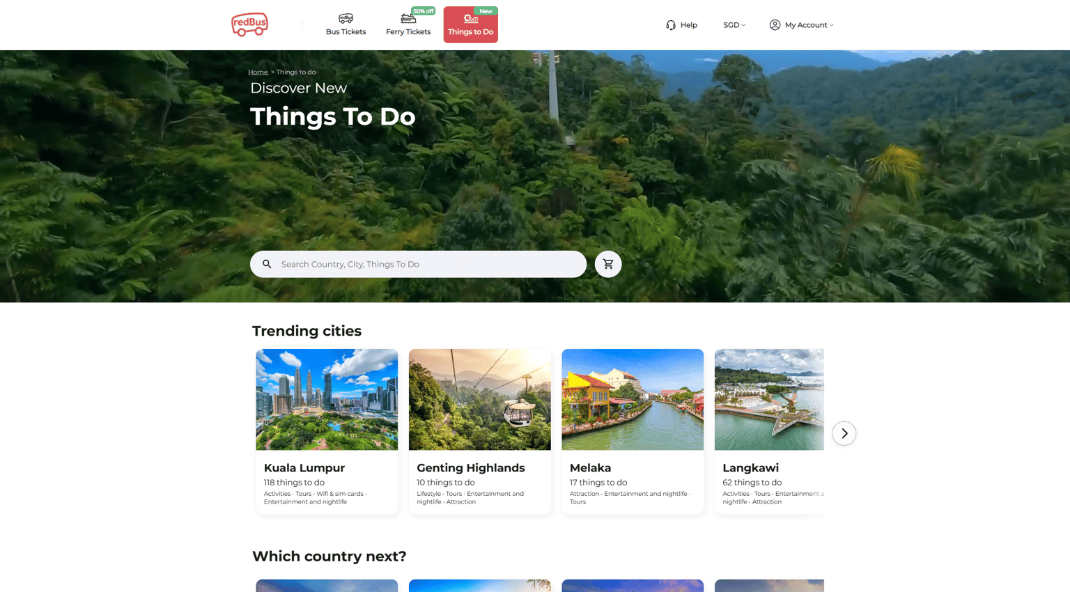
6. Recognition Rather Than Recall: The interface uses universally recognized icons to support quick navigation without relying on memory. For example, for the above image, the headphones icon next to "Help" intuitively suggests customer support or assistance, helping users recognize where to go for help without needing to read, and the user icon next to "My Account" signals account-related options like login, profile, or bookings.