Häagen-Dazs Logo Redesign
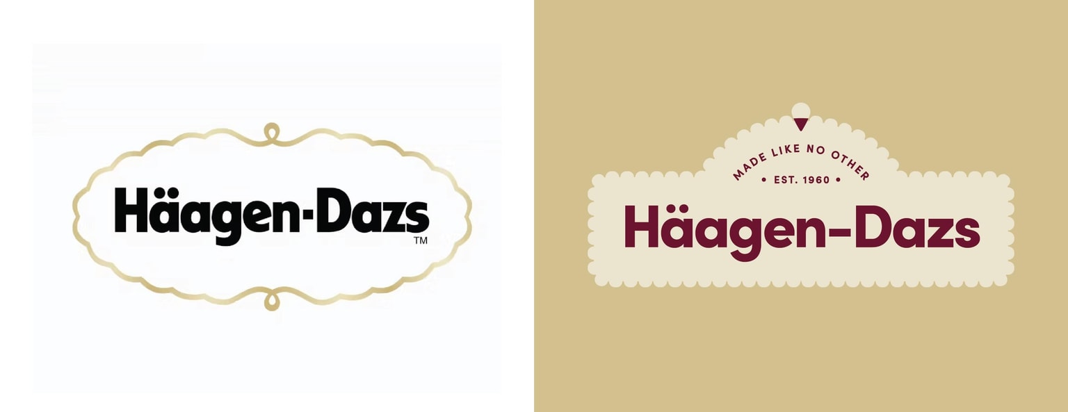
With this redesign, I wanted to keep and honor the sans serif type of the logo but chose a slightly more geometric and wider typeface to highlight the Dutch influence of the brand. I wanted to expand the mark to include a slogan and heritage and lock them up in a bold shape. I also wanted to keep the swirl at the top but instead reimagined it as an ice cream cone. Lastly, I mocked this up on packaging to think through how this logo would be utilized.