Goolf logo
I chose this logo because it always popped on my Pinterest and I always had a weird feeling about that letter "G". It is not very legible specially at a small scale.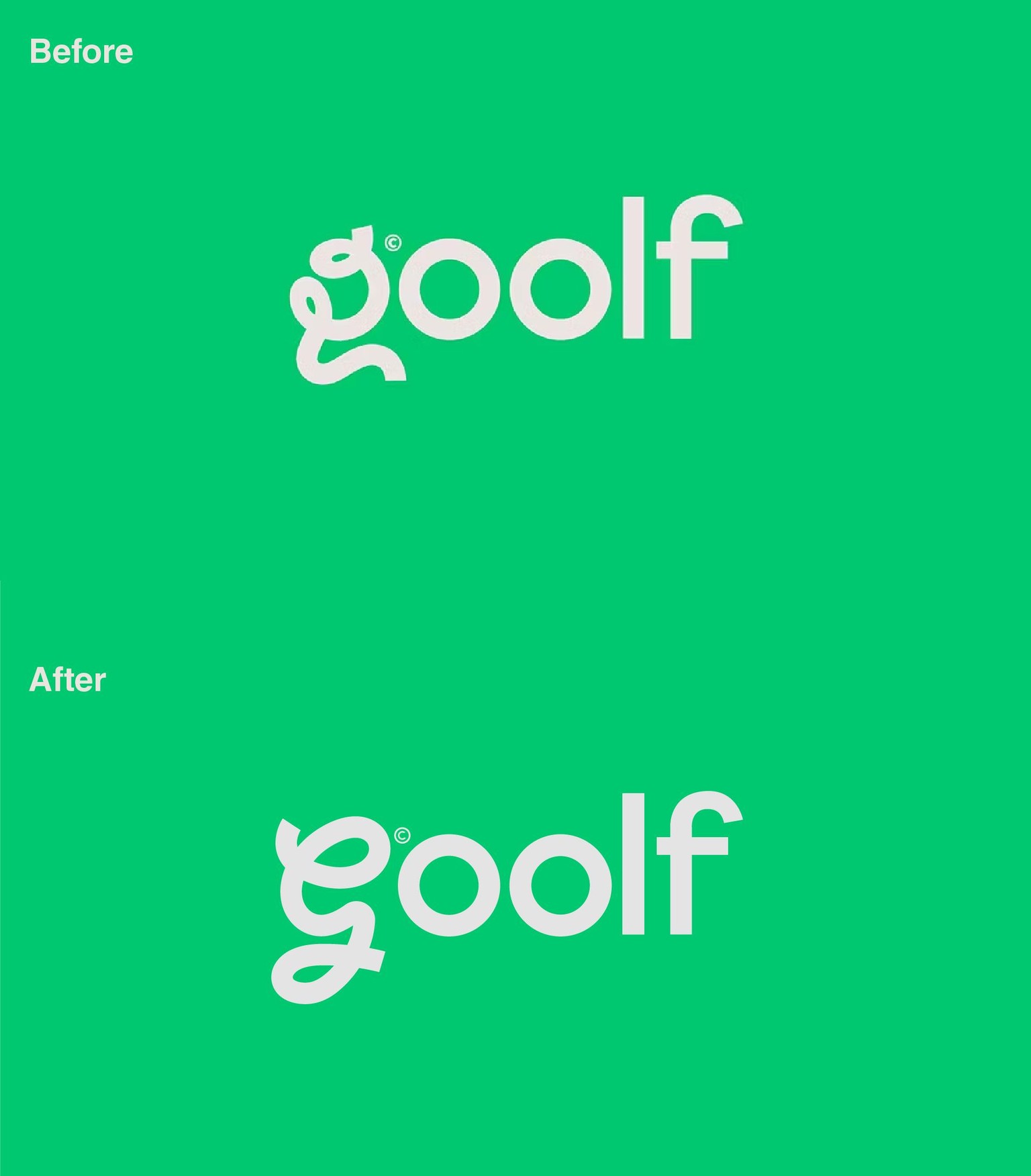
Initially, the letter "G" was supposed to represent a golf course.
I decided to use a cursive G to keep that "funky" and "curvy" look while the curves still looking like the actual letter itself.