Gelato in the City
To create my palette, I started with my brief notes. First, by those words that were in the brief that were used to describe the brand - and also the similarities between the products that the target market was drawn to - asking myself, what is it about these products that resonate?
I got: Urban, Artsy, Relaxed
Simple Design - Exclusive Feel - International Appeal
Modern, Stylish, Up-to-Date
I also got that the target market was younger, so they still needed "fresh" feeling colors - but "artsy" and "international" tend to use neutrals with a pop of color - or really bright colors everywhere.
I also made sure to check my notes for the competitors' palettes to make sure the palette I chose wasn't too similar.
Then - I went to the photographs that were provided to see which fit with the notes I had taken.
The first was this one of the city
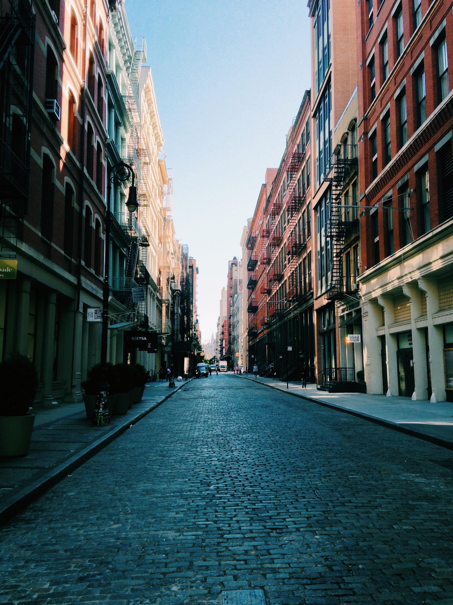
There are some really nice color combinations that come out of this. I got this palette that really resonated with me due to it's contrast and classic, simple feel.
https://color.adobe.com/street-color-theme-11082414/
Then this photo really stood out - Artsy. Wicker basket made me think of picnics in the countryside - Upscale. International street.
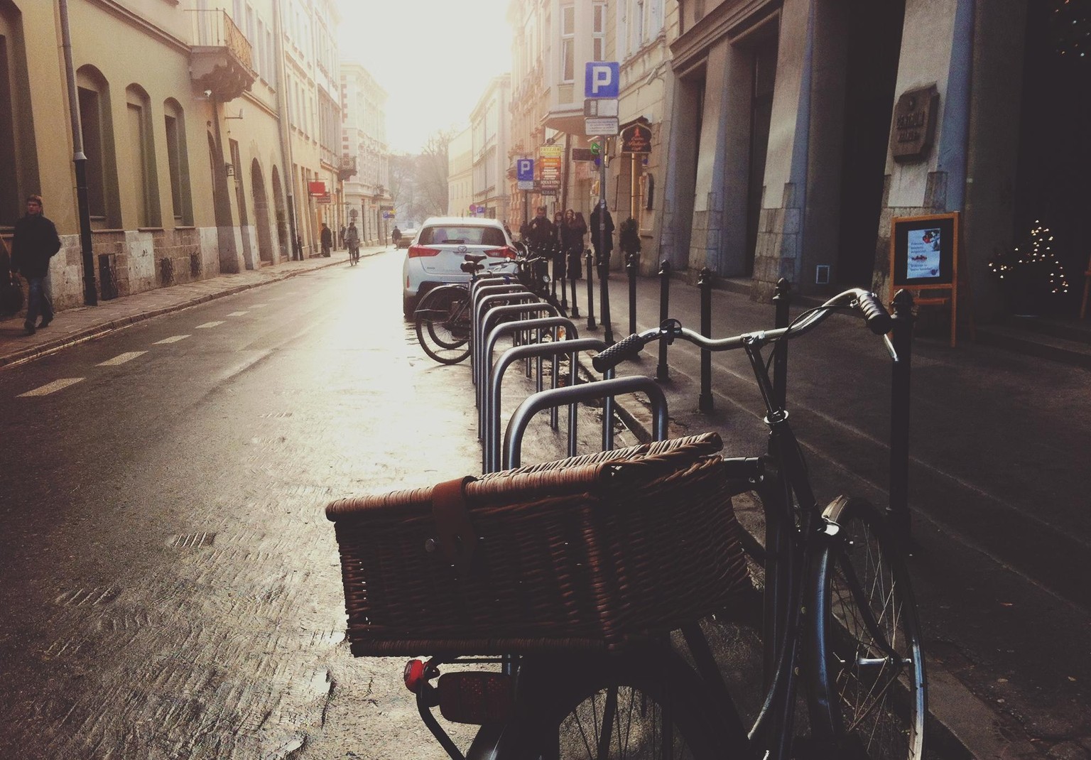
From this I pulled a surprising palette that made me think of taking a gelato in Italy. Everything I wanted to capture about this brand description. Fresh colors - a little darker - but really artsy, and good contrast with the complementary colors.
https://color.adobe.com/bicycles-color-theme-11082426/
Looking forward to feedback for which resonates more!