Flower Petal Mandalas
Oops, I was posting these under the first mandala class...
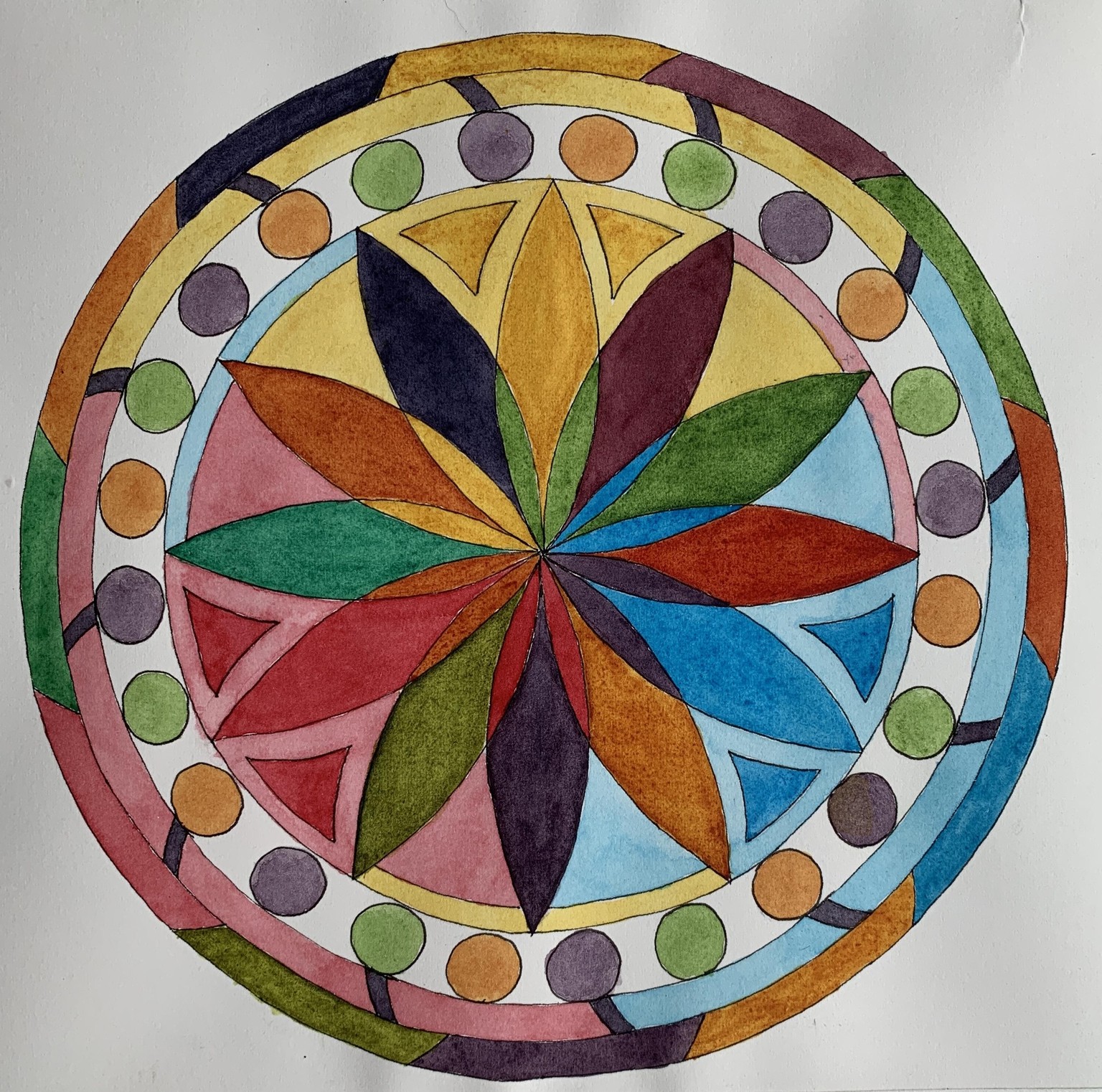
I went a little crazy with this new mandala design and it was a blast to do. It makes me laugh every time I look at it. Colors I used: Indanthrene blue, Quin red (both Windsor Newton), aureolin yellow.
I also tried some hot press paper which I haven’t painted on before. Not sure if this paper is of a nature that erasing ruins the surface or if it is just strange to begin with...It is very different to paint on than cold press. Some of the sections were incredible: paint the right thickness, pulling the puddle worked like a dream, others (green, orange and yellow green) got splotchy. You can see the scrubby texture the paper did on a lot of the sections. I must say this was pretty complicated!
Mandala 2:
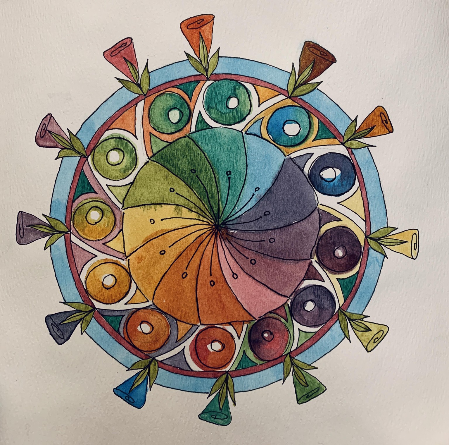
Here is my second one. I decided to stop fooling around and use some of the Arches watercolor paper I have after my experience with the one above. OMG>night and day - Everything was easier and the washes are the best ones I have ever done. I love making these up and then painting them in. Now I am going to try Arches hot press paper...
Colors used: Aureolin yellow, manganese blue hue, quin red (WN)
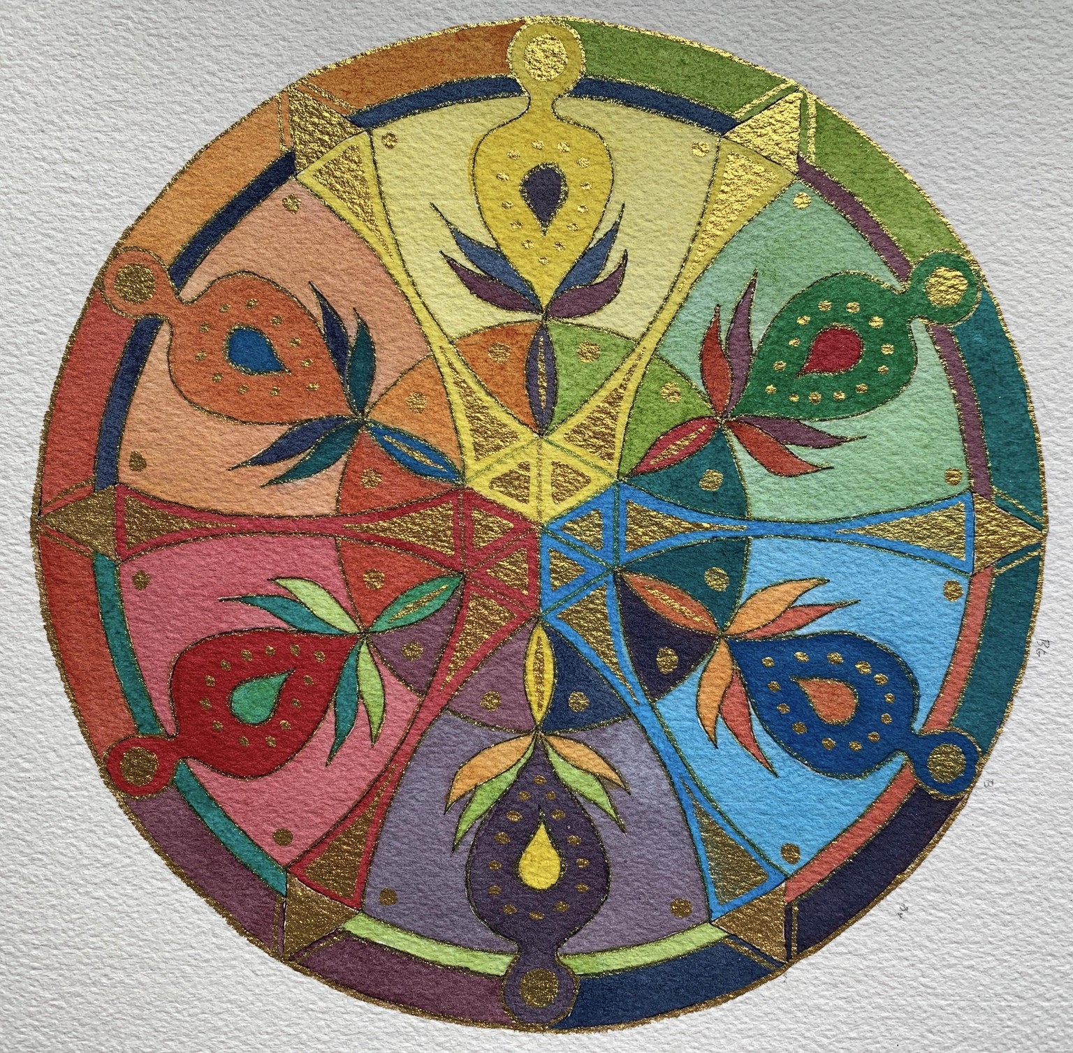
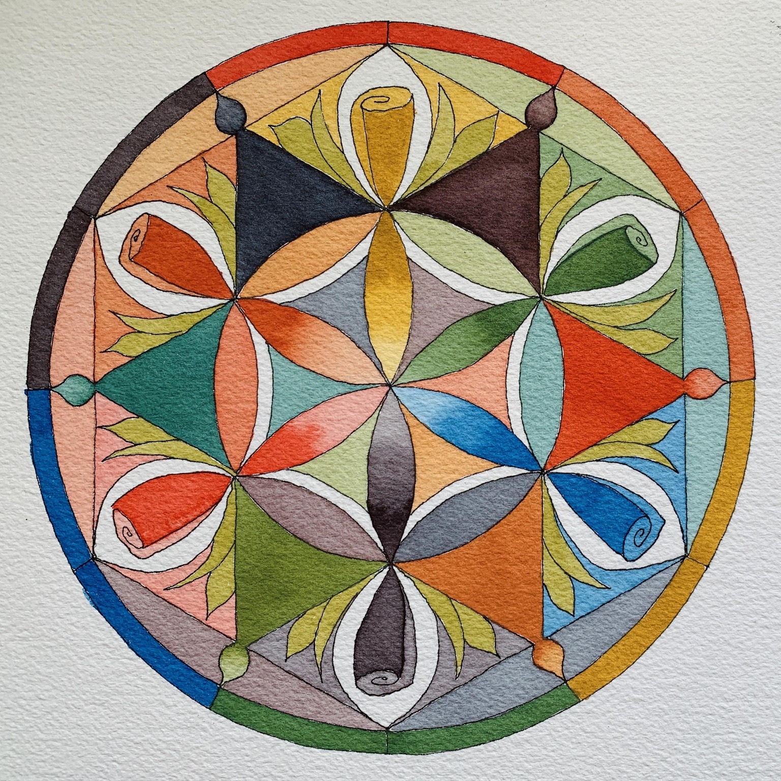
Mandala 3:
In the spirit of mandalas, I have added some gold to this design. I hadn’t planned on it but lets just say I was called by the beauty of glittering bits. This one took a special kind of logic that I lost track of and I goofed in a few places. Took as much of the paint off and put on the right color but of course it messed up the color a little bit. This is on Arches cold press paper, the same as the one above. It really is dreamy to paint on.
Something else that I am discovering is that if the pigment is really thick, the color tends to lose its vibrancy as the white of the paper isn’t showing through. A fine balance, but it also depends on what one is looking for I imagine.
Colors used: Aureolin yellow, Alizarin Crimson and Manganese Blue hue
Mandala #4...The paper: Arches hot press 90lb (didn’t realize that I bought a lighter weight paper). I had to adjust as it wasn’t as forgiving as the cold press Arches I had used for the previous two. However, the pale colors really are delicious on hot press paper.
The colors I used: Nickel Quin Yellow, Manganese Blue hue, Alizarin Crimson. I switched out the cool yellow in the previous 3 colors from Aureolin to the warmer yellow to see what would change. I haven’t wrapped my head around that yet. I don’t usually pay attention to granulating colors but in this case I had two with the yellow and blue. It is part of the reason the stronger colors look, uh, well, granulated!
04142020: Mandala 5
This is the same colors as the one above. I had so much paint left over it was easy to just keep enjoying working with them and improving on the thickness of the paint. I was actually doing a quick sketch of my idea and kept going along and when I got my new fountain pens I jumped in and inked it, then completed painting. It is on the back of a painting exercise I did. Interesting how it moved along when I wasn’t feeling so precious about it. It’s on the Bee paper I don’t like much.
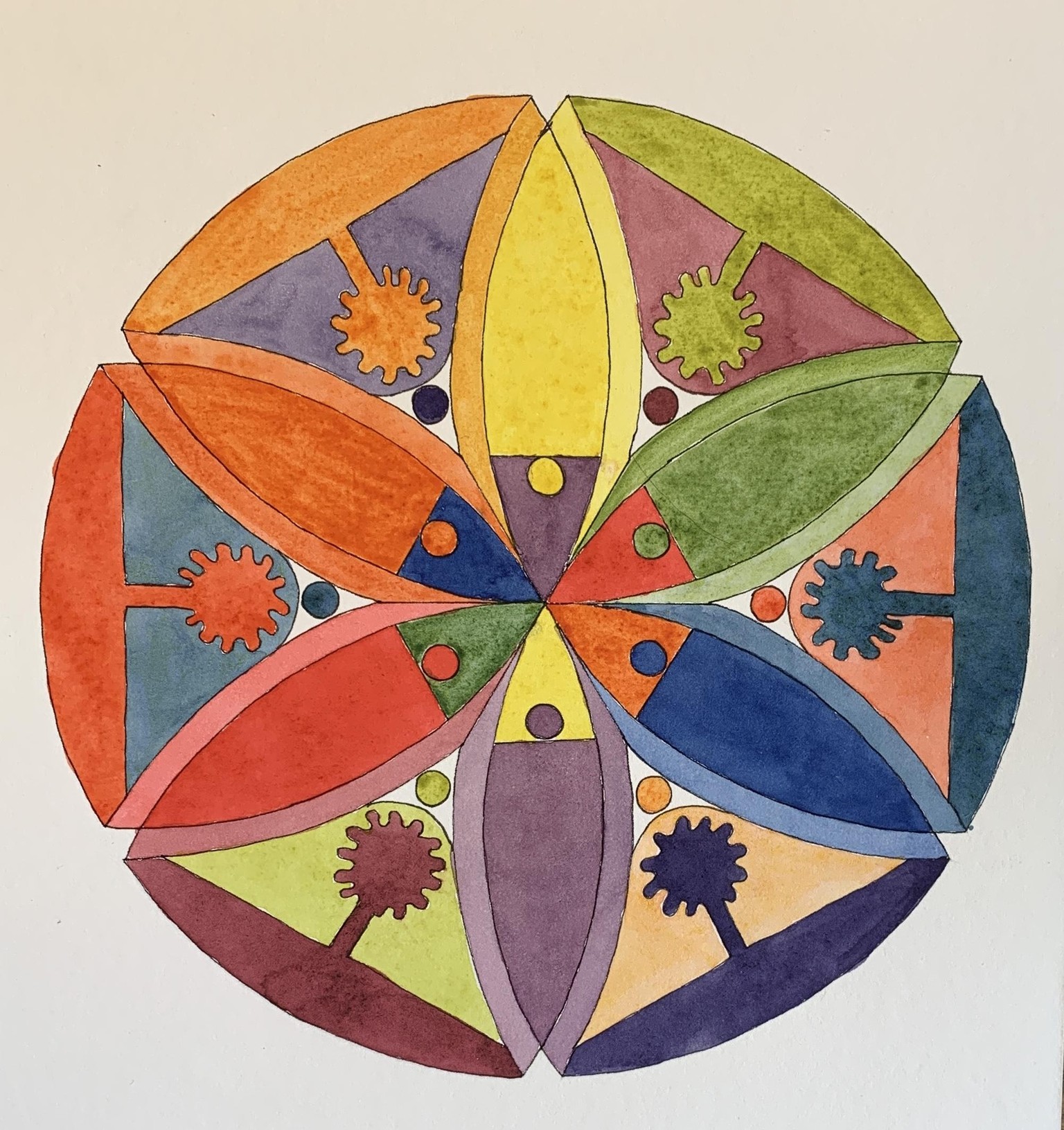
Mandala 6 of the Petal Series
I have so many ideas for these mandalas that I just can’t make them fast enough! This one is on the Arches paper with colors inspired by the latest set of mandalas that Chris posted using Yellow ochre. For the other colors I used phthalo blue (green shade), and Scarlet (ochre is from M Graham, the other two are Daniel Smith.) I am steadily learning the right amount of water to pigment although I still err on the side of too much pigment and not enough water BUT I am really getting close to seeing the right consistency. Chris, you will notice that I started doing gradients in this one. : )
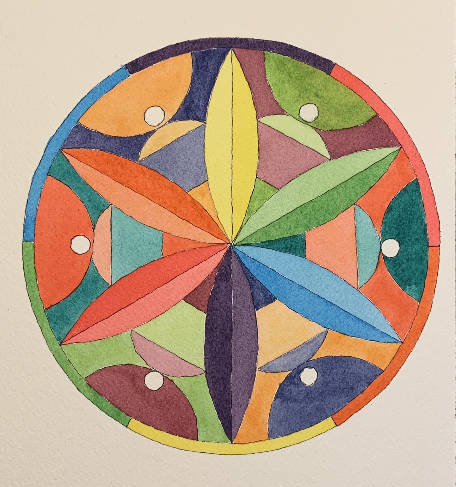
Here is the latest color wheel in this series. I think as much as I enjoy doing them, I am going to take a break after this one and do one of the other class projects!
Colors: Hansa Yellow M, Scarlet, and Ultramarine Blue. Paper: Strathmore cold press 500 series. (The paper was pretty nice - not quite as nice as the Arches but a long way ahead of the other cotton papers I have been using. In hindsight, I deviated from a general plan that I had and because of that, my eye doesn’t find places to rest in the center ring. My original plan was to paint one color beside each of the “trumpet” vase shapes of the complementary color. I also discovered that I have a harder time making washes with granulating colors. This one is also quite a bit larger than the other ones. The outside circle is 8”. And yes, I decided to add some gold to dress it up (like it needed more hahaha).
04242020:
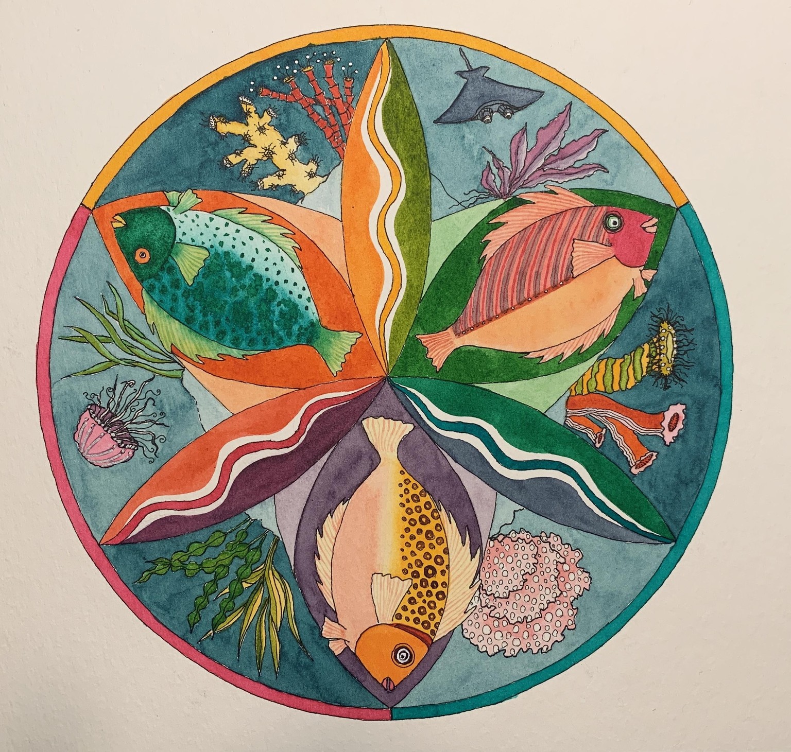
Finally finished my seascape mandala...deviating from the flower petal theme but it is still in the design. I learned a lot about painting smaller areas with details...like it is darn hard to do any puddle pulling when I have to stop to fill in a small area. So I was a bit disappointed with some of the areas of color. Stepping back from it, though, it isn’t as bad as I was thinking.
I went out on a bit of a limb in terms of colors:
Indian Yellow, Quin Rose and Pthalo Green - blue shade (for my blue). It worked out better than I thought. I did do a quick color wheel to see how the mix was going to be. A little confusing at times - I would want to know where my blue was. I will take a picture in the daylight so the colors are better...This one definitely has a chuckle factor for me.