Floral Art Prints (HolycrapIlovethem)
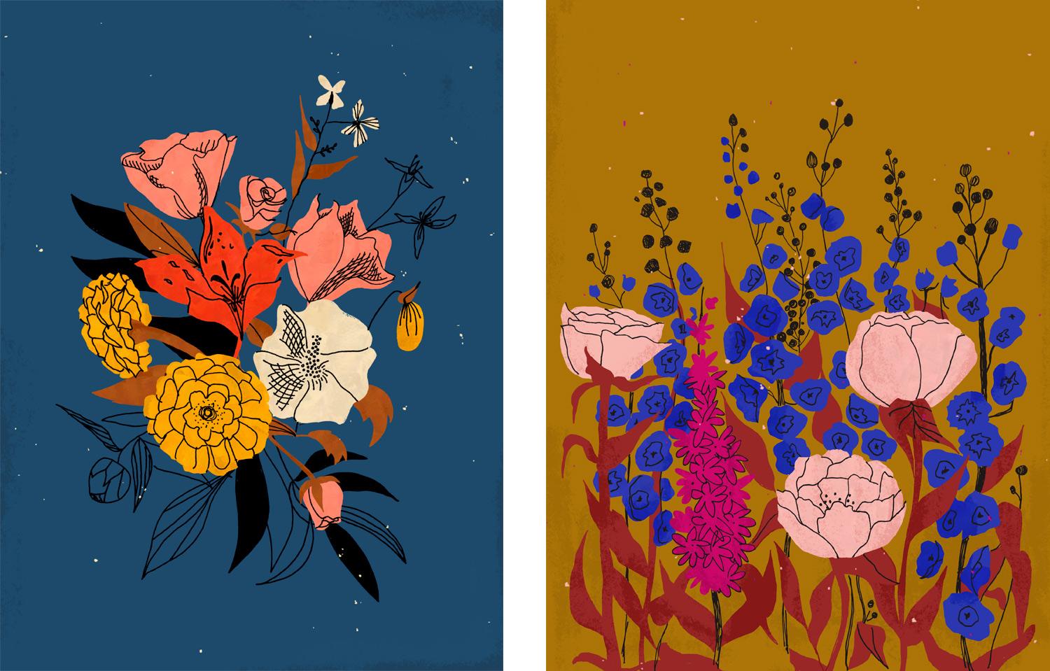
This year I did a 100-days-of-illustration challenge and whipped up a LOT of florals. I’ve been itching to get them printed and finally used this project as the kick in the behind I needed. I decided to try out Society6 because I had heard great things about their print quality and color gamut, and am interested in being able to sell me work. I chose two florals that had, what I'd figured, were pretty tough colors as far as pushing the CMYK gamut goes. I was looking for bright, bold, velvety blues and inky, golden, saturated browns. I was asking a lot.
I found the guidelines for Society6's prints here and took note of the following things:
-As for color model/mode, they say if it's in RGB to keep it in RGB, and to designate a color space myself. They say you can submit CMYK files, too, but that it's not necessary. I kept mine in RGB and stuck with sRGB
-They expect the artwork as a hi-res jpeg
I really didn't know what to expect with those bright blues in the piece on the right. Same with both background colors. I have to say, I am blown AWAY at the color and ink quality. I chose matte prints and they are incredibly velvety and vivid. It was a really special experience after all the hard work I've put into my craft.
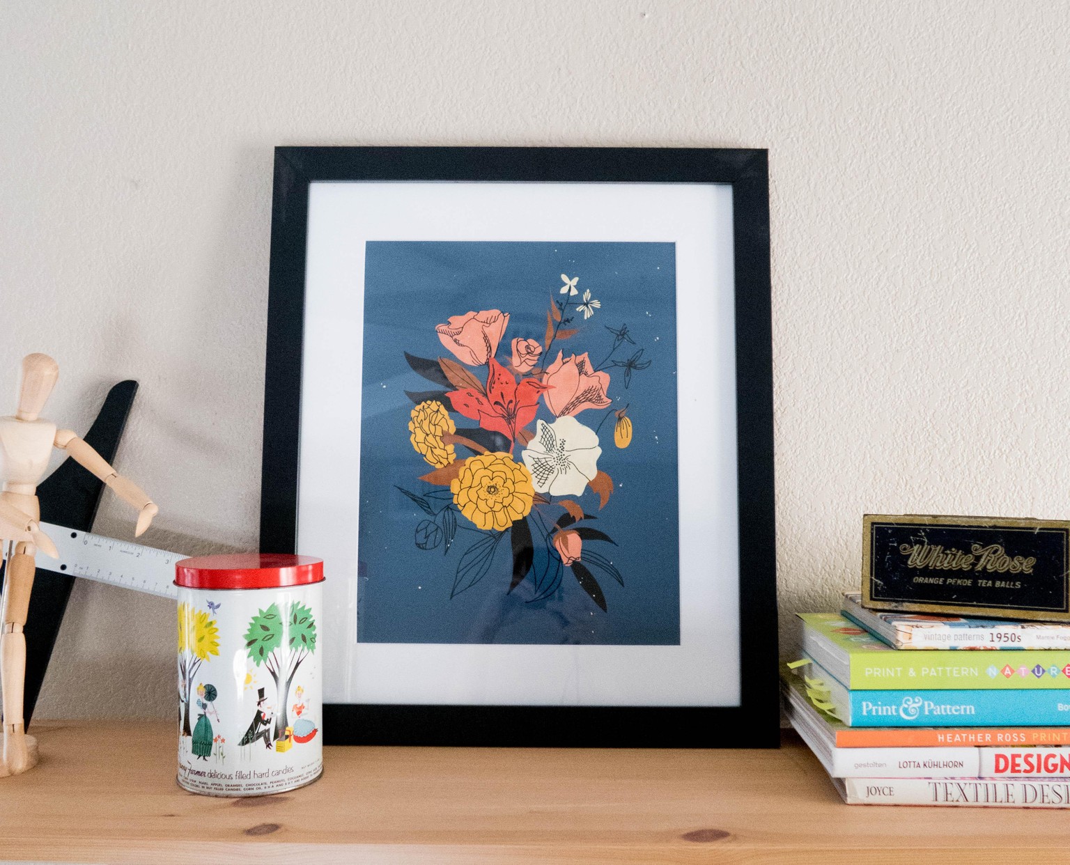
I had this really sad, brand new, empty frame on my sad, unpainted shelf for awhile, and it felt so good to put some of my work in it!
Seriously inky and lovely and YAS
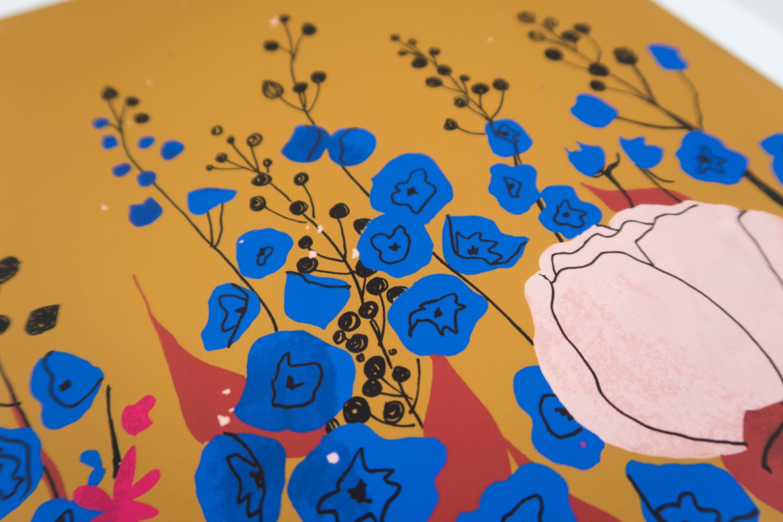
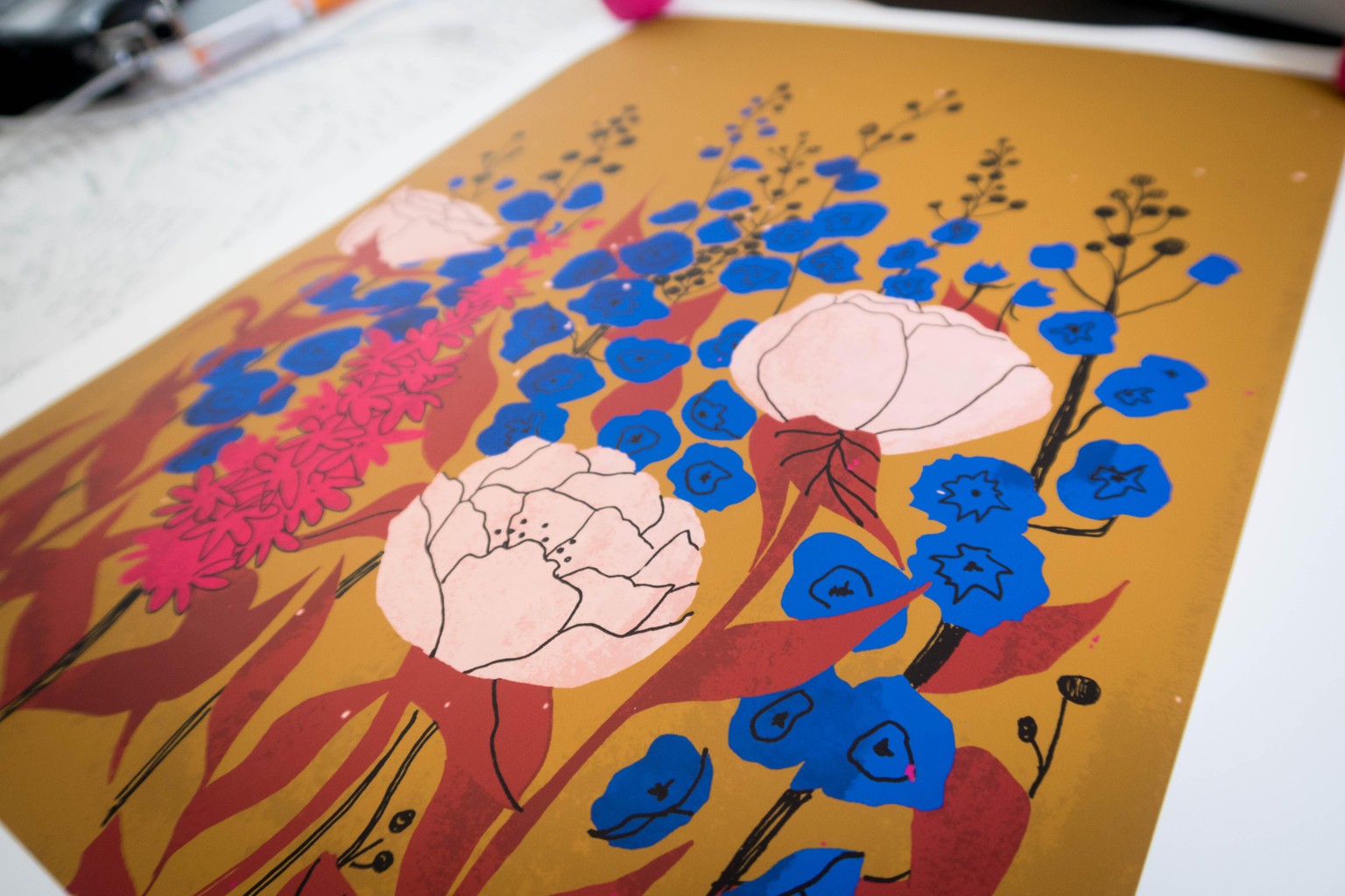
but those blues...
The coolest part though, is that even though if I hold the poster up to my computer it doesn't match (if you haven't watched the class yes, this is expected), it does look exactly as I hoped it would, and expected it would. I think that means my intuition with color and printing is getting stronger. See what going for it a few times can do?
Can't wait to empty my wallet getting everything I can think of printed (insert that emoji that's sweating and smiling and the same time) (that's way weirder typed out)