Find Your Illustration Style: A 30-Day Creative Challenge to Build Taste & Consistency
Lately, I’ve found myself returning to Crayolas, tempera paint sticks, and especially oil pastels. I’ve been wondering what I can truly make with these materials - and whether what emerges can become something meaningful and authentic to me. When I saw that Claudia was experimenting with oil pastels (what an uncanny coincidence!) in her 4th, 5th & 6th painting exercises for this class (check out her project), I kept watching, drawn in by the curiosity she modeled and the possibilities she opened up. Indeed, style and taste is more a matter of making decisions!"
One idea in particular stayed with me: how asymmetrical the tension can be between the art styles we’re drawn to and the skills we actually have. Simply becoming aware of that tension already gives me a clearer sense of where I am and what I can focus on - without blocking me from finding an interpretation that is honest to my present abilities. This has made the class feel deeply introspective. I completely agree with Claudia: Style doesn’t appear out of nowhere; "we have to work toward it - repeat, repeat, repeat!"
With that in mind, I’ve completed my Inspiration Library and Style Manifesto (24th June 2026) and will begin, over the next six days, the daily exercises - paintings created for this project - using oil pastels as a starting point (maybe, no pressure!). Through repetition, observation, and curiosity, I hope to explore what these materials can reveal as my style gradually takes shape.
(",)
WEEK 1: BUILDING A REFERENCE LIBRARY - As Claudia explains, it is about "gathering inspiration to build a foundation for your own style." There were various aspects in this class that I had already been doing - over the years - but never really did much with, nor connect with more intention, such as keeping a "folder, folders and more folders" of images that i liked or inspired me.
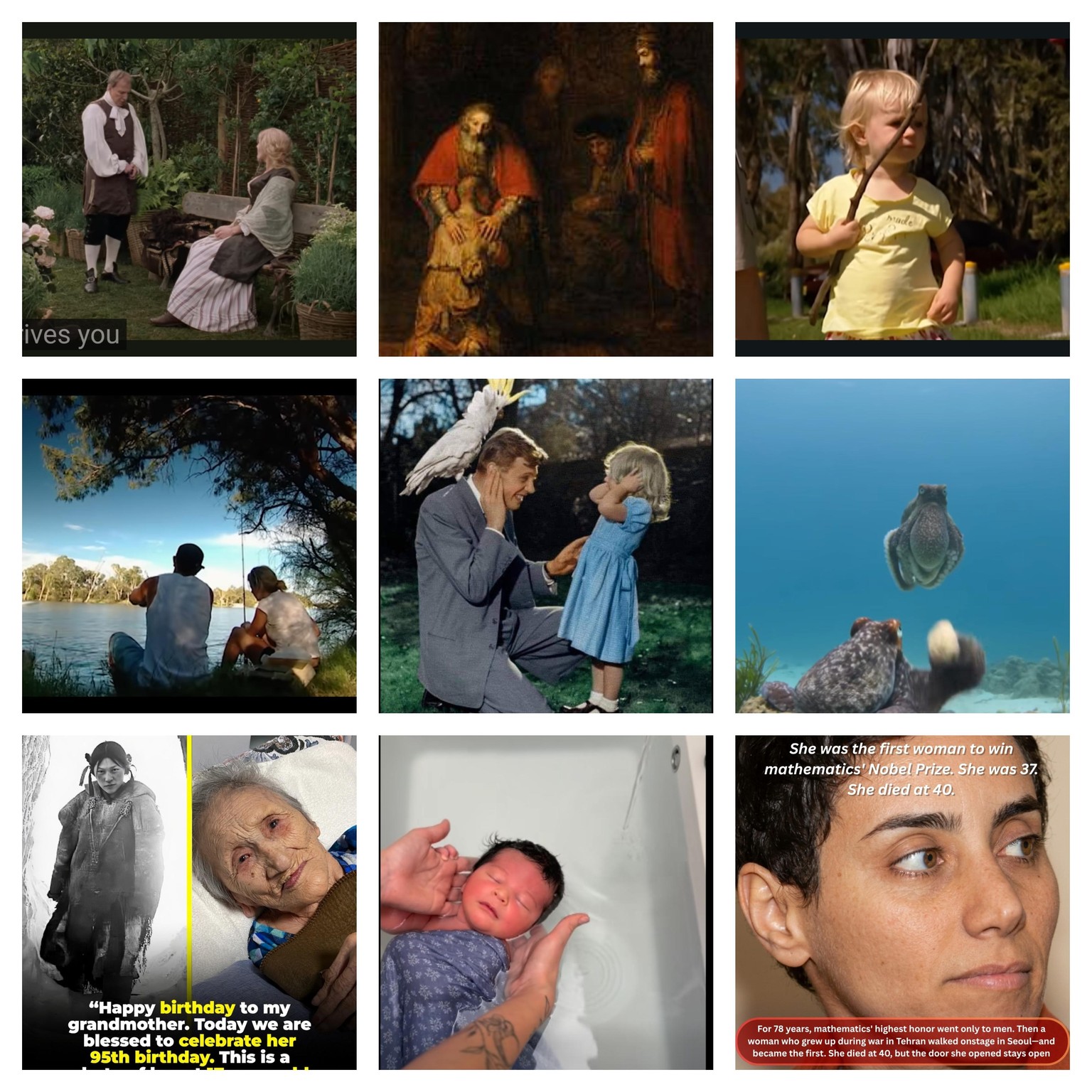
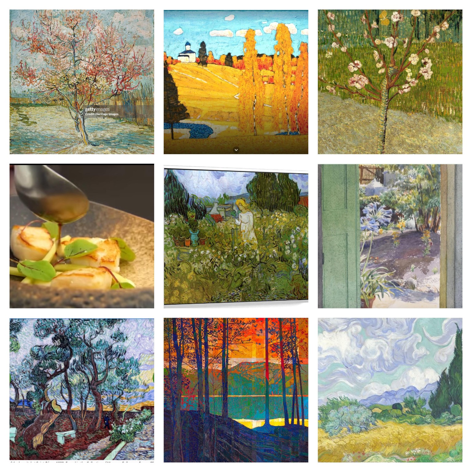
WEEK 2: ANALYZING YOUR STYLE DNA - Without overthinking I created 6 Grids of 9 images each from my folders in order to find a way to share what I have categorized here. I kept all 4 categories and added 2 more (Landscapes and Home & Garden) I'm really excited to get to know more about my Style DNA or at least discover a starting point and a direction to evolve further.
1) EMOTION & STORY: I can see layered human narratives and heart-to-heart connections - biblical, spiritual, intimate, and mysterious - expressed through tenderness, human gestures, and facial expressions that convey a deeper meaning about the magnificence of the human person. The octopus also surprises symbolically, reflecting complex human emotions. The color palette ranges from subtle pastels - light blues, yellows, and grays - to warm, earthy, and richly saturated tones of red, blue, green, and brown. Each subject is compositionally treated as the “hero” of the story, carrying the emotional weight of the image, while contextual elements and backgrounds quietly deepen and support the narrative.
2) COMPOSITION & STYLE: I can see heavy paint alongside spiritual, emotional, and contemplative space, with meaningful and expressive content drawn from impressionism, post-impressionism, expressionism, and contemporary styles. The colors repeat but appear brighter, more vibrant, and saturated - yellows, oranges, blues, greens, sunlit pinks, and soft pastels - with strong contrast throughout. Composition is shaped by landscape elements such as distance and perspective, diagonal lines, hero images, and supporting details. And the subjects: trees, trees, and more trees!
3) LINE & SHAPE: Geometric and organic shapes, negative and positive lines, silhouettes and marks help portray the mood, emotion, habitats and cultural atmosphere. Emotion and Story repeats here too.
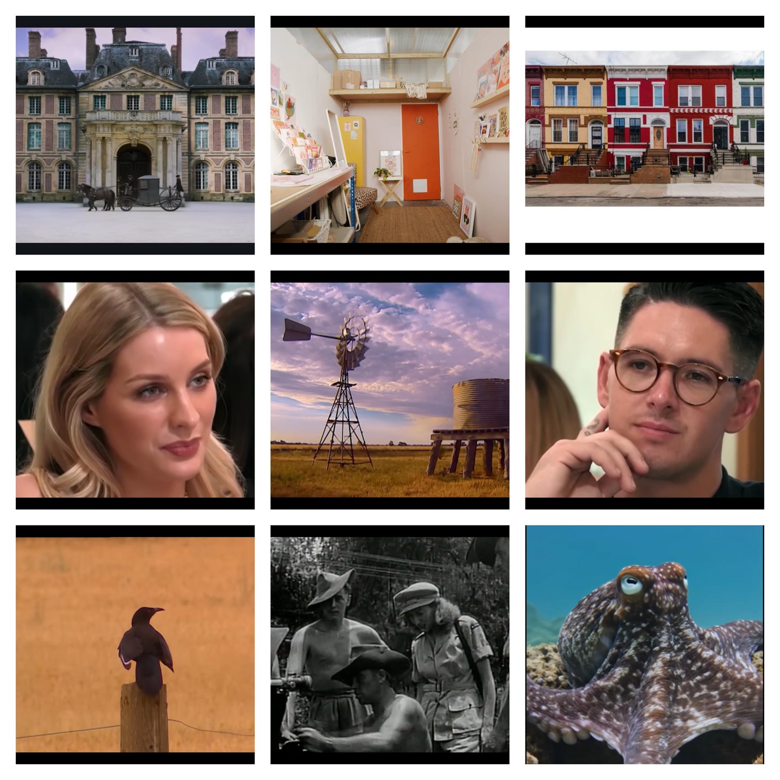
4) COLOR & TEXTURE: There is extensive use of dark, medium, and light gradiated colors - chiaroscuro (if rendered) to produce depth - combined with both harmonious and contrasting lights and darks. Textures emerge from layered groupings of shapes placed side by side, with silhouettes, marks and other details drawn largely from nature. The recurring subjects from nature include sunlit cobwebs, pigmented earth, water, lush vegetation, animals, and birds, with an emphasis on natural light, sunlight, and sunsets.
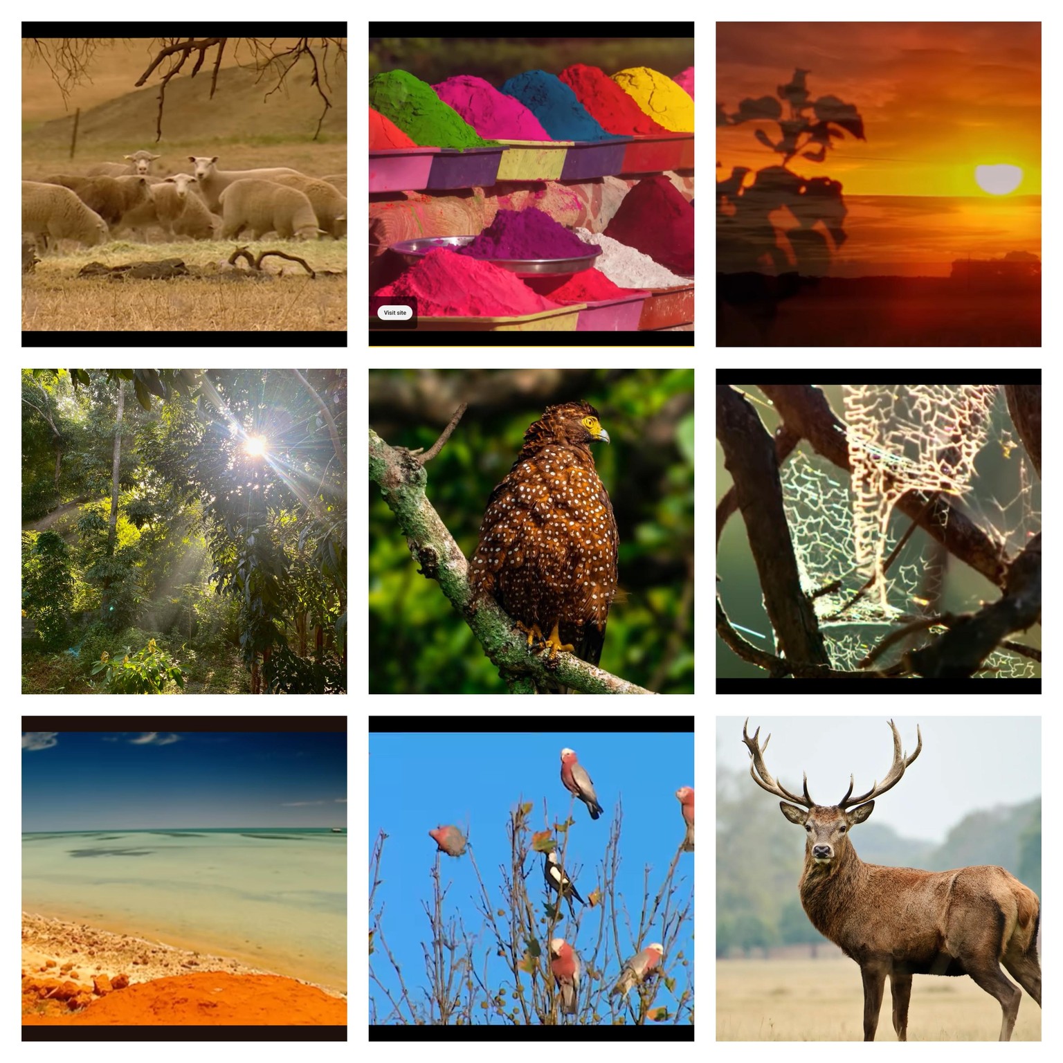
5) LANDSCAPES: I’m drawn to the contemplative space that landscapes offer - their pristine vastness, power, and beauty are comforting, grounding me in a sense of place and delight, even in their ephemeral nature. As images, landscapes that capture a fleeting moment of natural beauty open a space to contemplate what is invisible yet deeply real within that vision.
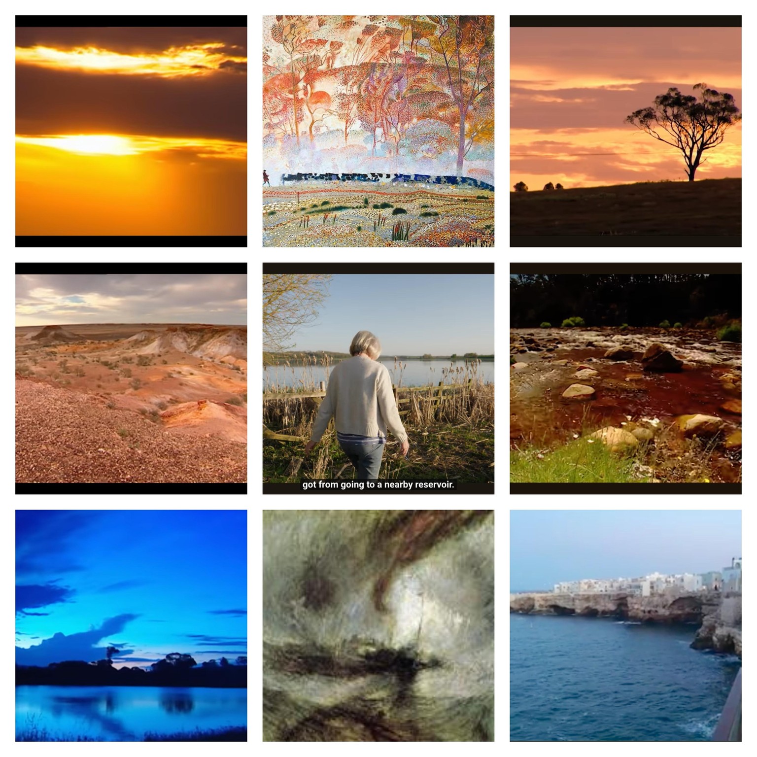
6) HOME & GARDEN: These themes urge me to create a sense of being, a sense of place, and a sense of kindred belonging and connection - something as serene as a child standing in the middle of a cultivated garden, surrounded by vast wildness, yet secure and grounded enough to appreciate the simple joy of gazing at light in the darkness. I’m thinking of using this image for the 6 drawing exercises during Week 4.
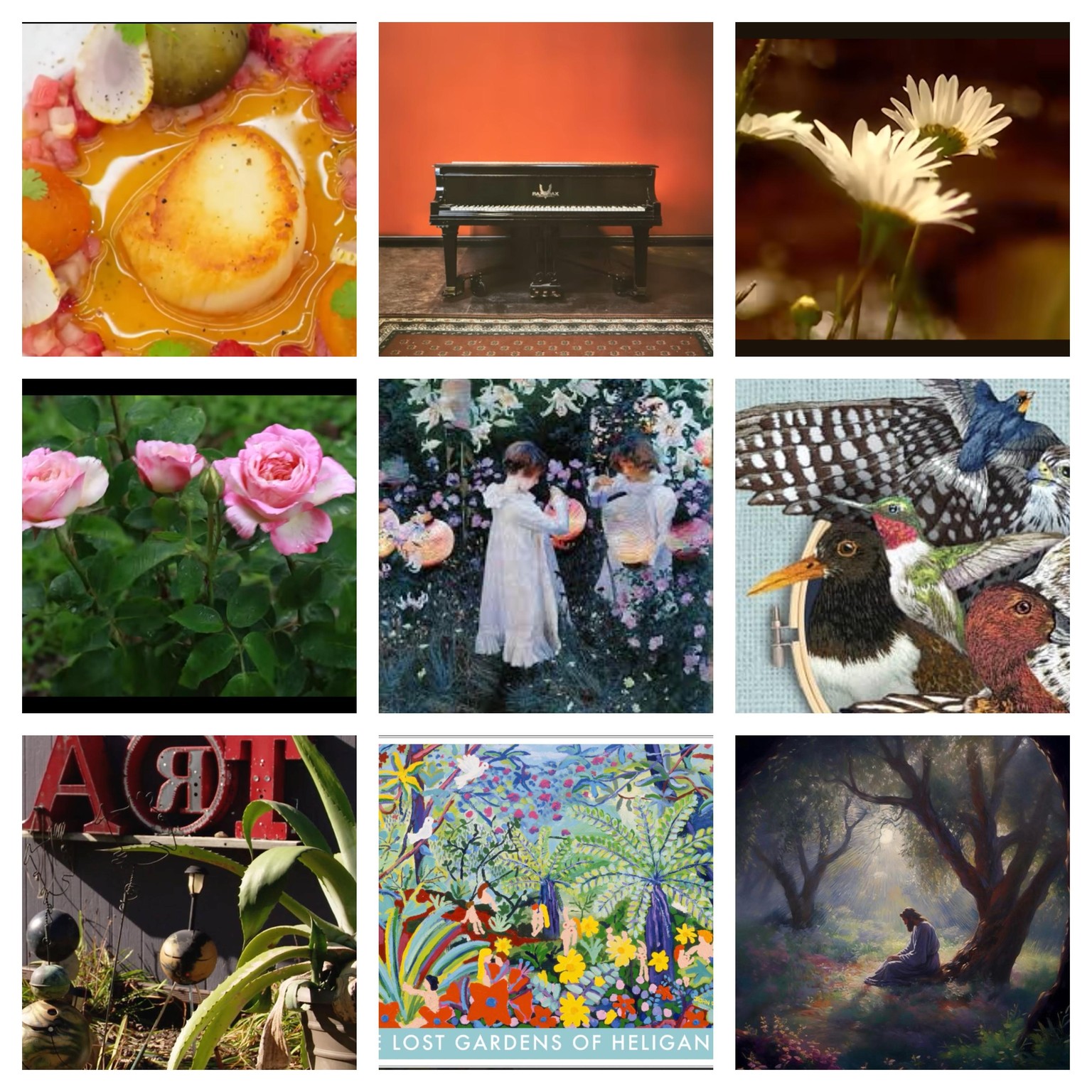
By the way, I just realized that this is actually my FIRST MOOD BOARD that I have ever made - if not more intentionally! I was not confident to do this before but with Claudia's guidance and encouragement, here it is! ❤️🔥
I’m glad that style isn’t static, but something that can be revisited and allowed to evolve. I can return to this after some time - maybe in a year, or every now and then - because for now it feels like a starting point. And I can see more clearly why a Style Manifesto is needed: it helps represent and translate all of these annotations into something coherent and intentional. 🎖️
WEEK 3: CREATING YOUR STYLE MANIFESTO - I had no printer, so i just tried to find a way to edit the PDF. I'm just too excited to submit it here (I'll visit a proper printer shop eventually).
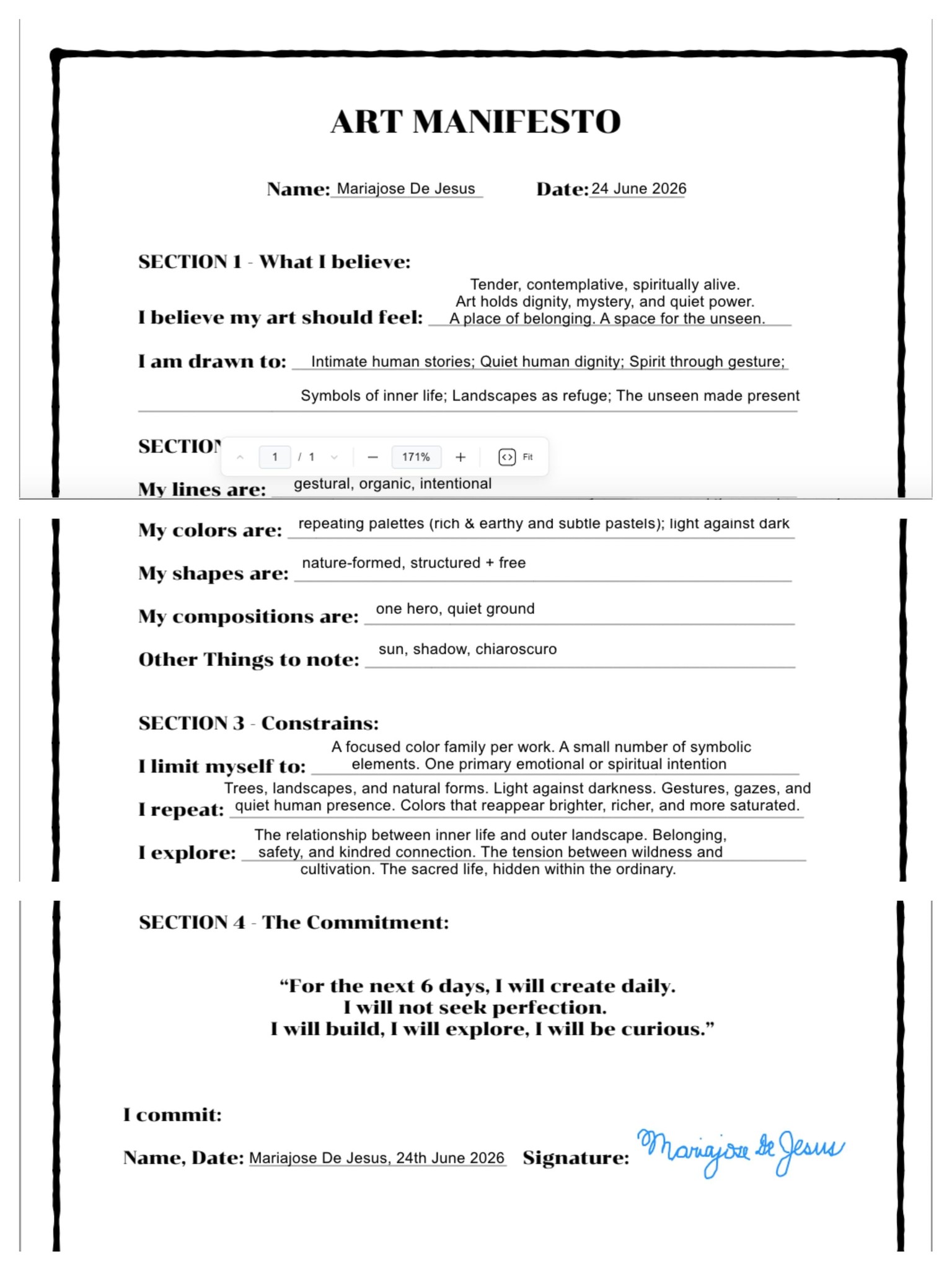
A 6-DAY CHALLENGE FOR CONSISTENCY AND PROGRESS! (25-30 June 2026, coming soon!):
My Choices:
1) "Mademoiselle Gachet in her garden at Auvers-sur-Oise" (1890) by Vincent van Gogh (with Oil Pastels - the middle image in the COMPOSITION & STYLE category
2) "Carnation, Lily, Lily, Rose" (1885–6), by John Singer Sargent - midle image in the HOME & GARDEN category (for Exercise 5)
WEEK 4: EXERCISE 1, PRACTICING & EXPERIMENTING
This first exercise is about copying, and I understand why - it’s part of learning how to make decisions so that (as Claudia said) style and taste can eventually come through. I have a lot of work to do with this, but it doesn’t feel laborious. What feels far more exhausting is working without clarity; this process gives me direction, even as I’m learning.
Working with oil pastels helped me become more attentive to color, pressure, and mark-making, but it also made me aware of their limits - especially with layering. Because I couldn’t fully build lighter values over darker ones, I introduced acrylic white paint to develop the light areas of the clouds, dress & flowers, which allowed me to create contrast while still working intuitively with the pastels.
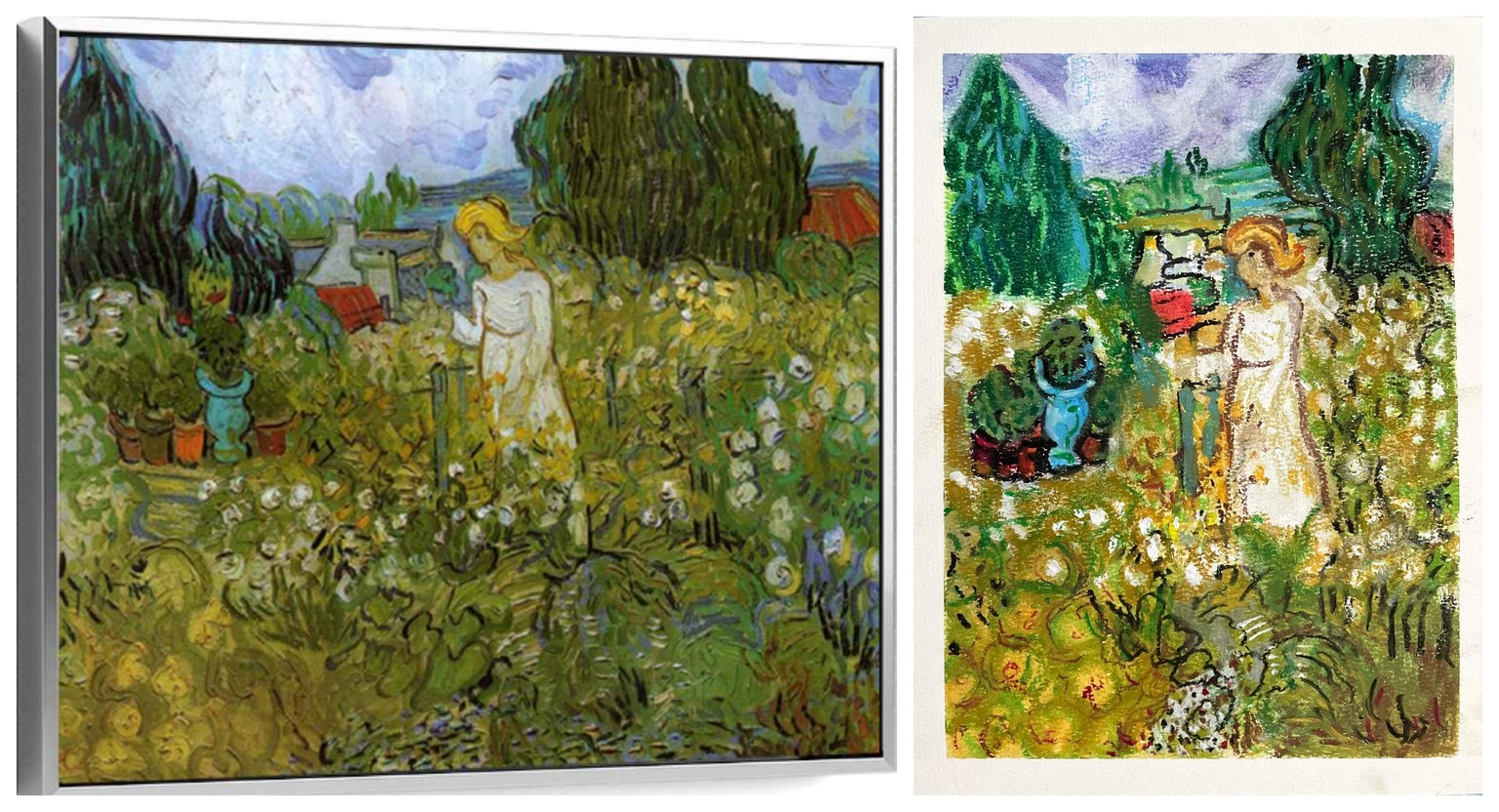
(Left = Original)
WEEK 4: EXERCISE 2, REINTERPRETING
I tried a new material: Acrylic Markers! which naturally shifted the color relationships because of the limited palette. I was hesitant at first, but I ended up really enjoying how layering works, especially being able to place lighter tones over darker ones, which I couldn’t do with oil pastels. The slight transparency also helped create softer blends.
Also, since I wasn’t copying anymore, I also felt more freedom in my gestural strokes, and - like Claudia demonstrated - I found myself simply responding to the material as I worked. While I like this version, I can see that, compared to my Manifesto, the contrast between light and dark is still quite subtle, and that’s something I need to work on more intentionally.
I’m really grateful to have a clearer sense of what to focus on now. The Manifesto helps keep me anchored to the choices I made through the mood board; otherwise, I’d probably keep liking every new thing and feel unsure about how to move forward. With this clarity, it feels like things finally have a chance to align. Thank you for this, Claudia!!! ❤️
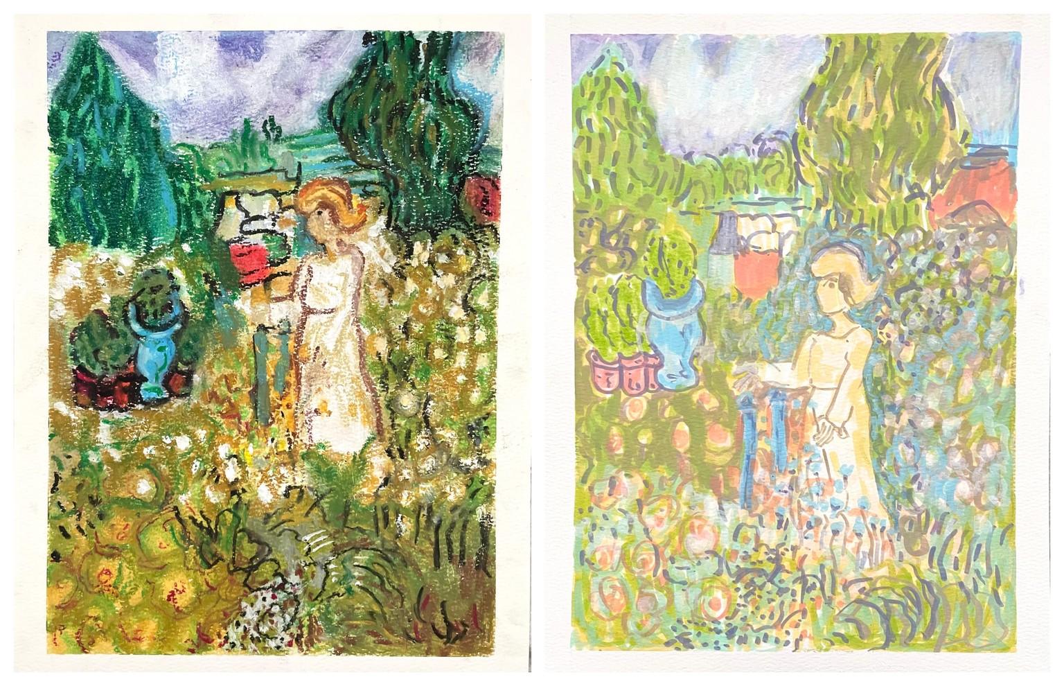
WEEK 4: EXERCISE 3, REINTERPRETING THE INTERPRETATION
I used different mediums: Starting with loose liquid watercolor i created washes in orange, green, and yellow - now mostly hidden and only visible as small glimmers beneath the layers - but it helped me feel bolder with color from the start. While the paper was still wet, I blocked in watercolor, added oil pastels for texture and soft gradients, and finished with acrylic markers for highlights. At this point, the work has become fully mixed media, and the layering allowed me to engage more consciously with contrast - though I can sense there’s still room to push the light and dark further.
I kept the same subject but as instructed I approached this as a "reinterpretation of a reinterpretation," which felt more freeing and less about copying. By holding the subject constant for now, I’m able to focus on experimenting with just a few variables: color, contrast, and texture.
Returning to my Manifesto raises new questions about how I want the work to feel - tender, contemplative, restful, yet spiritually alive, making the unseen and interior qualities present. I’m beginning to wonder if that quality might emerge more clearly with less going on: fewer textures, fewer elements? Maybe not necessarily, but i'll try something different from hereon.
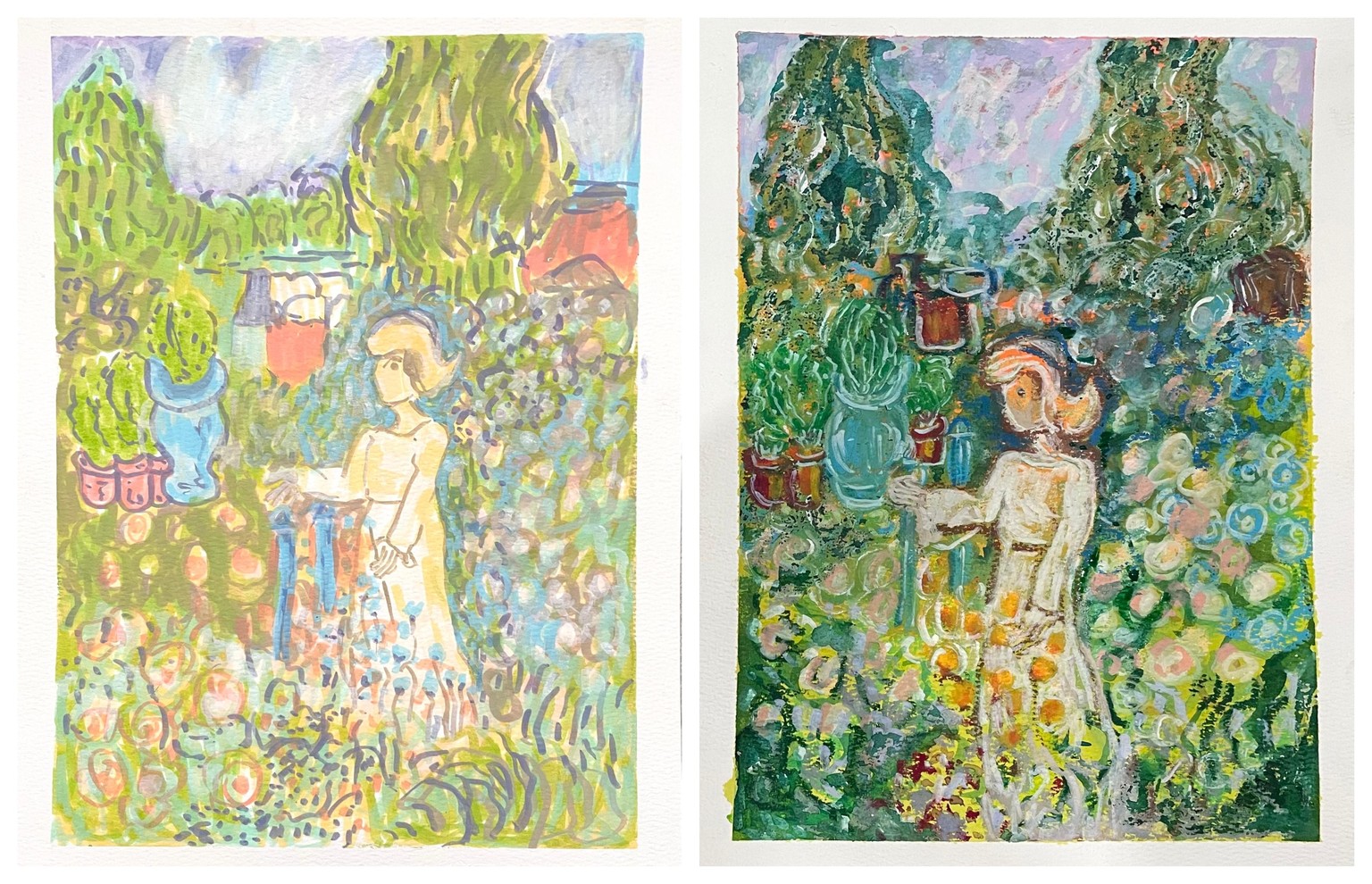
WEEK 4: EXERCISE 4, TRYING OUT A NEW MATERIAL
This is something I never would have planned to make, and what I recognize in it emerged through the process rather than intention. I’ll likely need Claudia’s help to better understand how to re-interpret a painting and what’s unfolding here? I feel that i cannot let go of the reference (its an internal critique that's telling me I'm not copying it right but i want to let go of the reference already), funny how the mind holds on to things! 😃🙃
I used new materials - water-soluble waxy bars and Inktense pencils - but I forgot that its difficult to apply the pencils over the waxy surface, so I layered acrylic paint first and then returned to the Inktense. I was drawn to their inky intensity and wanted to explore a garden at night. I wasn’t sure how to shade it realistically, but I pushed through anyway, adding more acrylics halfway through and toward the end.
For the next (5th) exercise, I want to do less - fewer elements, fewer details. I think I became attached to the forms rather than interpreting them, which may be why flowers keep reappearing and they are increasing each time!!
Still, I’m beginning to think this might simply be how my brain processes repetition. Maybe it wants to bring out more flowers, for example, and work through ideas one painting at a time. It feels a bit like practicing scales on the piano before being able to improvise - you have to let the learning curve fully unfold. Claudia says this is something we can do for a lifetime, and that really resonates with me. I’m genuinely enjoying this creative process - can you tell? 😊
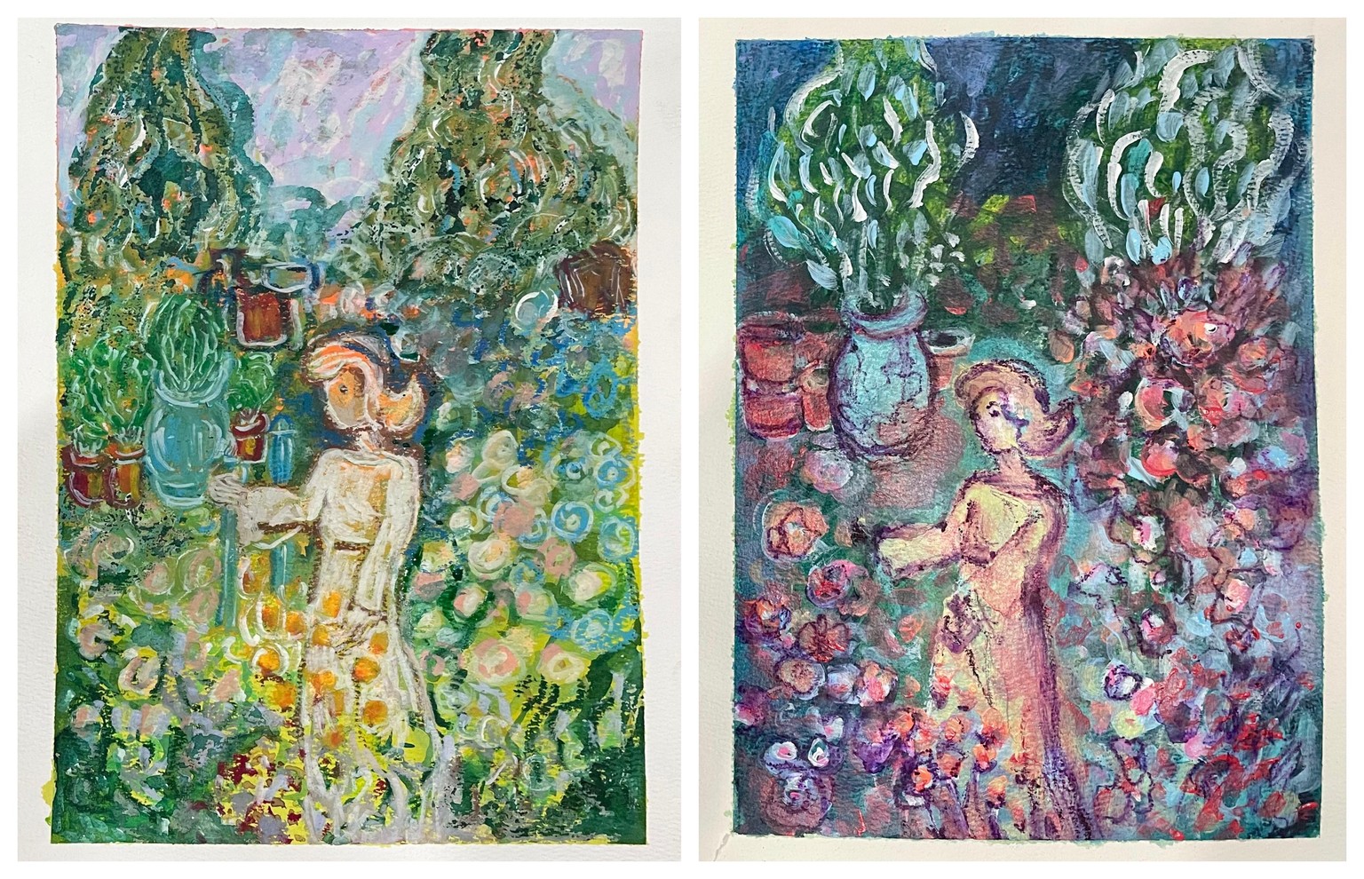
Once more, here are all 4 repetitions! Maybe not necessarily "re-interpretations" except that I changed art tools and mediums. I still have to learn how to "reinterpret" and thus stylize. I get that this is how I will eventually find my style emerging from the repetitions (",)
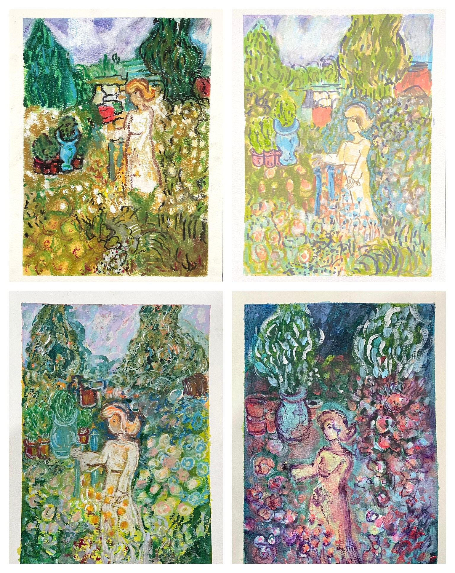
WEEK 4: EXERCISE 5, INTERPRETING A NEW ARTWORK - A Seascape (",)
I used gouache in pans along with soft pastels, and it felt refreshing to work this way - just letting the colors emerge and interact with one another. I also experimented with wetting the soft pastels so the pigment wouldn’t scatter as much, which gave me more control while still keeping the process loose and intuitive. Layered over some transparent gesso, experimented with textures and shadows, then placed some final highlights.
I think this is also a break from the "process" just give time to let go of the reference image.
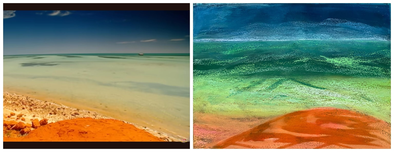
WEEK 4: EXERCISE 5 (yes again!), INTERPRETING A NEW ARTWORK - Exploring Re-interpretation / 2nd Painting is from COMPOSITION & STYLE:
(29th June 2026) I went back to my 5th exercise. This time I worked with a similar garden scene, using gouache - a medium I’m still getting to know, though it feels close to watercolor. I was aiming to come closer to the sense of tranquility my Manifesto describes, allowing more room for reinterpretation rather than simply copying. I chose not to include the yellow flowers on the grass and made a few subtle shifts in the color palette. I realized quickly that Gouache does have that lovely matte finish, which looks so natural, but also flat so next time, I might layer crayons or pastels over the gouache to introduce more texture.
And yes, I can happily hear Claudia's words in my ear: “Repetition, repetition, repetition!” 🥰
To be able to explore, experiment and learn more about re-interpreting a painting, I watched Claudia's other Class (an excellent class, and you must see her project there too!):
Gouache Landscapes: 7 Days of Sketchbook Practice to Develop Your Style
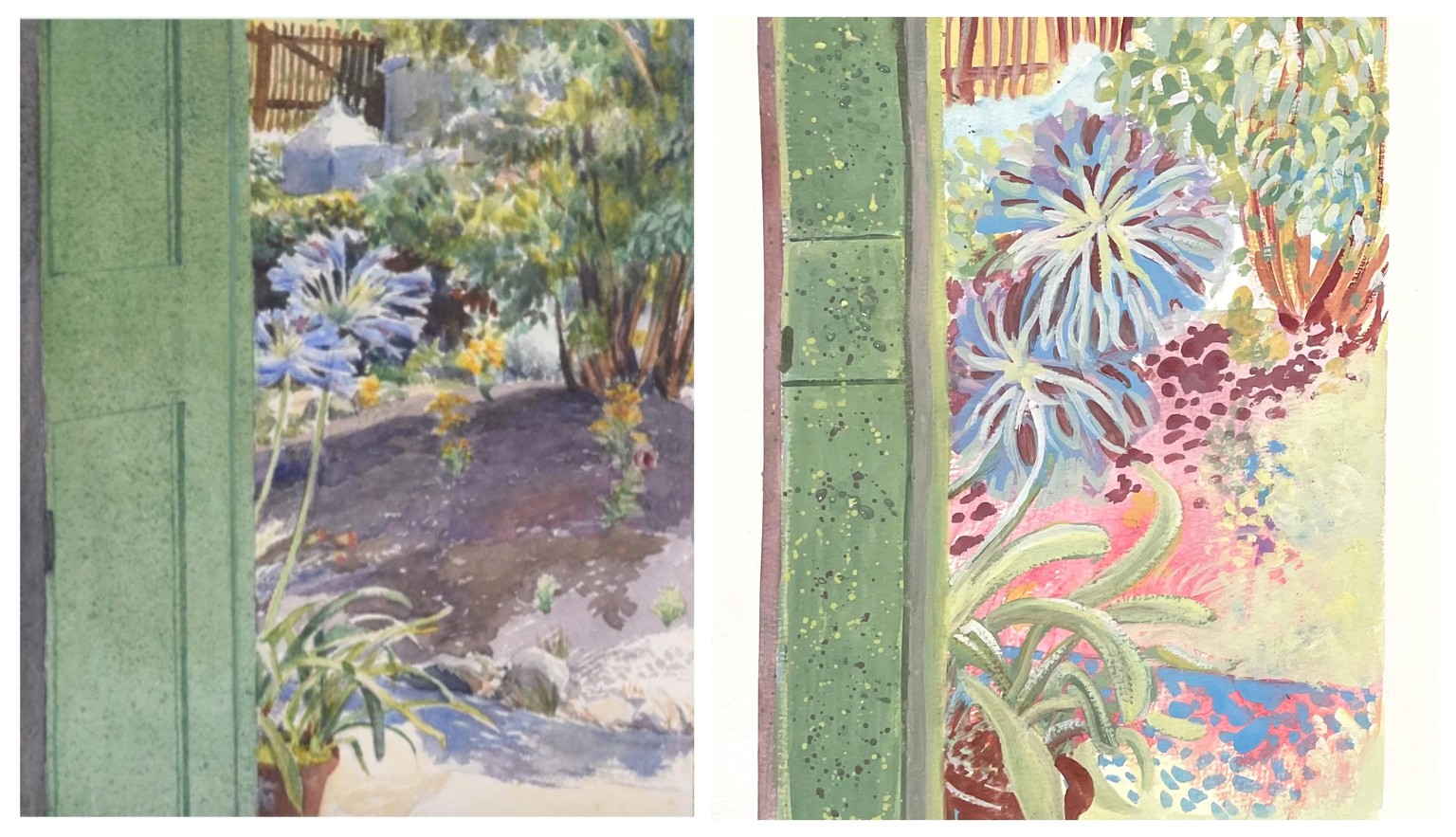
I'm so happy I went back to the same exercise ~ finding your style does involve a lot of decision-making, needing time for reflection and discovery one variable at a time. I also wonder how I can improve this painting too? Maybe less leaves in the tree (far right)? Seems over-crowded and now i remember Claudia demonstrating how we can re-interpret without having to put every nook and cranny!. 💙💦💕
WEEK 4: EXERCISE 6, CREATING YOUR ORIGINAL ARTWORK
28th June 2026) Hmmm… now what will I make? Yikes - that question is always a little daunting. What are the signs that let me sense this or that is what I want to make? I’m thinking a still life might be next. I’ll sit with that for now… ah yes, the Manifesto! That will be my guide. 🙂
(29th June 2026) I think after my 2nd 5th exercise I'm ready. I'm deciding to go through the whole process of Claudia's other course - "Gouache Landscapes: 7 Days of Sketchbook Practice to Develop Your Style," in order to make an original art work - this is sooo exciting!!!
1st VERSION: Here’s an initial gouache sketch and color palette. I plan to gather real-life references for the flowers, trees - everything, really - but this is what emerged for now in my reflection on the kind of artwork I’d like to make. It has a dreamlike mood, a restful garden atmosphere, as if someone is taking a nap or sinking into a deep sleep. I’d like to keep that sense of calm while softening the surreal quality it has at the moment.
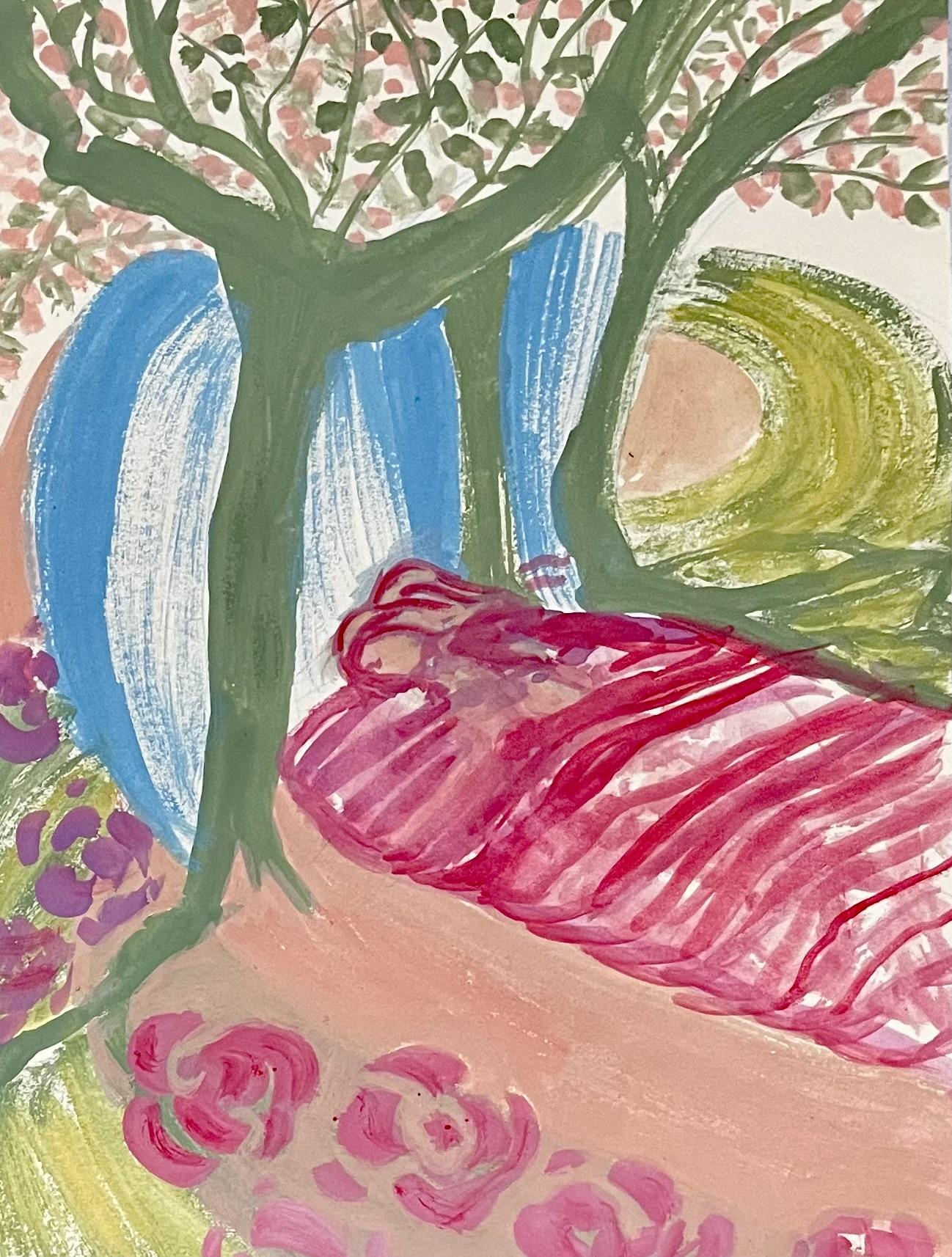
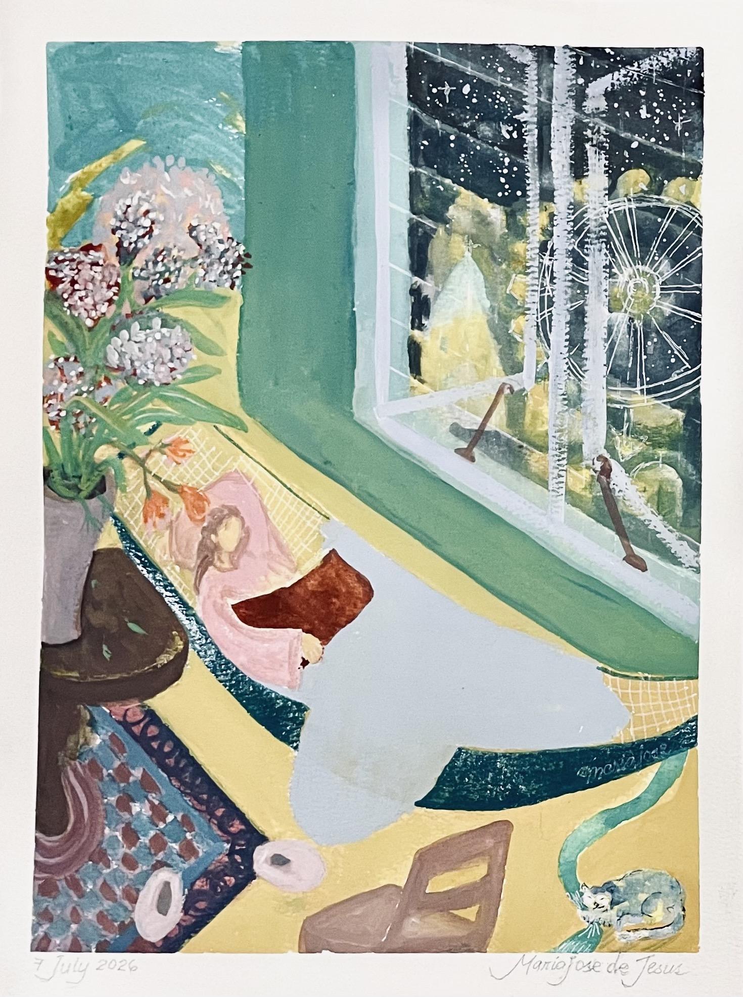
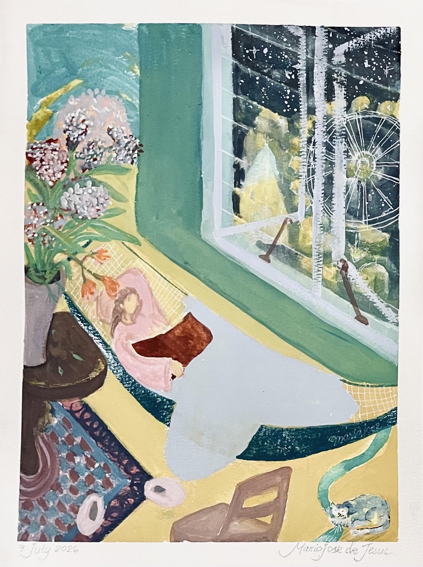
MY FINAL ART WORK
YAY!!! I’m done! I did it! 🤸♀️ and I followed the exact process Claudia demonstrated. I honestly can’t believe it, because I always felt creating something original was impossible for me. 🙆♀️ But this piece is truly the result of all the lessons coming together.🎉
The mood board and manifesto kept me focused, and the exercises and repetitions helped me see both my strengths and weaknesses. This concept didn’t arrive right away. I experimented with gouache and even took Claudia’s Gouache Landscapes: 7 Days of Sketchbook Practice to Develop Your Style. Then today, while practicing, the image suddenly formed in my mind - and I loved what I saw. I knew I finally had a painting. It’s true what Picasso said: “Inspiration finds you working.”
Here’s my little piece. I’m genuinely happy with it (without perfectionism!). Every element has meaning for me and aligns with my manifesto, and I fully own the creative decisions I made. Thank you so much, Claudia! 💖 Thank you for your EXCELLENT classes! 🥰
WEEK 4: ANALYSIS & RECAP
"Repetition is the way to consistency,
Consistency is the way to progress,
Progress is how you learn to create
art that feels like you."
( - Claudia Melchor del Rio)