Final whimsical landscape
Update
Thank you Ania for all of your amazing feedback! It really helped me going into the final version. You'll see I changed quite a few things this round, including a more harmonious color scheme, fluffier clouds, transparent layers on the mountains, tweaking the composition (bigger trees) and a LOT more time spent on the details. I am thrilled with the final product and can't wait to gift this to my best friend - this is a depiction of her childhood neighborhood.
A few miscellaneous tips for others if they read this:
- I used Dr. Ph Martins white ink for the details and I discovered that it lifts REALLY easily with just water and a paper towel. This made it less nerve wracking to do certain parts, and I was able to correct problems easily.
- I used a little tool I got when I purchased tracing paper to make dots (next to the pencil in the picture)- its time consuming to dip in the paint, but the result is way more uniform than with paint brush. You could use the other end of a paint brush, but I wanted smaller circles!
- I was much more deliberate in preparing a larger amount of paint beforehand for certain things - not having to remix constantly made it so much easier.
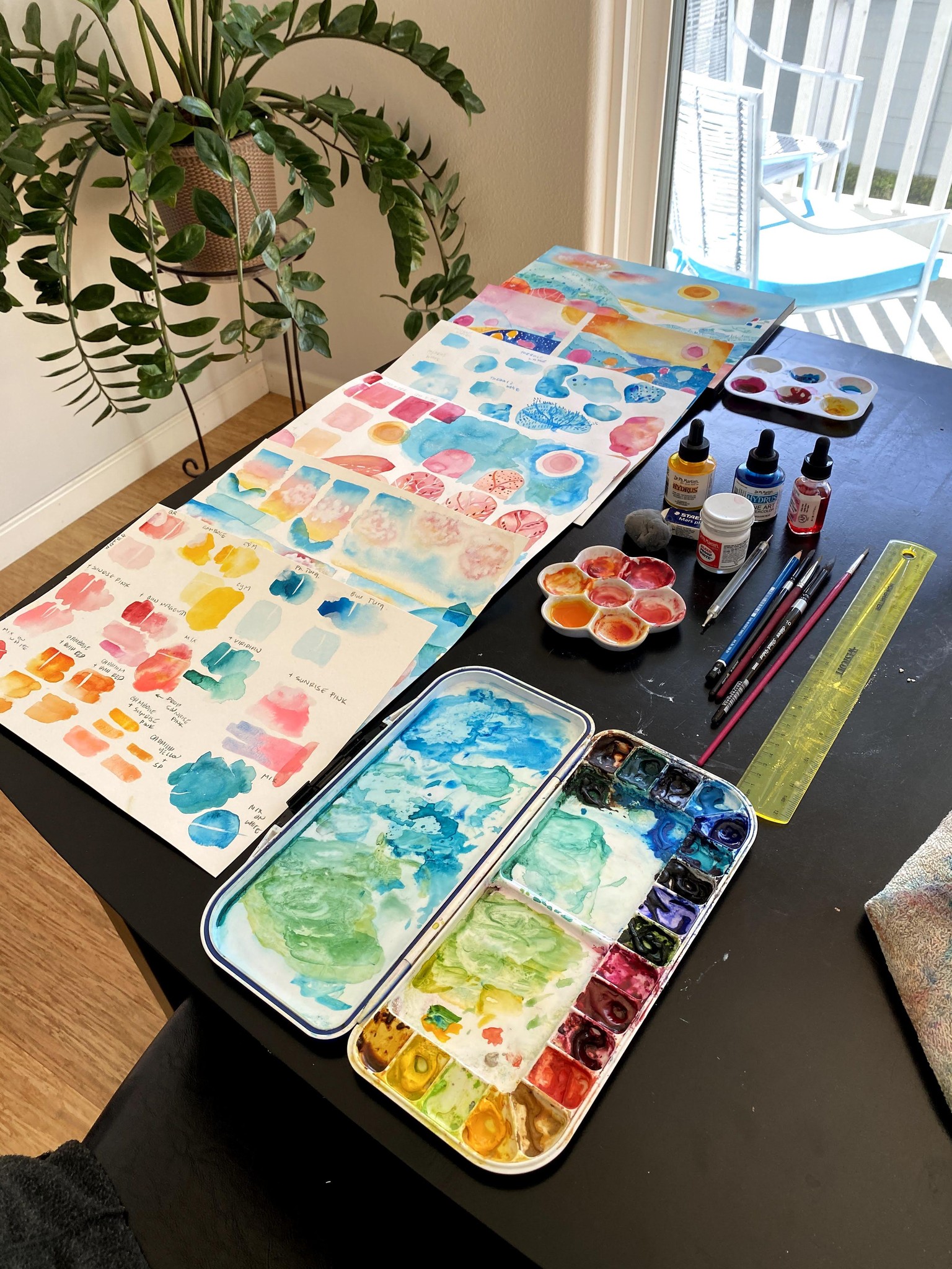
Here are some pictures of the process:
A lot of practice sheets (not all shown here!), working out colors, etc. I also got a new red and a new pink to work with as I wasn't happy with what I had.
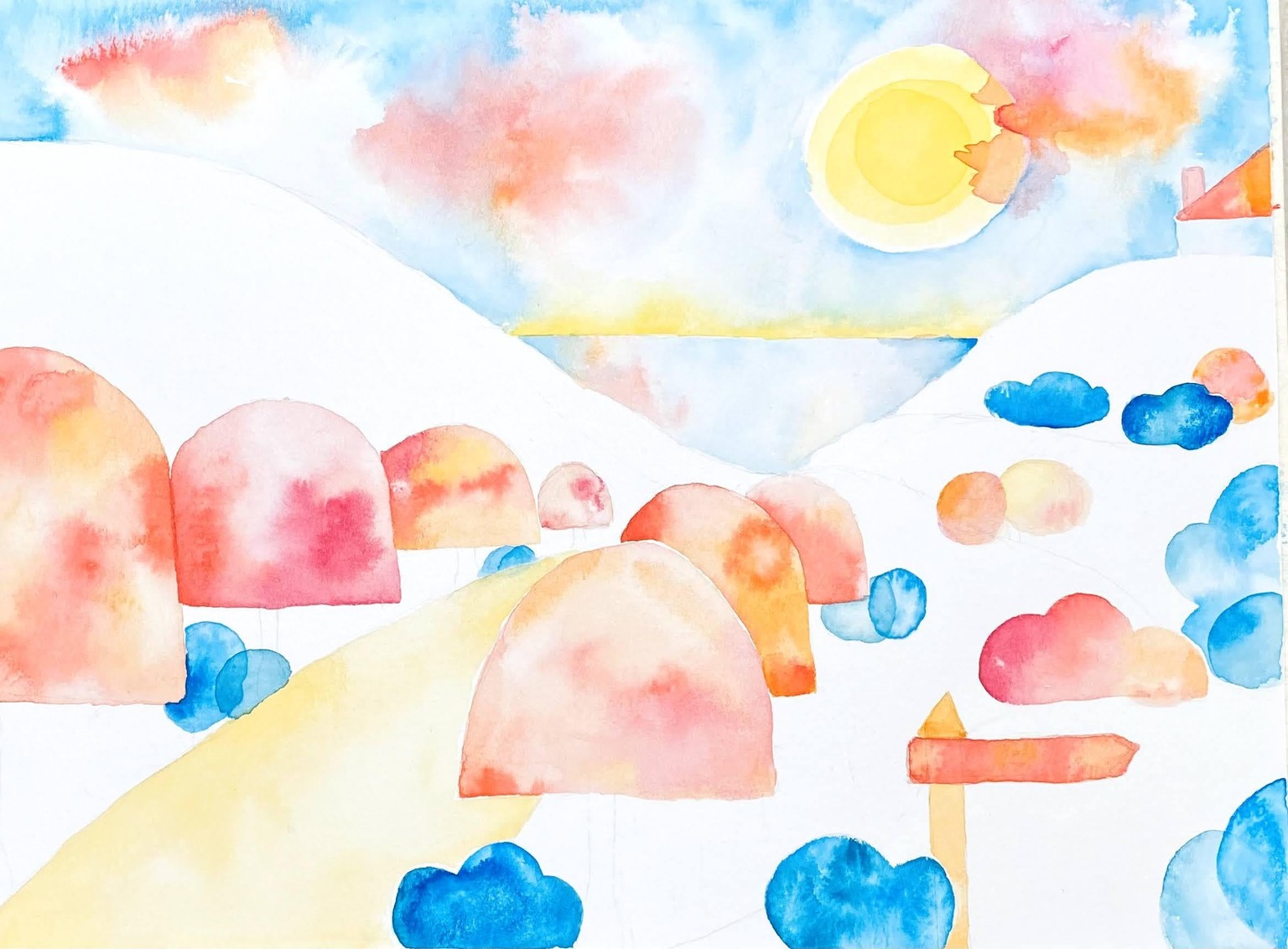
Intermediate stages:
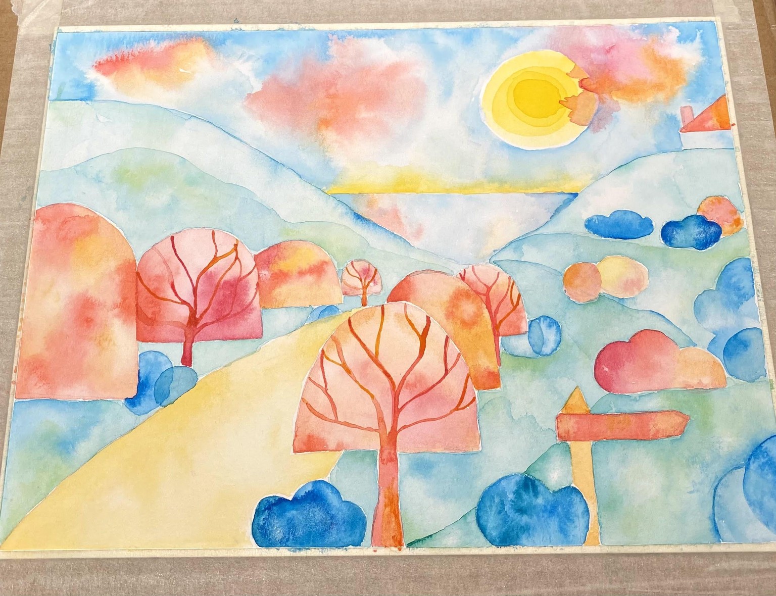
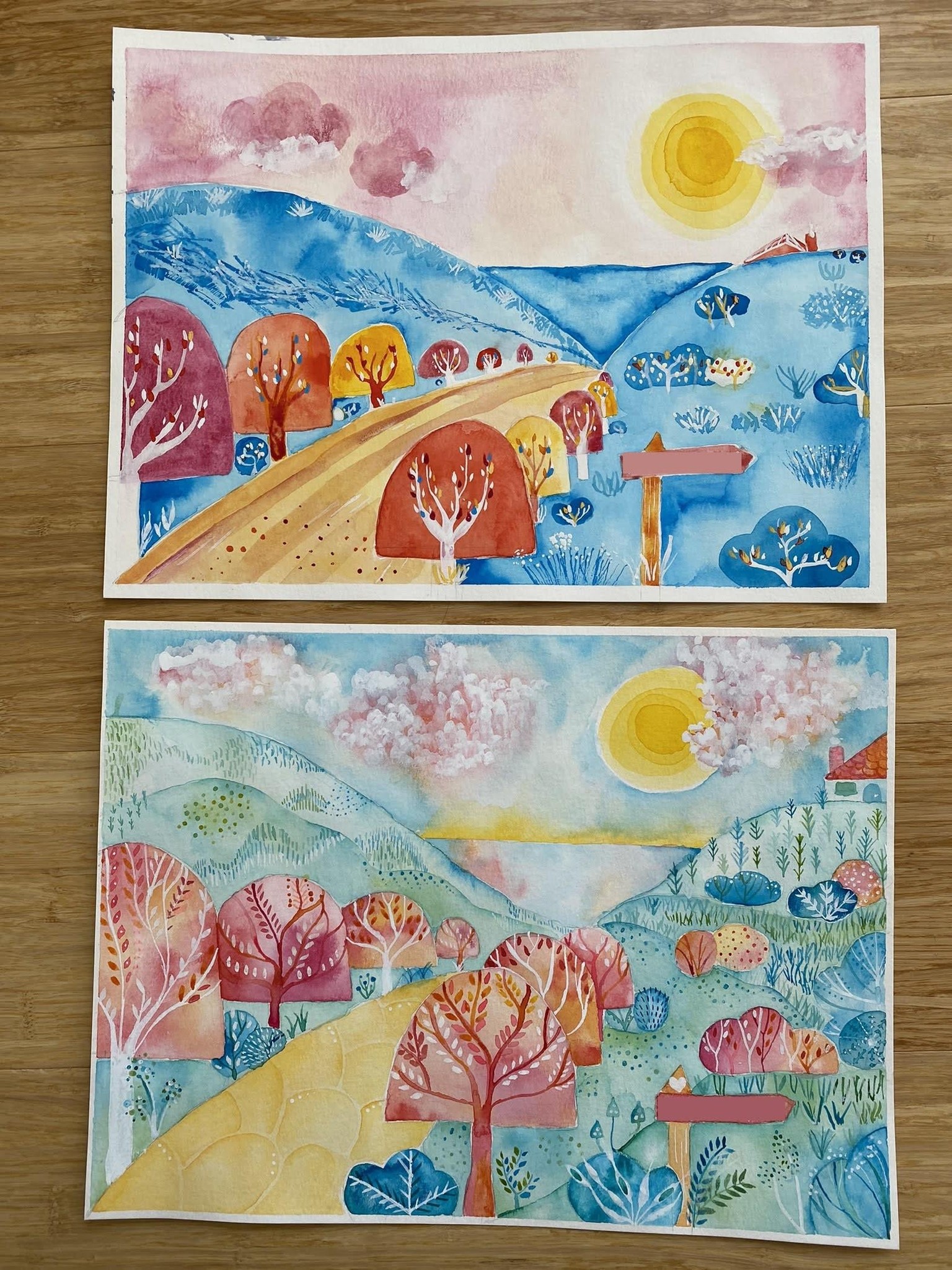
Here's a comparison to the original. The original was more vibrant with the blue, but I think the second one is a big improvement!
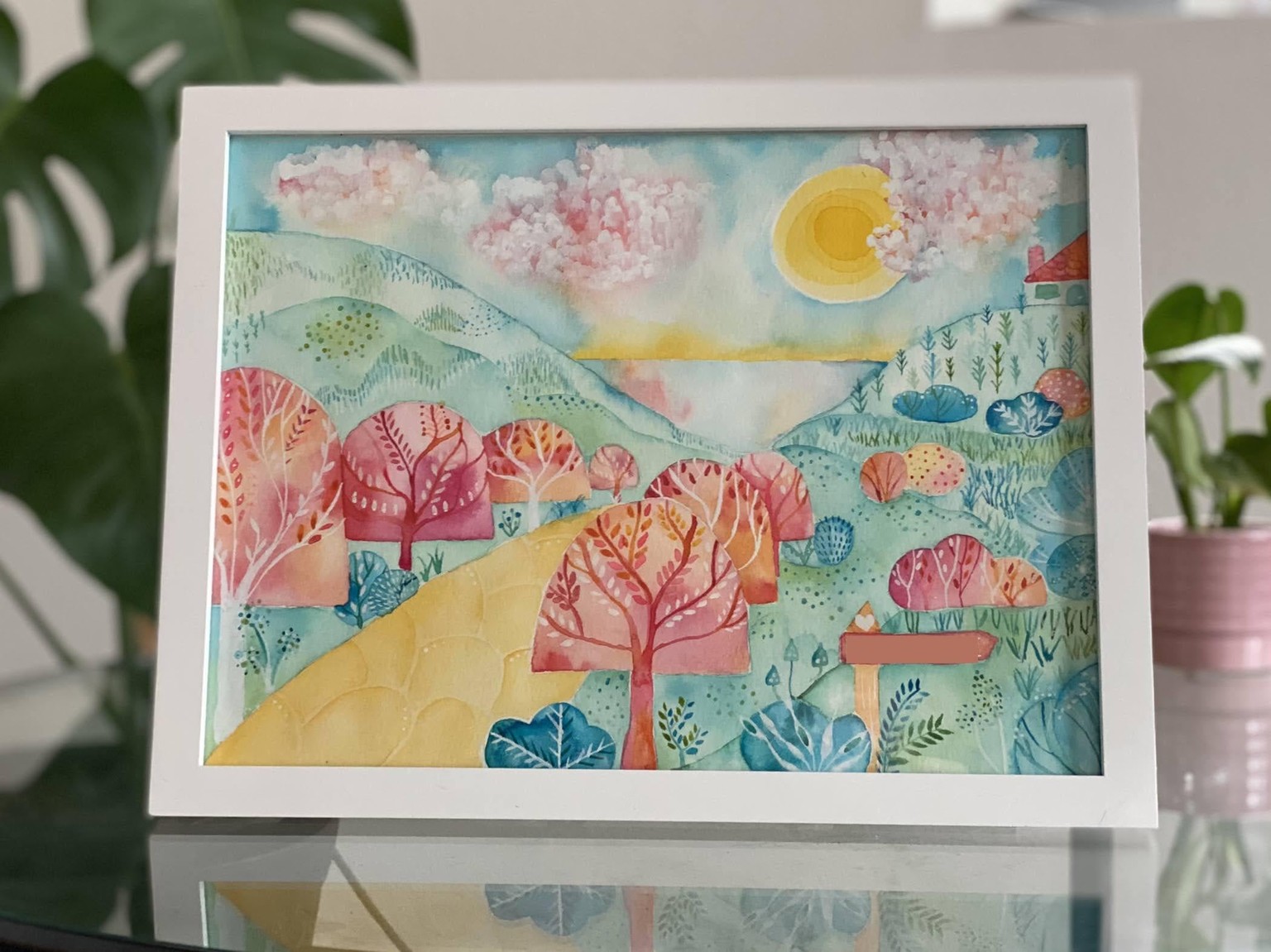
Here is the final piece! Thank you for this great class!
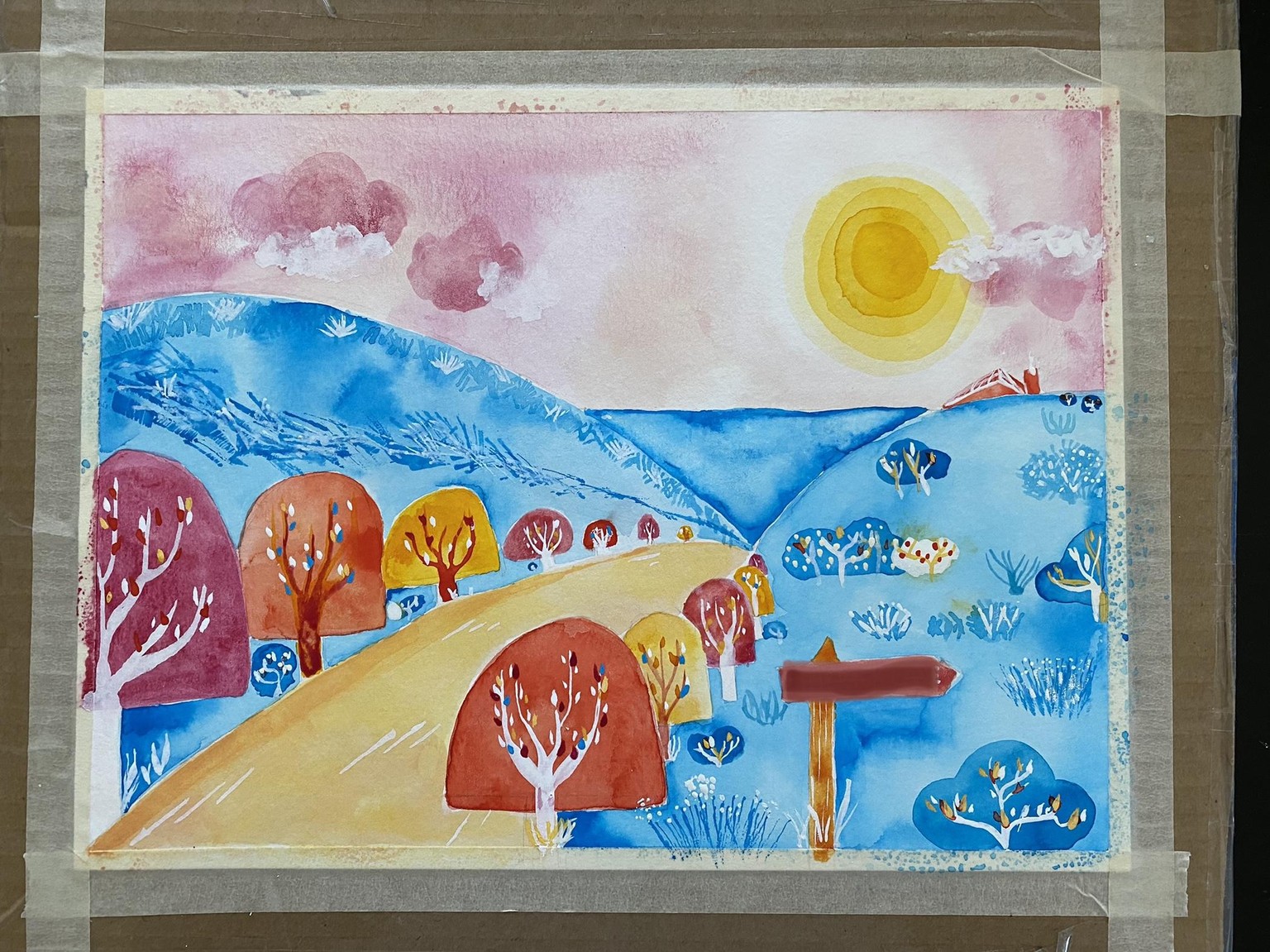
Original Post
Hi Ania,
Thanks for making this great class!! I followed each step (I’ve show my exercises below). I love the concept behind the class and your execution was just perfect.
I’ve included below a picture of my first draft. This is intended to be a gift so I will probably do another round from scratch to refine things. I wonder if you have any feedback or suggestions? I will probably keep the composition the same but a few things I’m thinking about changing are:
color scheme - I love the brightness achieved by the blue but it seems like it might be too much? The mountains and the ocean also aren’t distinct enough. I’m considering flipping the sky color and the mountain color. What do you think?
I had trouble adding details and texture to the far mountain, and couldn’t figure out what to do with the road. So if you have any suggestions for that or anything else please let me know. I’ll definitely follow up and post the final product
Thanks again and I hope you do more classes. I checked out your website and I love the birds and portraits!
Heather
exercises 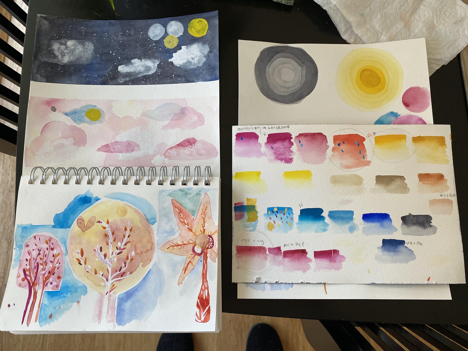
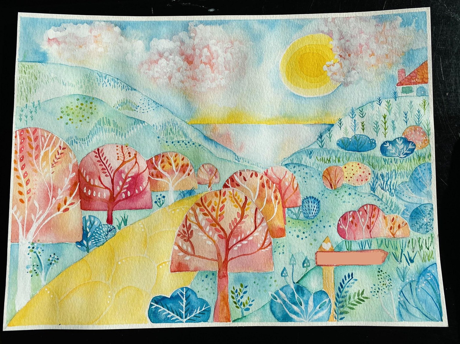
draft (ps the signpost isn’t actually that dark I’ve just blurred it out)