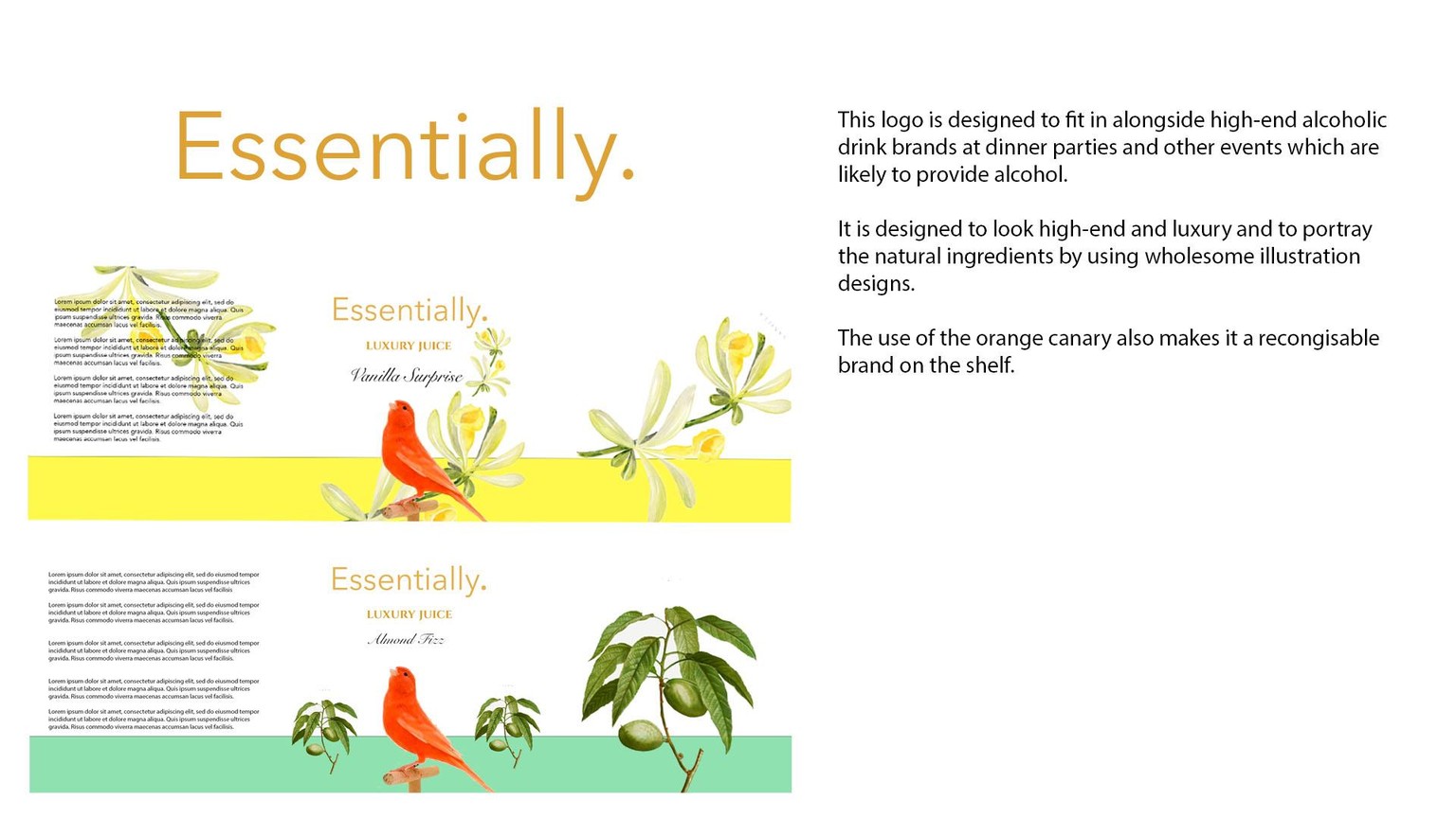
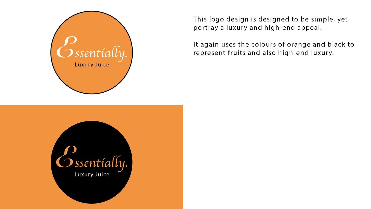
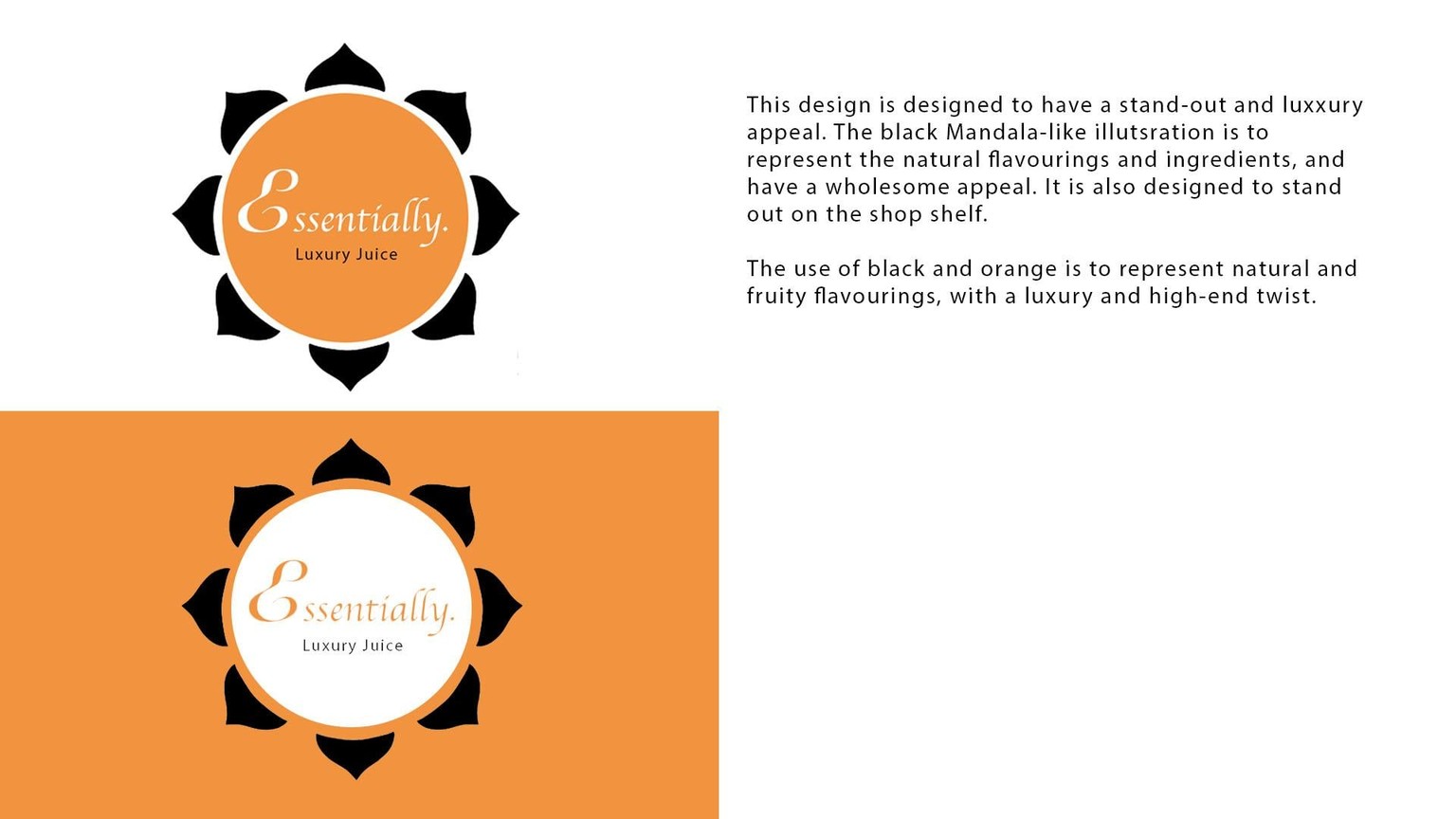
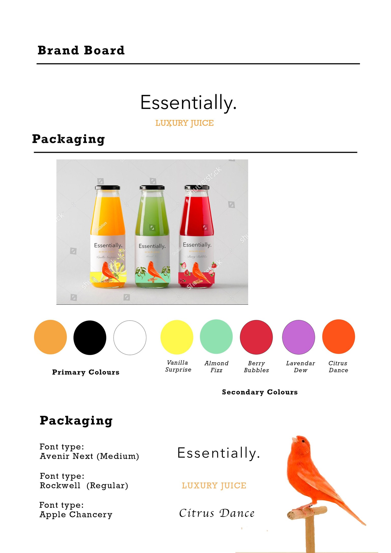
Essentially Logo Design
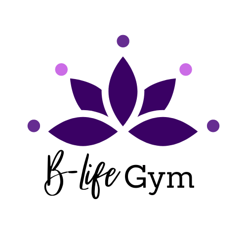
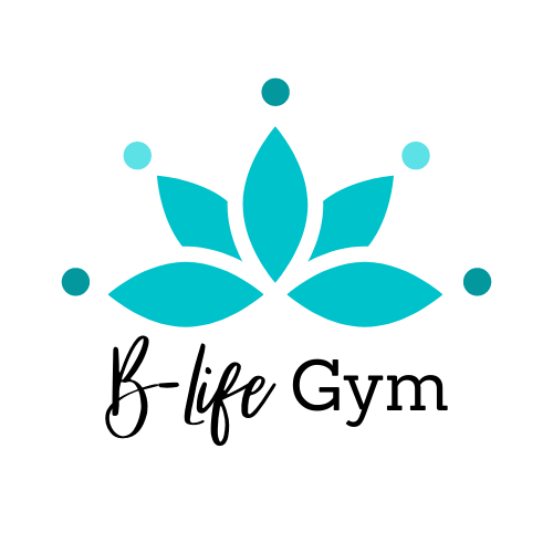
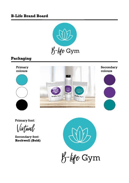
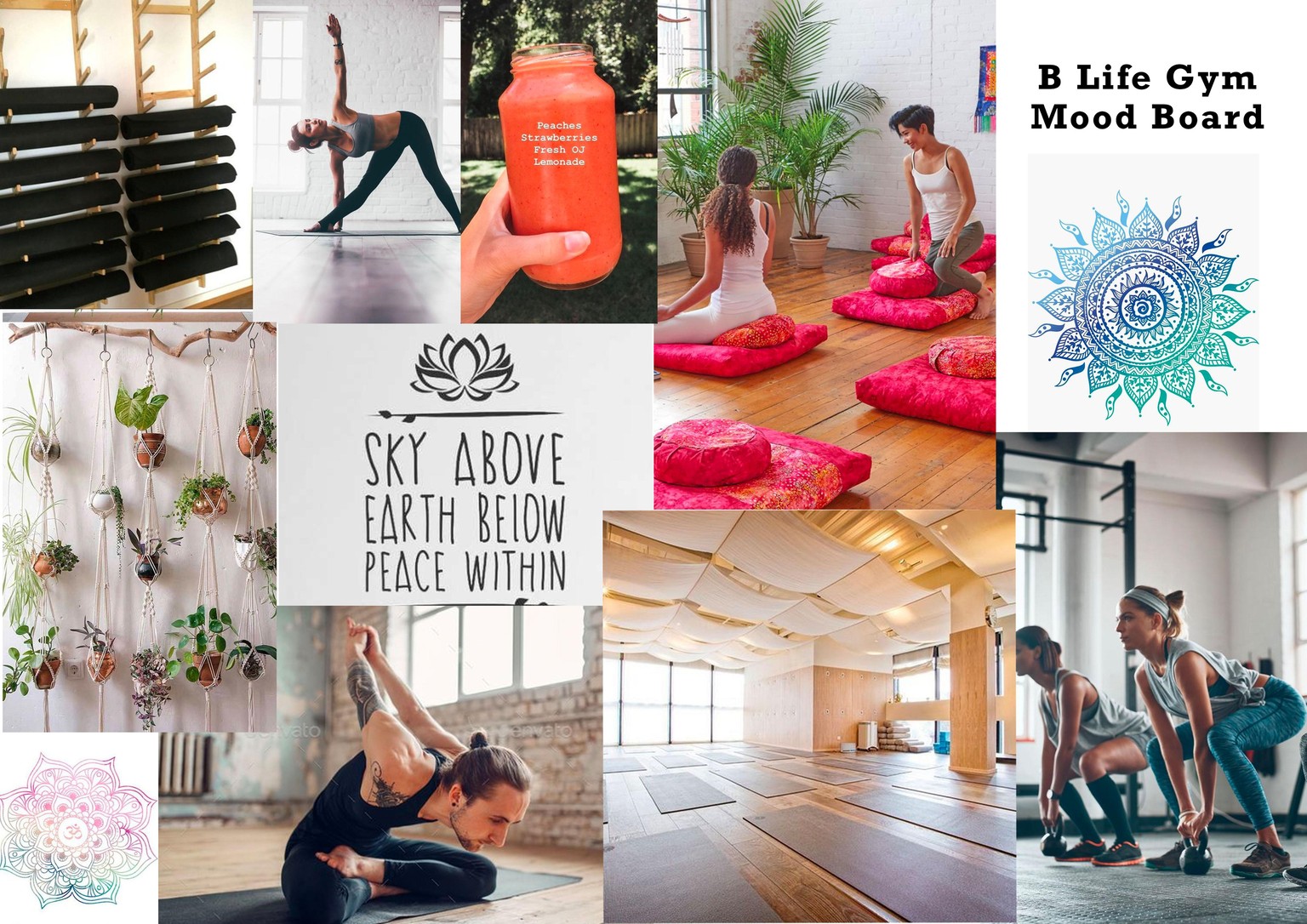
B-LIFE GYM
DESIGN 1:
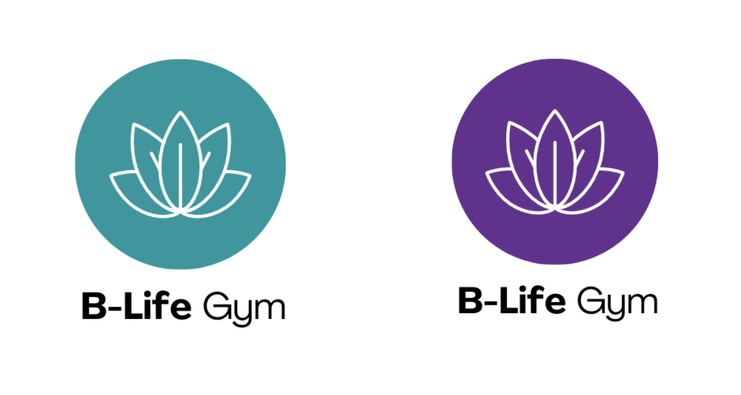
The first logo design incorporates the colours included in the colour mood board, which are earthy and "calming" tones to match the company's ethos. The simple use of the lotus flower reflects B-Life's focus on well-being and restoration.
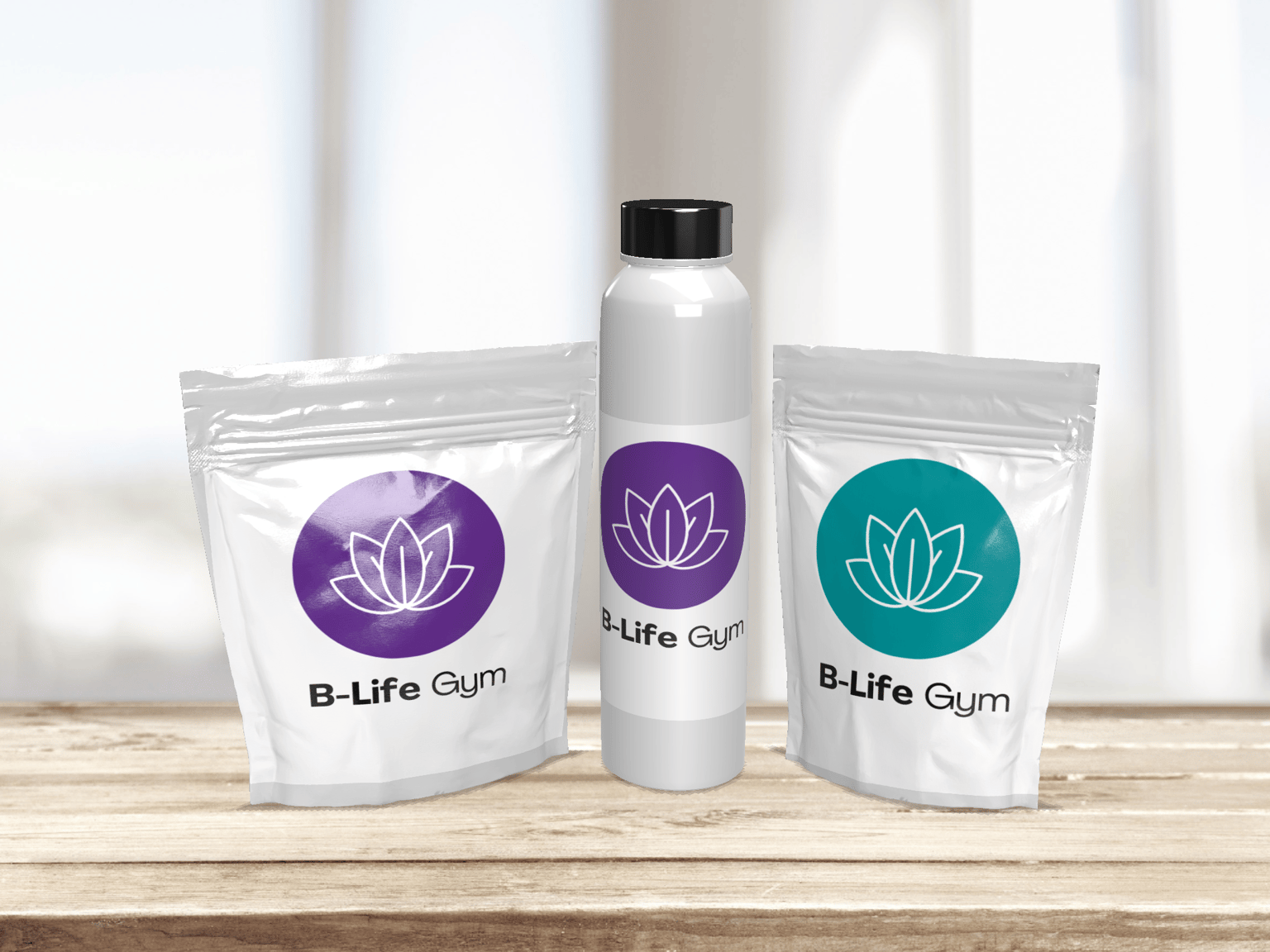
DESIGN 2:
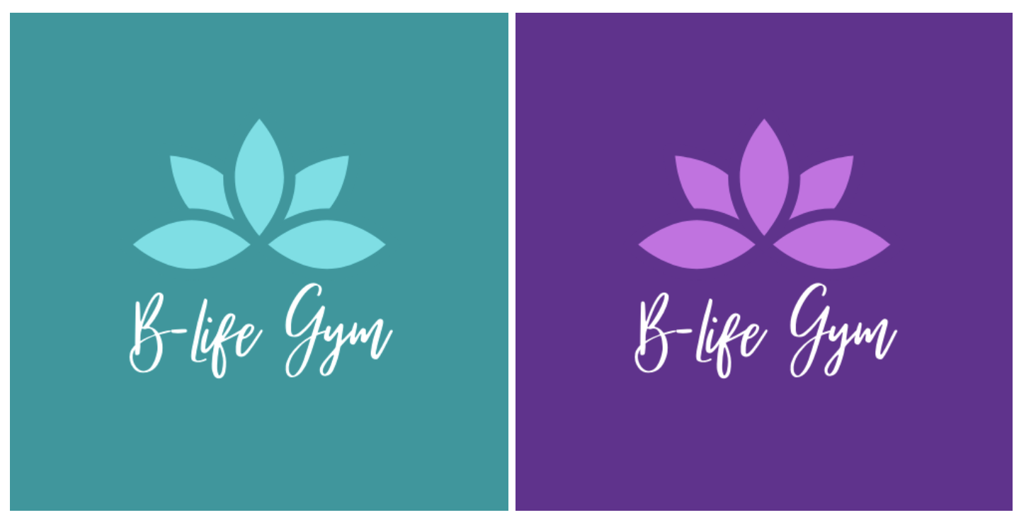
The second lot of logo designs continue with the theme of calming colours associated with health and relaxation. The lotus flower is also used in this logo collection.
A concern I have about this design is that it could be viewed as too feminine, and not as appealing to male customers.
LOGO DESIGN 3: