Don't Panic (desktop wallpaper)
I made some bookmarks for another class on Skillshare and decided to use that work for this class. The bookmark I chose to use was on yellow paper, so I had to play with the levels a bit more to get this to work.

The tip about erasing the background in photoshop was super helpful, so I'm glad I took this class for that little info nugget!


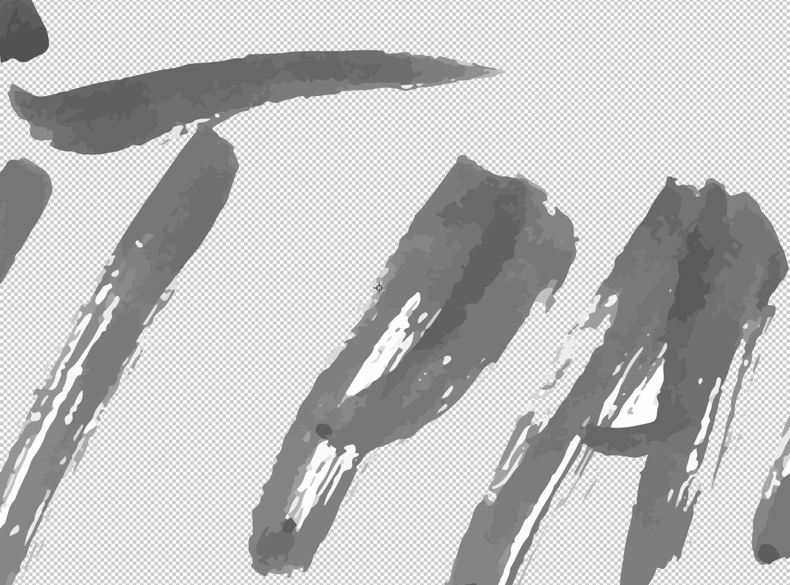
I guess I'm disappointed in the class because I thought we'd be learning tips and tricks on how to vectorize the type without using the autotrace function. Autotrace makes a lot of errors and it looks crappy most of the time. I can see why it's a good option for lettering with a lot of color, especially if you're going to be looking at it from far away. But I'd prefer having the type outlined properly and then adding the watercolor (or another texture) later by dropping it in as a photo using another technique. Going to keep searching for another soloution. I'm probably a little biased against autotrace because I'm a seasoned graphic designer. For most, this is a great solution. For somebody really picky about typography and design ... not so much. The screenshot below exhibits why I don't use autotrace.
I ended up taking this into photoshop, inverting it, cranking the layers, and putting it on a darker background (some of my other art) for a desktop wallpaper.