Creative Concepting
Honestly, this was a phenomenal exercise.
I figured I would do something not super complicated for my first time only, so I decided to create a new home page for my portfolio site.
I started just to sketch a basic idea, also writing out some key words about who I am and things that I feel make me unique.
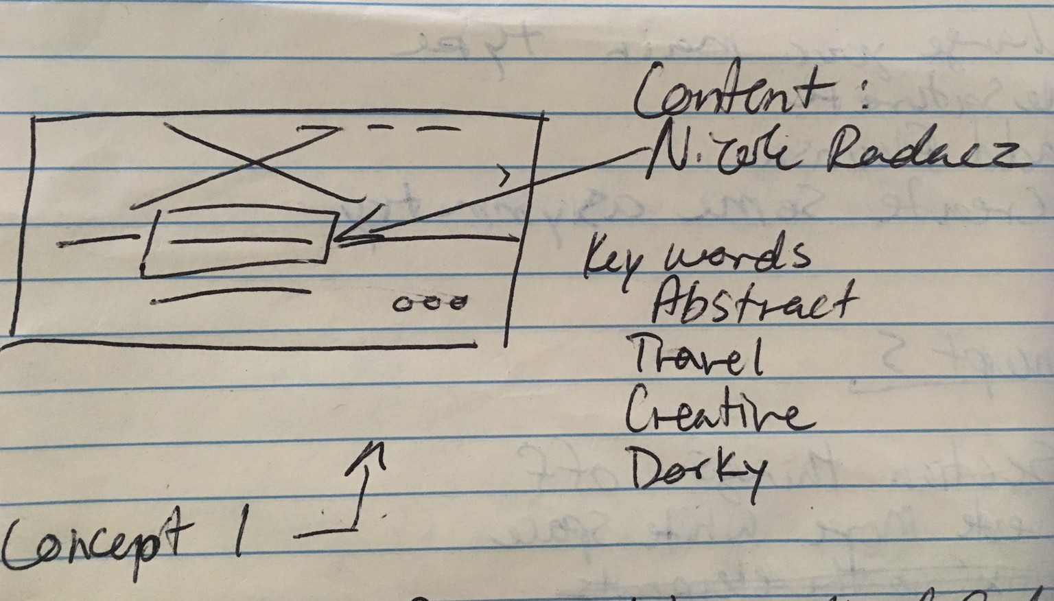
After I created the sketch I decided on a word that I felt would best fit this situation and created it visually.
Original Concept:
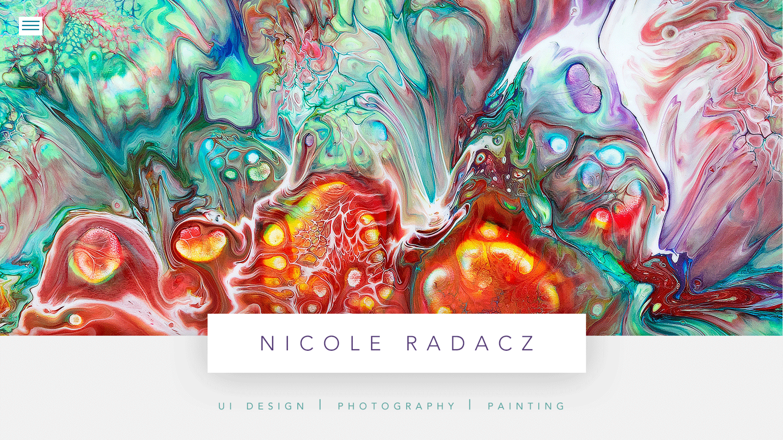
I found this beautiful, colorful abstract image on unsplash. But for the real site I would use something that I had created personally.
Concept 2:
- Play with depth of field
- Create asymmetry
- Experiment with the opacity of things
- Free up some Elements
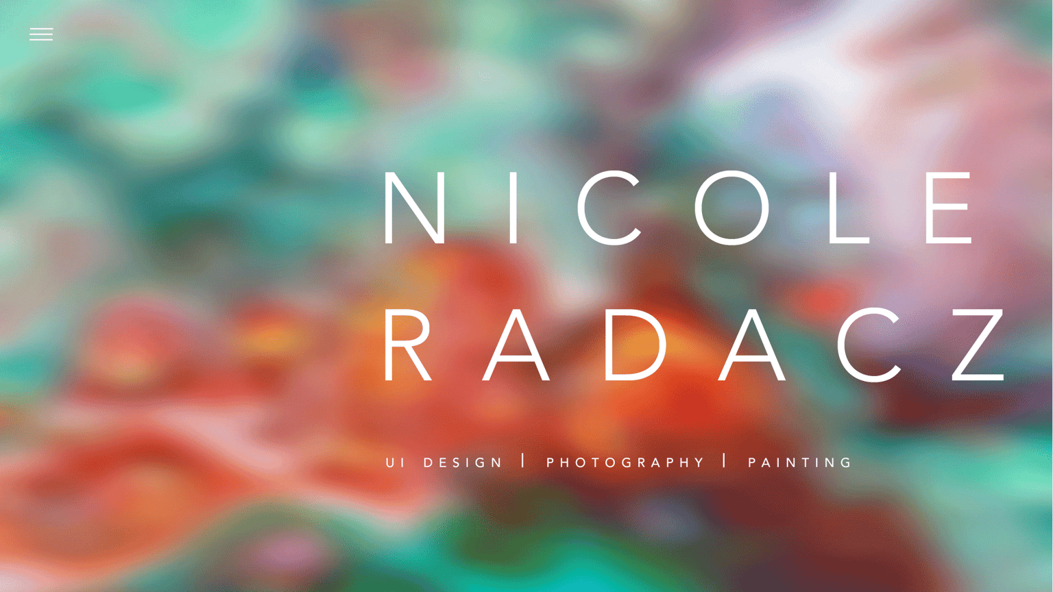
I added a gaussian blur as well as a motion blur to the background image because I enjoyed how it looked kinda like how the smudge tool does for images.
Concept 3:
- Section things off
- Make things symmetrical
- Experiment with a new palette
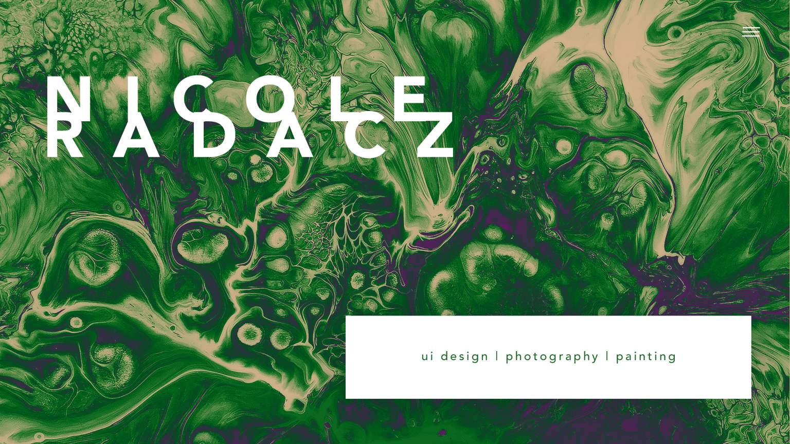
I never utilize the color green, so when I laid the gradients on top of this image, this one stuck out the most to me. I honestly love the way the the green and purple accentuates the texture.
Concept 4:
- Change your main type
- Desaturate
- Add flourish
- Create some asymmetry
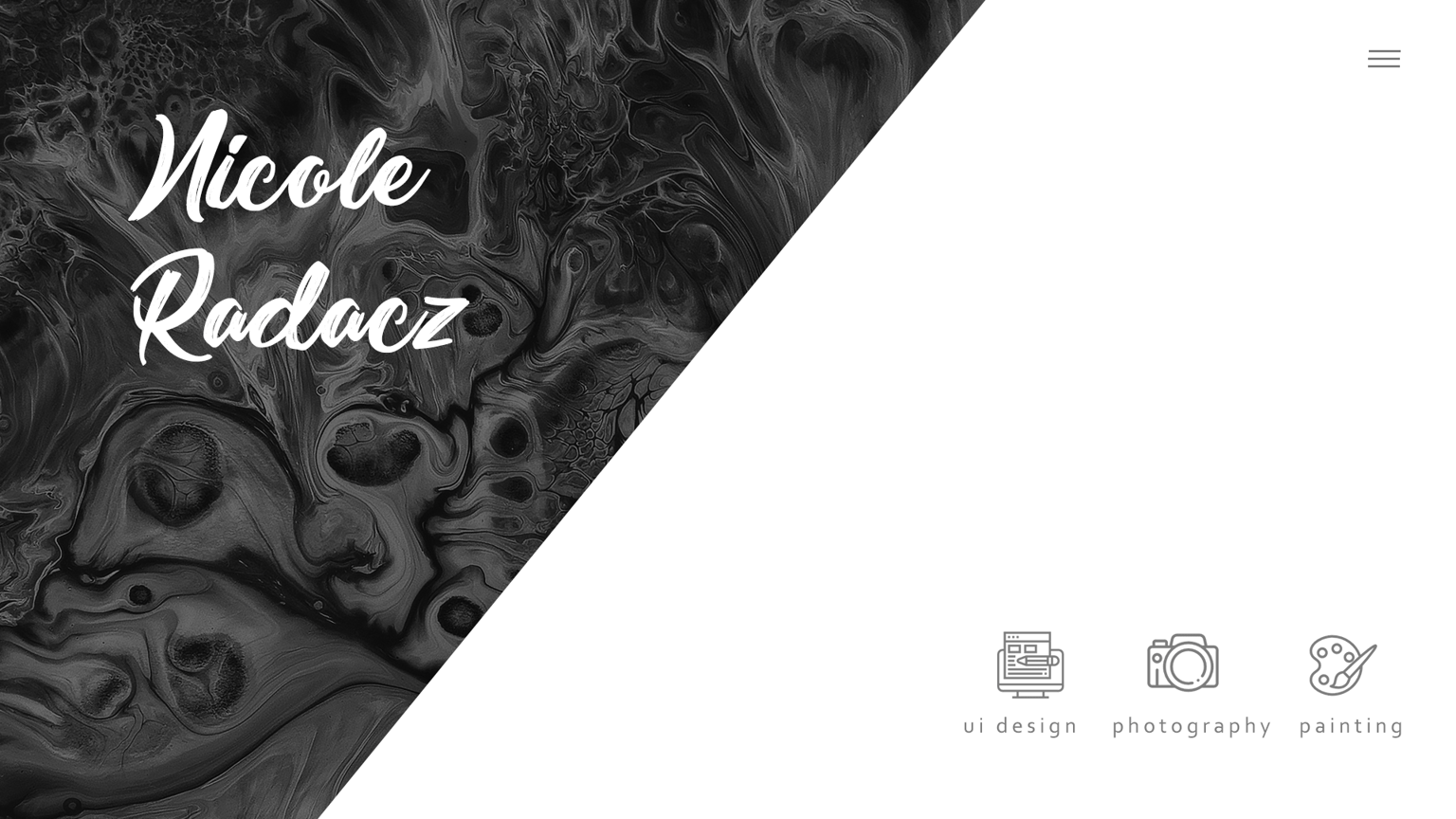
I decided to add some icons (from flaticons) to visually express my different branches of my portfolio.
Concept 5 (My favorite):
- Section things off
- Create more white space
- Slap on a substitute
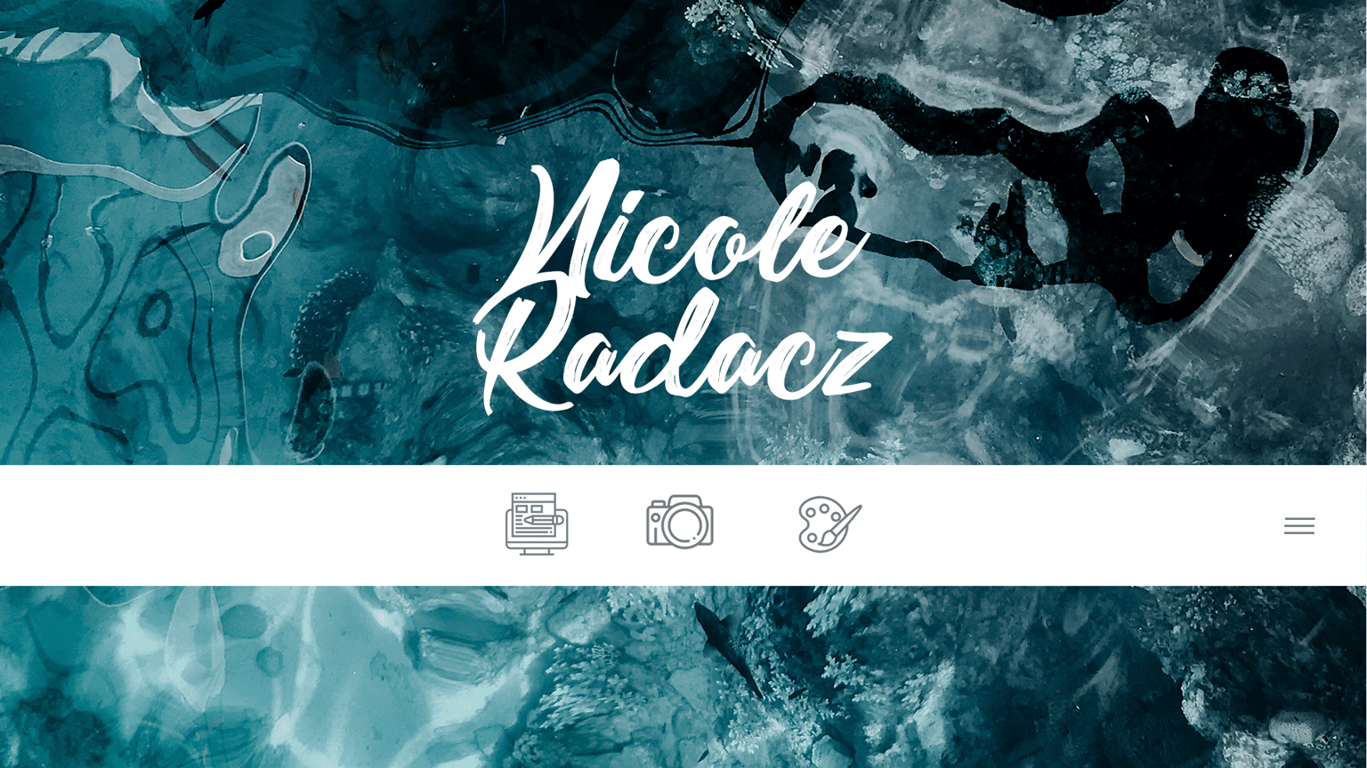
When I was originally looking for a background image, this was one of the few I plucked up, and blue is my favorite color. What I really love about this image is how it's a painting that immolates water so well. I took out the words of my portfolio sections and used the icons from the last design. I also moved the menu hamburger down to the bar to be more visible.
Concept 6:
- Mix up the elements
- Experiment with opacity
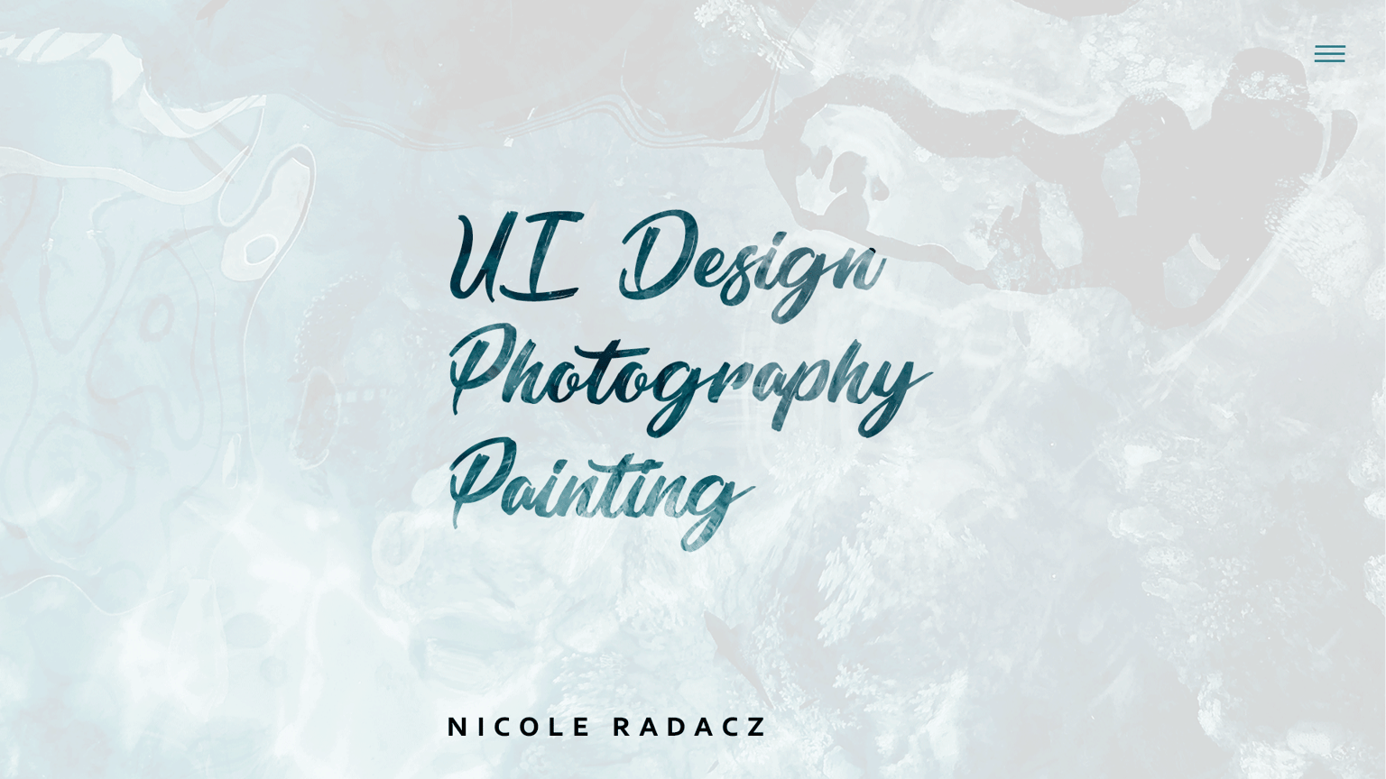
Originally I had picked to also round the edges, and make your most important elements more bold, but once I got down to this design, I couldn't apply those. I was satisfied with this design.
I learned A LOT from this exercise. It taught me how to push myself and create something new. Getting to better ideas faster. I'm thinking of designing the creative prompts into a poster to hang in my workspace, that way I can have something to reference when I get stuck!